Home of the Scrapbook Campus › Forums › Showroom › BOOTCAMP – May 2020
Tagged: Bootcamp may 2020 welcome
- This topic has 231 replies, 29 voices, and was last updated 4 years, 6 months ago by
Ruth Seibert.
-
AuthorPosts
-
May 13, 2020 at 6:43 pm #42742
Day 3 Hi, I enjoyed this lesson. I might try it again tomorrow. I don’t like the way I did it. The baby is my great grandson. I forgot the day he was born. They live in Alabama, I still have not seen him in person.
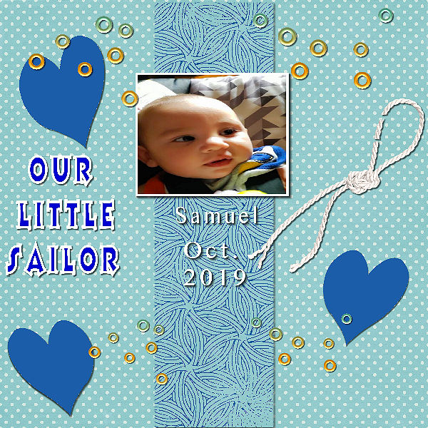
May 13, 2020 at 6:50 pm #42745Day 3. I had uploaded the image but I didn’t see it come through. I didn’t like the way I did it, I might redo it tomorrow. The baby on the picture is my great grand son Samuel. I have not meet him yet, they live in the State of Alabama, Thanks for the lesson Carole.
May 13, 2020 at 7:07 pm #42748Good Afternoon,
This is my first time scrapbooking with PSP, I’m a very long time user of the program, I’m a retired photographer. Today was my 1st attempt at scrapbooking because I’m the Historian for our cities Senior Center, we decided to go digital for our scrapbook. So, I’m hoping that by going digital I will be able to work more efficiently and make our book look more professional.
May 13, 2020 at 7:55 pm #42750May 13, 2020 at 8:33 pm #42752Since this is my first scrapbook page, I just used the kit we were referred to.
May 13, 2020 at 9:04 pm #42754Ma première page et non la dernière 🙂
May 13, 2020 at 9:46 pm #42755Thank you, Cassel! Over the years I have watched countless (very impressive) videos on how to use this software. Every time, I walk away thinking “way over my head” (but doesn’t stop me from upgrading!). I appreciate your repeating the concepts over and over so we can understand it. I knew about layers…but never understood how incredibly useful they could be and how to save a file retaining the layers. How much time I could have saved if I’d found you earlier!
May 13, 2020 at 10:55 pm #42756It looks beautiful. Great job.
May 13, 2020 at 10:59 pm #42758Hi, this is my first bootcamp. I have been a PSP user since before it was bought by Corel. The product has changed very much over the years and I haven’t kept up very well. So I thought this bootcamp was just what the doctor ordered. Here’s hoping we all have lots of fun and learn a lot.
May 13, 2020 at 11:02 pm #42759Darcy, glad you found one trick to make your life easier with PaintShop Pro. Blurring the background photo is a great way to use any photo, even a bad one. To create bear track tubes (or tubes of any tracks), you can do it manually but there is also a useful tool that several members have been using, which is the Custom Directional Tuber script (of course, you need to know how to use scripts too! 😉 )
Glenson, thanks for sharing your process to get your brown bread. Those instructions might help other participants.
Robert, just to make things clear for me to track, was the Scrapbook cover a separate project or your Project #1?
Sue, that is an interesting twist on the basic design. That round photo makes it unique.
Fiona, the crop command is always applying to the image, and not the layer. Some commands are like that, so you have to find a different way to achieve the result you want. In order to move a Selection, you have to right-click on the selection and you should be able to move it. You can check this article that uses that tip.
Krystyna, even if following the exact same tutorial, your layout is completely different. Isn’t that great? You have managed the shadows pretty well too!
Marica, you seemed to have resized the image correctly for the forum! and don’t worry, you should be able to catch up. You still have almost 2 weeks! Although we might not see how to change colors, it can definitely become a tutorial.
Cindy, you are definitely improving as you are getting more comfortable with your PSP!
Lynda, you are using those confetti very nicely with that theme!
Carol, that is a great start! I really thought you used the perspective on purpose as it is really fitting well in the page. You will see that there are a LOT more of those tutorials in the Campus 🙂
Shirley, that is a cute take on the title of “New kid on the block”! And that photo is fantastic!
Isabel, it is ok if you don’t have a date. After all, with the layered version of your project, you can add the exact date later! I think, however, that you resized the photo in height and not from a corner handle, which tends to squish that cute little face!
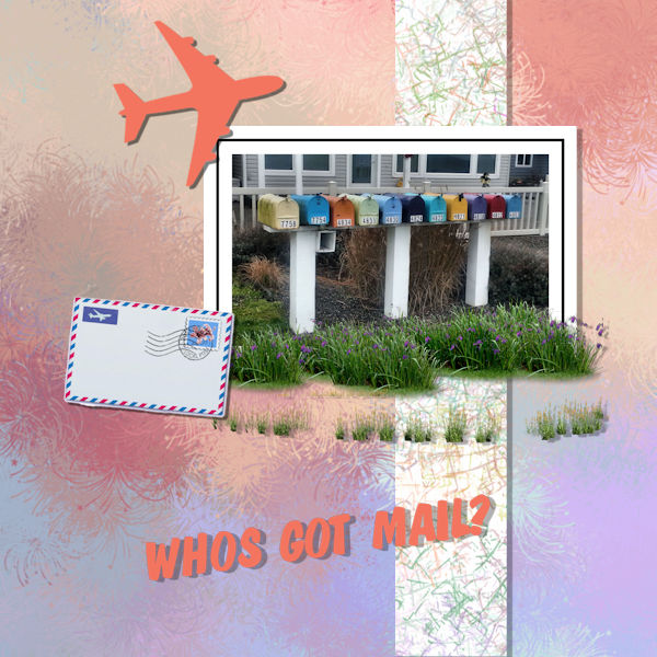
Janice, with your photography skills, and your comfort with the program, I am sure you will make wonderful and professional looking albums, I promise! If I could give one suggestion is to make your shadow a bit smaller on the text, as it is expected to be flush on the paper (unlike the plane, which is ok to fly off!). It would make your title even easier to read too.
Mary, I like how you use the strip horizontally instead of vertically like I did it. The result is great. Have you added some shadows? Either they are missing, or they are too small. Have a peek at your layered version and see.
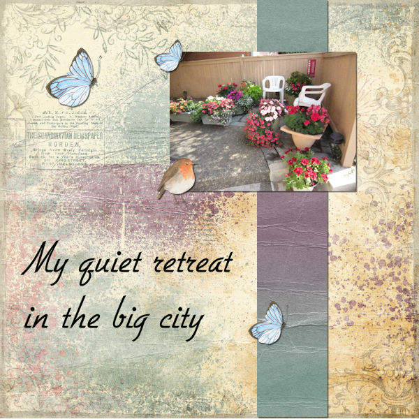
Joan, that is ok to use the suggested kit. That is why I suggested it! For a first scrapbook page, it is a great intro into your little world. Are we going to see more of your garden?
Mireille, excellent début. Une suggestion pour ta page: note le coeur plus épais en haut de ta photo. Il serait plus logique de l’avoir SUR la photo que dessous! (Translation: a suggestion for your page: notice that the thick heart on top of the photo, it would be more logical to have it ON TOP of the photo than UNDER)
There is no new lesson tomorrow, so those who have not completed their first page, or those who started late, that will be one day for you to catch up.
May 14, 2020 at 2:26 am #42761Thanks Carole for your kind remarks. As you know I am inclined to think out of the box and put a twist on things. Also getting myself in trouble at times, but this one strictly to the tutorial.
May 14, 2020 at 2:44 am #42763Loving the imagination and ingenuity of the pages posted here…. I look and think what a great idea how effective and how come I don’t think of something like that!!
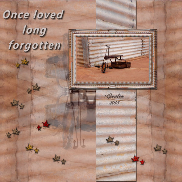
My background is the same image as in my photo using the simple 4way average filter. The panel is taken from the photo and the frame is from a tutorial I liked. The autumn leaves are supposed to represent the passing of time.
The photo was taken by me in Gwalia, West Australia.
May 14, 2020 at 9:40 am #42769Day 3 Project 1
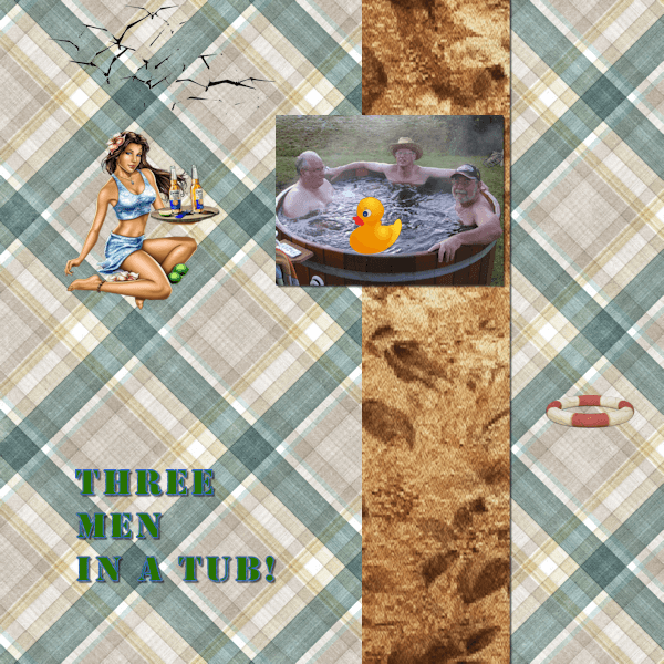
Three men in a Tub.
My photo of my two brothers (left and centre) and the partner of my sister on the right. They are in a hot tub at my brother”s hobby farm.
I used a few CC0 images from Pixabay.
May 14, 2020 at 11:22 am #42771Hi, Carole and friends!
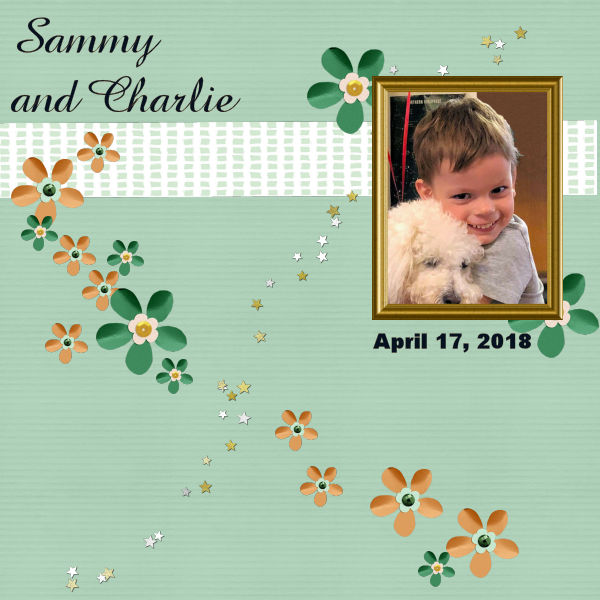
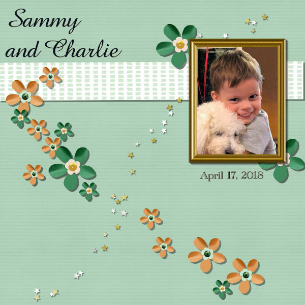
Yes I went back to Sammy and Charlie this morning and added shadows, changed the font of the date. I really had trouble getting that rectangle to go horizontal! played with giving shadow to the text but that didn’t look right. I had to keep your tutorial up and refer back to it frequently both yesterday and today. I am playing around with where to put the projects and where to put scrapbooking tools. I decided to make new folders under Corel Paint Shop Pro main heading since I have several copies of PSP as I almost always get the upgrade in Ultimate. You had mentioned in one of your pdf books that PSP 7 or 8 is better at getting an old colored photo which is faded with time to “smarten up” and look like new. For some reason I had a problem with finding drop shadow until I went over your tutorial this morning. Love how you teach.
May 14, 2020 at 12:17 pm #42775First, I want to ask for forgiveness after the fact, since I did more than requested in the lesson as when I completed it looked boring to me. So here is what I did …. I went to one of your links to get a free kit and did so of a company you gave a thumbs up. Second, I added another picture frame to add another picture from the kit, I erased behind the frame to add a picture there and then realized I did not have to but just left it alone. I changed the color of the kit by picking sepia. I added then the date. I added Paris which was part of the kit. Finally, the boredom hit and copied the pictures from the original file and used the plug in called Pic to Painting to convert to give it some pizzazz. Finally, I do not expect to win or be in the running. Just want to follow your camp to see if I learn additional items and not be cancelled out of class. I have so far so thank you for that. Will try to follow your request in the future.
May 14, 2020 at 3:51 pm #42779Here is my Project #1
Background paper by Palvinka “We Love Summer” paper-2. I tweaked the color with Adjust>Hue and Saturation>Hue-Saturation-Lightness.
I created the Confetti Tube following Cassel’s tutorial (Creative Scrap>Miscellaneous>Confetti).
Fonts: VAGRounded BT and Emily Regular
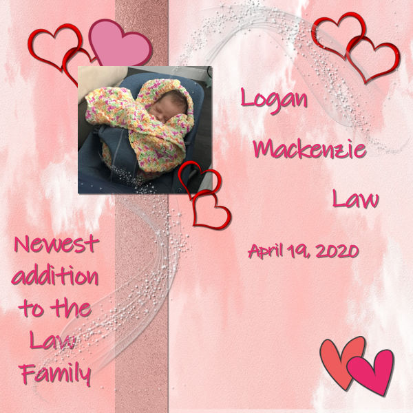
May 14, 2020 at 4:30 pm #42781Our new granddaughter – Logan. I didn’t have any ‘kits’ and the blue wasn’t going to fit with the baby blanket so I went on-line and got some free ‘background’ and ‘column strip’ prints. I went to a few clip art sites and found hearts and the white embellishment – all as png or jpeg formats. It’s my first attempt and I think I could do better with her name and positioning on the right side but I am pretty happy with how it’s turned out. Thanks Carole for the information on how to save the projects – first as the psp format, second as the jpeg and third as a resize. Amazed at what all the participants have included to enhance their projects. I will get there. Looking forward to the next project.
May 14, 2020 at 5:51 pm #42783Catching up with day 2. Thanks for the great example of layers.
May 14, 2020 at 6:41 pm #42785I redid my project with new paper, etc.
May 14, 2020 at 9:43 pm #42788Shirley, yes I know you are thinking outside the box!
Euka, it is great to see that even though you used almost exactly the same arrangement as in the lesson, the result is completely different. Good work on the shadows!
Glenson, the rubber duckie is a fun addition to the tub! Just out of curiosity, was your photo that small, or did you size it down? If it was that small, it is good that you didn’t enlarge it. If it was larger to start, we probably would have loved to see those handsome looking guys! 😉
Mary, text is a tricky element to add shadows to. If you are using a font with a look like it would be made of cut out papers, then you would add a shadow. It it is supposed to be written on your project (handwritten or printed), then the ink would not have a thickness so no shadows. That is probably why it looked odd when you added some. Organizing your supplies will be important as you gather some stash of resources and projects you will create. So it is a good thing you are starting now to do it
Jose, you will not be kicked out of the class, don’t worry. Your layout is similar enough to the lesson that I can recognize it, and it is great that you are explaining what you did as it will not only inspire others, but guide them to possibly try something similar. One thing I would suggest is to look at the shadows. I think you could use them more, especially on the photos that are framed with a color quite similar to the background.
Cristina, good idea to direct to the tutorial (although it is only for the DIAMOND members, so if you are not, you won’t be able to reach it). Did you add some shadows to the confetti? Maybe it does not show because of the resize?
Marica, I agree with you that the blue kit that was suggested in the lesson definitely would not have suited this photo. You are pretty resourceful to have found all those elements and they blend together very well. As your first project, it is very good, so with more and more resources, you will feel more comfortable over time. Looking forward to the next projects.
Joy, I hope that exercise on layers was helpful.
Joan, isn’t that great to have the option to change your mind? Can you imagine trying to do that to a paper project?
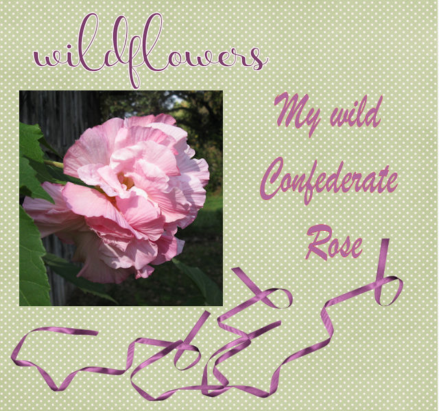
May 14, 2020 at 11:07 pm #42791Day 3, my Wild Confederate Rose. I used a Spring Kit for the wildflower caption, background and ribbons
May 15, 2020 at 2:23 am #42797Eagle eyes, Carole! I forgot to add shadows to the confetti. 🙂 They only have a tiny one of 3 for the offset when I created them and forgot to add more.
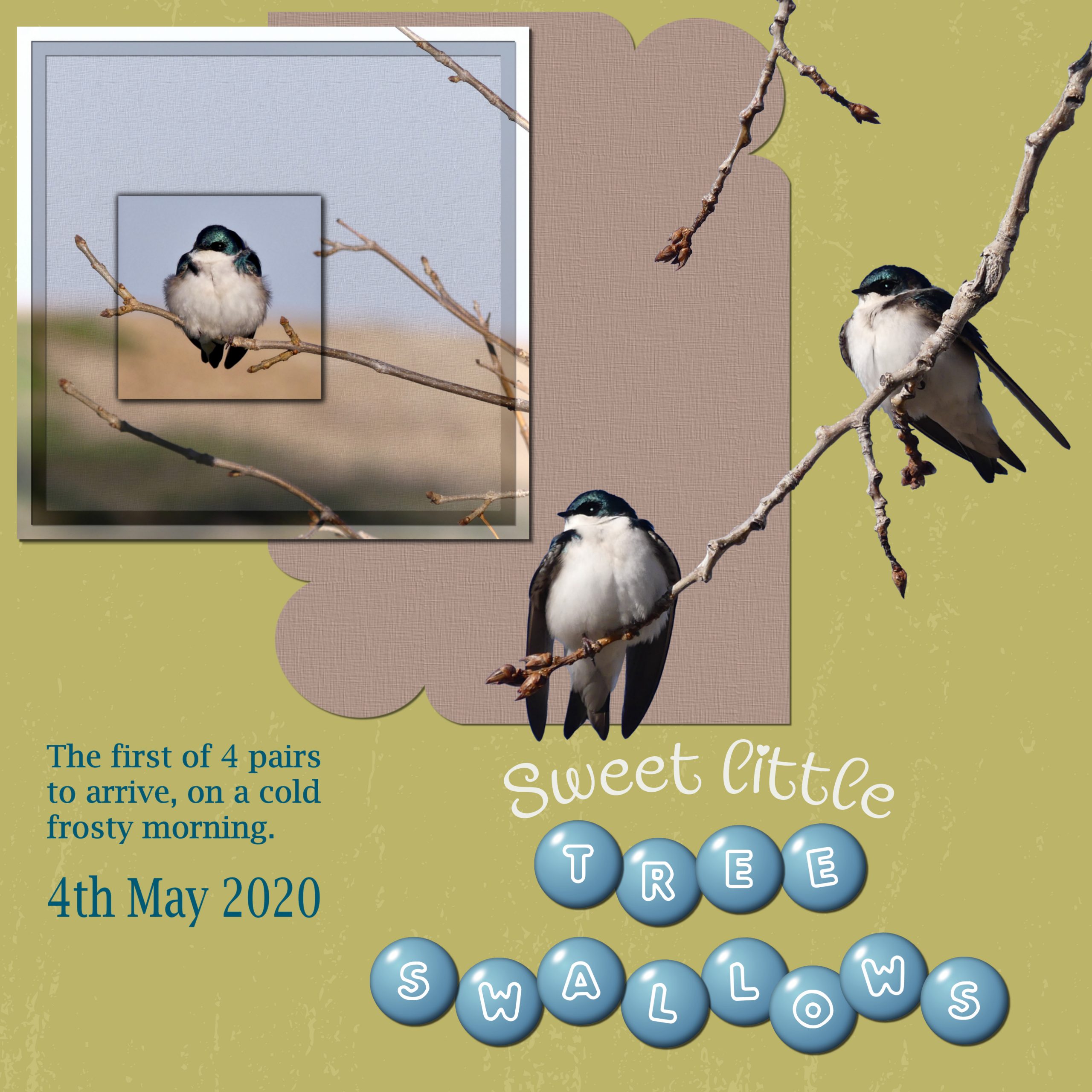
May 15, 2020 at 9:34 am #42803Cristina, I couldn’t agree more, there isn’t anything that escapes Carole! I was up at the crack of dawn, had my cup of tea outside with my usual digestive biscuit, while listening to the dawn chorus. Watching the tree Swallows above me in the tree, close to their bird house, inspired me to create todays page. I’ve tried to keep the page as close to the tutorial. Pardon the pun Carole! I couldn’t resist. You say candies, and I say sweets! Do you get it!!!! 🙂 Now for the page I created. I used adjustment layers to create the framed photo. Extracted the birds and branches from a photo. Corner punches, text on a curve, and round candies script. I moved the letters around, placing some above, and other below each other. I’d like to congratulate everyone on such beautiful pages, each and everyone is unique and creative. Not to mention inspirational. Well done.
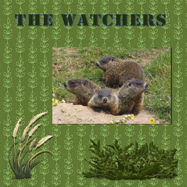
May 15, 2020 at 10:08 am #42805Day 5 Project 2 The Watchers
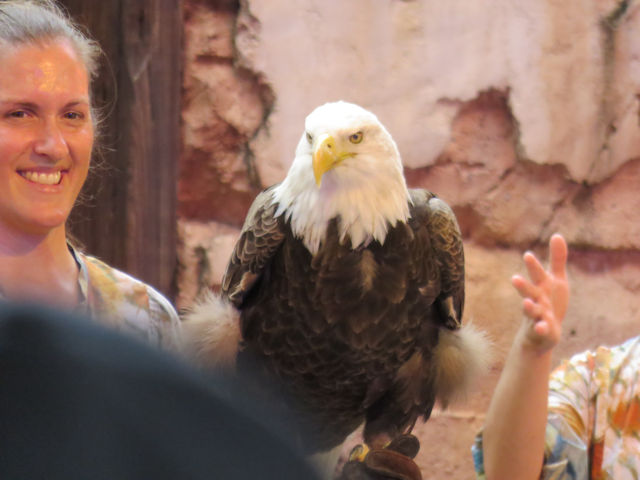
I used a background from a Kimberly Creations Kit but changed its colour to better match my photo. The photo is one my wife took on a trip to Nova Scotia in 2006. The clip art is CC0 from Pixabay.
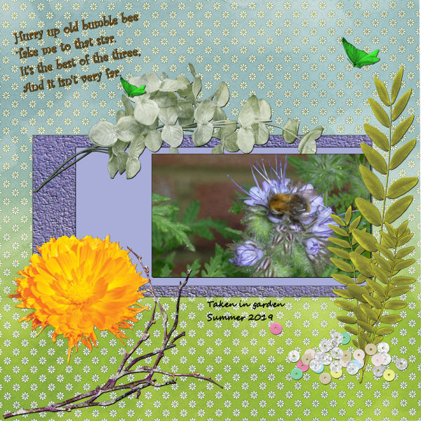
May 15, 2020 at 10:31 am #42809Hi there, here is my second project on Day 5. Must say I had trouble with the text tool. I’m afraid this is my Achilles heel. I then realised it was being entered as a selection, rather than a vector. No wonder it kept “disappearing”! My background was used from a paper supplied by one of the free scrapbooking kits, but the two purple backgrounds I did myself. One is just a plain colour fill, and the other is made by using the leather option under effects. The embellishments I picked from the scrapbook freebies, and the wording I found on pinterest.
This is my busy bee picture …
May 15, 2020 at 2:13 pm #42816Day 5
This is to commemorate my grandsons graduation from the Naval Academy. I used photos that I took at the graduation except the one that I’m in. My daughter took that one. Ian was in the Naval Academy Band so I included that insignia along with the Naval Academy insignia.
Everyone is doing such great work…congrats to all.
May 15, 2020 at 2:32 pm #42818Good evening. Thank you Carole for your recent tips and I think the moving of Selections may have sunk in to me now.
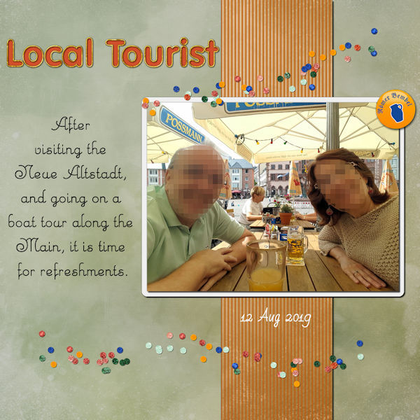
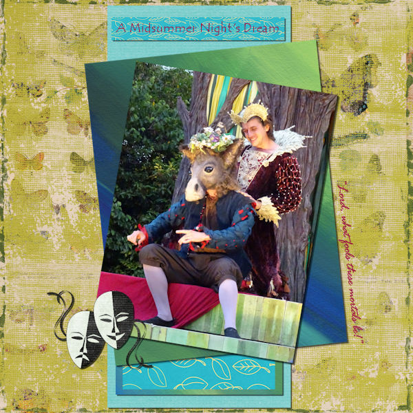
My chosen subject matter for Project 2 is A Midsummer Night’s Dream using a photo I took at a production by The Lord Chamberlain’s Men, last year. So sad we won’t be able to go to anything like that this year. Funnily I believe there are lines in the play: “Take pains. Be perfect.” “If we shadows have offended, Know but this and all is mended”. That’s what happened. My drop shadow effect on the title in my image just didn’t look right on the fine type I had chosen so I left it off. I tried different values but none looked right. I did duplicate the text before trying to apply the shadow effect so went back to that. Is there a way of deleting the drop shadow if you change your mind though?
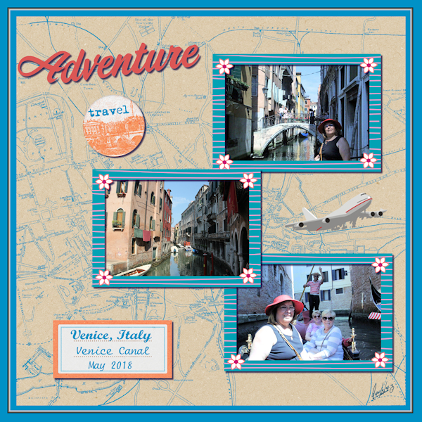
May 15, 2020 at 3:25 pm #42820I decided to once again showcase my wife in today’s lesson. First, I got a kit where it was suggested to go. I actually got two…. LOL. I then chose the background from the kit. I then added a larger canvas size by 300 pixels. Changed the color to what you see. I then picked the selection tool and set the size by 25. I drew the selection on the blue portion of the background layer. Picked the chisel tool and put the color on white and transparent. That made the chisel effect you see. I deselected the selection tool. I then picked the three pictures. My pictures are very large from the camera. I do it on purpose as in the past I have messed up pictures by resizing. I resized one to my liking. I made the pictures all the same size by stacking them to size the same, then separating and put in order as seen as they are on separate layers. I picked the PSP frame and made sure that it was set up to do the layer only. I then added the rest of the individual items such as the tag, the travel and adventure lettering. The adventure letter “A” was done separately in order to give it that extra tilt. The plane was a tube from PSP. I picked the text that went on the label for place and date. Picked the color to the blue background. I then put a shadow on all the items I wanted to do. Finally, I added my signature which is a font I had made when I used WordPerfect a long, long, long time ago from a vendor in their magazine. I then rasterized the signature and placed it. Hint, if you sign with a font, it must be rasterized cause if you send the PSP file to someone, it will not show up if they do not have the same font on their computer. That’s it. I think I followed all the rules today….LMAO. A plus was my wife really liked it…LOL
May 15, 2020 at 4:33 pm #42822Day 5 Lesson 2
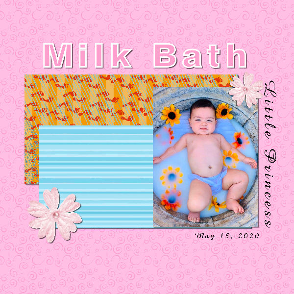
I hope I got it right. I used the papers Carole had to download, but the first one I used didn’t blend in with the picture I was going to use. I got a regular layer, chose a color and then I used a pattern from Paint shop pro. The bottom one I colored it and used a pattern on it. The baby on the picture is my great granddaughter. Thanks Carole, I know I need a lot to learn but you are a great help.
May 15, 2020 at 5:02 pm #42824I had No problems, I had fun with tubes and fun all the way thru. Thank You Carole, I am getting more comfortable like you said 🙂 I am going now to use what you told me and hopefully I can turn in my last 2 lessons. thank you for all your help and patience.
-
AuthorPosts


- The topic ‘BOOTCAMP – May 2020’ is closed to new replies.


