Home of the Scrapbook Campus › Forums › Showroom › BOOTCAMP March 2021
Tagged: BOOTCAMP March 2021 day 11
- This topic has 172 replies, 18 voices, and was last updated 3 years, 7 months ago by
Susanne Lietz.
-
AuthorPosts
-
March 25, 2021 at 7:37 pm #55415
Help, I’m having a fit with my computer and PSP 21 today. It is locking up ever time I open my last page. Here is the specks on my computer. If any of you know any thing that might help, I’m all ears.
Dell, Window 10-Home, 16 g of ram, Intel Core i7 6700 cpu@3.40 GHz.
Does that sound like enough to run this program. I have had embroidery software for years and have always bought to run CAD, I don’t have CAD but was told to tell the sales man that and he would sell me a computer fast and strong enough to run the software I had. When to look at the task manager, it tells me PSP is using about 53% of the memory and I try not to run anything else while I’m running a memory hog.
Any suggestions, Fran
March 25, 2021 at 8:04 pm #55416This is only a thought but if it’s freezing only when you open a specific page. Go into pictures, and check the size of the file. Perhaps it’s a rediculously large file. Like 500Mb for instance.
March 25, 2021 at 8:17 pm #55417Fran, I googled system requirements for Corel psp 2021. I have the same version of PSP.
Looks like you meet the requirements. Did you shut down PSP? restart it? I like to do a cache clean at least once a week if i’m using PSP daily.
File > preferences > reset preferences > check both reset general preferences and clear cache. click OK.
I then go back to File > Preferences > general program preferences and uncheck enable auto preserve.
You can try that for starters.
March 25, 2021 at 10:07 pm #55419OK, I guess it is my turn to have a post “eaten” by the forum! I am sorry, but last night’s reply went missing.
Ron, I am kind of curious what was the scale value you used for applying the glitters in your Keesler layout? It seems incredibly larger than when others used them. On your Mardi Gras layout, I wonder what settings were used for the shadows on the individual. If you look carefully at the corners, it shows that the shadow seems “detached” from the actual paper/photo.
Paul, I find it very interesting how you changed the shape of the images from rectangular to oval. Did you happen to try the pinking edges somewhere?
Laurie, it is great that you are asking yourself questions about the shadows. In fact, transparent objects won’t have a shadow as it would be created by something blocking the light. If it is completely transparent, no light is stopped. If it is partially transparent, it would be a different story. Your trick of deselecting is a good one. That has happened to me too before to try to apply a command and nothing seemed to show.
Peter, Sue offered some answers to your questions. I am glad that you are putting some of those tutorials to good use to troubleshoot issues. That is a great approach to take. In your second posting of your assignment 2, did you squish those flowers?? If you want to resize, you have to be careful to use the Pick tool set to Scale mode AND to only use a corner handle, in order to keep the proportions.
Anne, glad to see your final project after you worked so much on it. If i could offer a suggestion, I would double-check the layering. The text would be unlikely to sit on top of the firework, as it would be too thick to write on. In addition, there is one drop/bead just to the bottom of the paper (where the title is). Maybe putting that element on top of the paper would make more sense.
Fran, great way to showcase this time flying! Good shadows too. For your file issue, are you reopening a .pspimage file? Those tend to be quite large and it can take more time.
José, I agree with you that most picture tubes should be without shadows so users could rotate them as needed and add the proper shadows. You picked the right tubes with the matching shadow!
Anita, I am looking forward to seeing that pinking edge on other projects. Once you know the “trick”, you can use it differently too!
Ann, glad to see you add something from the membership. Such a subtle detail, but very interesting to have that curved photo in the middle.
Wendy, did you write the title yourself or was it a wordart? If you wrote it, what font was it? It is an interesting one.
Sue, that is such an interesting way to place the frame to slip it under the photo on one side. You might start a trend!
March 25, 2021 at 10:26 pm #55420Thank you Carole. I also added instructions on how to place a selection of the photo above the frame. I’m always trying to think of different ways to showcase my photos.
March 25, 2021 at 10:27 pm #55421Cassel, the Christmas Holidays is the Word Art. Its from the Christmas kit freebie provided beneath the tutorial video. I did an identifont run to find the name of the WA but none were a match.
March 26, 2021 at 2:47 am #55425Sue: What a delightful little bird! Thank you for the lifted photo+frame tip. I’ll be playing with that and the technique to add a background border which is different from what I’ve done in the past. I’ll have to try it! Thanks!
March 26, 2021 at 4:57 am #55432Hi Carole, I meant to try the eraser cutout on the base paper and forgot! Must be an age thing….again, heres how I meant to do it.
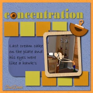
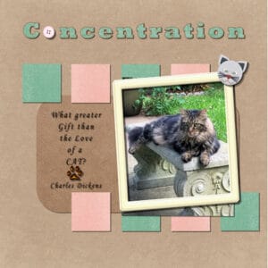
March 26, 2021 at 10:47 am #55437BootCamp Day 11 Concentration
Liked the original layout so I pretty much stuck
with it. I tried to use “toon” hues to go with the
toon clipart (I think I made it over 20 years ago).
The corner clip is from a FTU scrap kit, the semi
circle element I cut from the eye element in
“concentration”. I made the eye somewhere else.
I added a slight drop shadow too the word, concentration,
it just didn’t stand out enough without it.March 26, 2021 at 11:14 am #55439Cassel: The Mardi Gras background was slightly smaller than the 3600X3600 size so just dragged it to fit. It wasn’t made from glitter strips but was a complete background from one of the many image sites. Have no idea what you mean by the scale value used since it was dragged to fit.
I rechecked the value for shadows and it was set to 25 pixels; not the 10 I believe you used. I didn’t opt to put them on separate layers. Can redo them if you want. I do rename my layers as they are made, but it is hard for me to see the names of my layers as the text is way too small for me unless I use a magnifying glass.
I was going back and forth between the video and the editor and usually forget something. Short term memory problem.
-
This reply was modified 3 years, 9 months ago by
Ron. Reason: Add person reply addressed to
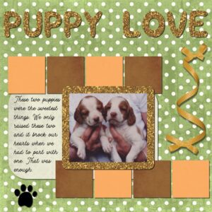
March 26, 2021 at 11:18 am #55441Finally, the computer is still acting up, time to go to the shop or green box. I used the paper and the graphic from MyMemories except the foot print and it is from Pixel Scrapper. The large text is Sweety and the small is Motherline(DEMO), it is free from defont.com. I just love the Motherline for small text on a page or card.
That’s it for me in this camp. Everyone has done such interesting pages and did such a good job on them, I kind of hate to see the camp end. I think I’ll take the beginners class again, maybe I’ll see some of you there.
Good luck to all, Fran
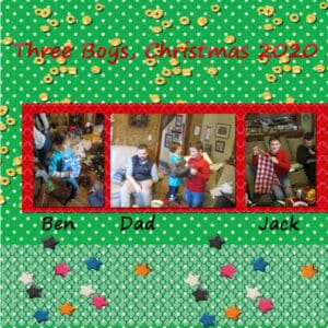
March 26, 2021 at 1:01 pm #55443Wow, this project went a lot easire and faster. By labeling each layer as I added it, I was able tyo keep track of everything a whole lot easier and manip[ulate/rearrange them with very little trouble. I don’t have any glitter papers in my files yet, but one of the textures in the color palette worked well as a photo background, and for the first time I used the flood-fill tool and it worked right the first time.
Take-home points:
Manage the layers carefully; label them individually;
Know which layer you’re manipulating;
Double-check to be sure you’re using the tool you want;
Make sure the rectangle that frames the photos is below all the photos in the “layers” palette;
Shortcut keystrokes will save tons of time. Learn ’em. Use ’em.
March 26, 2021 at 1:59 pm #55445Peter, very nice. You are getting the hang of using psp, and feeling more confrontable using it. I name each layer when I have lots of layers that I’m working with in a particular project, for a few layers I don’t bother. It’s only through making mistakes that you learn, and won’t forget in a hurry. The only way now is forward for you, I’m sure I speak for everyone when I say that we will be looking forward to seeing future projects from you in the campus. Same goes for all the other newbies. May I make one suggestion, and that is that you move the title below the gold element layer, as the text would be written directly onto the background paper. Also put a drop shadow on the multi coloured stars, perhaps you did, but it’s not very visible to me. Well done!
March 26, 2021 at 4:14 pm #55455This is my last Bootcamp Design. It has been a lot of fun, a lot of work, and I have learned a lot. Thanks Carole for teaching us!
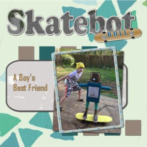
Last spring, during the beginning of our Covid lockdown, my grandkids were virtual learning from home. One of my grandson’s teachers gave him a creative assignment. He was to design a robot that could perform a specific task. Because he loved to skateboard, he created a ‘Skatebot’ He used coke cans, cereal boxes, Cardboard, and plastic container, and lots of hot-glue and paint! With the addition of some tennis shoes and wheels from an old skateboard, his Bot could actually roll down a hill!
-
This reply was modified 3 years, 9 months ago by
laurie solaas.
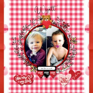
March 26, 2021 at 6:57 pm #55458Last day and I had to make one more project for my grandson Wyatt. He will be 2 yrs old next month.
I use all the shortcuts, Cnt C & Cnt L, Cnt Y is a favorite. I made little blocks from squares but it was bit much for this layout so I omitted them. I should have layered my background papers but couldnt as one set was merged. I duplicated my merged papers and flipped them horizontally to make both sides the same. I changed up my dropshadow settings only because I dont like a heavy setting. I ran out of time doing this piece but I will continue to tweak it in time for his birthday. I appreciate all the tutorials in this bootcamp. Thank you for having me. I learned a lot and even tried some tutorials outside of bootcamp like using the magic fill. I highly recommend this class. I love seeing everyone’s layout. It’s inspiring and we learn from each other that way. ♥ Wendy ♥
P.S. i forgot to mention, I used the eraser tool on the edging of my red gingham paper. its a mosaic tile that i rotate d 45 degrees and it make the pretty edging. i was quite pleased as it looks like lace. I didnt do the journaling but I will when I have more time. I added a border to the picture but instead of flood filling the same layer selected, I added a new layer and then filled colour, then added a bevel and dropshadow to the red circle frame. I like using that technique for other psp projects.
March 26, 2021 at 8:38 pm #55460What I have learned in the last 2 weeks about PSP 21. (Me and it don’t get along real well.) 1-Using material to fill shapes, I love this, I can use glitter, love the stuff 2-Check you layers often, if you see something the is merged and you didn’t mean to do it, use undo now and be you can undo it but if you save you are up the creek and be sure and check all your layers before saving
3-I love the boarders around pictures, I used it again on the puppies 4-Check all your shadows and make sure you haven’t made any changes that you need to redo a shadow 5-The pink edge is cute but I know we have been shown how to do scallops and I want to do them 6-Some way in all of fighting with the program I get a toot bar with drop shadow on it and I love it.I guess this computer is tired again, is trying to mess up my text. Have enjoy the camp and hope to see you again. Fran
March 26, 2021 at 9:39 pm #55464Wendy, thanks for letting me know. There are so many nice fancy fonts, and I am always looking for them (especially if they are free!). For the last project, did you do the squares using the guides and such? Since it was a technique to practice using that tool, if you didn’t use them, just let me know if you “practiced” before you ended up removing them?
Paul, cool to use the pinking effect around the page. In your last page, I personally would have used thinner shadows, however, since they are all consistent with each other, it does give the impression of thick cardboard, which is ok too. At least, you didn’t have the blurred shadow that would have made your papers float.
Ron, for the scale value, I thought you had used the Glitters as a pattern with the Fill tool. In that case, one setting is the Scale. If you used the glitters, did you copy and paste them instead of using them as a fill? I am not talking about the full background but just the yellow pattern behind the photos. And no, you don’t HAVE to redo your project. You can if you want, but it still counts!
Fran, those puppies are so cute! I am glad you managed to finish the Bootcamp before the computer gave up!
Peter, for the glitters, there is a set on the page with the tutorial. Did you download them? Yes, renaming layers can help a lot. I tend to be a little lazy myself and don’t do that (yes, I should). For the Flood fill tool, when it misbehaves, it is often when the Mode is not set to None. That is one detail I take for granted and don’t think of mentioning.
Laurie, those triangles are meant to be paint, right? That is what I assume since they don’t have shadows, and that would be the perfect choice.
March 26, 2021 at 9:58 pm #55465Yes, the triangles were meant to be painted. They were actually part of the background paper I chose.
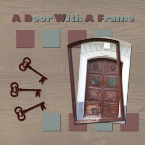
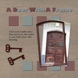
March 26, 2021 at 11:39 pm #55471Project 05. The photo was taken on 2018 in the Old City of San Juan, Puerto Rico. The papers were downloaded from Pixel Scrapper and the keys were found browsing Google.
It has been a pleasure to participate in this bootcamp. I learned a lot. Thank you to the persons who take their time to look at the projects and write wonderful comments. Thank you Sue Thomas, Wendy R. and Fran Walton. Thank you to each and every one of the participant. Thanks for sharing the photos and the ideas of how to get the results. Thank you Lady Cassel for giving your time and knowledge.
March 27, 2021 at 8:39 am #55480Here is the last project for day 11 at the Bootcamp. I thoroughly enjoyed all the training and finding new ways to use my PSP program. For this project I downloaded papers, button, and frame from Pixel Scrappers. The photograph showcases Leo again who loves to concentrate on watching his territory. Thank you, Carole for these awesome tutorials and for explaining everything so well. I learned how to use the magic fill, using the guides to make sure the pictures are all the same size, the shortcut to copy and paste and to repeat the shadow steps with control Y. I thought the pinking edge with the diamond shape was amazing, I will need to play with that some more. I also liked the way you taught us how to merge down the 4 squares. I have learned so much in a short time and am looking forward to learning some more. When working on this last project, I tried to use the method of selecting the rectangle for placing the text on the page and as I had just a few lines I could not get it to look good, so I just centered it. I will play with that some more. Also, thanks to everyone for posting your beautiful work here, you inspired me.
March 27, 2021 at 9:10 am #55482My favorite techniques during this Bootcamp were the picking edge (that was awesome), and making a boarder around the picture with the Selection-Modify tool (I had tried to figure out how to do that on my own once with no luck!) I also enjoyed learning about filling text with a pattern. Thanks Carole!
March 27, 2021 at 12:11 pm #55486I am posting again the last project. In the first, I forgot to include a text that flows inside a selection. It is included here.
March 27, 2021 at 12:16 pm #55487My favourite technique was using the eraser tool to cut edges, something I did know but had forgotten, it also reminded me any brush tip can be used to ‘cutout’ . Thank you.
March 27, 2021 at 12:54 pm #55489This project was again a lot more difficult than it looked. I’m not using a lot of the materials suggested ion the lesson, because I clicked on one of the “kit” links and ended up in a bewildering site with lots of irrelevant stuff like homeschooling lessons, and no clear path to the kit in the lesson. I bailed on that direction out of frustratyion. Since my interest in bootcamp is much more focused on getting familiar with PSP 21 (I have no significant interest in scrapbooking), I just used my limited collection of papers, etc., so I could learn tghe techniques.
The first problem came with flood-filling the borders. I followed the directions, but I had to click dozerns of times in the borders to get the colors to partially fill. Even then, some area would not fill and the bordes are ragged. Any thoughts?
Getting toe font to change dolor did not work as shown in the video. The only way I could get the color to change was to click on the color box in the text toolbar, which brought up the color wheel. That worked fine, but each letter required the same process, and in each click on the color box, I had to select a color anew – which meant that I was not using exactlyh hte same color as the previous time. There was no “recent colors” area so I could consistently use the same hue.
I think the most important question for me is why the flood fill didn’t work as expected. Anuy advice is welcome.
Thanks!
Peter
March 27, 2021 at 1:13 pm #55490Peter, the Fill tool requires you to have the Mode set to None. That is a little detail that I tend to not mention as it is normally set to None in my PSP, so I forget that others might not have had it. You said that you didn’t have Recent Colors on your setup. Could you post a screenshot of what you have?
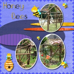
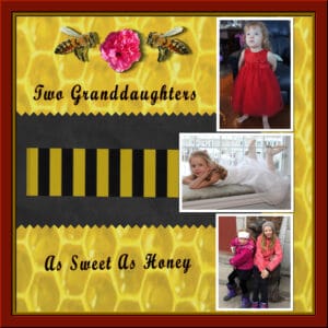
March 27, 2021 at 1:21 pm #55492Project #4
Used honey comb paper for background, bees of the net, flower picture I took in Cuba, a couple of papers I had in stock. Pictures of my grandkids. There are so many beautiful posts out there every one should be very proud of themselves .
Wonderful work everyone.
March 27, 2021 at 1:52 pm #55494Randy I love your bee background paper and your stripes!
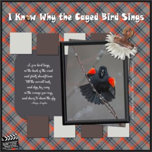
March 27, 2021 at 2:50 pm #55497And here’s my final for Bootcamp – the “Concentration” layout. Mine is Red-Winged Blackbirds – with a quote from a Maya Angelou poem: “I Know Why the Caged Birds Sing.” Just the first verse seemed to fit my blackbird. They arrived about 2 weeks ago along with some starlings, cowbirds and grackles. Noisy bunch of seed hogs! I only see a pair of starlings now; at first there were dozens.
I used a frame from Image/Picture Frame in PSP. There are a lot to choose from. The title font is Snap and the poetry is Valentina. I created a little clapboard to add to my designs with dates and details. The tutorial is in the Creative Scraps section of the Campus. The plaid is from the colors of the blackbird and the photo is by my friend, Ed Frampton.
March 27, 2021 at 2:52 pm #55498Carole/Cassel: I just posted my work but it’s not showing up and this is the only page showing for the Bootcamp.
Help!
March 27, 2021 at 3:57 pm #55512Hello-
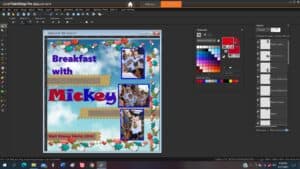
Here’s a screen shot of the workspace where I’m having trouble getting colors to fill in text. I don’t see the same materials palette as yours, and I wasn’t clear on the sequence of commands that you used to color the text. Any thoughts?
Thanks!
Peter Sherrill
-
This reply was modified 3 years, 9 months ago by
-
AuthorPosts
- The topic ‘BOOTCAMP March 2021’ is closed to new replies.
