Home of the Scrapbook Campus › Forums › Showroom › BOOTCAMP March 2021
Tagged: BOOTCAMP March 2021 day 11
- This topic has 172 replies, 18 voices, and was last updated 3 years, 7 months ago by
Susanne Lietz.
-
AuthorPosts
-
March 21, 2021 at 11:42 am #55118
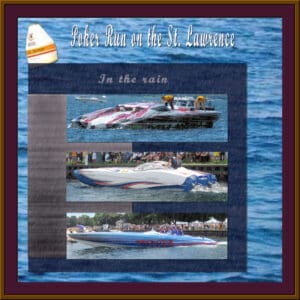
Just for fun I added one with rain effect got it from a tutorial of Carole’s
March 21, 2021 at 1:21 pm #55123Randy, I like the rain effect. I’ve done the thousand islands tours twice on the St Laurence River. Everyone participating are doing wonderful work. I enjoy scrolling through the pages admiring everyone’s creative talent.
March 21, 2021 at 1:42 pm #55124OK. Guess that’s because I probably put in a website where I normally spent my time instead of scrapbooking. I do free edits for people at that site. Also, I was explaining what site my neighbor’s daughter was using those characters in the books she writes. Spam filter doesn’t like the names of websites even though I used “DOT” instead of a period. But doesn’t explain why it was posting my content ok at first with all the HTML in it. Only deleting it after I went back and edited the HTML out.
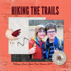
March 21, 2021 at 3:22 pm #55141This is my Day 5 design. These are two of my grandkids after a winter hike.
-
This reply was modified 3 years, 9 months ago by
laurie solaas.
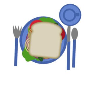
March 21, 2021 at 3:34 pm #55144Wow, that was harder than I thought it would be! I tried clicking on the “bread” in the image window rather than on the layers area, and the stuff just kept disappearing completely! After reviewing the tutorial more carefully, I clicked on the Layers “bread,” etc., and things proceeded much more predictably. It was a great learning experience and I learned a lot from my mistakes. Thanks for starting this bootcamp with baby steps.
March 21, 2021 at 8:08 pm #55153I updated the text to add some explanations about project 1. Not going to make corrections of the HTML I see again but wonder if you can see the HTML yourself. That is similar HTML content put in that caused me so much trouble and made the post disappear when I edited the HTML out on previous tries.
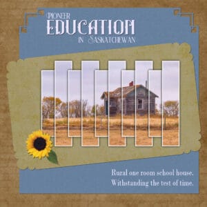
March 21, 2021 at 8:23 pm #55155Ron, I can see this post and no HTML, but there is no image showing. Did you add one?
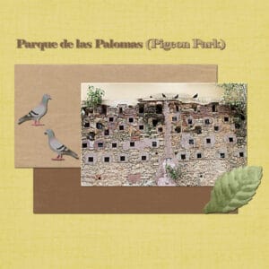
March 21, 2021 at 9:26 pm #55161Hello. The photo is a section of the “Parque de las Palomas” (Pigeon Park) in Old San Juan. The photo was taken on September, 2019. All papers and the leaf are from Pixel Scrapper. The two pigeons at the left are from Pinterest. Question: Does a limit exists on the size of the project file, i.e. does the file size should be less than 100K or 200K or 250K, …?
March 21, 2021 at 11:36 pm #55169Sue, you are referring to the second project, but I don’t see the image. Do you? I am surprised that the robins arrived at your place while we have not seen any here yet.
Randy, those photos are interestingly cropped. It is unusual to see such wide photos that are not panoramic, but with those boats, they are perfect for the theme. I cannot comment much on the shadows as the background papers are dark so they are a bit harder to see, but that is nothing wrong with the layout! If I could make one suggestion, I would put the buoy over the papers as it would be an interesting object to see in its whole. And the rain effect is well done.
Laurie, your Hiking the trail is very well done. Few elements and great shadowing. It looks like you are definitely getting the hang of it!
Peter, I am glad you didn’t give up on the sandwich, and yes, this exercise is meant to get you to repeat the same steps multiple times so they get more automatic.
José, to answer your question, there is no limit to the file size. As long as the image is 600 pixels, the file size will be manageable. Your second project is great. You are getting it!
March 22, 2021 at 12:30 am #55171That was supposed to be a reply to one of your posts. My project 1 with image was on March 20, 2021 at 11:57 pm where you did remove the HTML. Must have posted incorrectly. Too bad replies do not indent under original posts being replied to. 😀
-
This reply was modified 3 years, 9 months ago by
Ron. Reason: Added content
March 22, 2021 at 4:19 am #55173March 22, 2021 at 8:26 am #55180That is strange, because I can view all of my posts, including this one with the comments I made accompanying the pages. Anyway here is my 2nd project. You usually have Robins before we do, saying that Randy said he took his first photos yesterday of Robins. He’s in Quebec.
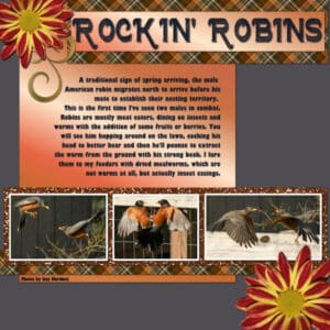
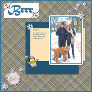
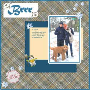
March 22, 2021 at 8:51 am #55184Here is Lesson 4: Carole’s “Friendship” page. I have 3 American robin photos from the photographer Izzy Martinez which are perfect for this exercise. I call it “Rockin’ Robin.” The font is Farmhouse and I created the plaid using the colors of the left photo. My PSP2021 choked on enlarging so using directions from Merlin at Corel Customer Care, I upgraded my Intel graphics software. Merlin was super efficient and helpful. Crossing my fingers that PSP will continue to behave. I’m also adding the pattern file for the plaid if you wish to copy it. It’s a 500px square. When I used it with my flood fill tool, I applied it at a 45 degree angle. Just leave it open on your workspace and PSP will use it as a pattern in your Materials pallet so you to add to your own work. I like to make plaids from photos so the colors match.
March 22, 2021 at 8:55 am #55186BootCamp Day 5 Adventure, I made my own papers for this.
March 22, 2021 at 1:29 pm #55204Wow! Everyone’s been so busy and wonderful results. I’m still working on Day 5 (Adventure). But I will show you what I did work on – what Laurie referred to as “top picture”. I had started to work on that last year but was unhappy with the results and I was too new at that time to make my own papers. However, now I know how to do plaid paper working with colors in the photo, so this is what I came up with. OOpps! No shadows. So 1st pic has the shadows.
-
This reply was modified 3 years, 9 months ago by
Mary Solaas.
March 22, 2021 at 2:12 pm #55206Mary Solaas: I love your page! As you’ve seen, I’m into plaids from photos, also. A little tip: if you need to post a revised image or message, just click on EDIT on the top right of your post and you can make changes, including deleting an image and adding a replacement. The image will have an [X] on the top right to delete it.
March 22, 2021 at 6:58 pm #55224Thanks, Ann Seeber. Also, like your Rockin Robin. But I have to say that I like the other projects you post, also. Laurie, like what you did with your Hiking the Trails.
March 22, 2021 at 7:01 pm #55229Day 5 – Project 2
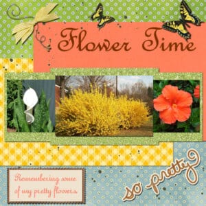
March 22, 2021 at 7:09 pm #55233I re-worked my page and add a few things. I may have gotten it to busy but I like it. Some of the elements came from Pixel Scrapper, the butterfly and the wire not real sure about the others. I was not happy with the glitter going straight across the top of the pictures, so I re-did that, made two sections and merged them.
Now for project 4!!!!!
-
This reply was modified 3 years, 9 months ago by
Fran Walton.
-
This reply was modified 3 years, 9 months ago by
Fran Walton. Reason: Added elements and changed glitter
March 22, 2021 at 7:44 pm #55235Fran, you did a great job, your Forsythia bush is huge, and look at all the stunningly vibrant yellow leaves it is displaying. Everyone are creating such wonderful pages, each one telling a story through photos showcased in creative layouts.
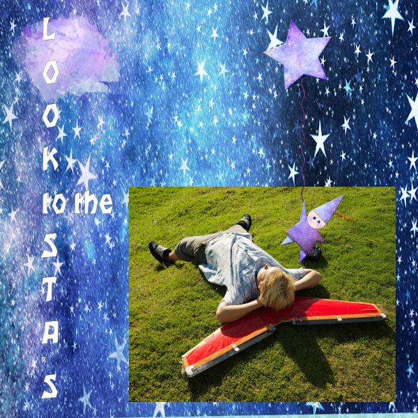
March 22, 2021 at 11:03 pm #55239Ron, the indented replies is something I tried to implement but there is a but in the system that is then incompatible with posting images. I figured we wanted images more than indentations! But I am keeping my eye out for a fix! That starry background is certainly interesting and perfectly suited for the layout. Have you tried to add a little shadow to the letters on the title? I think that even a small one would make the letters stand out.
Sue, I’ll have to recheck which post didn’t show the image. Maybe I was looking with tired eyes!
Ann, really having fun with those plaids! Great shadows and layout.
Paul, simple yet effective layout. Are you planning all your pages to be rectangular?
Mary, another plaid fan! If your journaling is to be short, you might want to center it. If it is only missing a section on purpose to hide personal information, that is fine then. Glad to see that you caught the shadowing error yourself!
Anne B., you found great elements to embellish your page. Do you remember where you found them?
Fran, unfortunately, you cannot unmerge layers that were merged, however, if you look closely, you could move the photos and the green mat slightly below and it will hide the part that is “missing” shadows. Because of the way you had layered the coral and the yellow papers, there is only the bottom of the coral that is missing it!
March 22, 2021 at 11:47 pm #55242Hmmm. I understood that shadows weren’t to be used on text so left as is. I could have taken more time but I tire easily. Will try to do better next time. Or, just post another effort for the same project using something like 3D letters. 😛
Not sure whether you write your own code (PHP, C++, plain HTML5) or have used a complete site using premade templates customized as needed, but indenting replies where images can also be uploaded might be easier than you think. The site where I do free photo edits indent with a light line shown from the post being replied to down to the replier’s post. I use the Insert/Edit Image (icon to right of insert/edit link icon) here in your HTML Editor instead of the “Upload Images” button at the bottom left. Seems to work so far but haven’t tried when I do an edit to my post.
March 23, 2021 at 12:52 am #55244Day 7 Bootcamp
Fran, I love your flower layout. I love gardening too and its so pretty. The forsythia is stunning.
I am glad you shared.
-
This reply was modified 3 years, 9 months ago by
Wendy R.
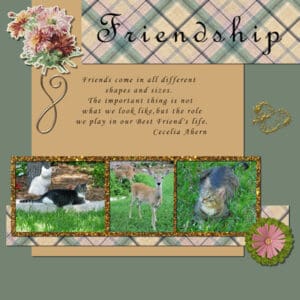
March 23, 2021 at 7:10 am #55254Just finished Day 7 Project 3 – Friendship. I used free items from Pixel Scrapper. Plaid paper and flower bouquet from Jessica Dunn, gold scroll from Janet Kemp, small pink and green flower from Marissa Lerin. The pictures, gold heart, and gold brown glitter are from my files and I made the green and tan background by using the dropper to come close to the colors of the plaid. The thing I found hard to do was adding the glitter after selecting the rectangle. I added a new layer but somehow ended up putting half of the glitter on another layer. Found that out later and had to redo everything.
I learnt a lot about drop shadows. I used to apply the same shadow to everything and never realized that there are so many interesting options. I enjoy looking at all the completed projects. Everyone is doing such a great job.
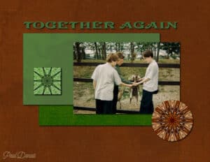
March 23, 2021 at 11:03 am #55258BootCamp Day 7 Friends
I made my own papers, I used 3 of my own garden photos, the elements are from ftu scrap kits.
-
This reply was modified 3 years, 9 months ago by
Paul Donati. Reason: I didn't like an element so replaced it with a second flutterby
March 23, 2021 at 12:41 pm #55260Wow again! That was a lot harder, and took a lot longer, than I thought it would. I couldn’t find the “pick” tool, and thought maybe the “select” option would work (the words mean the same: I thought maybe Corel had just renamed the tool.)
Not so. I fell down that rabbit hole for almost an hour, and had to shut down for the night and sleep on it. In the morning, I actually hovered over every icon on the desktop and spent maybe twenty minutes before I realized that the “move” tool (and its “this-is-not-the-pick-tool icon) also included the “Pick” tool in a submenu. Once I selected the “pick” tool, the icon on the toolbar changed tot he “pick” arrow, and things proceeded mush more smoothly. I used the “help” feature (F1) but the website wasn’t much help. There was no mention that “pick” and “move” were grouped together, and that the icon would change to indicate the active tool.
Another learn-from-my-mistakes lesson.
March 23, 2021 at 12:42 pm #55261Thank you Sue the Forsythia bush is really 3 bushes but they are large and that year they were the prettiest they have ever been. We have to cut them back every year, they are over 50 years old. The other 2 flower were given to me when my Mother passed away.
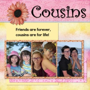
March 23, 2021 at 2:30 pm #55263This is my design for the Bootcamp Day 7-Friends. These two grandkids have been friends since they were toddlers. I started working with PSP a month ago. It’s amazing how easy things are now. Thanks Carole! You are a great teacher! I struggled a little bit with shadows on this one. When I applied the normal paper shadows, 10-10-10, they looked too dark for my papers, so I dropped the opacity way down. I am not sure that was the right thing to do. I still have a lot of rookie questions, like- why are all my layers locked and I can’t move them?? I am going to take some time and rewatch the setting-up of the workspace videos and then make a list of questions.
March 23, 2021 at 2:57 pm #55266Peter, it gets easier! A month ago I was hanging on every word, watching and rewatching segments of the videos, while scratching my head and saying to myself, “Carole, how did you do that?” Although I had some knowledge of another graphics program, PSP was totally foreign to me. The more you work with the program the easier it gets.
-
This reply was modified 3 years, 9 months ago by
laurie solaas.
March 23, 2021 at 2:58 pm #55268Project 4 – Busy Bees
Ooohhhh Ann, I snagged your plaid. thank you. I love making plaids too. Love your layout.
I think everyone is doing fantastic. I should start making my own papers like Paul. I think that’s brilliant.
-
This reply was modified 3 years, 9 months ago by
Wendy R.
-
This reply was modified 3 years, 9 months ago by
-
AuthorPosts
- The topic ‘BOOTCAMP March 2021’ is closed to new replies.




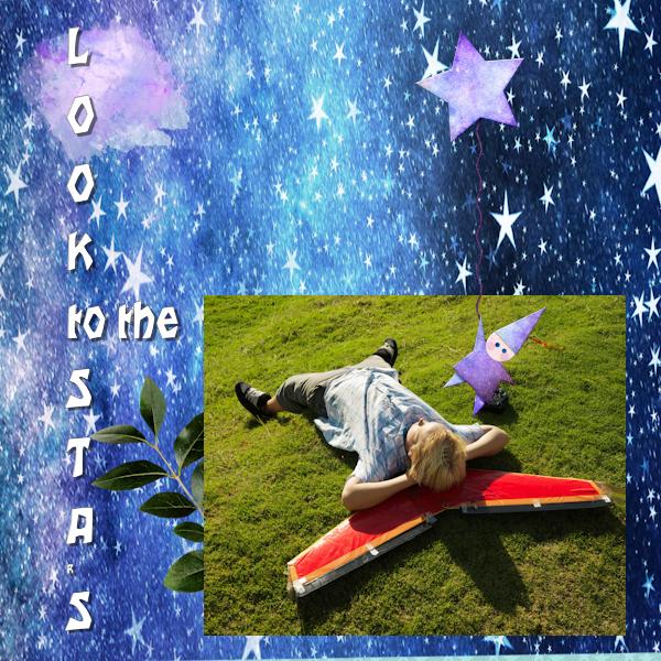 Project 2: Used most of the “ALL THE STARS DIGITAL SCRAPBOOKING KIT”.