Home of the Scrapbook Campus › Forums › Showroom › BOOTCAMP March 2021
Tagged: BOOTCAMP March 2021 day 11
- This topic has 172 replies, 18 voices, and was last updated 3 years, 7 months ago by
Susanne Lietz.
-
AuthorPosts
-
March 18, 2021 at 4:31 pm #54906
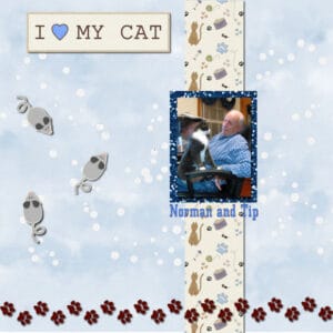
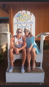
Most of the afternoon was taken up with this but I’m a little better satisfied with it than I was with the lunch. This is my husband and our fur person and don’t you think he doesn’t think he is human. He is so much company to us and gives up so much pleasure. You don’t understand that unless you have pets.
-
This reply was modified 3 years, 9 months ago by
Fran Walton.
March 18, 2021 at 8:59 pm #54918If you need some free kits to get started with, type “Free Digital Scrapbooking kits Download” and you will get more links than you will ever be able to use. Plus our teacher, Cassel has kits for sale as well.
March 19, 2021 at 12:05 am #54923Cindy, I am glad to see you play with PSP without pulling your hair!
Anita, where did you get that lovely cat alpha? For someone with very little supplies, you got creative and managed to get a great page done.
Fran, I don’t see anything wrong with your sandwich image. But of course, there is always another lunch tomorrow if you want to play differently with it! I love your first page. You will find a lot of cat lovers in this group!
March 19, 2021 at 1:14 am #54926Thank you Carole. I downloaded the free cat alphabet way back in 2002 as individual gif graphics. I only have them in CAPS and I can’t remember where I found them. I just named them acat bcat ccat, etc. I just checked online under Cat alphabet and there are a lot of nice ones there, but I did not see the exact same ones I have. If you like, I can send them to you.
March 19, 2021 at 1:33 am #54927My apologies for missing yesterday. Here is my version of New Kid on the Block:
The kit in the tutorial was no longer free so I used a different free kit.
Love how it turned out even though my psp crashed as I was saving it.
Good tip: is to Save your work as you go!
March 19, 2021 at 10:43 am #54953Heres my Day 3, made my own papers, I might go back and tone one down a little.
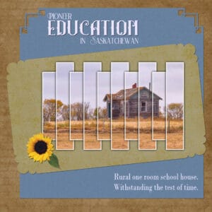
March 19, 2021 at 12:30 pm #54958Here’s today’s page. I chose a photo with colours similar to Carole’s photo in her tutorial, browns. I Have 3 of Carole’s slats scripts, which are great time savers, yet the results are stunning. It would take me ages to create my own effect. Also used Carole’s corner punch brushes on the papers. The element was already extracted, and saved as a png file. This page took me less than half an hour to complete.
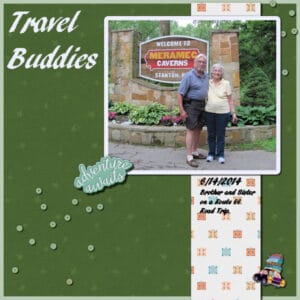
March 19, 2021 at 1:21 pm #54963I think I am on Day 3. Anyway, this is my response to “New Kid On the Block”. Carol, I think I will go along with your suggestion to do a book of the pics. My brother and I took a trip “on Route 66” beginning in St. Louis, not Chicago, ILL. to the northwest end of Arizona in 2014. He wanted to walk on the “glass bridge” over the Grand Canyon that is in that corner. This was on his bucket list.
I used the picture taken by another couple who were doing the Route 66 thing also. Background was from a kit by Marissa Lerin – the Good Life, Feb. 21 – also the bead scatter which I duplicated in the top right corner. The car was from my stash with the car colored black this time. The other element was from Marissa Lerin but not in the kit. I tried to keep to just what was shown in the tutorial, but I did put a frame on the background. I love color changing, so I changed the background color from light brown to a green from the picture. Oh, and I put a frame on the picture also.March 19, 2021 at 1:42 pm #54964This is my adventure version – Audrey’s mom graduation day; I thought this pic was so cute!
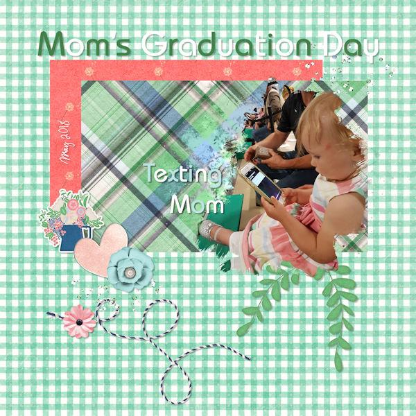
I have to say I’m loving all the scrap pages above. Each one is so special.
-
This reply was modified 3 years, 9 months ago by
Wendy R.
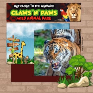
March 19, 2021 at 1:51 pm #54967Here is my Day 3 – Carole’s Adventure Park inspired me to use this photo from my granddaughter’s zoo, Paws ‘n’ Claws Wild Animal Park in PA. My photographer friend Ed Frampton visited Jackie there last fall. I was there last summer; it’s a delightful place. It will open in May for the 2021 season.
I did find a kit called Mickey’s Safari using some Disney motifs. From there I got the monkey, the giraffe, the signpost and the rocks, tree and grass. I was actually looking for papers but theirs were not well done; mostly just tiled patterns. I had the sky paper from Pixelscrappers and the brown brick from my stash. The dark paper is a color from the logo up top. Sorry, I didn’t do a title but the zoo logo is enough. I kept wanting to put a fence in front of those fearsome tigers but none of the tubes were dark enough. 😉
March 19, 2021 at 2:45 pm #54980I am a little bit behind in the boot camp. Hopefully, I will get caught up by mid-week next week. Here is my sandwich and table.
March 19, 2021 at 3:51 pm #54981Yes I believe I did Thanks
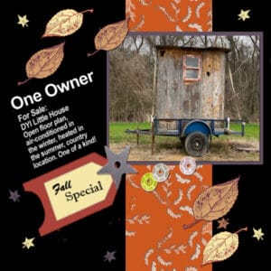
March 19, 2021 at 4:22 pm #54984March 19, 2021 at 7:34 pm #54986Here is my design for Day 3. My shadows did not show up against my black background. I ended up with a black background by mistake. But, I loved the contrast it gave my design, so I kept it. Yesterday, Joe (my husband) and I were walking on a dirt road next to a farmer’s field, and we ran across this deer blind. All I could think of was DIY Little house with wheels, well mainly because most of the time we live in a little house with wheels! (Ours is in much better shape than this one!)
-
This reply was modified 3 years, 9 months ago by
laurie solaas.
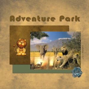
March 19, 2021 at 7:59 pm #54995I just finished Bootcamp Day 5 Adventure Park and had a lot of fun with it. I really like the Control Y command, it saves a lot of time. I used the brown paper from Pixel Scrapper Papers, Earthday, and as it looked too dark for the background, I brightened it up a bit and then used the original for one of the rectangles. Used some of the green color of the trees in the picture for the second rectangle and added the green flower from the Sonya Stover kit mentioned in the tutorial. I did not want to add birds, what if the lions got hungry? So I added the small baby lion which is looking for a home. I just had a little problem with the rotating tool. At first it rotated all my layers, so I went to free rotate and there a dialog box showed up where one could select all layers or not. Doesn’t the regular rotating option also have a that dialog box? If so how can I activate it, as mine does not show up, only in the Free rotate tool option. Thank you. Wishing everyone a very nice weekend!
March 19, 2021 at 8:27 pm #54998I did over due the shadows just felt they fit.
March 19, 2021 at 8:49 pm #54999I love all of the Designs that I am seeing! Everyone is doing a great job!
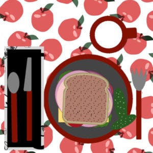
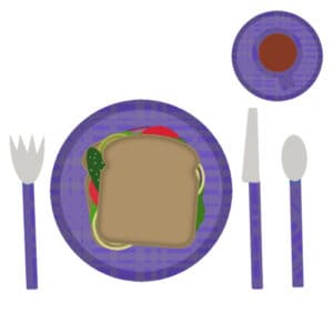
I love what Anita Wyatt did with Day 3 in choosing to make her picture an circle. Sue Thomas, I always like your birds! Ann Seeber, all four of your Day 3 layouts are great! Mary Solaas, I think you should use the top picture.March 20, 2021 at 1:32 am #55005Went overboard as usual since I hate following directions. 😛 Tried to put a decent pattern for the plate/saucer/cup/silverware. Quit trying as it wasn’t working like I wanted it to. Did try to change bread to wheat bread. The color should be close. I don’t make real sandwiches neat so messed up ingredients between the slices. Would have preferred the pickles to be sliced differently but didn’t know my way around the PSP kitchen to find the right tool. Made coffee afterward. 😀 Anyway, here ’tis:
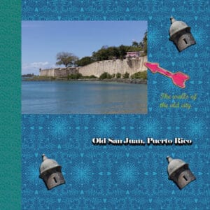
March 20, 2021 at 11:56 am #55030Hello. This is my first post ever. This post is for project in day 3 of March Bootcamp. Most of the elements in the post were taken from kit Marisa Lerin GL 21 downloaded from Pixel Scrapper. For the projects, I will be using photos of the old city of San Juan which I took last Tuesday. The sentry box (in Spanish: la garita) tube was make from a selection of one of the photos. Have a nice day.
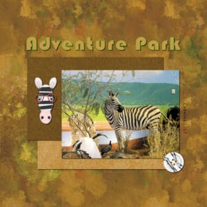
March 20, 2021 at 2:07 pm #55036I liked the Adventure Park so much, I decided to visit with the Zebras for a while. Used papers, button and small felt Zebra from Pixel Scrappers. I love this workshop and have learnt to use many shortcuts.
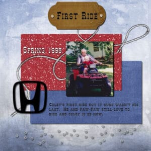
March 20, 2021 at 5:36 pm #55056Working with 2 of my favorite people made this a very enjoyable page, plus I’m home alone today. I learned quite a lot and most of it I should have know long age. After all I have had PSP since V7. Should be able to turn it wrong side out and back but I can’t
I can’t get over the activity with this group, I’ve taken the camp before but I think this is the most active group and everyone has done do good. So many different colors and arrangements and all of them so interesting.
I hope everyone can keep up the good work.
-
This reply was modified 3 years, 9 months ago by
Fran Walton. Reason: Fixed shadow under string
March 20, 2021 at 7:23 pm #55081This is my Day 3, Project #1.
March 20, 2021 at 7:32 pm #55086I forgot to post my plate & sandwich earlier
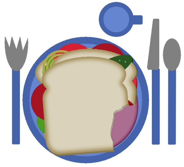 March 20, 2021 at 8:49 pm #55090
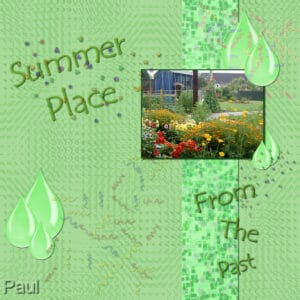
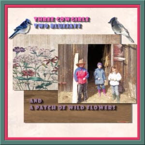
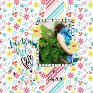
Made one more layout of my girlfriend visiting last summer. We both love gardening so its extra special to me,
March 20, 2021 at 11:46 pm #55101Fran, for your project 1, you might want to remove the shadow on the title because it makes it harder to read AND ink does not have a shadow. If you want to make it look like the letters were cut out of paper, the shadow would need to be darker and thinner (since the paper is flush with the base) AND the letters would need to be much larger (can you imagine cutting such small letters?). If your shadows are on a separate layer, try to hide that layer and see if the difference will make sense. The shadows on the mice, and the papers are all very consistent. On your First Ride project, did you happen to flip or rotate the string after you added the shadow? It looks like it is in the opposite direction, which would happen if you rotate it after the shadow is in place. Do you see how it is going toward the upper left?
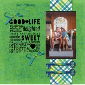
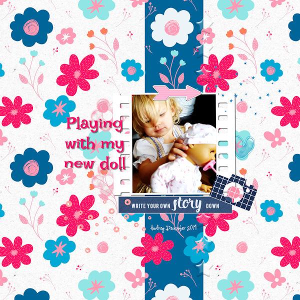
Wendy, the layering on your project 1 is interesting. Are the flowers on their own layers and you use them as overlay on top of both papers (the background and the blue strip)? Or are they both papers with the same flower pattern? As for saving, there is an auto-save that you can set to save every 5 minutes for example. It is a bit annoying when it saves in the middle of working as it seems to “freeze” your PSP, but it is good when something happens and you have not lost everything. For your project two, on the other hand, you can consider slightly more visible shadows on the flowers and greenery. Did you add shadows to the green plaid paper? And on the striped paper for your other layout?
Paul, if you want to tone down your paper, you can but I don’t find it overwhelming at all. I find it creative how you layered the drops on the corner of your photo!
Sue, was that Project 1 or 2, that you did with the slats?
Mary, you have been busy with that project 1 layout! I see that you are getting comfortable with doing more than the basics! Recoloring gives so many options when doing digital scrapbooking! Do you have a picture of the glass bridge? Did you go?
Ann S., that is a simple way to create a paper that will perfectly match your photo!
Laurie, I see you also changed the color of the dishes. Are you drinking milk in that cup? On your project 1, it is correct to say that the shadows don’t show but you are also better to add them anyways, as sometimes, you might want to move elements and then, their shadow would show.
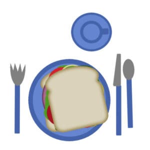
Anne B., happy to see you post your projects. Your sandwich might be simple, but that is exactly what was asked so it is perfect. Your first project is very well done; simple and effective in showcasing the photo!
Anita, I agree with you; the birds could be too appealing to the lions! Unless you had put them very high, maybe above the title!? I have a suspicion that the shadow on the photo is either missing or hidden. The zebra head is so cute on the other page!
Randy, your project 2 is quite interesting. I would suggest that you reduce the shadows on the text a little. The thick shadows give the impression that the letters are very thick (which would likely be too heavy for a paper background). I think you set up the horizontal offset twice the vertical offset. I think the vertical offset is correct. It is just the horizontal offset that seems a bit too wide.
Ron, maybe after the Bootcamp, you can come back to your pickles to slice them. After all, that sandwich won’t go stale after a week or two! For project 1 you posted a fun template from Corel. I understand that you are not a scrapbooker (and you will find other participants are like you), however, those mostly exercise to practice different tools and commands in PSP, which you will find quite useful to make collages too!
José, welcome to the Bootcamp. Did you add the shadow to your photo? If so, maybe the darker background needed a larger shadow? Looking forward to visiting that city in future projects too.
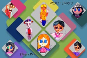
March 20, 2021 at 11:57 pm #55103Revisted: Images used were characters drawn by a friend’s daughter. She uses these characters to illustrate the books she writes using one of the kids social sites. Template used is from one Corel’s weekly freebies.
March 21, 2021 at 12:05 am #55104Ron, I am not sure why, but it looks like the previous tries were caught in the spam filter. I see this now.
March 21, 2021 at 9:04 am #55109It’s the second project. The migratory sparrow was the first, I skipped the very first sandwich project.
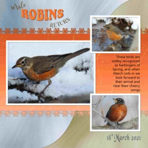
March 21, 2021 at 11:09 am #55114Here’s my third bootcamp project, I’m not a big fan of glitter, but I have used 3 photos. I used a font snowflake on the edge of the gradient paper. I also used an overlay. Robins arrived on the 18th, which is wonderful, as you can see I still have snow. I was hoping they would arrive on their due date, so I could use them in the bootcamp. I used colours from the photos for papers, creating effects of flowing water and movement. Sorry it’s not really in keeping with the tutorial. I used the paper to create the word robin.
March 21, 2021 at 11:38 am #55116Project #3 I used water as my background , a buoy from the net, three pictures I took my self. Add glitter around the right side and the bottom. Used colours from the pictures.
-
This reply was modified 3 years, 9 months ago by
-
AuthorPosts
- The topic ‘BOOTCAMP March 2021’ is closed to new replies.


