Home of the Scrapbook Campus › Forums › Showroom › Bootcamp – July 2021
- This topic has 228 replies, 27 voices, and was last updated 3 years, 4 months ago by
George Watkinson.
-
AuthorPosts
-
July 21, 2021 at 7:46 pm #60934
Project 4
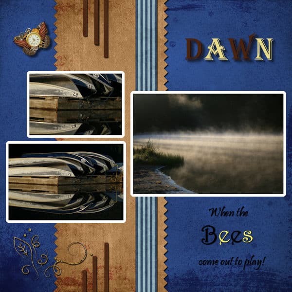
July 21, 2021 at 11:06 pm #60935Ann, although I am not a fan of bugs in general, your Bees layout is so elegant that those photos don’t bother me one bit!
Ravin, if you want to see my favorite way to extract elements from a photo, check out this blog post.
Cristina, you are right: it is often the little details that make a project shine or make you scratch your head!
Hank, you really did a fun layout. I suspect that the element on the very top was stretched sideways. Maybe you could leave it in its original dimension and maybe make copies side by side instead of distorting it? Your shadows look good!
Susan, I agree with you; I would love to see the photos better. For your question about the borders, Ann already answered you clearly. One detail about your shadows (yes, again!); look at the title letters. On the letter B, it is more obvious. Do you see there is a gap between the letter and the shadow? How do you think the light could shine “through” the letter? only if the letter is off the paper, meaning, it would be lifted or floating. The same shadow, on the word DAWN does not give the same effect because the letters are “thicker”. Do you see that detail?
Dennis, you did correct the missing shadows, but I suspect you rotated/flipped/mirrored the greenery at the bottom AFTER you added the shadow. This means that the shadows were probably correct (on the bottom right) but then, on the duplicate copies, you can see that they are now on top, and sometimes to the left and sometimes to the right. I know, I am picky about shadows, but you will see how they will become easier over time. Oh… I recognize those photos in your 4th project!!!!
Marvin, I apologize for not giving the explanation on the same tutorial for the outer border: the Fill tool should have the Match mode set to None to work without blotches. However, you are clever in using the Brush tool instead of fighting with it! In order to create your own element, I have over 400 tutorials for that, inside the DIAMOND membership. Although I don’t teach how to draw and paint those elements, I show how to use the tools of PSP to create many shapes and patterns and much more. If you have some questions about the content of the membership, you can ask, and some fellow members can give you their point of view (of course, I will tell you that it is worth it, but I am also biased, right?). Beautiful musical layout!
July 22, 2021 at 12:13 am #60936Thank you Cassel, I see the shadows on “Bees”…I think the word is possessed! that’s why it’s levitating, kidding of course. Please continue to be picky about shadows, like you and Cristina said, it’s about the little details. I never noticed it, too much time looking at the layout made me stop “seeing” it. I will do a re-jig tomorrow and try changing the pictures too.
July 22, 2021 at 1:02 am #60939HI All,
My Project 4 I used the Cass Neon for my frame I had trouble as in the past getting the other one to work 🙁
I used some tubes butterfly and flowers I love tubes and scripts. Cassel thank you I did see what you mentioned to me. thank you
Always thank You PixelScripters, Right now they are having a great sale on Kits for 1 dollar.
July 22, 2021 at 3:00 am #60940Susan: When using the Magic Wand to select a whole photo in prep to doing a border you can use “none” or “opacity.” Both give the same result. I have been learning lately to be really careful to Ctl-D or Select None after every encounter. Many times a little swatch of image has remained selected and causes untold problems down the line.
Martin: You have created an excellent showcase for your musician. If you look at the top of this page there’s a topic of CLASSES. The flyout gives you the choice of Intermediate/Creative Scrap. There you’ll find LOTS of little tutorials to make your own elements; customized to your needs. Also, the website NicePNG has hundreds of topical images with transparent backgrounds available for free. Just do a little search there.
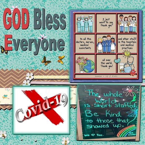
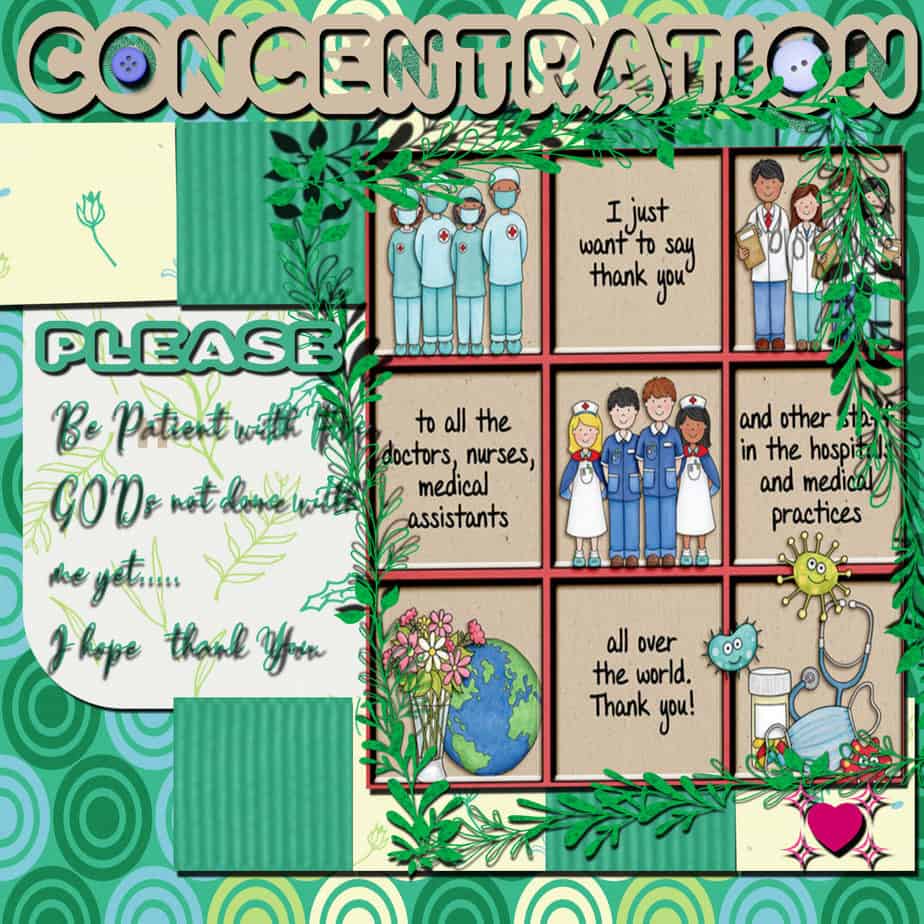
July 22, 2021 at 3:53 am #60941Cindy: Thank you for reminding us. My granddaughter is a medical worker on the front lines and tells tales of rudeness and entitlement that you wouldn’t believe. I suppose many are frightened out of their wits. The whole world could use a little more kindness lately!
July 22, 2021 at 12:00 pm #60948Here’s my Day 9, 4th project 🙂
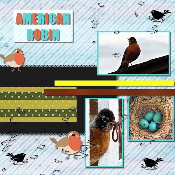
July 22, 2021 at 1:23 pm #60953I finally finished my day 9 project. The photos are mine. The little robin clip art and are and black stamp are from Creative Fabrica. I did not put any shadow on the little black birds on a nest because I decided they are stamps.
July 22, 2021 at 1:32 pm #60955Here is my redo for Day 9 project 4. I managed to get the flood fill to work. At first it was a bit translucent on one. I understand now that you need to be precise where you put the tool. In the end I got it. turns out I didnt like overlapping the pictures. At least for this project. I spent a lot of time with shadow settings and didnt find that it was shadowing properly, still looked like it was possessed and floating to high above the paper. Thank goodness for the downloadable PDF that comes with the Basic Course! I used shadow on another layer and at first tried to use the warp brush and found that was a hot mess. So then i just grabbed the shadow and pushed it up closer to the letter. I’m not sure you can really see the shadow. But hoping it looks better. Made the pictures bigger too.
July 22, 2021 at 3:26 pm #60965Hi everyone:
Here is my 5th project. It is a picture at our oldest granddaughters graduation. I used Tiny Turtles, Gentle Summer kit. I’m not very talkative as you can tell. I start typing and can’t think of what to say. LOL. Take care all. This scrapbook camp was great experience and I loved seeing all the creations that have been done. I learned a lot about shadowing (which I still am having problems with). I also learned about short cuts, using different papers and more. Have a great summer everyone!
Janet
-
This reply was modified 3 years, 5 months ago by
Janet Bunker.
July 22, 2021 at 3:27 pm #60966I used some of the Kit from Pixelscrappers and thank them. I have been a paid monthly user a couple times maybe few.
I Love Scrapbookcampus I try to me a Member when I can, I do. I hope I get to win the End of the Bootcamp for a
Month I won it before 🙂
I made a bigger one if its to small right now I have to stop having problems with my eyes 🙁 Darn the bigger one didnt work ill redo it soon as I can see sorry Cassel
-
This reply was modified 3 years, 5 months ago by
cindy harris.
-
This reply was modified 3 years, 5 months ago by
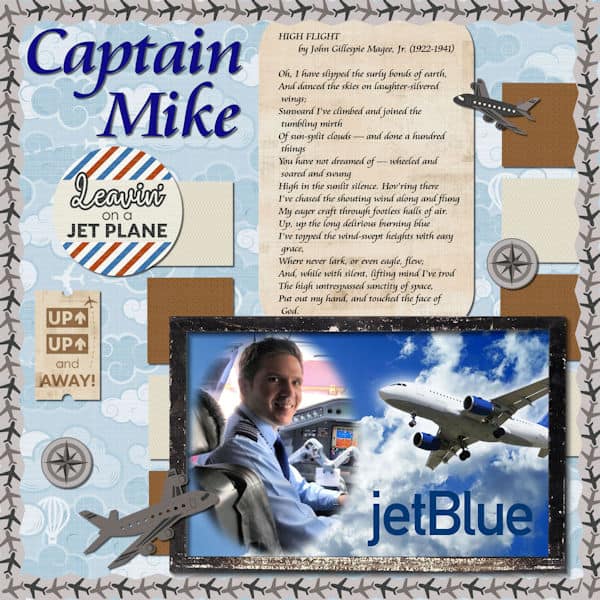
July 22, 2021 at 4:13 pm #60972This is my project 5 layout. The picture is of my son, who is a jetBlue pilot. I had previously created the picture using the mask techniques taught by Cassel in one of her PSP webinars. I appreciate the suggestions about how to create my own elements and papers for digital scrapbooking. I took this course to learn techniques for modifying photos to be used in digital slideshows and to become more proficient in using PSP, and I have enjoyed this course and Cassel’s expertise. I will certainly check out her other courses to become a more accomplished user.
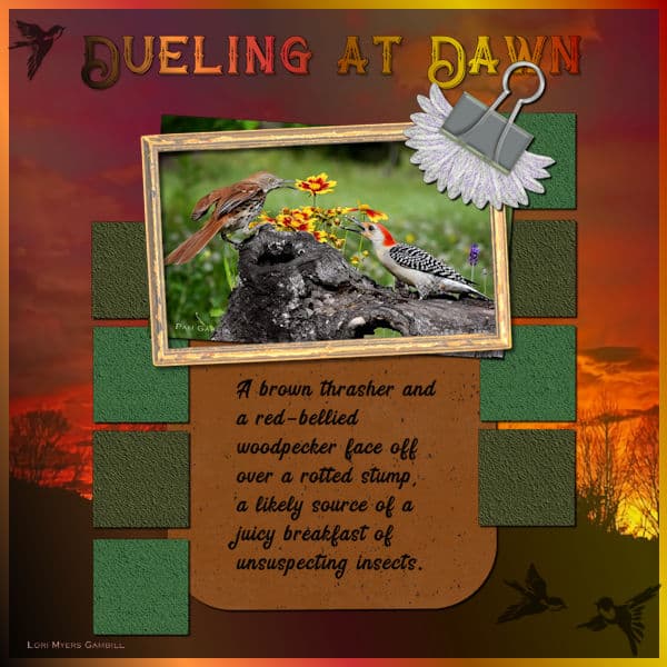
July 22, 2021 at 4:25 pm #60974Here’s my Day 11-Project 5 design: Dueling at Dawn; not people – birds!
First layer is filled with a gradient – Autumn Foliage. 2nd Layer is a sunrise photo from HViP that I cropped square and enlarged to 3500, leaving 100 px of the gradient as a border. Headline font is Bandidas in the same gradient. Photo of birds from HViP – Frame from a kit -All That’s Fall. I played a lot with the colors for the squares, after applying a canvas texture and using the Adjust/ Hue and Saturation/Hue-Saturation-Lightness. The journaling text is called Bring Heart.
July 22, 2021 at 8:54 pm #60978Janet, Cindy, Marvin, Ann! Oh my gosh, beautiful pages.
Here’s my Day 11 project 5 layout. Thank you Cassel for all the help about the materials palette, I am getting better at using it and not dreading the fight with it anymore. And Thank you Ann for your advice throughout this bootcamp. All the tips have been invaluable. I’m finding I have wee better understanding this time through.
My question for general PSP workspace use. If I have papers, photo’s etc minimized and I click restore, it comes back normal looking with the rules and frame around it. But if I accidently click the maximize button then it comes back and fills the screen with that photo,paper only with lots of space around it. I cant figure out how to close it when it’s like that. I dont have “tabbed” checked in the windows selection. Nothing is tabbed. Just a little annoying thing I wonder if I can easily remedy. My PSP (or computer?) was cranky and it saved the PSP and large JPEG file but when i resized it it lost the journaling. but my computer was being really slow for some reason. I ended up doing a reboot and it’s fine now.
July 22, 2021 at 10:36 pm #60979Susan, all those details WILL become easier to spot with practice. I think the shadows on the redo look more realistic. Notice that you have the same shadow on the golden leaf doodle on the bottom left; the shadow is not obvious, but looks natural. On the Bees, it is just as subtle, but it is there! And on that last project, I see how you tweaked the shadow to something larger for the flowers. I think you are getting it more and more! To answer your question, when the image maximizes (and it is terribly annoying), if you look just under the icons to minimize/restore/close the program, there is another set of similar icons but much smaller. For me, it is black on the dark grey of the menu bar. Can you spot it?
Cindy, your shadows are very consistent. However, I would suggest you reduce the opacity by about 10, and increase the blur by about 5. It will just soften then a bit. Give those a try. When you post images, do not try to post larger images; the system is set to size it back down anyways. On the small text, it is better to not put any shadow, or if you do, no more than 1 pixels offset. Otherwise, it just makes the text very hard to read.
Hank, I really had to look twice at your layout to realize that you morphed them with human faces! Very creative!
Anne L., I am curious what shape you used to do the cutout? It is obviously not the square brush!
Janet, looking good! I see that you used different size shadows for different elements. Good adjustment for each of them.
Marvin, that is a wonderful project. It is interesting that you rotated the sketch for a different look. I think you could add some shadow on the outer frame. I think it would give even more depth.
Ann, that layout is stunning!!!
July 22, 2021 at 10:57 pm #60993Boot Camp Project 5
I used mostly the ps_commons_kayl-turesson-162264-nature-escape kit from Pixel Scrapper and marisalerin-loveme-papers also from Pixel Scrappers
July 22, 2021 at 11:34 pm #60998Cyndi! Adorable!
July 22, 2021 at 11:38 pm #60999Anne L, I love your Robin page. I love robins and I’ve never seen the eggs close up. You got some good images. I love the one with worms. They sing a pretty song too don’t they.
July 22, 2021 at 11:39 pm #61000Anonymous
- 11

- Rookie
So first wanted to say thanks for inviting me to this as has helped get re-familiar with the program.
Secondly on to Project 5. I actually used two pictures instead of one. The first was of my tree out in the backyard that I used as the base paper. The second of course was the photo of Porthos. Was his first Winter with us. We had rescued him from the pound and got to take him to his forever home on December 4th of 2017. While he was not to enthused by the snow itself he did find running around the yard quite fun until his feet got cold.
I tried using the snowflake as an o in the letter but did not like it so instead just used them as decoration. And added a a second snow paper over the first so that the letter were more visible. I think this was my favorite one out the projects. Woohoo 🙂
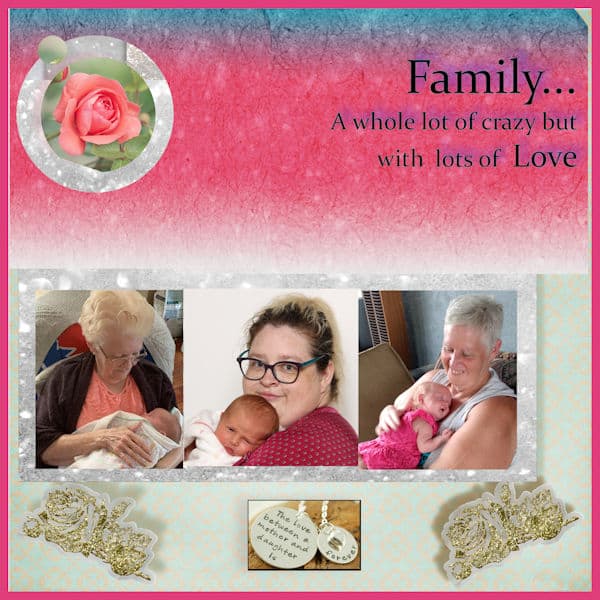
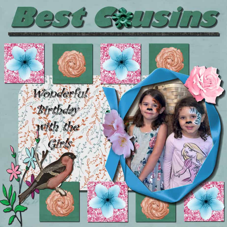
July 23, 2021 at 1:50 am #61002This is project # 3. I am using Family as my topic. I used Glitter page and added a frame to the whole page . We are using the 4 generations as the showcase in this project. I am enjoying the course very much and thank you for your comment on my Granddaughter. I am sure she will be showcased often.
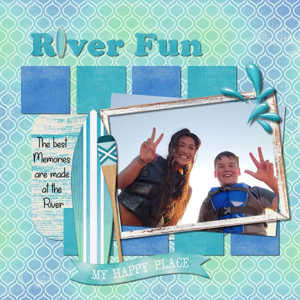
July 23, 2021 at 11:08 am #61009Here’s my day 11, project #5.
-
This reply was modified 3 years, 5 months ago by
Hank Sobah.
July 23, 2021 at 11:45 am #61011My final project for this Bootcamp. The photo of the stained glass window is mine. The frame is one of Cassel’s, the cross I used as a “T” is from http://www.digitalscrapbook.com. Whew, I have learned so much more this time even if I have done bootcamp before.
-
This reply was modified 3 years, 5 months ago by
Anne Lamp.
July 23, 2021 at 12:15 pm #61019Anne L, this is so beautiful. I can’t resist stained glass or glass of any kind (I was a glass fuser and lampworker once upon a time). I agree with you, I have learned so much more this time around. I recommend doing the bootcamp more than once. For me, the first time through was “deer in the headlights”. This time, even though I still had some issues that Cassel and the participants help me overcome, I felt more calm and at ease.
If I was to add the biggest thing I learned, don’t be afraid to try stuff and explore what the other tools do. I can get caught up in my head thinking, what if I get stuck and cant fix it. Well, I can always start again…after I’ve come to the forum here and FB page to seek guidance. I’m not in this alone. Alone didn’t work for me in the past.
Ravin, love the photo backgrounds you use, never get tired of Porthos!
Wendy, what a beautiful tribute to 4 generations, a forever memory.
Hank, I like the effect of the elements on the little squares.
July 23, 2021 at 2:00 pm #61021Hi everybody!
Wow…It is already down to the end of Bootcamp!!! For my final project, I used the scrapkit Coastal by dsi from Sweet Shoppe. I used Cooper Black and Desard.
I haven’t looked at anything that has come in the last few days, but will do so here in a bit. I am anxious to see all of your projects! Such wonderful renditions I see!
Have a great day!
Pixie
July 23, 2021 at 3:09 pm #61026- 11
- Rookie
Anne that was absolutely gorgeous.
Cyndi while I am more a Star Trek fan than a Star Wars everybody got to love baby Yoda 🙂
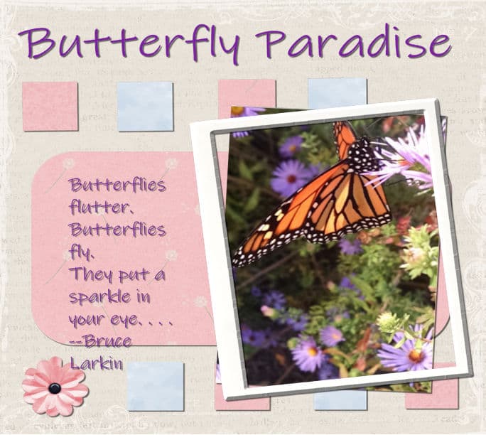
July 23, 2021 at 3:29 pm #61028Project 5 Butterfly Paradise
July 23, 2021 at 4:55 pm #61030Hi Everyone
Here is my last project for this class. I used scrap kit by K Aagard “Gone Fishing”. I used the FFX Brag font for the title (I also added a layer around my letters in black so that the title showed up better. I also used BallantinesSerial-Heavy for the font of my page. The Picture is of a creek in Idaho where we caught Trout.
Fond memories!!
This is the last class, but hope to see you all next time, was great seeing all the fabulous creations that everyone made.
This bootcamp has been great. Learned somethings I did not know about PSP and learned a little more about Scrapping.
Thanks Cassel for the lessons and hope to join you again for another Boot Camp.
Nonie
July 23, 2021 at 7:38 pm #61034Wow! what beautiful pieces since I last checked (Neala, Dennis, Nonie). I’ve never being so excited to check into a forum like I am with this bootcamp. I’m in awe of what everyone has produced. I forgot to add, one thing I learned (re-learned?) that I will use a lot is “Crop to Selection” . this is way easier to crop photo’s this way. the nice thing about Scrapbook layouts is that I dont have to rely on traditional photo sizes. It’s taken me a while to get to this realization since I come from a photography background where I like to get it as close to right in-camera. But this has opened up a new way to look at my photo’s and use them more than once.
Bravo Everyone! We done good!
July 23, 2021 at 11:07 pm #61039Cyndi, good work, you did 🙂
Ravin, it is really different when using a photo as a background, but hey! why not? I am glad you are getting more comfortable with PSP.
Wendy, you managed to resize the photos correctly without any distortion. That is a good lesson. And I look forward to seeing your granddaughter in more projects! One issue on your project #3 is the shadows. They are all over the place. They are missing on the photo, while on the glittered mat, the shadow is toward the top right, and quite large, meaning the mat is floating off the page. Then, the golden decorations have different shadows: one to the right and one to the left, and they are also very wide, making the decoration float (I am unsure but are they supposed to be gold stickers?)
Hank, beautiful last project. Did you add two shadows on the ribbon frame? (that is a great frame by the way!)
Anne L., funny, I don’t remember that frame you say is mine!
Neala, that is a fun element to use in the title!!! Good work.
Dennis, I see that your text extends further than the mat it probably was intended for. If you notice that, you have a few options to stay within the area: you can slightly reduce the font size, or you can reduce the Leading value to something like -0.1 or -0.2. You can find that setting in the Text options toolbar, toward the right, where you hover over an icon that will show “More options”.
Nonie, it is a cool idea to use a lure for the “i” in the title. If you have a chance, maybe you can consider colorizing it, since it is green and tends to blend with the green patterned paper. What do you think?
Susan, if you want to look into other types of cropping, you might like to read point #3 on this post about using bad photos.
July 23, 2021 at 11:44 pm #61040Thank you for the post, it’s really interesting. And boy, did that crop ever make a difference in that photo. I liked the other points in that post as well.
-
This reply was modified 3 years, 5 months ago by
-
AuthorPosts


- The topic ‘Bootcamp – July 2021’ is closed to new replies.


