Home of the Scrapbook Campus › Forums › Showroom › Bootcamp – July 2021
- This topic has 228 replies, 27 voices, and was last updated 3 years, 4 months ago by
George Watkinson.
-
AuthorPosts
-
July 20, 2021 at 4:23 pm #60860
Hello All:
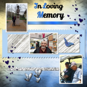
This scrapbook is in memory of my husband of 42 years whom I lost a year ago this month. I hope I got the shadowing correct this time. Have a great day everyone.
Janet
July 20, 2021 at 4:57 pm #60862Anonymous
- 11

- Rookie
LOL Thank You finally got the fill working right lol. So This one was a bit busier than my past ones. We took a few of the pics from a Petsmart Trip. Is one of his favorite places in the world and gets so excited when someone says Petsmart. needless to say he points to what he wants because no he is not spoiled at all. He even wears his fancy light up collar to go out shopping.
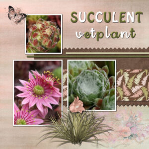
July 20, 2021 at 5:33 pm #60867This is my #4 and this time I used kits from the BlogTrain July 2021 that I collected on Pixelscrapper. The photos were made of a couple of succulents I had in little pots on a table on my patio. It’s a pity they didn’t survive last winter because we had a fairly cold one and I forgot to put them in the shed. That hadn’t been neccessary for many years…. The fonts are Hobo and Rock n Doll script
July 20, 2021 at 7:36 pm #60878Hi Cassel
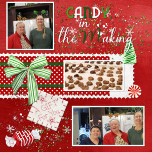
Here is my project for today entitled “Candy In the Making”. I used the Candy Cane Lane Kits from Raspberry Road.
My Fonts are Blue Plate Special and Bluebell. We made candy this last year, Pixie, Janet (my sisters) and I. We had a great time and much fun, do this lesson was fun also. I learned the cut out technique and will use that in the future. As you can see I tried using the circle also and it worked out great, (a great new trick).
We use 800 to 600 pixels because we do tags for gaming leagues and do digital files that are flattened and the size they need for tourney pages and league sets. We do a lot of custom orders for the Tourney directors and Head Admin also.
Took this class as a refresher and to learn more about using PSP, took classes for what we do but they did not cover a lot of the things in the PSP its self or how to best use them. Like your short cuts which are great. It is even giving me composition ideals and I am really enjoying it. May just have to be scraping on the side. LOL
Nonie
July 20, 2021 at 7:40 pm #60879Thanks Sue for the encouragement.
Nonie
July 20, 2021 at 7:52 pm #60881Here is my 4th project!
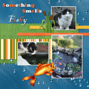
I used pictures of my precious Twinkie. We lost her a few years ago. She loved being outside and looking into the pond.
My papers are ones that I made. The striped paper I made using Stripes-2 script from you Cassell! The cattail and fish are from Happy Fishing by Macy’s Designs. The bubbles were in my stash..no idea where they came from.
My fonts are Rockwell Extra Bold and Blackladder ITC.
I have seen some exceptional projects here!!! What eye candy for sure! Everybody has such great creativity.
I am totally enjoying this session and will be back for more.
I truly appreciate all your nice comments.
Thanks for looking and have a great evening!
Pixie
July 20, 2021 at 8:24 pm #60883Beautiful Corrie!
July 20, 2021 at 8:25 pm #60884Love this Ravin. Don’t they just get so excited!!
July 20, 2021 at 11:51 pm #60891Here are my pages for Projects 3 & 4
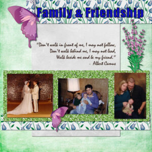
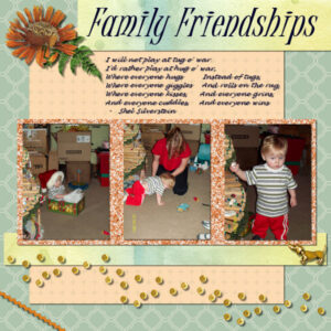
For Project 3 I could not view the video so I just went by the page shown and created Family and Friendship. The best way I could figure to handle the glitter was to duplicate and align, then merge the two and duplicate and align two more times to create a solid strip. Today I was able to view the video and created Family Friendships. None of these pages have journal notes so I will need to add those and also post the kits I used.
Cassel – I will try reinstalling PSP but I need to back up my folders first.
July 21, 2021 at 12:26 am #60892Corrie, those watercolor mountains look wonderful! And you did a very good job with the succulent layout (even if the succulent themselves didn’t like the winter).
Hank, did you use a frame to showcase the children? I would love to know where you got it as it looks great!
Wendy, this little girl is beautiful. This is a very good reason to start scrapbooking!!!! I hope we see more of her!
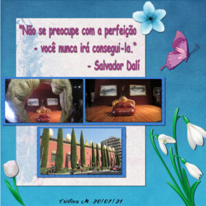
Cristina, great projects. I see your shadows are very consistent. If I could suggest something it would be to move the flower on the top right on top of the text (instead of under) OR move it a little bit so it would not be between the paper and the letters.
Janet, that is a nice tribute to your husband. And yes, I think the shadows are ok.
Ravin, glad to see you completed that project. Did you extract all those toys or did you find them already like that?
Nonie, I am glad that you are learning new things about PSP. I can see now that when you worked with images that were 800-9900 pixels, it was for smaller projects AND online (so with a lower resolution, you don’t need as large as our scrapbook pages). There are two main reasons why we work in such large projects: (1) if you ever want to print full pages, the resolution has to be closer to 300 pixels/inch for a much better result, and since the pages are traditionally 12 inches, that makes 3600 px and (2) most scrapbook supplies are based on those dimensions so it is easier than having to resize everything, one by one as you use them.
Neala, I see you tweaked the cutout technique to get a slightly different edge. Isn’t that the beauty of understanding the tools? You can tweak them after and know what you are doing! There is one bubble on top of the top photo that seems like it would fit ON the photo. I love to see those bubbles on the bottom right photo!
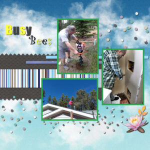
Cyndi, what happened when you were trying to play the video? Did you try a different browser by any chance? The glitters are to be used as a fill, which is one technique you will use hundreds of times in the future and is MUCH simpler than copying and pasting! Also, there is the technique to size images in the same height using the guides. It would be so much easier for you if you can at least view the video (even if you don’t redo the page as it is quite good already). Did you add shadows on the photos on the Busy Bees layout?
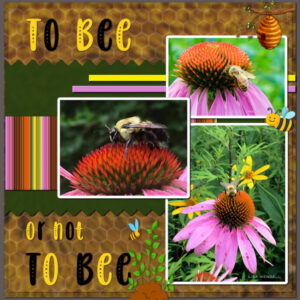
July 21, 2021 at 7:22 am #60896Here’s my Bees layout: Headline font is Baby Olivia; double background layers: honeycomb paper from the Serenity Bee kit and the background photo is by Lori Myers Gambill from HViP
July 21, 2021 at 8:29 am #60897Anne, that is STUNNING!!!!
July 21, 2021 at 8:38 am #60898Janet, loving memory perserved. It’s beautiful.
Neala, what a beautiful page and a beautiful way to honor your memories of Twinkie. It’s hard losing them.
Nonie, your candy page looks so delicious! I wish it was Christmas.
Everyones pages are so awesome, it was nice to come home from an unpleasant evening at work and see these images before I drifted off to bed. Now i must get to my project!
-
This reply was modified 3 years, 5 months ago by
Susan Ewart. Reason: forgot a word
July 21, 2021 at 9:09 am #60900Anonymous
- 11

- Rookie
Neala Such a pretty kitty, so sorry for your loss.
Cassel Thanks, I knew I had to have had one of the settings wrong I just couldn’t figure it out lol. As to the toys no I hunted for them and they were already like that. Extracting was on of the things I was hoping to relearn. lol As has been a while and is a way different program from the old days. If I remember right has something to do with the magic tool and cropping, but that is looking through 20 years and chemo brain lol.
July 21, 2021 at 10:16 am #60902Hi Cassel.
Thanks for the suggestion, it really got better.
I preferred to move it a little to the right, decrease the size and rotate it a little bit.
It’s small details that make the difference
July 21, 2021 at 11:43 am #60903Hi, Susan. Thank you so much for your compliment. (I hope it was for me as we have at least 3 people with similar names on Campus right now. I am “Ann” with NO “e” and we also have an Anne and an Annie. 🙂 )
July 21, 2021 at 11:51 am #60906Cassel/Carole in the Scrap Bootcamp – Day 10 today asked us to mention any technique from class that has been particularly helpful and I’d have to nominate using the Magic Wand and then Selection/Modify/Select Selection Borders to create those nice narrow white borders around photos that helps them stand out from various busy backgrounds. That technique can be very versatile!
-
This reply was modified 3 years, 5 months ago by
Ann Seeber.
July 21, 2021 at 11:52 am #60908Hello everyone, here’s my Day 7 project.
July 21, 2021 at 11:53 am #60909Oh my gosh Ann. Yes, I meant you and I’m so sorry about the faux pas on your name. No excuse for that. Not only do I need to pay attention in PSP (what tool is active, what layer is active etc) I need to pay attention PEROID!
July 21, 2021 at 2:37 pm #60912Susan, don’t worry. If we were on Facebook I’d give you a “heart!”
-
This reply was modified 3 years, 5 months ago by
Ann Seeber.
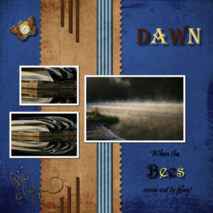
July 21, 2021 at 2:46 pm #60914Here is my Day 9 project 4. I’m not happy with it yet. I think the pictures need to be bigger, and maybe overlapped like Ann did with the bees ( I love that). I put the butterfly in to show that time flies fast at the golden hour. I made the “Bees” text another Vector layer so I could shadow it without shadowing the words around it. I love the fonts everyone else has, where do you get them? I used what is with PSP 2020. (side note: I had some amazon GC’s and used it to buy PSP 2021, hoping it comes with more fonts). Everything came from Pixel Scrappers. The photo’s are mine. I never think to overlap the photo’s unless it’s in the lesson. I hope to do more of that, it looks really good.
I agree with Ann, I had forgotten about the white borders and I think I will use them a lot. This is also why going through the bootcamp more than once is really helpful.
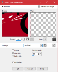
Question about borders: What are the settings for putting borders outside the photo as I don’t like to lose from the photo as I did in these ones. Can I add another border to the photo that has a border for two colors, like a thin matt and the frame.
July 21, 2021 at 2:48 pm #60915Oh, Ann, you gave me a heart but best of all a CAT! I love all animals and grew up with dogs, but have cats since I moved out (waaaay back) and am looking forward to my next career as a crazy cat lady. How do I get paid for that?
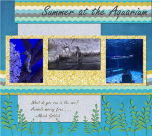
July 21, 2021 at 3:04 pm #60917Project 3 Version 2
July 21, 2021 at 3:13 pm #60920That looks good Dennis, the plants at the bottom really feel like they are swaying in the tide. I love Aquariums of any kind.
Corrie, I keep coming back to look at your succulent page, it’s so pretty
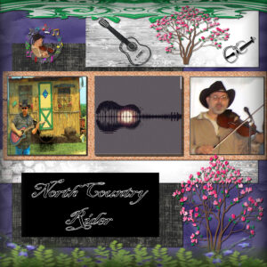
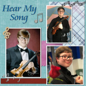
Hank, those photo’s are interesting, I’m going to guess you are a musical guy. Really love the middle photo.
July 21, 2021 at 3:15 pm #60921Susan, the main reason I upgraded to PSP2021 is the new AI software for enlarging images. I had found my own photos were small when put on a 3600 layout. Now I blow up EVERYTHING! 😉 You can always scale down with the pick tool but NOT UP. It’s so much easier working with larger photos! I hope you get it installed soon. And be aware, your computer might hiccup a few times with the heavy demand for calculations but mine settled down after a few days.
July 21, 2021 at 3:27 pm #60923Susan: You asked about the borders. I posted the dialog box you get when you tell PSP to create the border and as you can see it asks if you want it “outside” or “inside” or “both” and you control the width here, too.
July 21, 2021 at 3:33 pm #60924Susan, thank you, glad you like my work. As for your question about fonts: Creative Fabrica has freebies on a daily basis. They have fonts and png embellishments and much more, you only have to make an account or login with Facebook.
July 21, 2021 at 7:15 pm #60928Here is my Project 4 layout. I had trouble with the fill tool for the photo borders because it left blotches. I had to use the paintbrush to get an even appearance. I also had trouble with the selection tools with my photos; the one that finally worked best for me was the freestyle selection.
I find all the technique suggestions to be helpful since I am learning how to use PSP. Some I learned on my own such as the depth of field tool for the photo with the rose in the foreground and the back wall in the background.
I would like information about how to create my own elements and papers for topics that I can’t readily find on the web. Examples are U.S. Navy, military aviation, commercial aviation, and orchestral and symphonic music.
July 21, 2021 at 7:29 pm #60929Martin this is really nice. I agree that I would like to learn to make my own elements/papers. It’s often hard to find what you need.
July 21, 2021 at 7:44 pm #60932Corrie, thank you, I will look up Creative Fabrica
Ann, I did buy PSP 2021 for the same reason. My image file size is large (5100×3400 approx.) to start with and I tend to crop in camera (with a bit around for what you lose in making prints). Years as a photofinisher showed me all too well about enlarging and loss of resolution. I’m hoping the new AI in 2021 is as good as I want it to be. thank you for the warning about the install, I will stay calm and carry on. Okay, probably not.
Do you still leave the match mode (hope this is the right thing) to opacity? I had tried doing that but I am sure my clumsy over-excited clicky fingers messed it up.
-
AuthorPosts
- The topic ‘Bootcamp – July 2021’ is closed to new replies.

