Home of the Scrapbook Campus › Forums › Showroom › Bootcamp – July 2021
- This topic has 228 replies, 27 voices, and was last updated 3 years, 4 months ago by
George Watkinson.
-
AuthorPosts
-
July 18, 2021 at 12:46 pm #60705
Hey. This is my second job. It took me a while, but I managed to put in some knowledge I’m loving the classes.
July 18, 2021 at 3:02 pm #60719Anonymous
- 11

- Rookie
First off thank you Susan.
And also here is my 3rd project. I went with the “friend” theme since that was the password lol. Porthos is friendly with many of the animals in the neighborhood. One of his favorite friends used to be this tuxedo cat before it moved away. It would always run down the street and boop him with its head and do nuzzles.
July 18, 2021 at 3:18 pm #60721Hi All!
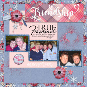
When I opened Day 7, my mind went immediately to a get together of some of my dearest longtime friends.
So, I dug out the pictures and here is what I came up with.
I used True Friend from digitalscrapbook.com. The flower cluster I replicated from one in the kit, as I wanted the more vibrant flower color. The glitter also came from digitalscrapbook.com as did the pink glitter scatter. I turned the pink glitter scatter into my heart cutout copying the butterfly effect from this lesson.
I am a fan of “stacked” paper so I made my own using the cluster elements.
The True Friend wordart is from Studio Bethany and my font is The Romantic Absolute Script with a few glyphs inserted. Thanks for looking! I am truly enjoying seeing everybody’s creations! You are all awesome!
Pixie
-
This reply was modified 3 years, 5 months ago by
Neala (aka Pixie).
July 18, 2021 at 4:10 pm #60726Hello:
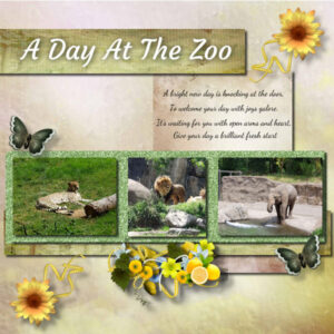
My pictures are from a trip to the zoo with my daughter and son-in-law. I could not find a saying or quote I liked about the zoo so I put a saying I enjoy. I had problems with my shadowing, I tried using the same as the video but it didn’t look right so I changed the numbers. I hope it looks ok they look a little big to me. The elements I used are from Miz Teeque. Have a great day all.
Janet
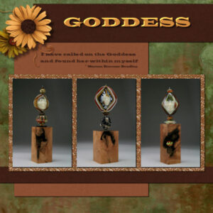
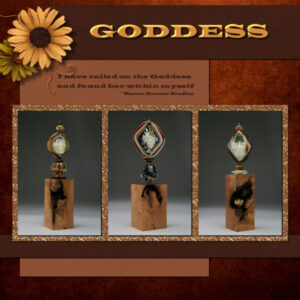
July 18, 2021 at 5:41 pm #60729Here is my day 7 project 3. I kept the reddish background paper hidden until the end and worked mainly with the green background. It was neat to do that because then I could see what background I liked best. Probably the green one still. I had some problems with the flood fill procedures and was crazily clicking away and it worked…only i have not idea how it worked. I’m still unsure about those two boxes in the materials pallet and when you use the top one or the bottom one. More practice needed when there isnt a deadline. the bottom right corner needs something but I couldnt find anything I liked that would fit my theme. the fonts are Wide Latin and I used an inner bevel (settings from the cheat sheet – thank you Cassel for the Basic Scrap Course). Both background papers and the yellow flower is KMRD Steampunk kit, Green flower is Sahin Designs, Wires and glitter paper Marisa Lerin, light brown paper Digi Dewi, dk brown paper APJess. All from Pixel Scrapper.
Glass art and wood plinths are a collaboration of Melanie Rowe (all glass) and myself (wood plinths and photography). Goddess quote from Marion Zimmer Bradley.
Ravin, love the fur paper. Porthos – friend to all, love it.
Neala, how did you get those rounded corners on the glitter paper? I like your color choices
Janet, this is a beautiful layout, your color sense is inspiring.
Cassel, I linked/merged the photo’s and glitter paper because I need to move it over, can they be un-merge to be separate layers again in case I want to tweak them?
Beautiful layouts from everyone.
July 18, 2021 at 5:56 pm #60731Hi
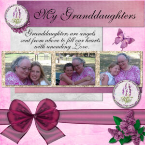
Here is my project for today. I used scraps from the kit Welcome Spring from Pixel Scrapper Blog Train. My font is Saffron Too. This is a picture of my three granddaughters, met the youngest two for the first time in these pictures. What a great day that was!!
Thanks for the lesson.
Nonie
July 18, 2021 at 6:32 pm #60734My day 7 layout.
July 18, 2021 at 6:37 pm #60735Anonymous
- 11

- Rookie
Question: So have a question inspired by Susan’s issue with the fill. I find myself clicking a lot with nothing happening as well. And have found that it usually has something to do with somehow having selected a tiny pix length of the picture some how (often under another layer and only see it when I turn off layer visibility) that is active, stays active, and has become a separate item that is movable like a cut out of the little section of the picture it was from. The only way I have found to deactivate it and go on is if I repeatedly hit the undo button until I find that action, and then have to go and redo the things that I had wanted to be there.
It happens I believe when I accidentally try to move something when the select tool is active. But can’t find a way to get it to no longer be an active separate section other than the undo process. Is there something easy I am missing, or is that just the only way to do it. lol
Susan: Love that layout is gorgeous.
Janet: Woohoo Love Animals 🙂
July 18, 2021 at 10:25 pm #60752Hi Susan,
I selected the photo, then float/defloat then modify expand by i think I did 50 – then new layer and filled with white.
I did on all 3 photos as they were different sizes and then merged the 3 layers..selected/float/defloat/ on the white layer and flood filled with my glitter choice.
Thank you for your nice comments!
July 18, 2021 at 10:44 pm #60753Neala, thank you. I’m not sure what float/deloat is but will endeavor to find out. It’s a cool effect
Marvin, I really like your layout, love the warmth from the glitter frames. And beautifully white snow, not always the case with snow photo’s.
Nonie, your layout is heartwarming and I love the design of it.
Ravin, thank you for the compliments. I totally feel your pain, the same thing happens to me. In fact on the yellow flower, when I “thought” I was done I looked a little closer and saw 2 letter “k’s”. I have no clue how I did that. But I suspect I am on one tool and then go to “pick” something (thinking I’m on the pick tool) and then I get into trouble that way. First I do CTRL-D to deselect….just in case (not because I think it’s the right thing to do, figure it doesn’t hurt to do it), then undo or delete the layers and start again. I’m interested to see if it can be determined what we are doing. I probably need to slow down and talk my way through it so I don’t forget steps or what where I am (tool-wise).
July 18, 2021 at 11:01 pm #60755Ann S., I love that quote on your Shroom layout! It made me smile, even though it is quite true! I like how you slightly covered the S with the flower. It gives it character!
Marvin, you are doing good! I see the shadow on the photo but I am not sure if you added shadows on the other pieces of paper? Since they are likely about the same thickness as the photos so you can use the same settings. On your Project 3 however, all the shadows are perfect.
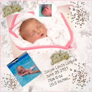
Cristina, your second layout has great shadows. The confetti with the lower opacity are an interesting twist. Glad you are enjoying the class.
Ravin, great job on your third project. I can see that you didn’t distort your photos, which is great. I love the added animals on the top left. Well done. Your question about the Fill tool was right on point: you noticed that the little bits that are filled (when not everything is), has to do with the colors of the layers below. Check the answer to Susan, just below.
Neala, I am glad this third project inspired you to find those photos. I hope you will share this layout with your friend!
Janet, I see that you didn’t distort your photos while sizing them even (which is a technique to learn in this lesson). Your shadows are a little on the large side. If you look at the butterflies, the large and faint shadow suggests that they are flying off the paper, which makes sense. However, if you look at the same shadow on the flowers, it does not make the same sense. Do you see?
Susan, the “problem” with the Fill tool is common. I should add that in this lesson because you are not the first one to report this. By default, I leave the Match mode of the Fill tool at None. However, I rarely think of mentioning it. If you have it set to something else, you will often get a partial fill only. The two squares in the Materials palette are for the Foreground and the Background. When you use the Fill tool, if you left-click, it will use the Foreground swatch (the top one) but if you use the right-click, it will use the Background swatch (the bottom one). And for your third answer, if you LINKED layers, you can unlink them. If you MERGED them, you are out of luck.
Nonie, beautiful layout with your granddaughters. If I would have one suggestion, it would be to move the lilacs just off the edge. The reasoning is that you are unlikely to cut off a flower if you had a traditional paper layout, right?
July 19, 2021 at 12:55 am #60757Cassel
I will try and remember that I do not do paper layouts but I will try and remember, I think that is why I have issues as well with the shadows….we work in 850 to 900 pixels usually lol. Thanks for the heads up and advise.
Nonie
July 19, 2021 at 1:47 am #60760July 19, 2021 at 11:14 am #60762Thank you Cassel. I will keep this note about the flood fill on my cheat sheet (thank goodness for cheat sheets). Another question about that dastardly materials palette. Does it matter which one you use, foreground or background? Do you use only “foreground” for certain things and never for other things, same applies to the “background”? How do I know when to use “foreground” or “background”? Foreground and background in photography are very different things so that’s why I’m confused. In PSP it has the same names but it doesnt seem to mean the same thing. Sorry for all the questions. I previously had lots of problems even making the materials palette work, it’s coming along smoother now.
About the linking and merging. I knew one was not the one I wanted to use and I suspected it was MERGE. But I couldn’t remember how to LINK 4 layers together to make the move I needed to make. Glad I’m finding this out in the classroom setting. This is the best place to make these mistakes, while you (and everyone else) is here to guide me. I’m really glad I am going through this course again. I was like a deer in the headlights for the first one and now I’m a little more comfortable so the lessons and what I need to pay attention to are sinking in more.
July 19, 2021 at 12:47 pm #60767Sry if I end up with a double post … I had it already to send then I scrolled back and poof it disappeared.
Susan, I am glad I am not the only one who has trouble deciding on backgrounds/ papers etc! I like both versions of yours but maybe the green. Several years ago I learned a hard lesson with tool settings, I thought my PSP had ‘stuffed up’ and I ended up deleting and reinstalling only to discover it was a settings issue that caused my problems!!
Anne Lamp – the buttons (which were just a circle cut from my image) then applied a plugin in called Alien Skin Eye Candy Impact -glass. I have made them from the balls and bubbles but its too fiddly for me. You reminded me though that I do have a script which I had to search earlier PSP versions to find and below is the result. For the image I would need to tweak it but for an even pattern it would be fine. Just need to have your pattern/image in foreground and run the script, it creates 4 pearls x 2 sizes each on its own layer. If you would like it you are welcome to it. Thank you for reminding me I had it!
Impressive projects are being created here, special days with grand daughters, special friends both 2 legged and 4. I am running behind but I hope to catch up before long.
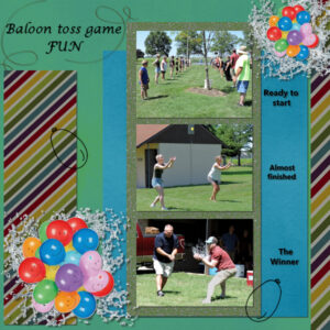
July 19, 2021 at 6:06 pm #60773Day 7 project. The smiley face balloons as sell as the balloon outlines are from Pixel Scrapper I think. The water splash behind the balloons is something I created some time back. I was not quite sure what kind of shadow I should use on those, but I played with it until I liked how it looked. I did not put a shadow on the balloon outlines because I think they would be stamps or drawn with a pin. I placed the pictures on top of each other because they are on the wider and I thought they would be hard to see side by side
July 19, 2021 at 6:11 pm #60774Euka Thanks for answering my question and furnishing the samples.
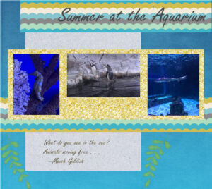
I want to say how impressed I am with a lot of the project posted, especially with the ones that are created by persons fairly new to PSP. (Not that I don’t love the others too.)July 19, 2021 at 8:18 pm #60777Project 3 Summer at the Aquarium
I have learned so much this past week from resizing, to layers, to . . . .
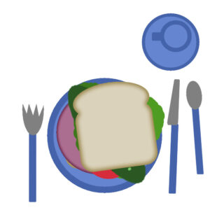
July 19, 2021 at 9:38 pm #60785Hi Wendy here, from Estevan Sk. My sandwich has 2 slices of bread a piece of meat some lettuce , tomatoes and a huge dill pickle. No onions allowed in my home so could not put any on the sandwich. I enjoyed working on this project and am looking forward to more.
July 19, 2021 at 10:41 pm #60819Euka, the story of your PSP getting “stuffed up” sounds like me. Generally technology doesn’t like me. I am determined to tame my PSP. I’ve had to scrap the page I was working on before, hoping I don’t ever have to re-install PSP. I’m finding the second time through the bootcamp I’m noticing more stuff that I had forgotten or didnt realize was as important as it is.
Hi Wendy, I’m your provincial neighbour to the West (Alberta). Your sandwich looks yummy.
July 19, 2021 at 11:11 pm #60822Nonie, I understand that digital scrapbooking and traditional paper scrapbooking are different and we can do things digitally that are different than with papers. Avoiding cut-off elements on the edges, or odd layering is just how “tangible” elements would be manipulated. Even though it is not scrapbooking, for example, one would be unlikely to have a half button on the edge of a frame or a third of a flower. 🙂 I am curious why you usually work with 850-900 pixels projects?
Cindy, doing good with that third project. I suspect you squished that branch on top a little as the flowers look more oval than expected. For your journaling, the shadow is making it quite hard to read. When you use fine fonts, shadows should not be added or if you do, it should be VERY small and faint. Notice the difference with the text in the title.
Susan, good question about the Foreground/Background. In fact, there is no real difference in which one you use. With the Fill tool, or the Brush tool, you can left-click or right-click to choose whichever you want. Where it would make a difference is with vectors, where the Foreground = Stroke and the Background = Fill. Now about the linking, you can select several layers by holding the Ctrl key. Then, you click on the link icon on top of the Layers palette and all those layers will be linked. Notice that by default, when you add a shadow on a new layer, it is automatically linked to the element itself (which makes sense).
Euka, I also have some posts disappear just after I click the SUBMIT button. I actually took the habit of copying my text just before submitting in case I get a pink message saying “Are you sure you want to do that?” That is when the post is NOT posted and I have no clue what causes that. If that appears, I click the Back button and paste my text again. That works. Annoying though especially after I make a looooong post to give feedback to a dozen participants!
Anne, it is interesting that you are not considering the medium for each element to decide on how to shadow them. That comes with practice. For the shadow at the bottom for the splash, I would have likely tried a faint shadow, blurred with 0 or 1 offset. I am not sure if it would have been any better. Oh and you have a typo in the title! Hopefully, you still have the .pspimage file.
Dennis, did you happen to post a duplicate of your project without the shadows for your third project?
Wendy, welcome to the Bootcamp. Glad you got started. You might have a little more work to catch up, but you still have a whole week. Looking forward to your next projects.
I noticed that SOME participants got tomorrow’s email a few hours earlier. Don’t worry. I am not pressing you. It was just a programming error.
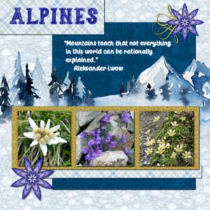
July 20, 2021 at 6:06 am #60827Hi, I thought I had uploaded my project#3 late yesterday evening but apparently I forgot to press the submit button or my mouse was not on it….. So here it is again. I used a “linoleum” background with an overlay I have in my stash of a watercolor landscape. I got that one as a freebie by Creative Fabrica some time ago. The starshaped flowers are by Chantahlia Design, she haas those in many colors, together with the swirl. Fonts are SketchZone and Muthike and the photos are as always by me.
July 20, 2021 at 11:03 am #60832Corrie – that is gorgeous!
July 20, 2021 at 12:00 pm #60837Here’s my Day5, 2nd project.
-
This reply was modified 3 years, 5 months ago by
Hank Sobah.
July 20, 2021 at 12:03 pm #60841My homework for day 3 I went with the new baby on the block type theme as we did have an new addition this summer (hence my learning scrap booking). I used a few pics from my phone and added some embellishments from the kits that were available. I am enjoying what I have learned so far. Thanks for a great course and the ready availability.
July 20, 2021 at 12:25 pm #60848Anonymous
- 11

- Rookie
Help LOL OK I am stuck. Was trying to do the flood fill of the border and it doesn’t flood fill the border just each color it hits within the border. I thought I was following the instructions but have obviously missed something lol
July 20, 2021 at 12:37 pm #60849Ravin, when the Fill tool is active, check the Match mode in the options. Set it to None. It should fix the issue.
July 20, 2021 at 1:42 pm #60851I finally got it. I don’t know why my PSP crashed all the time.
July 20, 2021 at 2:31 pm #60852Wendy, that is an adorable page. thank you Cassel for clearing up the materials palette for me. It’s nice to know when it matters when you use the foreground vs. background and when it doesn’t. I’m going to also try the flood fill again with the setting you suggested.
July 20, 2021 at 2:33 pm #60853I have scrolled through the bootcamp, all 5 pages. What an absolute feast for the eyes, and great inspiration not only for newbies, but for seasoned members like myself. I have to say that I am extremely impressed by the high standard of creativity and broad topics of each page posted from around the world. Each one of you should be proud of your achievements, whether you are newbies or not. I have previously participated in the bookcamp, and for those who are starting out for the first time with PSP or digital scrapbooking, or both, you are definitely in the right place. Keep up the wonderful work. It’s ever so rewarding to sit back, and say, yes I created this page, and I love it!
-
AuthorPosts
- The topic ‘Bootcamp – July 2021’ is closed to new replies.

