Home of the Scrapbook Campus › Forums › Showroom › Bootcamp – July 2021
- This topic has 228 replies, 27 voices, and was last updated 3 years, 4 months ago by
George Watkinson.
-
AuthorPosts
-
July 16, 2021 at 4:12 pm #60610
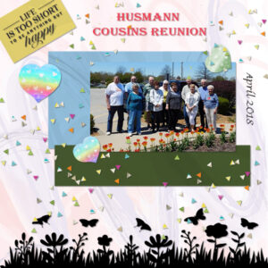
I decided to use this picture for my day 5 project. My Husband’s family tried to get together twice a year. This one is from 2018 and several of the cousins have passed away since then. That is the reason for the “Life is too short comment in the corner. Of course I also couldn’t resist some scatter.
July 16, 2021 at 4:44 pm #60612Hi All!
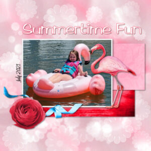
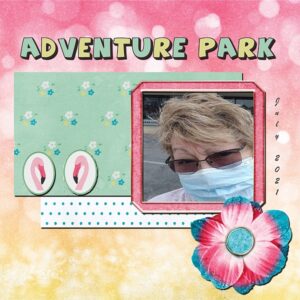
Today I used a FTU scrap from MizTeeques called the Canary and The Flamingo for Day 5.
The font I used is Amazona
I used the same layout but added an additional photo to give to my good friend as this is her granddaughter.
I am really enjoying seeing everybody’s creations, and all the nice comments.
Enjoy your day!
Pixie
-
This reply was modified 3 years, 5 months ago by
Neala (aka Pixie).
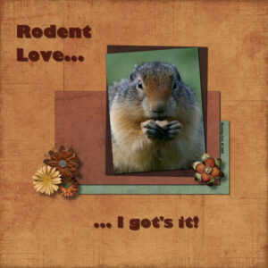
July 16, 2021 at 5:30 pm #60617Here is Day 5 Project 2. I thought I’d get in on the rodent action too. This is from Manning Park, BC just outside the Lower Mainland (Vancouver). it was only an 1.5 hrs to this beautiful provincial park (from my house in Chilliwack, BC) and we went camping there every year on my birthday so I could see the ground squirrels. Manning park is also home to many black bears and I’d be laying down photographing the ground squirrels a there would be bears walking around the day use area. I’m not too sure about the shadows on the 2 titles. When the title color is dark it’s hard to tell there is a shadow. Also the flowers I wondered if it was too much shadow, they look like they might be floating to high. I used the basic shadows from my cheat sheet (from the Basic Scrap Course).
The papers and the flowers are from Pixel Scrapper, KMRD Steampunk kit and the textured overlay was Merissa Lerin. some of the papers and the overlay I reduced the opacity. I forget what font it was (oops), the photo is mine.
I really enjoyed logging in to see all the new layouts. They are really inspiring, thank you all. thank you Cassel, I will start looking at works I really like and deconstruct what I like about it. I was taught that in Photography too. Now, I’m off to work…sniff sniff (insert sad face me).
July 16, 2021 at 5:48 pm #60619Hi Cassel
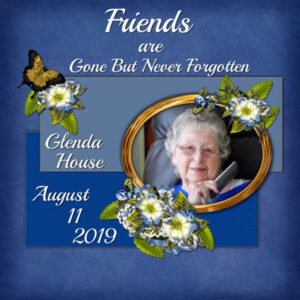
Here is my next project…I used scrap kit from Brenda’s Scrap Design Store on my project. I used a photo of my dear friend who passed in 2019, miss her every day. I drop shadowed all elements…at a higher number so that it shows better.
Still do am not getting the emails for the class in my new email…..:>(
Nonie
July 16, 2021 at 5:56 pm #60620Nonie, that is so beautiful and touching. It’s hard being left behind.
July 16, 2021 at 6:28 pm #60622Anonymous
- 11

- Rookie
So Porthos of course is my muse for the boot camp. In keeping with the “adventure” theme I went with a puppy dream of a perfect day at the park. Bumble Bees, Geese, and Bunnies are some of his favorite things. Since I tend to go with darker colors and the shadows didn’t read well on project one, i changed the shadows to white instead of black and I think it made it look nicer.
July 16, 2021 at 7:47 pm #60626Day 5 Project 2
July 16, 2021 at 9:32 pm #60628Thank You Susan
July 16, 2021 at 10:12 pm #60629Dennis, that’s really pretty.
July 16, 2021 at 11:13 pm #60632Ann S., the answer to your question about the rectangular confetti might depend on which script you are using: the Confetti Maker will offer you the choice of square, rectangular or round confetti; the Punched Confetti script will make them round; and obviously the Custom Confetti will take the shape of whatever element you turn into confetti. Red Wolf really looks mean!!!
Marvin, good start! Although you don’t need to change anything, just be careful with the shadows on the title. What you set is probably just the maximum usable to make the text still legible. If it were larger, it would probably distract from the shape of the letters. But yours is still ok to read.
Anne S., good start on your first project. There seems to be a shadow missing on the string. Is that possible? Also, another detail: you used the paint splash, and didn’t add a shadow which is perfect since paint has no thickness. However, in the same train of thought, the paint would not appear on top of a thick element. They might do better under the frame.
Janet, that is a beautiful image and it looks like you used just solid colors from the photo. That is the simplest way to go and does not distract from the image. Some details about the shadows: your papers are likely thinner than the flowers, so to make them proportional, the offset for the paper shadow should be smaller than for the flowers (which would logically be thicker). I know, it is not obvious when you start. The next Masterclass will be all about shadows so keep an eye on the newsletter when registration opens.
Anne L., that is a great photo and well showcased. I love that border at the bottom. Can you share where you got it?
Neala, that photo and layout made me smile! I bet your friend appreciated it.
Susan, you did a great job with the shadows of the flowers. Glad you used the cheat sheet. And for your title, you are correct; it is harder to see on darker background. But your settings are probably correct. And you would love to see Sue Thomas’ layouts: she has a lot of squirrels too!
Nonie, your shadows really don’t look too much at all. They look right, although they typically should not have one ton top if there is one at the bottom.
Ravin, I see you are using white shadows on your project. Even though they show more on a darker background and they could achieve an “artistic” effect, if you want to be realistic, shadows always are black (or grey if they are not totally opaque). In using black shadows on dark background, you would need to use them either larger or more opaque than you would otherwise. So if I suggest a 60% opacity, you might want to use 80% or something like that. Using darker papers and elements is always a bit more challenging. Looking forward to more photos of Porthos.
Dennis, those leaves a used and shadowed very nicely. If you are using PSP2021, you could use the AI-Powered mode to size up your photo so you can showcase it better. And don’t forget the shadow on the photo!
July 17, 2021 at 12:02 am #60634thank you Cassel. I LOVE LOVE LOVE Sue Thomas’s work. I haven’t really been a FB person until I joined your FB group. She is brilliant! her photography and her layouts are outstanding. Can you tell I’m a fan? Pretty much everyone here and on the FB group inspires me. and I simply love seeing anyone’s photography. I think I’m in the right place.
July 17, 2021 at 12:06 am #60635Neala, I love the monochromatic in your flamingo page and the touch of blue ribbon really adds that extra wow.
July 17, 2021 at 12:09 am #60638July 17, 2021 at 7:04 am #60641The pages being produced are amazing and it is really interesting to see how each day is being presented. We have the same starting point but go in so many different directions!! That is the beauty of scrapbooking.
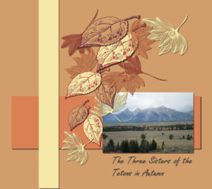
Everything on the pages here I created although the texture on the background and the brown paper doesn’t show up much but that is ok. I wasn’t sure which background I preferred so I am posting both! The font is Fugenta Script and the photo is mine taken in Broome West Australia.
July 17, 2021 at 7:12 am #60643Hi everyone! This is my first time with Bootcamp and writing on a forum. It took me a few days to figure out where to chat! Carol was a great help! I love taking photography, specially my 2 whippets dogs, Oslo and Rascal. I have PSP2020 and PSP 2021, my favourite feature is Sea Sky! For the last pass year I did learn editing by myself and playing with all those interesting features. But, I really need help to learn how to do things and learn to use different feature. I really enjoy seeing all your creations.
-
This reply was modified 3 years, 5 months ago by
Sara.
July 17, 2021 at 10:48 am #60644Cassel, your day 6 email was like it was written for me! I constantly open a paper or element to a page, dont like it, then delete. I thought it was just me as looking at everyone’s pages makes me wonder how they get it so right so quickly. I know experience and making many pages is the key too improving. I started using “hide layer” so I could compare one element or paper over another so I wouldn’t have to go back and look for it again. Kind of like being at the eye doctor when he says, which is clearer, 1 or 2. I think I will try the duplicate page too. that might be easier than filling up the layer palette with hidden layers.
July 17, 2021 at 11:06 am #60646Cassel asked me to share where I got the Spring silhouette that I used at the bottom of my Day 5 paper. Than one and the life is to short in the upper left corner are both from Creative Fabrica and I believe they were both one of the daily freebies. There are a lot of nice silhouettes there, but I don’t know which ones are free.
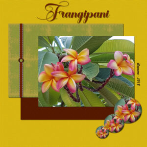
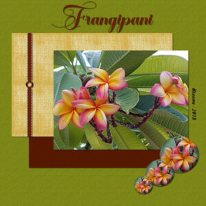
Euka They are both lovely, but I like the one withe the light background better. I loved the way you used the different sized cutouts of the flower as an accent. Was that done with a script or perhaps the bubbles thing in PSP?July 17, 2021 at 2:20 pm #60657Hi everybody,
Sorry I’m a bit behind due to work etc.
I’m from the Netherlands, in love with my 6 pugs and my poison dart frogs. I’ll be using many pic’s of them of course.
July 17, 2021 at 2:35 pm #60658Hi Joke,
Can’t wait to see your pugs and really curious about the poison dart frogs. How do you pronounce your first name?
July 17, 2021 at 2:50 pm #60660Day 5 Project 2 I used the ps_marisa-lerin_264052_the-good-life-january-2021-elements-kit_pu
July 17, 2021 at 3:14 pm #60663July 17, 2021 at 3:29 pm #60665Hi Joke welcome, I’m from the Netherlands too and there are a number of Dutchie’s in the Campus.
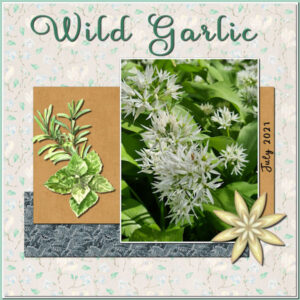
This is my project #2. I didn’t use a specific kit because I never seem to find one that has all the elements or papers that I want for a certain layout. I make them myself or combine from different kits. Fot my background I used a paper from the kit Naturescape (Pixelscrapper) and looked for 2 suitable papers in my stash. The photo is mine, as always and the flower is a freebie from Chantahlia Design. The herbs were in my stash and I think I got them from Creative Fabrica. Font is Ubertas.
July 17, 2021 at 4:10 pm #60666Corrie: That design looks very handsome! The colors and photo and elements really come together well. These classes are really back to basics but they do stand the test of time!
July 17, 2021 at 4:54 pm #60667Ravin I really like that layout. It’s really ethereal. It does seem like a the haziness (background) of the dreamland and yet the vividness (forground) of what dreams are like sometimes.
July 17, 2021 at 5:56 pm #60669Susan, I’ve not long come in from kayaking, in spite of the smoke and the heat, which is 38c. I ‘ve had my 3 hr work out. Anyway, I’m now sitting here scrolling through the boot camp. What an inspiration everyone is, with such wonderful diverse layouts, and stories. Well done everyone!
I was quite overwhelmed reading your comment, where in it you mentioned me. I sincerely hope that I have inspired you, also a huge thank you for your very kind comment on my photography and how I showcase them. I must say it takes me longer to take the photographs, than it does to present them in a layout. Many on here will know that I’m not a scrapbooker. Primarily, I create greetings ecards, cards to post home to family and friends, also calendars. Through the campus I have learnt countless techniques to use. I can quite categorically say that you are definitely in the right place to maximise what PSP has to offer, and implement those techniques is your layouts. We are a small, friendly, helpful, supportive family. If it helps I always start with a photo, the photo then determines where I go from there. I like simple, minimalistic pages, always keeping the focus on the subject in the photo.
July 17, 2021 at 6:37 pm #60680Project 2 Version 2
July 17, 2021 at 7:47 pm #60683Dennis, what a difference that makes. It’s nice to see the two versions. I like how the leaves drape over the corner.
I meant every word Sue. I have done photography since my black and white developing days of high school (film) and as a mini lab supervisor at Black’s Cameras for 7.5 yrs. I took a break from photography to learn lampworking (making glass beads in the flame), glass fusing and silversmithing. It took me back to photography to photography pieces and others works. Now I’m back to having lots of photo’s and no way to showcase them. And being from film processing days I had no clue how to bridge the gap to the digital world until the Scrapbook Bootcamp and the Campus came at the right time. I feel very lucky this came across my computer. I think your 3 hour workout is much nicer than my workouts …that are of the iron variety. I wasn’t a scrapbooker either and wanted a way to present my photography in some way, other than making physical cards.
I do start with a photo. Finding the right papers/elements that all go well together is the tough part for me. Like you say, everyone here, is here to share, help and inspire and they do that brilliantly. I am happy to be a part of this. Oh, I haven’t forgotten about the moth I was going photograph for your identification, busy couple weeks. hopefully I’ll post to FB when I photograph it this weekend.
July 17, 2021 at 10:46 pm #60694Cindy, I am so happy to see how far you have come in your layouts! Your layering is correct, your shadows are correct. You are improving one layout at a time!
Euka, those are such pretty flowers. You found a clever way to showcase them in those multiple circles! Simple yet effective! I am not sure which background I like either!
Welcome, Sara. Glad you found the Bootcamp and you will surely learn something and be supported along the way if you have any questions or issues.
Susan, I am glad that tip will help you. Although you see all those finished projects, NOBODY ever does them in one shot without changing their mind. If it looks like that is what I do in the videos, it is because I had already done the layouts FIRST, then, I record the process.
Hi Joke. Welcome to the Bootcamp. It is ok to start late. You will surely have a chance to catch up. There is still more than a week to go. Did you end up eating your sandwich?
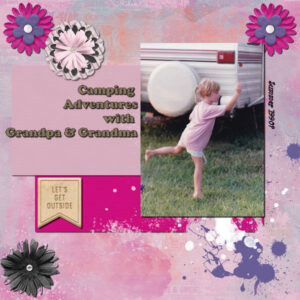
Cyndi, great project #2. If I could make a suggestion it would be to tweak the layering of some of your layers. Your photo is on top of a flower, and I think it would stick better if the flower was on top of the photo. It would not cover much, just a tiny piece on the corner. Also, I think that your paint spatters on the bottom seem to be on top of the dark pink paper. If you want them on two different surfaces, you would need to use a little tip explained in this tutorial.
Corrie, good work on that project #2. As you mention, finding the “perfect kit” is often quite tedious, which is why it is so much faster when you are able to create those papers and elements yourself (which is where the DIAMOND membership becomes a huge advantage!).
Dennis, that is much better to showcase that photo!
For all our newcomers (and maybe not so new), did you see where the other members of the Campus are from? Check out this thread, and add your location to the thread, and I will pin it on the map.
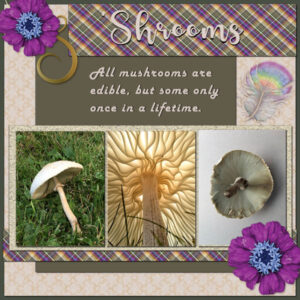
July 18, 2021 at 10:10 am #60696Here is my layout for Day 7. Mine is titled ‘Shrooms. The photos are all from HViP and the photographers are: white mushroom photos by Reni Lorray; and in the center: Underside of a mushroom by Isabelle Soule. The background paper is from Pixel Scrappers Feb2016 for the love of coffee. The flower and feather are from the Animal Kingdom kit. The headline font is Glamlips and the text is in Harlow Italic. The plaid paper is my own pattern made from the photo and flower colors.
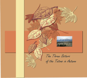
July 18, 2021 at 10:54 am #60698My day 5 layout.
-
This reply was modified 3 years, 5 months ago by
-
AuthorPosts
- The topic ‘Bootcamp – July 2021’ is closed to new replies.


