Home of the Scrapbook Campus › Forums › Showroom › Bootcamp – July 2021
- This topic has 228 replies, 27 voices, and was last updated 3 years, 4 months ago by
George Watkinson.
-
AuthorPosts
-
July 14, 2021 at 11:34 pm #60537
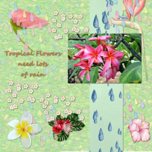
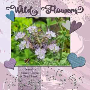
Here is my day 3 project. The original photo is one of my own. The other flowers are all from Creative Fabrica and the raindrop and flower “scatter” are from Pixel Scrapper. It took me forever to get this done because I got sidetracked over at Creative Fabrica and Pixel Scrapper. I love Hawaii and I love taking pictures of flowers so I combined my loves in this one.
July 15, 2021 at 12:20 am #60538Cindy this is beautiful. I love the picture and it looks like it’s curling up a bit on the sides. Those hearts are neat with the papers in them and one that is a hole. I like that technique (whatever it is).
Ravin, Porthos looks like one happy puppy (I call them all puppies no matter the age). Isn’t it our job as their staff to spoil them? Looking forward to more Porthos and more of Bruce from Cindy.
July 15, 2021 at 12:21 am #60539Beautiful Anne, all those colors go so well together. What a stunning flower that is.
July 15, 2021 at 3:48 am #60541Cassel: No, actually the scatters are from your script for custom scatters which make a Tube so I didn’t touch them with the pick tool at all.
July 15, 2021 at 7:00 am #60545Carole, previously I have been using 2020 (and still use it for some filters) and my drink was hot chocolate.
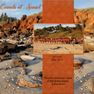
Both photos here are mine, and both taken at Cable Beach Broome. I made the 2nd paper and also the pearls. The font is Fugenta Script.
The pages produced so far have been awesome to view.
July 15, 2021 at 7:37 am #60546Euka you live in a very beautiful place. I love the camels. I like that you used a picture for the background, that’s really effective.
July 15, 2021 at 9:54 am #60557July 15, 2021 at 10:40 am #60559My Day 3
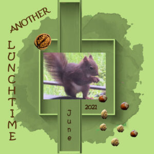
…. and here comes one of my long-time guests :-)! I added already around 2 years ago squirrels in different projects, so guess, it’s never ending. I found the background on Pixel Scrapper, if I remember well, but changed the color and the fonts is Kristen.
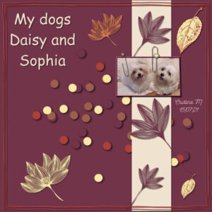
July 15, 2021 at 1:35 pm #60562Hi, these are my dogs. Daisy is 5 years old and Sophia is a baby, 6 months old. I’m enjoying taking these classes. I was having a bit of difficulty putting my creativity into it.
July 15, 2021 at 1:46 pm #60563I like your page Cristina. And I feel your pain (design pain I mean). I have a hard time adding in elements and knowing when it’s either too little or too much while also making it look balanced. Design is a hard one for me. Your dogs are adorable. I really like these classes too. I’m blown away and inspired by what everyone produces. It would be neat to have a class on “design” that shows before (usually when I think it’s done) and what can be done, the wow factor “after” that I need to learn how to do. I guess it’s the 3 P’s (that I learned in Calligraphy). Practice, Patience, Perseverance.
July 15, 2021 at 1:57 pm #60564Anonymous
- 11

- Rookie
LOL I added the shadow to everything but the photo and the background and strip. I honestly didn’t see much difference in the before and after display. Though the bunnies did look a little “crisper” afterwards.
Also question about Text.
So was fooling around with the program for some other stuff. I usually when working with Microsoft paint have just copied text directly from Word or Libre as I prefer to spell check things there since I am horrible speller. When I tried to do that in the Paintshop Pro program I get the text square, but is basically one huge line of text that goes off the side of the project (that can not be seem to be scaled down to size) rather than being formatted how it is on Libre. Is there a way to copy text from a processor program to the project without it doing that?
July 15, 2021 at 1:59 pm #60565Hi Susan Ewart. Thank you for her words. I’m going to put the 3 P’s into practice.
July 15, 2021 at 3:21 pm #60566Hi Susan thank you its a script I bought from our Campus Store Cassel, I also bought the one Anne has that makes the scattered things to, I love them all.
And everyones work 🙂
July 15, 2021 at 3:29 pm #60568Here is my day 3 and the first real scrapbook layout of this bootcamp. What a wonderful pages are made by everyone, to much to comment on individual. Yesterday something came up and I couldn’t finish, but that isn’t a problem we have 2 days for each project.
The background is an abstract pastel one that I found sometime ago on Inky Deals, the paperstrip was by Pixelscrapper. Hearts where in my stash and I colored them to match the colors; the font is Renitha.
Looking forward to the next day.
July 15, 2021 at 4:07 pm #60569I Love Our Teacher, I Love our Campus store! Yes Cassel, I used the script I bought in your store the Curved Photo script it is so fun, I used a lot of the color and other options till I got what I wanted. Appreciate the nice comment. ty
Cassel, I did see that on the scatters, and it was done to make it not look extatically the same, You know how I am (different).
I wished I could buy every script in your store, I love them I love them all. I still have not made that Beautiful button pattern on using the last script you put in store but I will.
You People are so Cool………….. Hey Lurkers join us plz
July 15, 2021 at 5:11 pm #60571Hi all
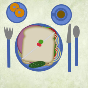
Anne & Henry here. Henry and I are doing this course together because I have developed a painful problem in my hands and find it difficult to manage the mouse. I tell him what I am looking for and he makes the moves for me. I am hoping that it will improve so I can do it myself. Here is my sandwich.
Anne
July 15, 2021 at 8:19 pm #60575Day 3 Project 1.
July 15, 2021 at 8:46 pm #60576Anne, is that cookies on your plate. Yummy.
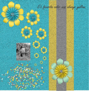
Dennis, I love the cascading flowers. And glitter paper! you can never have enough glitter I say.
July 15, 2021 at 8:51 pm #60577Hi Cindy, I will have a look in the store. Retail therapy is high on the list right now! hahaha
July 15, 2021 at 11:14 pm #60579Day 3 First Project for Boot Camp
July 15, 2021 at 11:55 pm #60580Anne L., good work on the project 1. Your shadows are good, although, on a busy background, I probably would have used a darker one if it is supposed to be a cut out paper, or no shadow if it is supposed to be written with ink.
Ann, what led me to believe the scattered elements were squished is that the round confetti look oval to me.
Euka, at least, it won’t be too much of a change from 2020 to 2021! That is interesting to use a full photo as a background. Well done.
Libera, I am a little puzzled with the shadows. Your frames seem to have a sort of extrusion effect, which would mean that the frames would be way above the paper, yet, the photo and the elements (nuts) have absolutely no shadow as if they were floating into thin air. I am curious; how did you get that “extrusion” effect on the frame?
Cristina, don’t worry about creativity. Right now, you are concentrating on the technique and it is quite a bit to absorb and put all together. Creativity will come when you get more comfortable with the program. And you know, if you save your project in .pspimage format, you can come back later and tweak it.
Susan, one way to help with inspiration is to look at other projects and see what you like and what you don’t like. We all have different tastes and while some people love busy layouts, others prefer minimalist. Nothing is really good or bad. Even my advices are often more of a personal preference.
Ravin, the text can be formated in PSP, but if you copy it from another program, it only copies the text itself and not the formating. If you want the text inside a particular shape, you can follow this tutorial. On the other hand, if you want to copy the text a little like a screenshot, you can copy it and paste it as a new layer and not a text. Of course, it also means that it is not editable.
Corrie, looking forward to seeing more flowers in your future projects. Good work.
Anne S., hopefully, your hand will heal fast. I am sure it must be annoying having someone try to move the mouse for you! So, what did you add to the small plate? Is it a biscuit? or a dessert?
Dennis, what version of PSP are you using? If you have PSP2021, you could enlarge that photo so you can showcase more of it! All those flowers you added would really pop with shadows. Did you fix that issue with the Drop Shadow?
Cyndi, your text is a little hard to read with that color. Could you change it to a more neutral, like white or black? Also be careful with an outline on the text. It often makes it harder to read unless the text is quite large.
July 16, 2021 at 2:23 am #60582Hello. I am George. I am not sure if I am in the right place. I have complete workshop open on PSP with white lettering 0n black backgrouund. I have been using PSPfor a few years. I am mainly self-taught but keen to learn more. I hope I am not too old to learn.
July 16, 2021 at 4:05 am #60585Cassel: Interesting because your script generates rectangular confetti. I would prefer round if I could get it. Is there a way?
July 16, 2021 at 10:08 am #60586Cassel Thanks. I waffled back and forth on wether that text was written or not. I had not thought about making the shadow darker for a busy paper. Thanks.
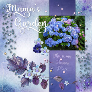
Nela I thought your hydrangea page turned out really beautiful.
Euka I hope the nasty bugs didn’t eat your pretty lace doilie.
Janet B I thought that background paper was really good for your Coastal Waters page.
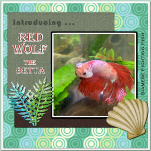
George You are never to old to learn. If you are like me sometime the same thing more than once, especially if it is something you don’t use very often.July 16, 2021 at 12:07 pm #60597Here is the Day 5 – assignment. Introducing my Siamese Fighting Fish: Red Wolf the Betta. lol I’m having a lot of fun with my first tropical fish in many years. They live alone in a 5 gal tank or larger. Sometimes they tolerate snails as tankmates. He looks mean because he IS mean. He glares at me and dares me to approach his tank! 😉
The photo is mine, the patterned paper from my stash and I created the textured papers with flood fill and a texture effect. The shell is a Corel Summer Clip Art freebie. The branches are from Marisa Lerin of Pixelscrappers. The title text is Algerian. I used 3 layers for the background so I have a double border.
July 16, 2021 at 12:38 pm #60598Ann S Well done. I have had several Bettas in different colors, but have never had much luck getting a decent picture of them.
July 16, 2021 at 12:50 pm #60600Sorry that I am late with this. This is my day 3 layout.
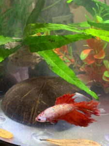
July 16, 2021 at 1:12 pm #60602Anne: here is a better picture where he’s peaceful. 😀
-
This reply was modified 3 years, 5 months ago by
Ann Seeber.
July 16, 2021 at 1:53 pm #60605Hello all. Thank you for the comment. they were supposed to be doughnuts. Today’s project one. I like a less cluttered approach to choosing elements for these projects. Henry is a big help.
Anne S
July 16, 2021 at 3:39 pm #60607Hi all:
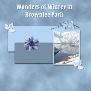
My picture is one I took years ago, on a Sunday drive. It’s set in winter and I thought the mirror image was beautiful.
I am really enjoying learning PSP. Thank you all for the compliments and encouragement that you have posted here.
Have a great day.
🙂 Janet
-
This reply was modified 3 years, 5 months ago by
Janet Bunker.
-
AuthorPosts
- The topic ‘Bootcamp – July 2021’ is closed to new replies.


