Home of the Scrapbook Campus › Forums › Showroom › BOOTCAMP July 2020
Tagged: project 5
- This topic has 263 replies, 26 voices, and was last updated 4 years, 4 months ago by
MoniqueN..
-
AuthorPosts
-
July 22, 2020 at 9:32 am #45320
Scrap Bootcamp – Day 9 – Project 4
Love learning new things like the frame around the photos, text colors and the eraser tool.
July 22, 2020 at 11:05 am #45322Hello,
This was a tough one for me. The only easy new thing for me was the “Eraser” tool. It took umpteen tries to get the “Magic Wand” to work. It would work in blotches until I changed the opacity to about 50%. “Drop Shadow” feature is also tricky for me, your numbers don’t work on most of my layers, but I am working on it. So, along with the frustrations, I am enjoying this. As you can see I got a little carried away with the enhancements.
I enjoy looking at all the great projects, they inspire me.
HenryJuly 22, 2020 at 11:34 am #45326July 22, 2020 at 12:46 pm #45328Project 4.
Some pics from a vintage plane meet. I added noise and sepia effects to age my lovely sharp digital camera images 🙂
Got the hang of the serrated edge after a few trials.
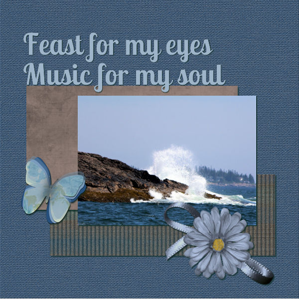
Not sure Ive got the recoloring the text or using a texture firmly in my head. I think I arrived there more by accident. I tried to select a color from another picture using the dropper tool. The chosen color correctly showed in the materials palette (both foreground and background). Then when I went onto the text tool, the materials pallette reverted to the previous text colors when I selected the text. Maybe I need to watch that part again.July 22, 2020 at 1:14 pm #45330Bootcamp #5
My daughter said she really liked this one. I was a little reserved about it. Think it still needs a little work. Loved learning the little tricks to save steps. The kit I used was “A bit of wear and tear” designed by Gilda Paterson, Digital Design Den. This kit is about 12 yrs old. I tried looking up Digital Design Den on google but with a quick glance didnt see the original webpage or store.
July 22, 2020 at 3:07 pm #45338I’ve finally finished Project 3. Sorry, I couldn’t use glitter in this layout. I tried but it just didn’t look right. ?
July 22, 2020 at 4:37 pm #45340Day 9 Project #4
I had some challenges working on this – not because of the project, but because of weird things happening with PSP. I’m running version 2020. In the case of selecting the the edge, using Opacity, I did exactly the same thing as in the video, but it would not treat the selection as one area. I tried multiple times. I found 2 things that proved satisfactory alternate solutions: 1) if I selected the outside, rather than the inside of the photo 2) instead of Opacity with 0 tolerance, I used All Opaque for match mode. The latter option seemed to work perfectly.
The other issue I had, I can’t explain at all. All of a sudden, I couldn’t select layers. I couldn’t see my layers pallete, and nothing was acting or appearing properly. I ended up closing PSP then restarting…no change. Then I rebooted and restarted PSP…no change. So I reset all my preferences to default and everything functioned properly after that. (I then went and re-updated my preferences and it all seems ok since.)
All of the troubles were yesterday and I decided to stop working on it last night. I finished it today. I like what I learned. I like adding the border to the photos, rather than having to create a new layer for each paper matte. I like the fun lettering possibilities also.
My digital kits is Dahlia (April 2016) from Club Scrap.
July 22, 2020 at 4:42 pm #45342Within this “bee” project I made the decoration flower, bees and toonimal bee myself in poser.
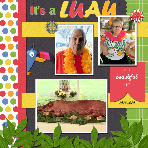
July 22, 2020 at 4:53 pm #45345Finally finished the latest project! I sort of let the Fruitloop kit lead the way and I found the photos from our Rotary Luau from 2018 and the colors worked well. My husband just passed away in Dec 2019 and Rotary was his love (aside from our movie theater!) I think I came in 3rd. 😉 So this page turned into a homage to our Rotary days.
Cassel: I put the script in the proper folder but forget what I do with it in PSP? 🙂 I was so busy finishing my Luau project that I didn’t have time to experiment. Where do I look for it in my PSP2020?
July 22, 2020 at 4:53 pm #45346Carole, your so Awesome, Happy Birthday Bob!
Thank You Eyeinspire for the fun kit to do my homework on.
July 22, 2020 at 5:16 pm #45347The other issue I had, I can’t explain at all. All of a sudden, I couldn’t select layers. I couldn’t see my layers pallete, and nothing was acting or appearing properly.
Frances Coutzen, because of the memory usage or harddisc space it is possible not to see your layers, that often get hidden behind < or > on top. If you go though to the taskbar to PSP20 and move your mouse there the files often pop-up.
July 22, 2020 at 5:35 pm #45348Hello! I’m a tad late to the party, having forgotten Boot Camp was starting. Where do I need to go to get started and catch up, please?
I think I found my answer. Are the tutorials emailed? I registered for boot camp, but haven’t received any emails ?
July 22, 2020 at 7:58 pm #45355Fay, my goodness, if you can create projects that great when you aren’t feeling well then I don’t stand a chance. LOL! Do hope you are feeling better.
Tried to add shadows to my page by going to effects, photo, 3d, picked the block shape and color. It’s actually one of the main reasons I wanted to learn PSP as the software I’m currently designing in doesn’t do them well. But I didn’t like the effect at all. Looks nothing like the 3d effect that I was wanting.
Day 4 mentions giving us time to practice and watch the videos. Is there a list or link to certain videos we are supposed to be watching?
So impressed with everyone’s work!
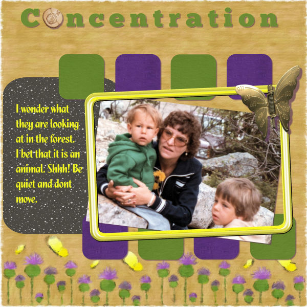
July 22, 2020 at 8:12 pm #45357I am behind. I have to catch up. This is my project from Day 5. I’m enjoying seeing everyone’s projects.
July 22, 2020 at 8:25 pm #45358Susan, thank you. ? As far as I know there is no path Effects > Photo > 3D. Under Effects you can select Photo or 3D Effects but there is no 3D under Photo Effects in PSP 2019. I don’t know about PSP 2020 and perhaps that is the version you are using. There is an Instant Effects palette. Is that what you mean? Anyway, Carole will help you. I think when Carole refers to “videos to watch” she means the instruction videos for each lesson which sometimes must be watched several times.
July 22, 2020 at 9:26 pm #45366Carole – Yes, I do import abr files into PSP2020. But creating files via abrMate gives me a quick way to select the brushes I will use instead of importing 100 brushes.
On this project, it serves as proof you can teach an old dog new tricks. I never used the Selections/Modify to add a border to an element. Great short cut process.
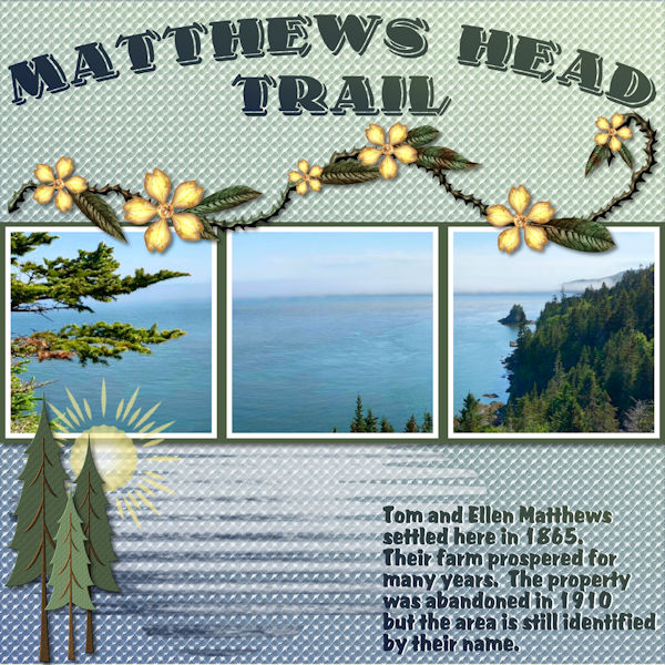
For inspiration, I looked around my area (literally) and spotted one of the model boats I built. Well, I’ve established my near obsession with nautical history. I do belong to the Nautical Research Guild.
I present the results…
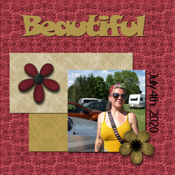
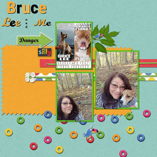
July 22, 2020 at 11:19 pm #45367Bill, yes, PaintShop Pro is much more than a “simple” photo editor. Compared to Photoshop (which has most of the publicity), it is very underestimated. On your project 4, you might want to add this handsome guy’s name. Who knows if everyone knows who he is. 🙂
Monique, if you find that the colors of a kit (papers and elements) are too bright for your liking, you can tone them down. Go to Adjust > Hue and Saturation > Hue/Saturation/Lightness and lower the Saturation value. It won’t change the colors completely but tone them down. The trouble with the border might be for a common reason (I should add that mention in the tutorial). When you fill with the Fill tool, make sure that the Match mode is set to None, and Sample Merge is UNchecked. Try that and see if it works better. For the settings for the drop shadow, there is not really any default since it will depend on the element and how thick you feel they are (since the shadow will differ). For papers, I will use 10,10,80,10. If you want to create a project of different dimensions, you don’t have to start with 3600×3600 but it might depend on the supplies you use. Starting with the full-size image will allow you to use regular scrapbooking resources as is. If you start with a smaller image, some elements might simply be larger and you would have to resize them whenever you use them. So it depends on how you choose to work.
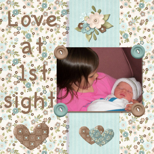
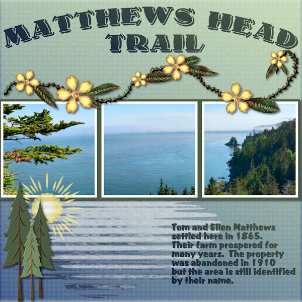
Sandra, you will have time to catch up! On your project for Day 3, did you forget the shadow on the bow? Will you add some information on this little princess on the page? For the Day 5 project, you know that you can always add something later, as long as you keep that .pspimage version. And I remember Digital Designer Den!
Lynn, simple tricks can make the projects more fun and creative!
Henry, when you selected the area with the Magic wand, where were you selecting? Typically, the Match mode should be RGB if you are selecting a color, or Opacity if you want to select an empty space. But you should also verify that Sample Merge is UNchecked as it can really mess up the result. For the shadows, what settings are you using? Typically, for a flat paper element, I will use settings around 10, 10, 80, 10.
Kathy, even though you might not like your projects for days 5 and 7, they look great! In fact, I think that the glitters look good on that project. Just a trick you can use in the future: if you have a tile that seems to not be as suitable, try reducing the Scale in the Materials properties; then the pattern can just become a sort of “texture” so for example, the glitters might no longer look like glitters.
Simon, the Text tool has been a little picky. In older versions of PSP, you could select the color before clicking to add the text and it would respect that color, while in recent versions, it tends to prefer you add the text first and change the color after (making sure the text is highlighted before changing). If a color is already applied, you need to highlight the letters or words, change the color, and click OK on the Materials properties dialog window. Try to see if it helps.
Fay, I see you added some white shadow to your text at the bottom to help legibility. If you were to blur it a bit and reduce the opacity, it will have the same effect without looking like sharp shadows. But you definitely have the correct idea to use the shadow in that manner.
Frances, is it possible that you have Sample merge checked? It can mess up the result. Glad you found a workaround. In PSP, there is often more than one way to get something done. It is like having a toolbox full of different tools.
Ben, you are doing extractions too? That is a good one!
Ann, yes, that is a colorful kit but it works great with those colorful photos. I am sorry for your loss. About the scripts, you should open the Script toolbar (View > Toolbar > Scripts), and then you will see the script you want to use in the drop-down list.
Cindy, everything is still going well? No issue in these projects? You are doing so well!
Diane, did you receive the emails for the Bootcamp? Each email with a tutorial will link you to the protected page with a password, where the video is. Each email has the subject starting with Scrap Bootcamp – Day X. Can you check your inbox (or maybe your spam)?
Susan (with no photo), some of your shadows seem to have different settings. The shadow for the vertical strip is on the left side instead of the right, and it seems to be grey. As mentioned by Fay, I am just referring to the videos of the Bootcamp.
Amparo, glad to see you back. I am sure you will have time to catch up as you don’t seem to have any major problem so it should all work out.
Robert, be just a little careful with the shadows as it looks like your title is floating. For the Select Selection Border, do you want a fun trick? Make a selection, apply the Selection Border with a fairly large value (like 25 both sides), then apply it again, with a smaller value (like 10), and then again, with a smaller value (like 3). You will end up with a bunch of parallel selections!
July 23, 2020 at 12:07 am #45369Hi All – Cassel thank you for all the positive feedback.
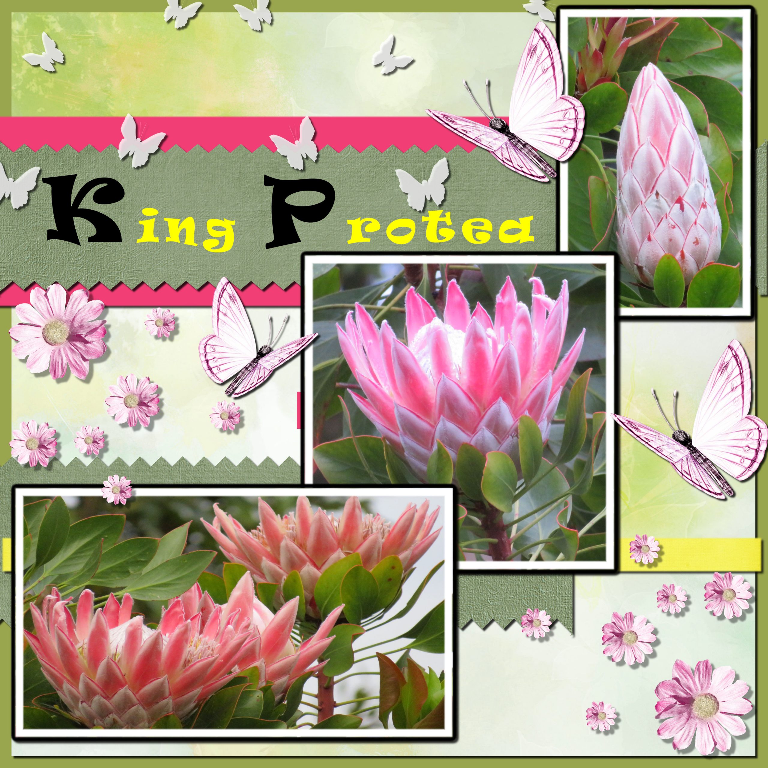
Here is today’s project which are some king protea flowers from our garden. I used some elements from Laras Digital World (Inner Peace), Ilonka (Hanami and One Fine Day) and Xuxper (Purity). After a few practices managed to get the eraser to work to create the zig-zag edge.
Yesterday I asked Cassel “is it possible to change the colour of the border selection on a photograph after you have flood filled and then deselected?” I said I would post the question here for anyone with the same query and this was her response:
As for changing the color on the edge of a photo, yes, it can be done. Depending on the situation, you could use different approaches.
– If the photo is square/rectangular and straight, you can select the whole image with the selection tool by drawing a rectangle around it, then holding the Ctrl key, you can select the part of the photo itself, which will leave you the selection of that frame around. Then, you can fill that area with a different color.
– If the photo is square/rectangular but it is not straight, you can use a similar method but using the Freehand selection tool set to Point to point and selecting from corner to corner for your photo
– Another method that MIGHT work in all situations, depending on the colors of the photo, is to use the Magic Wand, set to RGB Mode and Contiguous checked. Select the border and as long as there is no identical color touching the border, it should give you a selection for that border that you can then fill with a different color.
So, maybe you can try one of those methods.
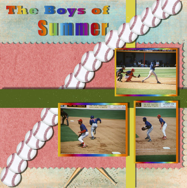
July 23, 2020 at 12:08 am #45371this is project # 4
July 23, 2020 at 6:23 am #45374hello
I went back to the videos to review glitter and busy bees text changes.
Not sure what I was doing yesterday – seemed to work fine today.
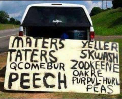
July 23, 2020 at 7:12 am #45380I was poking around with some Quick Pages hoping to try out the new script I got from Cassel. I found a photo to display that made an amusing observation but didn’t really know how to proceed with the script. I had two images open – the Quick Page and my photo. I layered them together and applied the script but just got several black masks.. which I don’t understand at all! I finally put the photo and quick page together my old-fashioned way but I’d really like to know how the script is supposed to work.
Here’s a screenshot of my desktop when trying the script and here’s also the Quick Page and also my final design.
Oops, sorry, forgot to resize the Quick Page base.
July 23, 2020 at 9:34 am #45386Carole … Yes, there is a definite legibility problem with the text but what I did to try and correct this was not done using a drop shadow. I duplicated the text layer, moved the duplicated layer below the original, used the Hue/Saturation/Lightness adjustment to make the text white (-100 saturation, +100 Lightness). I then tried two further adjustments … (1) moved the white text a few pixels to the right and a few pixels down, (2) using a second copy of the original white text, I did a Gaussian blur of 3. I kept viewing the results of first one and then the other. I eventually settled on (1) but was not satisfied even with that. The real problem is the background which has a slight embossing effect and blurring this would have made a big difference in the clarity of the text with no need of a drop shadow, etc. which I would not normally use for such journaling. I should have played around more with that and perhaps changed the font for the text. I just wasn’t feeling up to playing around with it. It’s always easier to use non-patterned papers but I so love designing and using patterned papers that it often makes problems with journaling that I wouldn’t otherwise have. ?
July 23, 2020 at 9:54 am #45390Carole … Yes, there is a definite legibility problem with the text but what I did to try and correct this was not done using a drop shadow. I duplicated the text layer, moved the duplicated layer below the original, used the Hue/Saturation/Lightness adjustment to make the text white (-100 saturation, +100 Lightness). I then tried two further adjustments … (1) moved the white text a few pixels to the right and a few pixels down, (2) using a second copy of the original white text, I did a Gaussian blur of 3. I kept viewing the results of first one and then the other. I eventually settled on (1) but was not satisfied even with that. The real problem is the background which has a slight embossing effect and blurring this would have made a big difference in the clarity of the text. I should have played around more with that and perhaps changed the font for the text. I just wasn’t feeling up to playing around with it. It’s always easier to use non-patterned papers but I so love designing and using patterned papers that it often makes problems with journaling that I wouldn’t otherwise have. ?
July 23, 2020 at 2:20 pm #45394Carole, the first kit you mention in the project #5 mail, is parked, can’t be reached…….
July 23, 2020 at 4:22 pm #45400I guess I was feeling cocky about getting the last episode done relatively easily, so this one gave me a good kick in the pants.
I have no idea how many times I started over completely as by the time I would save a step, errors had crept in, but I think I did learn quite a few techniques. As our first three shot, I managed a lot of problem solving, as in how to get around all of my errors that PSP had it’s own ideas about. One cute thing I learned was how to do point to point to encircle the images and saving that to flood. There are a whole pile of other things, but my mind is so numb, now, I can’t think of a thing.
It seems every time I get desperate and try making a loom video to show the steps to crash, Loom gets to be an issue and doesn’t work right until the first time I manage to get thru the project (more or less). I could publish the link to my latest in here, but since it is an hour and 41 minutes long, I will send it separately and let you trash it.
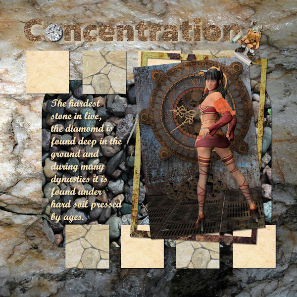
July 23, 2020 at 4:47 pm #45409You are never to old to learn. Paint shop Pro was my first tool to make frames, effects, movement and design. Still it was my goal to make designs like the pro did. I never forgot PSP though. Using Paint Shop Pro 20 ultra at the moment, next to several grafic programs. I put my first steps during all those years online on a site, https://www.aqua1955.nl/creasite If you like to go there, be my guest. klick on the bearded man to get in. Cassel, I only can say thank you 😉 You’re a gift to people that like to do something with their computer, beside mailing, banking and chatting. Wish you all the best with your bootcamps. Hope those who entered the Bootcamp will come in, as I did. My last work I did with several stones, found inside the ground.
July 23, 2020 at 4:57 pm #45412Hello,
Can you believe it, I completed Project #5 on time. Mind you my wife has been a widow for the last ten days or so. I did most of my last two project by a lot of trial and error. I find this is how I learn. I could do with a new memory system but I guess this one will have to do. I like the merge feature, a valuable tool among so many yet to be discovered.
Thank you Cassel.
HenryJuly 23, 2020 at 5:51 pm #45414I am really enjoying boot camp and I am learning so much. Carole gave a few suggestions on my scrap page from #3 on the bow and title and it truly made a difference. Thank you very much for the feedback. The second photo is from Boot Camp #7. I did the glitter rectangle it is very small behind the photos. I also used a paint brush and added a little glitter to the bird and dragonfly . The kit I used is called “Sweet Spring” by cbj. Unfortunately I dont know who Cbj is. There wasnt any more information in my file. This picture is of my grand daughter Summer on her second birthday. She sure loved her unicorn! I am loving all the scrap book pages that are being posted. Great Job every one!
July 23, 2020 at 5:51 pm #45415Hi Monique, have seen you already on Facebook and now I read that you have your PSP in Dutch. As a Dutchie myself I had the same problem that you are constanly translating. I solved that problem by changing the language of PSP to English! All the tutorials are much easier to follow that way. In your PSP go to:
1. Bestand – Voorkeuren – Taal wisselen
2. Selecteer taal
3. OK
4. Berichtenvenster – Opnieuw opstarten – OK
I found this the eyeopener of the Bootcamp! Good luck
July 23, 2020 at 7:12 pm #45421Oh! I really like the text manipulation in Project5. And all the other tips as well. I started off thinking I was going to learn some things in PSP, especially layers. But, I learned to like scrapbooking as well. My children will be getting crafted cards again. Hmmm. I just noticed that shrinking the project down to 600 pixels made the text disappear from the journaling section. Not a problem in most uses I would suspect. The 2nd image is saved as a 50% jpg and the text is there.
-
AuthorPosts


- The topic ‘BOOTCAMP July 2020’ is closed to new replies.


