Home of the Scrapbook Campus › Forums › Showroom › BOOTCAMP July 2020
Tagged: project 5
- This topic has 263 replies, 26 voices, and was last updated 4 years, 4 months ago by
MoniqueN..
-
AuthorPosts
-
July 19, 2020 at 12:37 pm #45100
Cassel – my sharing what I do is the trainer in me. Before retiring, I trained people (engineers, sales, etc) in motor and automation control. When teaching software, I always encourage people to ‘play’ with software. That’s even more so with graphic and art programs (and even when I taught PowerPoint). As I told my students: “If what you do doesn’t work…there’s always CTL-Z.) Let me know if I go too far with sharing.
Good catch (or bad throw on my part?) on the picture shadow. Here’s re-post of image with the shadow. As part of my work flow I add effects affecting multiple layers as a last set of steps. I must have missed the layer with the photo.
As a tip for others, if you add a shadow to an element and then rotate that element, the shadow also rotates and doesn’t match the other shadows. That’s why I do things like shadows and other effects to layers as a group of steps so they all look the same.
As for conversion: ABR format. Many times I just need one (or two) PNG files from a brush set to import into PowerPoint, PSP, DAZ Studio, etc. I came up with my process years ago (long before finding your tutorial – which covers the same process I use). You got me curious, so I googled the software. I see abrMate has been updated. I’ll look to see what’s improved. I think it is a nice conversion utility.
BTW, thanks for the shout out on your blog.
July 19, 2020 at 12:45 pm #45101Monique, I Love the layout and the story behind the photo as well. ?
July 19, 2020 at 1:23 pm #45104Faye – Thanks. From the look of your latest project you may have jumped ahead to the next project. I look forward to more of your projects.
Tip to others: Taking Faye’s observation about the latest video, you may want to remove guides. (I tend to put too many on my work space and they sometimes get in my way.) There is a ‘handle’ for each guideline on the ruler. Just slide that handle all the way up (for horizontal lines) or to the left (for vertical lines). They ‘disappear’ back into the ruler.
July 19, 2020 at 1:27 pm #45106Scrap Bootcamp – Day 7 – Project #3
July 19, 2020 at 3:08 pm #45125this project # 2
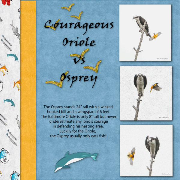
July 19, 2020 at 5:29 pm #45128Here’s my next design using 3 photos shot by a photographer friend of mine, Ed Frampton. The photos are signed. Some of his shots are amazing and witty, too! I really like the CTL-Y shortcut! (Thanks for the correction, Cassel) Saved me a lot of time with drop shadows. And, yes, all the fish are picture tubes, a first for me! Oh, and I used a glitter file as fill for the bird silhouettes. I changed to the Classic Palette and it is much better!
July 19, 2020 at 5:53 pm #45134glitter@the water_600
July 19, 2020 at 6:08 pm #45139That was a very educational project. I was happy to learn about the fill option, snap to grid, and copying text.
In all of my pages, I have used Club Scrap digital kits. For this project, I used the Hopes kit (from June of 2013).
Instead of using sand or something like that, I used a digital stamp – so it’s ink.
July 19, 2020 at 6:41 pm #45145Thanks for the tips about the leaves. I wasn’t thinking about the ‘proper’ placement in the layer pile, but trying out effects and kind of liked having them in strange places. Granted, some of my things might end up looking ‘funny’. I have only managed to download one kit…the “Summer Symphony” one, or whatever it is called. I haven’t gotten either fabric/glitter.
July 19, 2020 at 7:06 pm #45147My apologies. I have to take it back. I was just looking in the wrong place. It was just a little tired out at that time.
July 19, 2020 at 8:18 pm #45168Hello all,
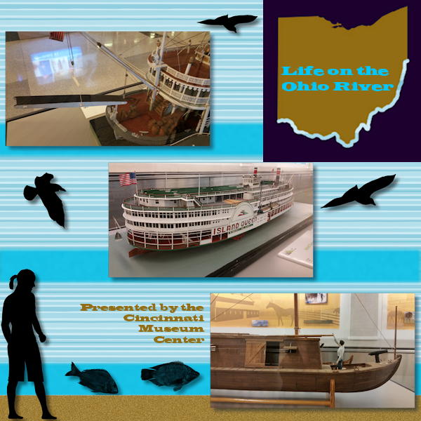
A bit of explanations for this project.
At the Cincinnati (Ohio) Airport you can see (or could see a couple of years ago) displays provided by the Cincinnati Museum Center. I’ve taken many photos of the displays over several years of traveling there on business. (I have an interest in things nautical.)
As Cassel will point out, I am sure, the skills we learn here are not necessarily restricted to scrap booking. But using that format may help with communication to specific audiences. So, I created this advertisement that would promote a specific exhibit at the museum. I still used the techniques in the video.
But I am not a ‘glitter person’.
July 19, 2020 at 8:34 pm #45176Hello everyone,
Cassel – I tried to edit my post but it disappeared. Just a heads up. Easy enough to do it over.
A bit of explanation for this project. At the Cincinnati Airport you will see several displays from the Cincinnati Museum. Lots of them show travel methods used through history (trains and boats specifically). Over the years I’ve take several pictures of the displays particularly the river boats. I have an interest in things nautical.
Cassle will support this statement that what we she presents apply to any use of imagery we modify, create, and design in PSP. Using a recognizable format, like scrap booking, may catch someone’s attention. So, I used that approach for this project. I still used items outlined in the video.
But, I am not big user of glitter. ;D
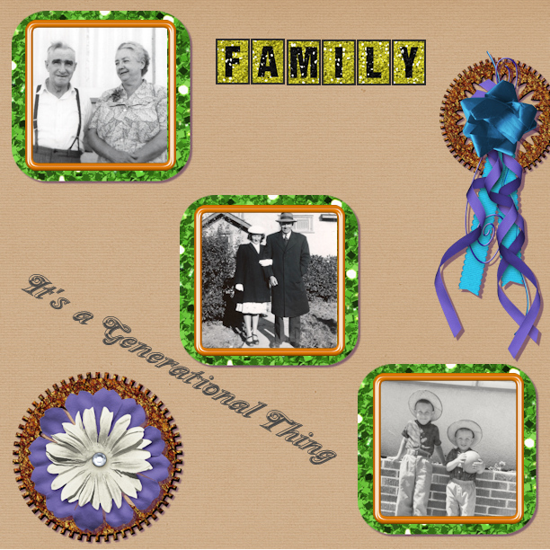
July 19, 2020 at 11:30 pm #45193Cathy, glad the second download worked. Yes, I think we might have a few resident gremlins in the Campus ;). as for the copyrights, if you give credit AND you are not using something for commercial purposes (making money), it is alright. Your use of the shadow on the yellow flowers is creative. Typically, what is meant to be a brush imprint would not have any thickness, therefore, no shadow, but when you give it a different meaning and choose the shadows accordingly, the effect can be special, as in your layout. Good thinking.
Brad, nice to see you 🙂
Ann, when you export as a PNG, there is one setting you have to adjust (only once). Under the Transparency tab, choose Alpha Transparency Channel, and at the bottom, choose Existing Image or Layer Transparency. After that, it will be set for you. As for the shorcut, did you mean Ctrl-Y? Ctrl-L would be to paste as a new layer.
Simon, the shadows make those words really stand out!
Fay, I am not sure what you are referring to when you mention “copy and paste” procedure you used within the engaged Text tool”. Can you clarify?
Monique, it is clear that finding the best suitable supplies can be one of the longest tasks in scrapbooking! Renaming the layers is a good idea. I tend not to do it but mostly because I am lazy. Typically, text would not have a shadow, but what you did was to use the shadow command and used it to emphasize the text, which is excellent. To answer your question, you would get the same blurriness on a paper. The actual question you need to ask yourself is whether that distortion is noticeable and acceptable. If you say yes, then go ahead. My guess is that the details on a paper are probably less important than on a photo.
Robert, the process to convert an ABR brush to a PSP one using abrMate might be unnecessary for you. Did you know that since version X5, you can just import them as is in PSP? Simply go to File > Import > Custom Brush and from there, navigate to the ABR brushes you have, select them, and import. No need to go through the long way. I kind of assumed that some participants would not be the glitter-kinds. I still have them there to show how an image can be used as a pattern to fill as some times, we don’t have (or need) the pattern to be saved, and we just want to use something from the workspace.
Lynn, nice and colorful layout. I see you used the glitters?
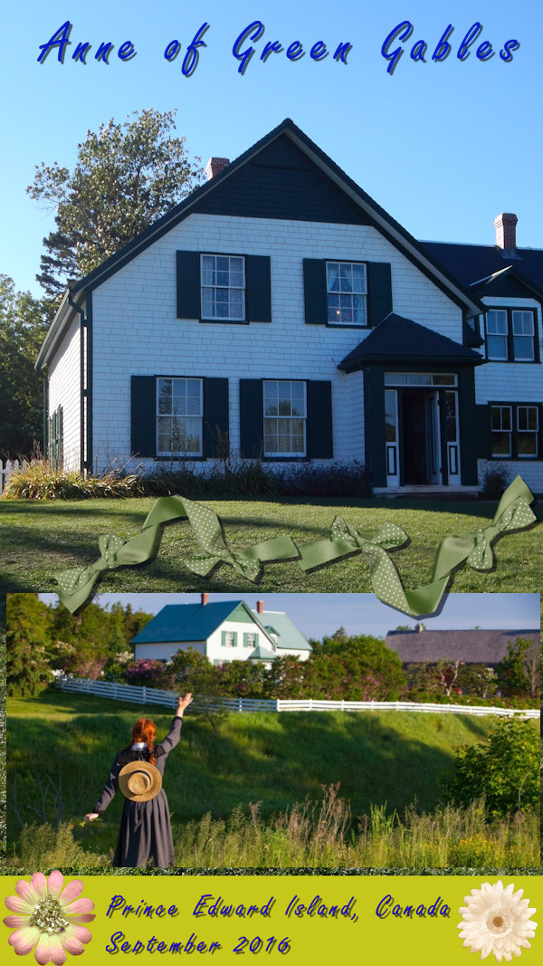
Allen, you visited Cavendish? I went there too, but a long time ago (summer of 1997).
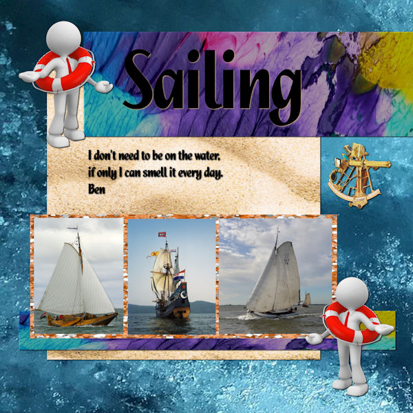
Ben, beautiful photos! Did you add a shadow to the text just above the photos? I think it might make the text a bit harder to read unless it is just due to the resizing (which is possible). Although sometimes, a “shadow” is useful in helping with the legibility, sometimes, it has the opposite effect.
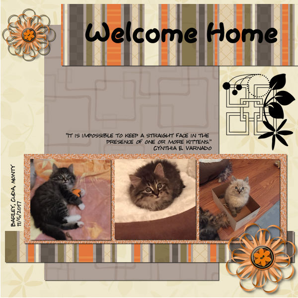
Frances, awe… more kitties! Glad to hear that you learned some useful tips in this lesson.
July 19, 2020 at 11:37 pm #45196I am having trouble with the Materials section. The texture does not appear and does not seem to sample. My work around was to create a shaped selection and resize it around the picture elements. I did learn the new commands, in particular the Ctrl+Y. I was aiming for a more basic palette to enhance the black and white pictures, but glitter did not make that possible. Is there a way to get the lines off the screen once you put them on to align the elements. Mine stayed there after I had moved on to other things. It does not show up on the saved images thankfully.
July 19, 2020 at 11:54 pm #45200Another informative lesson especially the texture/pattern fill and the Guides (and Snap to Guides) features. I used a variety of elements from:
1. Studio Four (Butterfly Dreams – Bird Scatters, Flourish and Flower),
2. Lara’s Digital World (Sun in Splendor – Seagull)
3. Fancy Bird Designs (Misty Autumn – Glitter Tiles)
4. Mystery Scraps (Last Summer Thoughts – Background Papers)
Thank you Cassel
July 19, 2020 at 11:54 pm #45201Bill, the guides are just guides, so they will never appear on the saved project. If you want to remove them, you can always go to View and uncheck Guides. When you say that the Textures don’t show up, can you share a screenshot of what you mean or what you have?
July 20, 2020 at 7:13 am #45214Hello – I have a question
Is it possible to disable or alter some of the keystrokes in PSP. For example CNTRL-D deselects everything, but in windows it means delete. So if there is a lag between switching windows in windows or are still ‘active’ in file explorer the photo files can get deleted by mistake.
July 20, 2020 at 7:25 am #45209Hi Cassel, yes I did put in the shadows. Giving it more shadow it is going to float the text.
The boats are in the middle “de halve Maan”, a ship that is a replicate of the original and a boat that is under fire, because of its past. Both others are Hoogaars sailing boats, which were and are still used for shrimp fishing. They still cook the shrimps fresh on board. The Dutch keep this historic boats and are still building them in Lelystad. The former ship the “Batavia” has left the warf and sails around the world. https://www.youtube.com/watch?v=L_d9a6k42Ig
What started as a unimployment project, made people handcraft men and women. At this moment they are building “The Seven Provinces”, the admiral ship of Michiel de Ruyter with most all volunteers. https://www.youtube.com/watch?v=SvSiClZFAnQ
July 20, 2020 at 7:37 am #45216Simon, yes you can do that. You can reassign keyboard shortcuts by going through View > Customize, and go to the Keyboard tab.
Ben, I agree that adding larger shadow would make the text look like it is floating. In fact, I typically don’t recommend adding shadow to text because ink has no thickness What would it be like without a shadow completely (for the middle text, not the title)?
July 20, 2020 at 9:07 am #45219Thank you, yes I used the dark one from Glitters-HotCocoa.
July 20, 2020 at 9:09 am #45220Clarification of “Copy-Paste” …
Carole, about 16 or 17 minutes into the video (you had just finished adding the title FRIENDSHIP) you said “… with the Text tool active …” and added a new raster layer to the layer palette then copied the quote/poem attributed to Albert Camus from Notepad. You then returned to PSP and pasted the poem into more or less the area where you wanted the poem to be. You then were able to edit the text to your satisfaction. I’m not sure about the reason for adding a new raster layer prior to doing the copy-paste as I assume anything added to the layout using the Text tool would create its own vector layer. Anyway, you must have a good reason so I’ll check it out. I REALLY like this and it will be a process I’ll use frequently. Thank you!
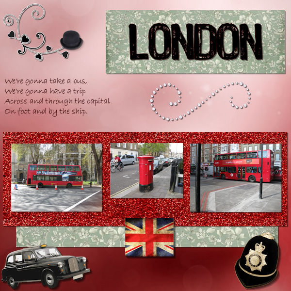
July 20, 2020 at 9:33 am #45223London again 🙂
Is there a way to increase the size of your materials palet? Sometimes the objects are so small I can’t see what’s on it. (Renamed the layers most of the time,but sometimes it’s so hard to see 🙂 )
In the tutorial when you add the shadow, you’ve got two windows, so you can see what’s happening shadowwise ;).
I only have one window. How can I change that? (I’m using psp2020)
If you resize for the forum, you resize the pspimage first or when you converted it to jpeg en then resize? Or you can do as you prefer?
July 20, 2020 at 9:33 am #45224Fay, I see what you mean. The reason I add a raster layer is kind of a habit as it a previous Text layer is already active when adding new text, it creates a text object that will be inside the Text layer and I find it is simpler to have them separate whenever I need to move one without moving the other.
July 20, 2020 at 9:43 am #45225Carole, OK adding the raster layer makes perfect sense in this case. Actually I have had the problem you are avoiding by adding the raster layer. This old brain has only two gears these days – slow and slower – so I didn’t make the connection. ?
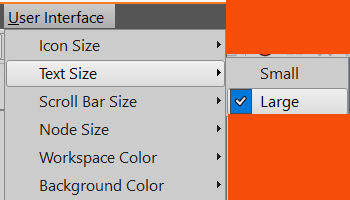
July 20, 2020 at 9:55 am #45228Monique, in most dialog windows, there is an option for Preview. Did you check that?
As for the size of the text, check out the User Interface menu > Text Size > Large. It might help.
July 20, 2020 at 10:02 am #45230Thank you for the tip about shortcuts – I would never have found that menu there.
Day 5 – multiple photos. No glitter, but I found some wood and got completely lost (in a good way) around the links for papers and various things.This time I ‘cropped’ the images when they were already in the layers behind the frames as I wasn’t sure how much of the photo I needed ->by selecting the bit of photo I wanted as a rectangle, inverting the selection and then delete (the extra I didn’t need).
I had another photo I had that was just some dry spinefex grass so I added that as part of the background since it looked a bit bland on its own.
Then I merged the photo with the frame to reduce the number of layers and so the drop shadow didnt drop from the frame onto the photo.
At the end I had a bit of a hiccup when resizing as I did not have the ‘resize all layers’ checked. I chose to flatten it after first saving the layered PSP and then resize & save the .jpg after that.
July 20, 2020 at 10:32 am #45232Cassie
Yes i spent a week on PEI a couple of years ago. Had a great time. Food (especially mussels) was great. Loved visiting all the lighthouses
Allen
July 20, 2020 at 11:36 am #45235Carole, thanks, this helped! (Preview and text size 🙂 )
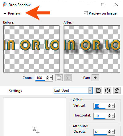
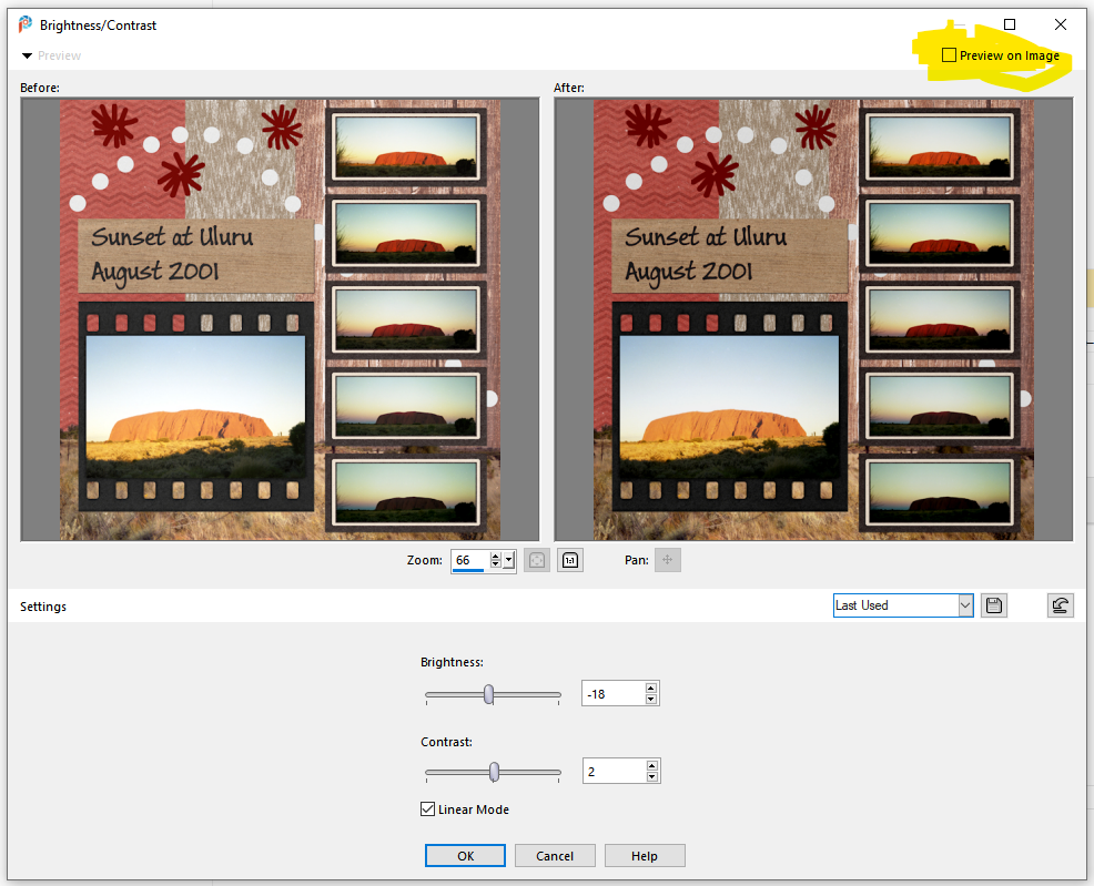
July 20, 2020 at 12:56 pm #45240Hello
Is there a default setting for the ‘preview on image’ check box? Either on or off.
I couldn’t find in the menu’s.
Thanks
July 20, 2020 at 1:17 pm #45243Simon, the Preview on Image will depend on your preference. If you check it, it just takes more resources to always render every tweak you make on the dialog window. Also, it will depend on the command. You can check it for some and keep it unchecked for others. I THINK that the default is checked.
-
AuthorPosts


- The topic ‘BOOTCAMP July 2020’ is closed to new replies.


