Home of the Scrapbook Campus › Forums › Showroom › BOOTCAMP July 2020
Tagged: project 5
- This topic has 263 replies, 26 voices, and was last updated 4 years, 4 months ago by
MoniqueN..
-
AuthorPosts
-
July 14, 2020 at 9:39 pm #44827
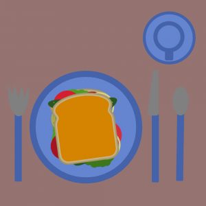
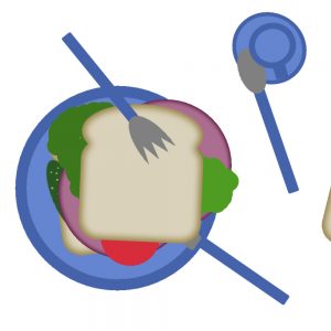
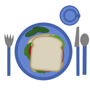
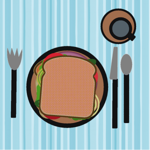
Here is my toasted sandwich. I am still working out how to get the background to be a pattern.
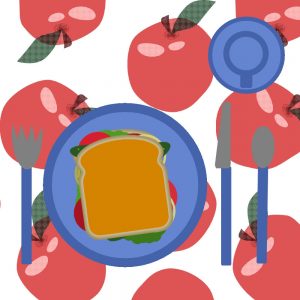
July 14, 2020 at 10:25 pm #44829Here is my toasted sandwich. Got a background now.
July 14, 2020 at 10:41 pm #44831I’m having my sandwich for dinner
July 14, 2020 at 11:02 pm #44832Allen, you can probably make a whole album about that trip with a complete section on food and drinks.
Frances, we will help you all the way through those basic steps so you can get a good foundation. You will see that however powerful PSP can be, it is not that scary (and I love those cats!). What will you drink with your sandwich?
Monique, I hope you discover the pleasure of doing scrapbooking to showcase your photos and stories. And yes, that sandwich always seems to make us feel hungry (especially looking at all those sandwiches).
Rita, will we have a whole album about that Greece trip? It will be fantastic to travel along with you.
Ben, the spoon might be for your coffee, or maybe there is dessert coming?
Ann, I thought you just preferred whole wheat bread.
Fay, I am curious; what was that one specific thing that you learned in this lesson?
Robert, I had never heard of the PICNIC acronym. That is a good one we should remember! Isn’t it amazing how far PSP has come from that first version?
Amy, since you are at least familiar with PSP and familiar with scrapbooking, you will see how the two together can be so enjoyable and create fantastic showcase pieces. Your son is a cutie! Bon appetit for your sandwich.
Brad, the Classic Materials palette shows as similar in the main workspace, but it is when you click on the swatch to select a different color that you will see the difference. You can always change it later if you prefer it (especially since I always use that Materials palette). Linking and unlinking are functions of layers: linked layers are like “glued” together so when one moves, the other follows. Are you referring to something I mentioned in the tutorial or something you read/heard somewhere else? in recent versions of PSP, the default resolution was changed to 300. If yours is set to 200, you can change that going to File > Preferences > General Program Preferences and check the Unit tab where you can then change it to 300 ppi.
Henry, you have a nice tablecloth under that lunch! Did you add some Oreo cookies for dessert?
Bill, you finally got a nice tablecloth. You can also adjust the Scale value if you want the pattern to be smaller. It all depends on the size of your project and what effect you want to achieve.
Remember that if you are just starting, you will have plenty of time to catch up. Don’t be shy and post your projects. If you have questions, post them too. I will respond to every one of them.
July 15, 2020 at 1:39 am #44834I’m not sure what happened but when I downloaded the Zip file I only got one slice and bread and one plate – :(. I was hungry so downloaded some free clip art images and made my own sandwich with Lettuce, Tomato, Cucumber, Red Onions and Grilled Chicken plus one coffee – now one happy girl. 🙂 I also added some texture to the bread.
July 15, 2020 at 3:52 am #44836If ever I had to spend that much time making a sandwich? Well, it sure would be the best weight loss program?
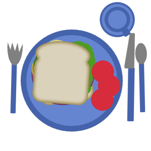
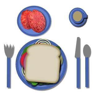
I like tomatoes very much but placed them on the plate so they wouldn’t slippy-slide out of my sandwich. Now I have a use for my knife and fork!July 15, 2020 at 4:59 am #44838I thought these would be art or whatever layers, not rastor. Anyway, the sandwich turned out so hard, I bent the tines on the fork and got my knife stuck in the goodies.
July 15, 2020 at 8:19 am #44842July 15, 2020 at 9:42 am #44844Download went ok now. 🙂
July 15, 2020 at 1:08 pm #44852Hi Thanks for the Break and Lunch,
Yummy sandwich and beefsteak tomatoes extra onions don’t have anyone to kiss but my dog, luckily for me he hates onions so I don’t have to share. lol Now I got a sunburn that’s really true no sun when on antibiotics.
July 15, 2020 at 2:02 pm #44854My second try, where I must admit that it takes and took a lot of time, which I did not think it would. Although using PSP for almost 20 years now, it took more effort than expected. Just changed a little in the filmrol which was empty. Filled it with musrooms 😉
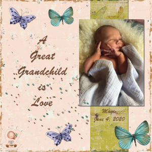
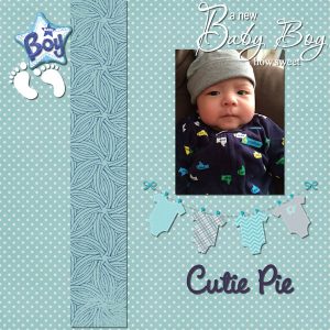
July 15, 2020 at 2:20 pm #44857Day 3 – Scrapbook page for baby Magic. Had a time chasing down papers and elements that suited me. I don’t like my pages too cluttered. I used your demo page as an example, Cassel. I think this came out nice.
July 15, 2020 at 3:16 pm #44860I remembered I made scraps years ago and found kits on my computer, so I used one of them 🙂 I haven’t add a shadow on the photo, hope that’s ok.
July 15, 2020 at 4:45 pm #44864I used kits from Rush Ranch for papers and elements
The photo mask and background are my own
Oh happy day, I just found the color changer tool.
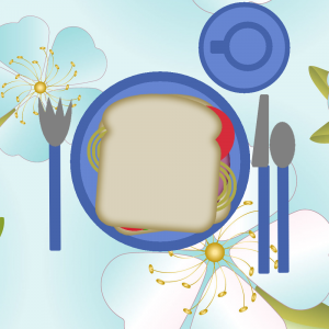
July 15, 2020 at 4:52 pm #44866Here’s my sandwich. Like others, I played with some color aspects by ‘toasting’ by bread [both slices changed colors, added an adjusted halftone effect], changed colors for most of the elements [used fill for various colors on the bread layers] and – using my best Jean Luc Picard voice : Tea, Earl Gray, hot.
(Catch my play on words? I know Earl Grey isn’t gray (or grey). And, yes, I am a big Star Trek fan.)
I already took a drink of tea hence the cup is off center. Added a layer for the tablecloth with a texture fill from the standard, resized slightly. I toyed with adding some drop shadows, but thought they may be going too far.
July 15, 2020 at 6:34 pm #44870Hi Thank You Carole,
I had No Problems thanks to my Teacher 🙂 Thank you Lady 22 for the kit to submit my lesson on.
I really understood and completed it with no problems. My Granddaughter thinks this Luna Moth, looks like a elephant if you rotate it right a bit me to.
July 15, 2020 at 6:46 pm #44872Carole, you asked what I had learned while watching the video for Day 2. I was surprised to see you “click, drag, and drop” images from the layer palette to the working image. I doubt that I will ever use it but am pleased to know it can be done. I’ve been using PSP since Jasc’s Version 8 so since I’ve learned something new on the second day of this bootcamp I’m thinking there are many more interesting things in store.
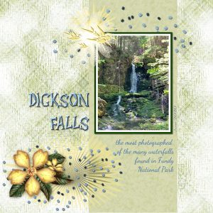
Now for the Day 3 Assignment … I see some very interesting layouts posted so it looks like we’re all paying attention! ? All the papers and elements used in this layout are my own design. Please note that I used Cassel’s Seed Beads picture tubes to create the “scatter” and the fonts used are Alpha Dance for the title and Dancing Script for the journaling.
July 15, 2020 at 6:59 pm #44877Second attempt for this post …
Carole, I mentioned that I had learned something new while watching the video for Day 2 and you asked me exactly what. I have been using PSP since Jasc’s Version 8 and I was surprised to see you “click, drag, and drop” from the layer palette to the working image. If I can learn something like that on Day 2, I can hardly wait to see what else is in store for my knowledge base of PSP.
Now, Day 3. I see some very nice layouts already posted so it looks like we’re paying attention. ?
All the papers and elements used in my layout were designed by me. Some of you may notice that I’ve used CC’s Seed Beads picture tubes to create the “scatter.” The fonts I used are Alpha Dance for the title and Dancing Script for the journaling.
July 15, 2020 at 7:02 pm #44878Don’t know why but I manage to make serious blunders each day. Today I somehow joined both text boxes – TWICE! Couldn’t find a way out the first time so deleted that and started over. The same thing happened again but – no idea how – I wiggled out of that.
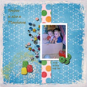
In all of this, yes, I think ? I am enjoying the course.July 15, 2020 at 7:08 pm #44879Margaret, I like your layout very much; especially the background paper, and the children are so cute. ?
July 15, 2020 at 9:12 pm #44881July 15, 2020 at 9:36 pm #44883Project 1 – Day 3 completed. I used papers and elements from kits by Jen Maddocks and Lara’s Digital World. The photograph is my own. I also learned to drag and drop from the layers palette. The Title was a Paintshop Pro Preset and the journaling font was Segoe Print.
July 15, 2020 at 10:06 pm #44885Greetings all,
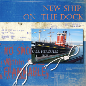
Here’s my Project 3. Another ship from the SF Maritime Museum.
I went for a ‘post card’ look on the image dimension-wise. A couple of backgrounds of blue prints for the paper.
I think the image meets the intent of the assignment. But a question:
How much ‘bling’ is too much? I know it’s a judgement call, but when does adding embellishments start detracting from the overall effect?
July 15, 2020 at 10:19 pm #44888Wow i enjoyed making this! I rarely use drop shadow on images, but i loved how it brings out the embellishments and decorations on the scrapbook page. I enjoy seeing everyone’s creations 🙂
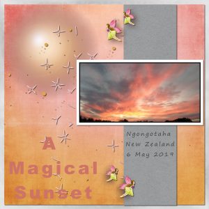
July 15, 2020 at 10:58 pm #44889Cathy, have you tried to download the file again? How large was the file you downloaded? In any way, you are very resourceful as you still managed to get a nice lunch! Is that a sunset or a sunrise on your first project? Either way, it is really colourful!
Margaret, if you were to make 100 digital sandwiches, you would get very efficient and faster. But either way, those are the best for weight loss, for sure! For your issue about the text, there is a likely simple explanation: when you add some text, accept it, and then add more text, it will likely be created as a new “object” but on (under) the same Vector layer. To see if that is the case, click on the little triangle on the left of the Layer, and you should see two “sub-layers”. Moving one will usually move both at the same time UNLESS you activate the Text tool and select one of the two “sub-layers”. That is one reason why I tend to select a raster layer before clicking to add a new text: that will create them on separate layers and makes them easier to move around. If I could offer a suggestion for your page is to look at your elements and their layering: would you put a photo ON a button?
Brad, was the bread to stale? Is that why the fork stuck in it? Good work either way.
Kathy, glad you got your workspace set up. Did you add more pickles or just took them out of the sandwich? That is a very interesting mask that you created. I would point out that if you are adding shadows on the papers to give them dimensions, you would have to be consistent with the photo. You could merge your mask group to add shadows to the various sections of the photo. Consistency is essential.
Cindy, since you have done the Bootcamp several times, that makes a lot of sandwiches! Aren’t you tired of the same menu? 😉 Glad to see that you managed to get this first project without issues. I guess you are getting more comfortable now.
Ben, did you create a scrapbook page with a photo of your own? You recreated the preview of the kit, which is not a scrapbook page, unless you just posted the wrong image. Can you check that?
Ann, picking the kit, the papers and elements is often a longer process than making the page itself. But it is worth the work because your page is lovely.
Fay, your first project is lovely and I am impressed that you created such a nice set of elements and papers. Lovely result! And that tip of Click and drag is one of the many other tips in my book! There are so many little tricks, shortcuts or even things we don’t know about using PSP!
Monique, if you don’t add a shadow on the one that shows on the bottom right, it is ok as the shadow would be outside of the page. However, for the one where the photo is more in the middle of the page, it loses the 3D effect, especially since the piece of paper right underneath does have a shadow.
Robert, it is so much fun to see how everyone is tweaking the various elements of their sandwich. Maybe I should make a whole “bootcamp” all around the sandwich exercise and adding lessons about colorizing, extracting, etc. Humm… you are all giving me ideas! Your question about embellishment is a great one. I have seen such a range of “no embellishment at all” to “so many embellishments that you are searching for the photo”. I tend to go in-between, and use embellishments to showcase the photo, accent it, or balance the page, but I believe that the photos and the stories should still be the star of any project. Some people use scrapbooking more as an art than memory keeping. I assume that’s one explanation for the difference. Does that make sense?
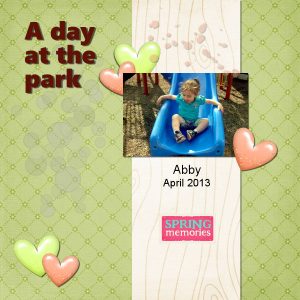
Lynn, that is a lovely photo of Abby and nicely showcased.
Amy, you will discover how shadows can make your work look so much more realistic. These are just basic shadows, but once one learns to manipulate them, the effects can be amazing. I am glad you see the difference with shadows.
July 15, 2020 at 11:51 pm #44891Cassel: Yes, it makes sense. As with art, it’s the eyes of the beholder. I agree with you that the photo should be the focal point. So, another ideas for ‘boot camps’, image/page composition and using lines and embellishments to draw the eye to the photo. Since PSP uses the basic forms of rule of thirds, golden spiral, diagonals and such in the crop tool, it might be good starting point.
July 16, 2020 at 5:41 am #44896I’ve added a small shadow now. Set the preset to 5 instead of 10, because the photo looked like it floated far above the paper.
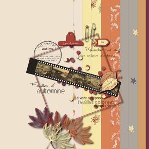
July 16, 2020 at 7:33 am #44899I probably did not read right and made one of the examples, we got through the link from you. I used though own pictures from fall last year inside the negatives.
July 16, 2020 at 8:59 am #44901Robert, I believe a scrapbook page has three components – photos, artistic enhancement and words. The amount of artistic enhancement is obviously the choice of the page designer BUT it certainly can be overdone to the point that the most important part of the page, the photos, is overshadowed. I also believe that without words, the page becomes just an embellished photo album and without photos it’s just a page in an art journal. ?
July 16, 2020 at 9:25 am #44905Practicing……….here’s another try. The pin on the left should of been more centered I see now I u/l it 🙂
-
AuthorPosts
- The topic ‘BOOTCAMP July 2020’ is closed to new replies.


