Home of the Scrapbook Campus › Forums › Showroom › Bootcamp – January 2022
Tagged: project 5
- This topic has 303 replies, 27 voices, and was last updated 2 years, 10 months ago by
Cassel.
-
AuthorPosts
-
January 22, 2022 at 10:12 am #70249
I took a “walk on the wild side” with this one —
think ill have another go and move the title up
-
This reply was modified 2 years, 11 months ago by
Liz Kershaw.
January 22, 2022 at 10:49 am #70252I had trouble with my text until I realised it was coming out as a selection not a vector —- once I fixed that it was ok.
Think v2 looks better — it seems to be all about scale.
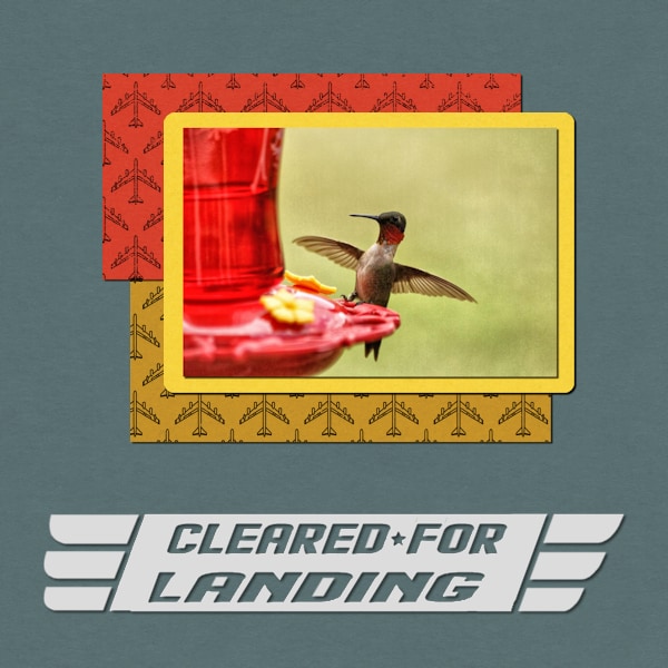
January 22, 2022 at 11:19 am #70254The picture is another one from my college friend. She gets some of the best photos in her backyard. This one makes me laugh.
Carole – When creating the frame around the picture, I used a selection of the photo and expanded it by several pixels. I always got rounded corners for the expanded selection. It looked OK in this instance, but I need to figure out how to get sharp corners. THANKS.
The font is Flight 21 from Creative Fabrica.
January 22, 2022 at 11:51 am #70255this is my fur baby lulus she is 5 years old and weighs 2.9 pounds and is spoiled rotten lol. one of our favorite outings is the beach even in the winter time.
<p style=”text-align: center;”>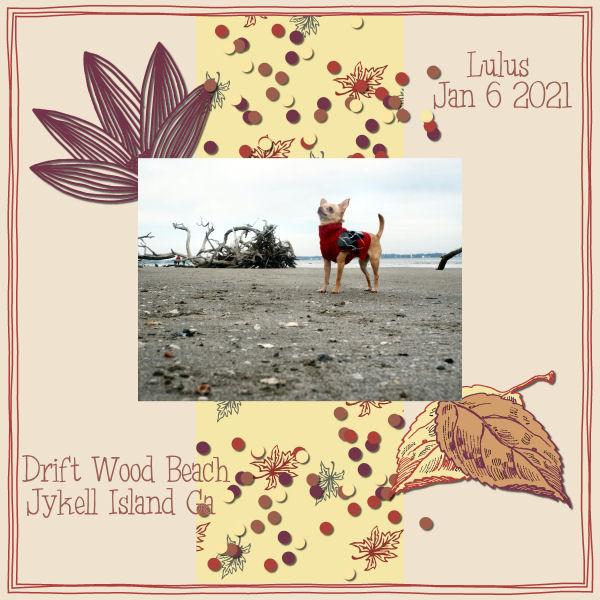 </p>
</p>-
This reply was modified 2 years, 11 months ago by
lavada vance.
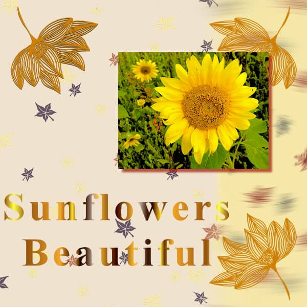
January 22, 2022 at 12:54 pm #70258Here is my submission for Project 1. I wanted to have the words stand out better but this was the best I could seem to do.
The picture is one I took sometime in the past. I tried the one with the cornflower but the green seemed to overpower the blue so I tried this instead.
I used the Fall In Love item.
Thank you.
Any suggestions for improvement are welcome.
P. S. I have seen some very beautiful projects from others. Thank you for sharing these works of art.
January 22, 2022 at 1:00 pm #70259Randy, this might give you some ideas: https://scrapbookcampus.com/2014/05/5-ways-to-keep-text-legible-on-a-photo/
January 22, 2022 at 1:16 pm #70261I’m enjoying seeing all the different pages that are being created – it’s wonderful – thank you to everyone for sharing.
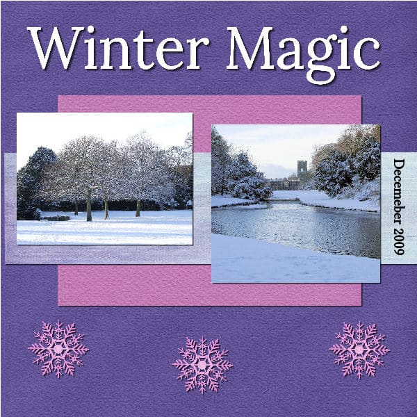
This is my Day 5, Project 2. I tried to do this with one photo, like the example in Carole’s video, but I couldn’t get it to work so I’ve used two photos. Both photos from Fountains Abbey again.
The kit I used is ‘Snowy Winter,’ downloaded from https://themagnoliapatch.blogspot.com/
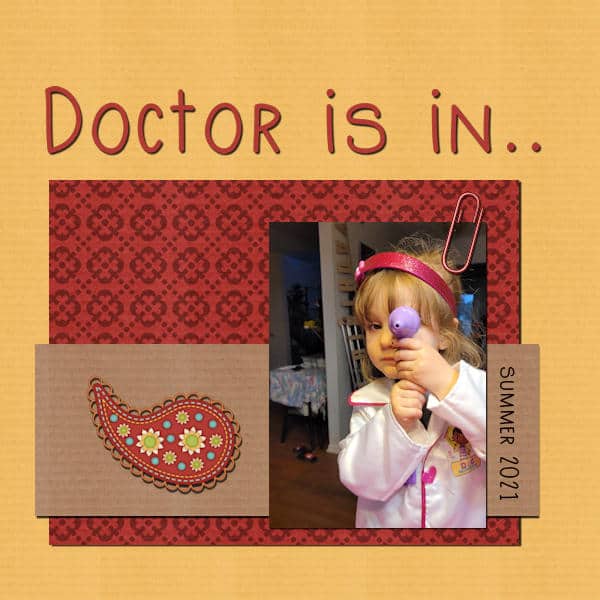
January 22, 2022 at 1:16 pm #70263Day 5: My granddaughter again playing doctor. Kit I used is called Hobby girl’s rule by Angel Wing Scraps.
January 22, 2022 at 1:26 pm #70264Gerry: Carole taught us a trick recently to get sharp corners on a selection. On your PSP toolbar, to the right when using Selection, it says Custom Selection. Hit the white button and your selection will have sharp corners.
January 22, 2022 at 2:25 pm #70266Ann: Now that you say that, I seem to remember that tip. I’ll go back and refresh my memory. It’s one of those things where you go, “I know I should know this, but …”
Thanks!
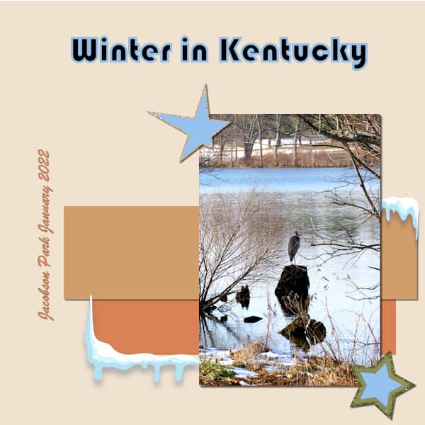
January 22, 2022 at 4:04 pm #70269Day 5 – Project 2
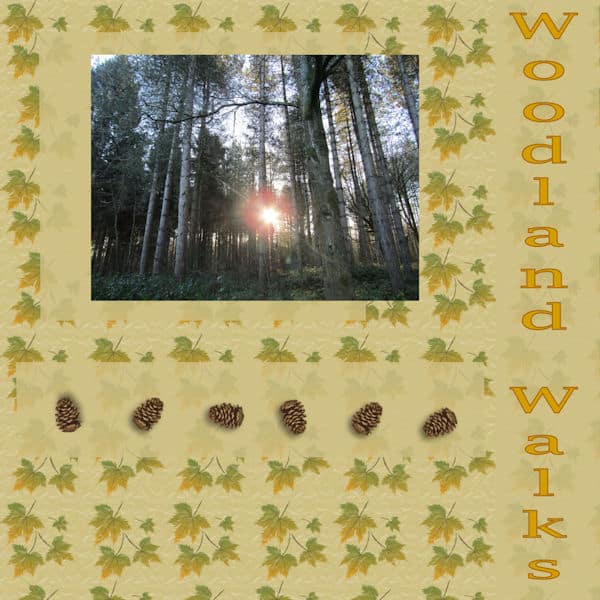
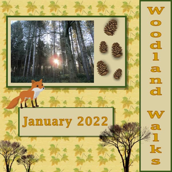
We’ve been on little adventures this week, walking through a couple of local-ish woods. It has been wonderful to re-connect with nature and get the camera out again. The picture on the layout is one I took yesterday. The background is from the patterns on PSP 2022. The font is Lucida Fax which I changed the direction to go vertically. The pine cones are from the tubes on PSP2022.
Wonderful to see the delightful pictures that you’re all putting up.
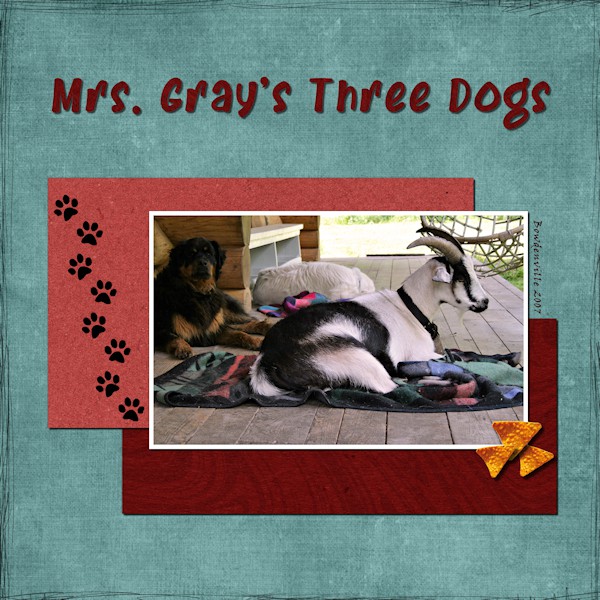
January 22, 2022 at 5:21 pm #70271This is Barney. He is, in fact, a goat. But don’t tell him that, he thinks he is a dog. One day when my friend (Mrs. Gray) was out walking with the three “dogs” a driver of a logging truck stopped to chat. As she was going on her way she heard him radio ahead to the other drivers to watch out for “Mrs Gray and her 3 Dogs”. Why the tortilla chips? Every night when it was time for Barney to retire to the barn he got to have a few torilla chips…his favorite!
The papers and paw prints are from Digitalscrapbook.com, the font is Brandon Bromley from Creative Fabrica, the tortilla chip came from pngitem.com. it had a white background and I clicked away with the selection tool. I think I used “smart selection” or on of the other ones until I was able to select the chip which was on a white background then promoted it to a new layer. It worked but not sure if that’s how it’s really done. I would have liked to deboss (sink into the paper) the paw prints a wee bit. I did not add a shadow as that would look like they are floating. Unless they are prints from a “Rainbow-butterfly-unicorn-kitten” then of course they would be floating!
Beautiful and creative layouts from everyone. Inspiring.
January 22, 2022 at 6:21 pm #70273Here is my project 2 (day 5) Staying withe my theme of my Church. The papers are ones I have saved over the years for various places. The hard hat and tool box are from Creative Fabrica , the rain drop in the cloud I created in another program using a raindrop paper. The stained glass oval is from a picture I took of that same window from inside.
January 22, 2022 at 8:26 pm #70275Anonymous
- 335

- Enthusiast
Here is my Page for day 5
and all made by myself – again 🙂
January 22, 2022 at 8:39 pm #70278I couldn’t get the dropper to choose a color from my photo with the text tool but it let me get a color from the Materials Palette and from the recently used palette. What did I do wrong?
I redid my Project 2(3?) and worked on the title to make it look colder with the Blue outline (strike). What is Anti-alias on the Text Toolbar? I set it to sharp but couldn’t tell must difference from the other settings.
Anyone know where I can get a snow element? Hopefully free? I wanted some for my Project.
Gramie
January 22, 2022 at 8:51 pm #70282Gramie, look and see if the option “Active layer only” is checked. If it is, then you would have needed to have the layer with the color you want, active. Uncheck that box and it will fix the issue.
January 22, 2022 at 8:57 pm #70283Hello- Things are moving along well on my “outdoor adventure” project, with one exception. I wanted to make my secondary paper a series of diagonal strips. I cut a full-height vertical strip and pasted iut into my project. I used the “freehand rotate” option to rotate it 45 degrees, but as you can see it doesn’t stretch for a full diagonal corner-to-corner. I wanted to stretch the strip, but the selection box remains square around the diagonal strip – which means that if I stretch a corner handle, the strip gets thicker as it gets longer. I don’t mind it much as-is, but I’m sure there’s a way to elongate those strips. Any suggestions?
Not done yet, but nearly so. I still have shadows to add and a bit of cleanup.
January 22, 2022 at 9:09 pm #70284Peter, the only way is to stretch them before you rotated them.
January 22, 2022 at 9:36 pm #70285Gramie, not sure what kind of ‘snow element’ you want, but look here–
Where did you get the ‘snow’ in the corners?
January 23, 2022 at 1:40 am #70290Marie-Claire, I might not catch all the details, but some of them, I will! 🙂
Liz, unlike other projects I have commented on before, I will not suggest moving the title off the two different papers because it looks like your title is made of glued paper and not written with ink. Just for better visibility, you could have just made the white paper a little taller, so that it would clearly extend above the title itself. But if you want the title completely off the paper pieces, it is good too. All your paper elements are lined up, which does not give as much of a layered effect. Try to offset them a little. That title is so clever!
Gerry, that photo is quite impressive. Your friend must have a very fast camera to capture those wings! Did you try the tricks Ann and I shared above?
Lavada, is she a chihuahua? I think you might have forgotten to add the shadows to your photo and paper piece. You added them to the other elements though.
Randy, to help make your beautiful title stand out, you could add a drop shadow to it. That will create a separation from the background paper which is similar to the colors used in the title, in places. You used a red shadow. That is a creative shadow, but will not serve to create realism because shadows are not red. I tend to look for more realism typically, so you will see my comments in that direction. 🙂
Sharla, beautiful color combination! And it is ok to deviate a bit from the original tutorial. I only suggest not to deviate too much so I can recognize which lesson is done, so I can tally them at the end. Keep it up!
Sandra, that “Doctor” page made me smile as I had done one when my daughter was playing doctor with her baby brother!
Theresa, looking closely at your layout, it looks like you have several layers of paper but they are so similar in colors that they are hard to distinguish. Can you add some shadows to them? That will define them much more so we can appreciate the layers.
Susan, that is a funny story. Is that goat full-grown? You worked well with the shadows on this page.
Ann, is the glass window actually oval in real life? Sometimes, depending on the angle, some circular windows can look oval and when extracted, without the surrounding, might look odd. If that is the case (and I don’t know), you might want to stretch it to re-appear round.
Pirkko, that is such a beautiful flower! Your shadows are great, however, I would make it a little less on the title. Simply because it is thinner lines, we can see “between” the letters and the shadows, making them look like they are off the paper. If the font was thicker, it might not show as much.
Gramie, outline on titles can be tricky. Often, the stroke will overlap the text itself, distorting it a bit and making it harder to read. That is one reason why, in the Glyphy Font class, I used a duplicate of the font layer to add the “stroke” below the layer with only the fill. See if that would make the title just as “cool”.
Peter, looking forward to the shadowed version. Do you know that you could have those diagonal strips slightly offset from one to the other and you would not have to resize them? Looking at your title, if you have glued little flowers there, you would not be able to add it on top. Have you considered putting the title where there is no decoration on the paper?
January 23, 2022 at 3:32 am #70291Cassel – Thank you for the advice. I need to break out of my keep it simple, less is more mode, and be a bit bolder with my layouts 🙂 There is just one background and I colour-picked a shade from it and made a rectangle for the right side, faded it a little and added the text. The same with the square/rectangle beneath the pine cones and the photo.
Will give it another go and I’ll be bolder 🙂
January 23, 2022 at 4:52 am #70293- 335
- Enthusiast
Carole: Did you mean like this? 🙂
January 23, 2022 at 8:05 am #70294Thanks for all your good advice Cassel
Liz
January 23, 2022 at 9:31 am #70295Pickko, yes, that look even better.
January 23, 2022 at 10:59 am #70299Here is Version 2 of my Woodland Walks Layout. I tinkered around with it a little more 🙂
January 23, 2022 at 11:49 am #70301Theresa – that is really neat now. Everything is much clearer and I love the addition of the fox and tree.
January 23, 2022 at 11:51 am #70302Theresa: That is now an outstanding showcase for your awesome photo. Well done!
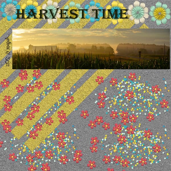
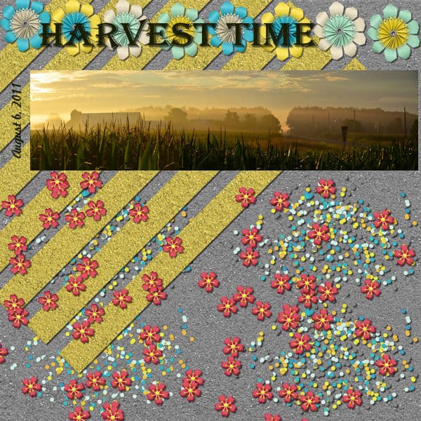
January 23, 2022 at 11:51 am #70303Here’s Project 2. Cassel, thanks for teh advice. I decided to accept my diagonal paper strips as-is and call it a lesson learned. Similarly, I chose to leave the title on top of the papers and flowers, because (1) I think of it as more of a collage than a scrapbook page; (2) there wasn’t really anywhere on the layout without some other element; (3) I was really nervous about triggering a cascade of unintended consequences with other elements;* and (4) my primary interest was to use this panorama photo.
*Somehow, the vertical “date” text got flipped end-for-end during editing. I’m not sure how. Perhaps the text was associated with one of the decorative-element layers that I flipped as I arranged them. I had to delete the layer altogether and re-do it, because if I just deleted the text on that layer and re-typed it, it came back in, same way: flipped.
January 23, 2022 at 12:42 pm #70305Thanks Cassel. The window is round, it is way up high and when seeing it from the floor but fairly close it does look oval. I know in the picture it is too small to see, but you could actually see the crane basket behind it so I decided to leave it oval shaped so as not to distort that. I had considered making it round though.
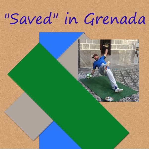
January 23, 2022 at 2:10 pm #70311My latest creation for Project 3; it is based on a photo of one of the many human ‘statues’ in and around Granada, Spain in 2018 before the dreaded struck!
-
This reply was modified 2 years, 11 months ago by
-
AuthorPosts


- The topic ‘Bootcamp – January 2022’ is closed to new replies.


