Home of the Scrapbook Campus › Forums › Showroom › Bootcamp – January 2022
Tagged: project 5
- This topic has 303 replies, 27 voices, and was last updated 2 years, 10 months ago by
Cassel.
-
AuthorPosts
-
January 18, 2022 at 11:17 pm #70073
Like some of the other folks that have done this more than once, I got a little carried away. I remember how many things I learned to do the first time I did Bootcamp and like to repeat it to jog my memory about some things I don’t use often.
January 19, 2022 at 12:22 am #70075Omitade, welcome to the Campus. Yes, PSP seems to have shifted focus toward more photo editing, but even though they don’t promote them as much, other tools are still there and available to create elements and designs. Looking forward to your ziplining photos.
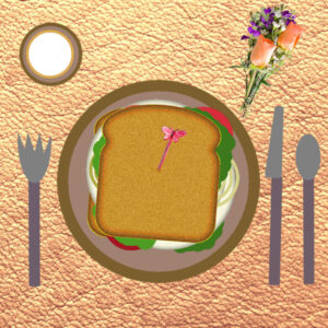
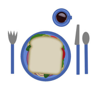
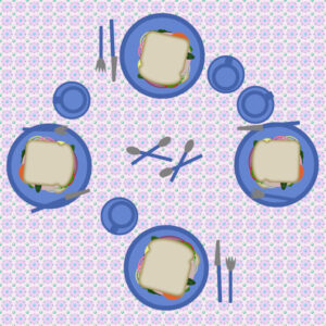
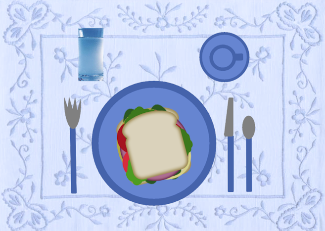
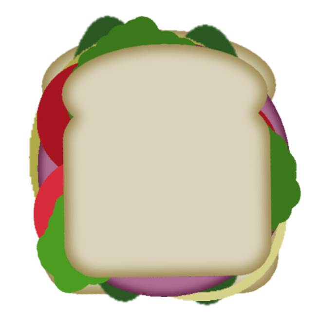
Liz, if you have more photos of such cows, it will be fun for us to look at. That is a club sandwich you did, with three slices of bread! And yes, that is the story of your sandwich.
Euka, welcome back. We will go on walks with you? 🙂
Pierluigi, let’s hope you can still follow the videos, and the written text on the pages. (speriamo che possiate ancora seguire i video, e il testo scritto sulle pagine)
Sandra, did you have a drink with that sandwich?
Gregory, I am glad you finally made it to the Bootcamp. Did the trick I mentioned earlier help?
Randy, although you used another method, grouping layers is working just as well. I just don’t address that in the beginning for the newcomers, but if you are familiar with it, no problem. It is like if you were to use a tray to bring all your elements versus carrying them one at a time. 🙂 When posting in the forum, png will automatically be converted to jpg, to save space, and since there is really nothing to see through (the background of the forum is white), it won’t make much of a difference. Glad you managed to set up your workspace the way you wanted.
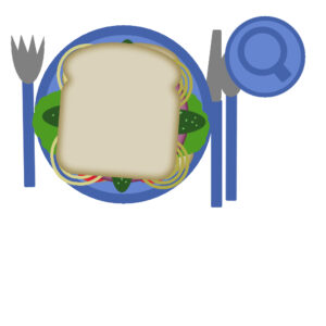
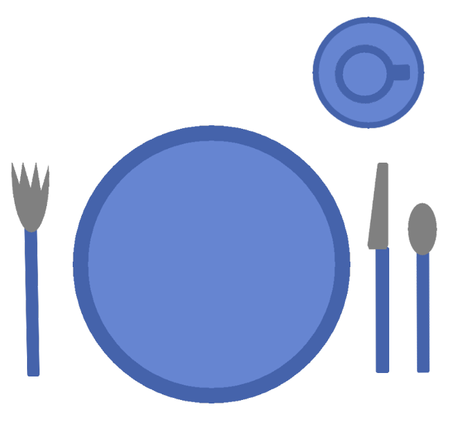
Pirkko, of course, as a leftie, the cup has to be moved! And good job on the shadows.
Gerry, I find that tabbed documents have many inconveniences, including the inability to drag and drop. Another issue is the inability to clone from one image to another (yes, you can do that). That is why I recommend untabbed documents 99% of the time!
Ann, I had not thought of dessert but with all those fruits, we have choices!
Anne, what you have is the dialog window when you select a color, and not the Materials palette itself. Click on the swatch in the Materials palette to choose a different color and that is what you should see, if you are using the Classic Material palette as set in File > Preferences > General Program Preferences > Palettes. Thanks for helping Diane. For your sandwich, it looks like you are having a glass of milk?
Linda, good idea to add a mat under your lunch!
Marie-Claire, did you have anything to drink?
Peter, welcome back. Yes, without practice, it is easy to forget some habits. To answer your question, the Background Eraser might not be the best tool to use on photos like those of your amaryllis. Instead, check out this blog post. I think you will get better results with that.
Gramie, is that a heart-shaped chocolate box? I want some! For your question about the Guides, did you also check the “Snap to guides“? Also, are you using the Pick tool or the Move tool? It seems that the Guides don’t snap when using the Pick tool.
Diane, glad you are feeling inspired. I would not want anyone to feel intimidated or bored. To answer your question, the elements will always end up in the middle of the canvas, by default, so that is the expected behavior. Second, Anne pointed to a good observation: the Pan tool (the little hand) does NOT grab or drag layers but drag the “view” when you are zoomed in.
For those who have not posted yet, don’t be shy. We have all been beginners before. If you have questions, don’t hesitate to ask. We all here to help.
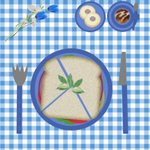
January 19, 2022 at 12:24 am #70076Sharing my sandwich – I like triangles, my son likes ‘man size’ and we have a jam tart each for a treat. I made the gingham cloth. I am pretending the chilli acorn leaves are parsley!!.
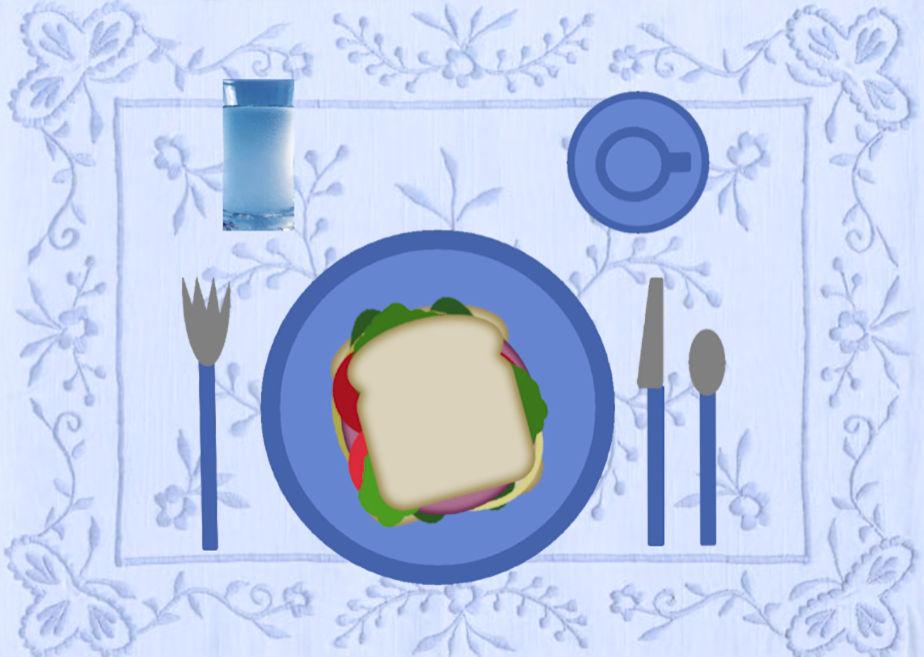
January 19, 2022 at 9:11 am #70079Hallelujah! I did it! I added a tablecloth and a glass of water 🙂
Ann, Thank you!
I will try again after I fortify myself with coffee.
I’ll be back!
-
This reply was modified 2 years, 11 months ago by
Diane Lochala. Reason: Finished Project
-
This reply was modified 2 years, 11 months ago by
Cassel.
January 19, 2022 at 9:38 am #70081I went on a boat to see the dolphins and we were told a story about mermaids . . .
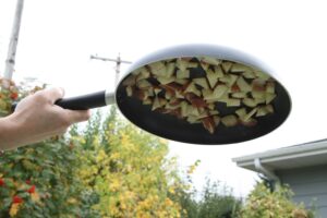
January 19, 2022 at 12:33 pm #70085The photo wasn’t a close up so you can’t see what it is so here is one with a better photo
January 19, 2022 at 1:53 pm #70093Carole, I forgot to pour my coffee 🙂
January 19, 2022 at 1:54 pm #70094January 19, 2022 at 2:01 pm #70097Here is my sandwich project. I was really impressed with all of the creative variations other students used. However, because I’m getting my feet wet for the second time, I decided that it was best to complete the assignment as presented. However, I did decide on a little creative arrangement of onions, pickles, and lettuce leaves. A very enjoyable exercise, and another great learning experience! I had forgotten that elements cannot be moved from one window to the other, but must be dragged from the “layers” pallette. A challenging and enjoyable start!
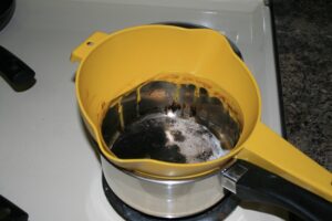
January 19, 2022 at 2:32 pm #70101I’m a little late to the table (pardon the pun). I put my “rose-colored” glass on today. there are no pandemics in my rose-colored world so I invited my besties for lunch. They all agreed, provided I did not cook! So sandwiches it is. After all, how many times can a stomach take cajun style (in my house code for: BURNT!). As evidenced by the photo’s below, call “magic pan” and “pasta melt”. Anybody wanna come for dinner?
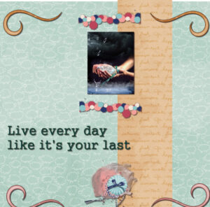
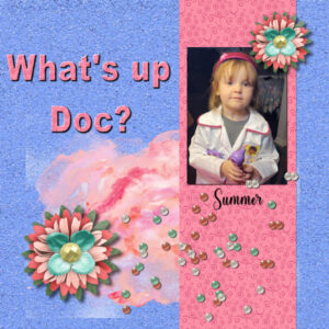
January 19, 2022 at 5:00 pm #70109This is my page for project 1 of bootcamp.
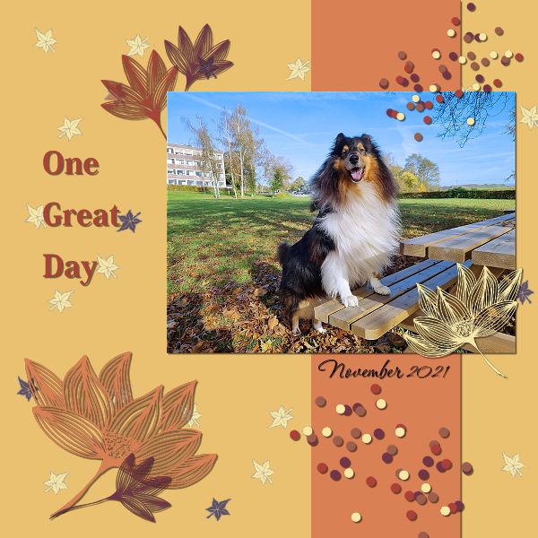
January 19, 2022 at 7:39 pm #70118The photograph was taken by a college friend. The papers and elements were drawn from many different sources. The font is Rachel Brown Display Font from Creative Fabrica.
Carole – Thank you for the tip on cloning from a different picture. I had no idea that was possible.
-
This reply was modified 2 years, 11 months ago by
Gerry Landreth.
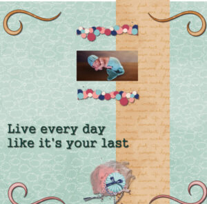
January 19, 2022 at 7:42 pm #70120This is for Day 2 and Project 2. I changed the Tag below because I couldn’t find how to get to day 3 posts!
Questions; Can you put the drop shadow on an element then duplicate it several times and it will already be on the duplicates and not have to do them 1 at a time? #2 Once I have chosen the paper can I use the dropper tool and flood fill the paper with a color from my photo? I couldn’t get it to work. #3 My new image didn’t have the blue and white checks it was all black! Why? I am using the 2022 version is that why? I was able to flood fill it with white but shouldn’t have to. #4 I had my second line of text on a new layer that I changed to Raster but then it wouldn’t let me select it with the Text Tool so I could add the shadow. I had to use the selection tool to select it then I could add the drop shadow. Is this a glitch in 2022?
My splatters are distorted because I didn’t realize the MODE had changed from size. So I left it!
January 19, 2022 at 9:31 pm #70128Hallelujah, I finished the day 2 exercise 🙂 I added a tablecloth and a glass of water.
 January 19, 2022 at 10:06 pm #70131
Day 3.
The text didn’t look good with a drop shadow, so edit>undo.
At first try to upload, I realized I had not resized to 600. So I hope I have uploaded the smaller image!
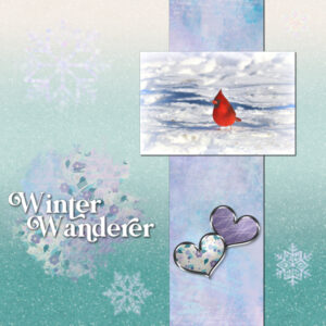
January 20, 2022 at 12:00 am #70132Day 3 Project is done. I placed the divider on an angle
.
 January 20, 2022 at 12:03 am #70133
Euka, nice cloth with the gingham. It looks “picnick-y” 🙂
Liz, it is normal to have photos that might not show up as well on a resized page. We expect that, so don’t worry about it. I think that on the second try, you might have accidentally moved the background paper as it shows a little gap on top. This often happens when you try to grab and move an element that is small, and you grab the bottom layer instead. Also, on your projects, the photo and the paper strip would benefit from some shadowing to give them some volume. Good start.
Marie-Claire, you can’t have lunch without a coffee! Beautiful picture of your dog! I see you added shadows correctly on all the elements of your page.
Peter, I also love to read the stories that come with every sandwich! Staying close to the example is quite alright as it serves as a good practice. And yes, the drag and drop is something many users don’t know about.
Susan, I guess not only digital sandwiches are calorie-free but virtual meetings are still very safe in these times!
Sandra, great pages. May I suggest that you move your paint splash toward the left and the bottom so that the straight edges don’t show OR you can use the Eraser tool with hardness of 0 to soften those straight edges?
Gerry, I hope your friend will see this page you made! For the Clone tool, have a peek at this article.
Gramie, the distortion could have happened even if the mode was left to Scale *IF* you use a side node to resize. ALWAYS use a corner node to avoid distortion (but yeah, there seems to be a bug that makes the mode change without notice). To answer your question, yes, you COULD add the shadow (not on a separate layer) and then duplicate that layer. The problem is that if you do that, you cannot resize, mirror, flip or even rotate the element as the shadow will no longer be consistent. If you just copy and paste the same element with NO CHANGE, yes, you can do that, but it will just limit your options after.
Diane, that is a nice tablecloth! Did you do it yourself? Adding the strip diagonally is a different way to go, but works well too. I would suggest reducing the offset a bit for the shadows as it gives an impression that everything is very thick.
Linda, you are right; sometimes, a shadow won’t make sense with text. Writing will not have shadow because ink has no thickness, but for the titles, you just have to consider whether the font you use could be made out of paper or not. Some fonts can obviously be made of paper, and therefore would need a shadow, but you used one that obviously didn’t resemble paper, so no shadow is better.
If you have not posted yet, we are waiting for you. Don’t be shy. We are here to help you discover more of what you can do with your PSP.
-
This reply was modified 2 years, 11 months ago by
Cassel.
January 20, 2022 at 12:29 am #70136Here is a photo I plan to work with on this project.
January 20, 2022 at 1:05 am #70138Well, I’m really late this time, but a lot has happened at home – Covid again with one of the kids (and she was vaccinated too). At least she is not experiencing too many bad symptoms.
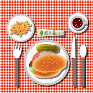
I did finish the sandwich and table. This time I made a red and white checked tablecloth. Also changed the sandwich this time to a hamburger (yummy) – thanks to NicePng for the clipart. Still wanted french fries with it and the special mayo. Decided to have hot chocolate with mini-marshmallows this time. Experimented with a separate shadow layer for the mayo this time as the tube is more full near the top so I used the perspective to pull it out a bit. Had fun adding the marshmallows to the hot chocolate (at first the marshmallows were so big that they overpowered the cup! Then I remembered that I had used the F11 key last time I used the paint brush and so had to tone that down. Anyway, all the ingredients were bought when I went to the store (played the shopping game in one of my last layouts – lol).
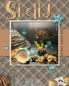
January 20, 2022 at 10:39 am #70141When Carole puts up the design to welcome the New Kid on the Block, I try to focus my layout on who (or what) is new with our family. This time it’s the red-eared turtle, Shelly, housed by my daughter, Laurey, who is a big turtle enthusiast. Her entire home is decorated in turtles! So, here’s Shelly, New Turtle in Town. First I created a backround and flood filled it with white. Then, I created the plaid pattern using Shelly’s shell pattern, and gave it a 45degree angle at 50%, to fill the next layer and reduced the opacity to 85%. Because my photo is square I ended up with a horizontal strip instead of vertical, so I’d have room for a title. I placed the photo in the center and went to Image/Picture Frame and chose one called Albumin. Except for the Shelly portrait in the lower left, all the embellishments came from my beach kits. including the alpha for the title. I played with the star and rope by duplicating the star and putting it on top and then erasing where the rope would disappear through the holes. (It helps to reduce the opacity on the star to see what you’re doing but be sure to put it back to full opacity to finish or else your erasure will look odd.) The font used on the brown strip is Wide Latin typed in a vertical manner. I used a lot of shadows and that finished it up. I create my layouts on 2400 x 3000 so they print 8×10 on my desktop printer.
-
This reply was modified 2 years, 11 months ago by
Ann Seeber.
January 20, 2022 at 10:57 am #70142I appreciate all the details Ann!
I also considered adjusting the size so I could print it on my 8.5 x 11 printer. Otherwise I never print, and eventually the files get lost/buried/forgotten when I have to upgrade to a new computer. I can’t seem to find my layouts from the previous bootcamp(s).
January 20, 2022 at 11:33 am #70144I just spent a lot of time learning!
I kept having a problem with the type function. Several times it seemed to lock up and the only way I could get out of it was by using the undo function. Anyone have any ideas about what I am doing to make this happen repeatedly, please?
This is my very simple project.
January 20, 2022 at 11:39 am #70145Greg, what do you mean by the type function. Are you referring to the Text tool?
January 20, 2022 at 12:26 pm #70148yes
January 20, 2022 at 12:38 pm #70149Greg, could you give some details as to when it happens? Is it when you first add the text or when you want to edit it?
January 20, 2022 at 12:51 pm #70150I am using PSP2022
I had been playing around with the text. I had changed the font and the size and the colour – probably several times.
I was trying to move the text because, after a font/size change, half the typing had disappeared from the project
I must have done something unintentionally, because suddenly I was unable to get the pick tool to work on the chosen layer. It was as if I had frozen it on the first layer. Each time I tried to do something I could only get a colour change screen appearing. It was for the colour of the stipe on my project, even though the layer selected was the background.
It happened again after I had cleared it for the first time by using undo, so I just used undo again until I could get to the right layer.
Hope this helps – and you can suggest what I may have done wrong.
Thanks in anticipation, Greg
January 20, 2022 at 2:27 pm #70151Greg, what version of PSP are you using? I have experienced some bugs, on occasion, with the Text tool where it does not respond either. So maybe we are experiencing the same issue.
Are you able to activate another tool at that time or is everything frozen?
Is the Pick tool greyed out and not available or just not working?
January 20, 2022 at 3:15 pm #70154I am using 2022
The pick too; was working; it just wouldn’t work on the layer that I wanted to use. In fact I could only select the background layer, whatever I tried to do.
I did not try to activate anther tool.
January 20, 2022 at 3:43 pm #70155Greg, when you activate the Pick tool and try to move the text, are you grabbing it in the very middle, on the center node? Maybe you click on the wrong “pixel” and it activates a different layer. If you need to move the text, I would suggest that you use the Move tool and hold the Shift key so it won’t grab whatever pixel you touched, but will stay with the layer you have activated. Would that work?
January 20, 2022 at 5:02 pm #70157I don’t know if this help Greg, but sometimes when I have trouble selecting the layer that I really want, I will make the layer that ends up selected, not visible in the layers pallet. For whatever reason, then I can grab the layer I want.
-
This reply was modified 2 years, 11 months ago by
-
AuthorPosts
- The topic ‘Bootcamp – January 2022’ is closed to new replies.


