Home of the Scrapbook Campus › Forums › Challenges › August TUT/TECH Challenge – Wrapped Text
- This topic has 52 replies, 8 voices, and was last updated 3 years, 11 months ago by
Sue Thomas.
-
AuthorPosts
-
August 26, 2021 at 4:50 am #62659
Love all your projects, Annie. They are all different styles, but they are all wonderful. I prefer your redo of My Country. The text wrapping in the first version made it difficult to read due to the high peaks in the Australia shape.
Sue, I’ve already told you how much I loved yours on the FB page.
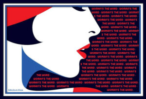
August 26, 2021 at 5:13 am #62661I remembered using text wrapping three years ago repeating, “WOMAN’S THE WORD.” (Remember, I don’t pick the themes lol.) The problem I had was with the word “WOMAN’S.” The program kept reading the “S” after the apostrophe as a separate word. I tried all different fonts and sizes, but this was the best I could do, or I finally gave up. I’m sure I’m the only one who noticed, but it is frustrating. Maybe I’m just too OCD.
The illustrator is Malika Favre, one of my favorites.
August 26, 2021 at 6:09 am #62663Thanks so much dear Sue, your comments are always uplifting for me. The brad was part of Janet Kemp’s kit and I thought that the slight touch of blue would add another dimension of colour. With family out here Suze you should consider a trip over … if we are ever allowed to travel again. The world seems to be going backwards on a social scale. ;D
August 26, 2021 at 5:15 pm #62685I’m so glad the text wrapping is working now!!! But I still find it very strange because I didn’t ever change that compatibility setting, so it must have been on a lower PSP version from the moment I installed it.
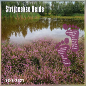
Here is the result of the effort and I’m not very happy with the result but I’m fed up with it now. I’m happy with the background which I made from 2 photos with a mask that I had from Carole. It was a freebie once when I didn’t know how to use it, luckely that has changed. I wrapped my text (Hobo font) inside the footprints and gave the page a title which is the name of the heath and fen area and the date we visited there. I did not want more elements to obscure the photos. A simple frame made with another not so good photo.
Sue nice photo and I am happy to see your face!
August 26, 2021 at 5:33 pm #62687I’m happy that the text wrapping is working now, but I still find it a bit strange that my PSP 2021 which I installed a couple of month ago must have been set with another compatibility; I have never changed that setting!
Here is the result, I’m not completely pleased, but I’m fed up with it. However I’m very happy with the background made of 2 photos with a mask and they blend in well. I used another photo for the frame, wrapped my text (Hobo font) inside the footprints. The title is the name of the heath and fen area. No further embellishments, I didn’t want to obscure the lovely heather and fen.
Sue, nice new profile photo, lovely to see your face!
August 26, 2021 at 5:40 pm #62688Sorry I thought I forgot to submit the first entry and made a new one and the first is here after all, I suspect Murphy’s Law is at work with this project….
August 26, 2021 at 7:46 pm #62692Corrie I love your page, beautiful photo and your wrapped text turned out perfectly. You made me smile when you said Murphy’s law applied to this project! But you got there in the end dear friend, job well done indeed. 😉
August 26, 2021 at 7:50 pm #62693Terrific page here Michele and the wrapped text is executed perfectly. I love the artwork. And, thanks for the compliments my friend, always appreciated. 😉
August 26, 2021 at 11:34 pm #62696Corrie, thank you, I came across the photo, while looking for a particular insect photo. It isn’t a recent photo, it was taken 6 yrs ago. Great composition, and text wrapping. On basic shapes the wrapping works well, with straight forward text.
August 26, 2021 at 11:38 pm #62697Yeah, the ‘s has been a problem in the beginning, but from what I have seen, it seems to be fixed now.
August 27, 2021 at 5:41 am #62701Thanks, Carole. That’s good to know.
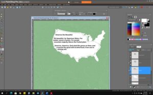
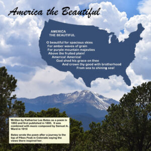
August 27, 2021 at 6:54 pm #62728I saw the challenges Annie had with the outline of Australia and text wrapping and with Ann on the butterfly outline. I just experimented with using an outline of the USA and text wrapping – since there are several points in the outline that would be problematic in text wrapping. Going to the tutorial, I tried Carole’s removal of the objectionable areas of the outline that I didn’t want to include as part of the text wrapping. I am just in the process of this LO, but am going to add a screenshot showing the outline and my text and then a resize of the jpg to 600. Hope this helps.
August 27, 2021 at 7:42 pm #62729Mary, if I may make a suggestion, increase the size of the font, until the text fills all of the selection. The butterfly text wrapping page is my work, and not Ann’s.
August 27, 2021 at 7:47 pm #62730Michele, I remember that page you posted a few years back. It’s beautifully executed.
August 27, 2021 at 8:35 pm #62732Sorry, Sue – mea culpa!
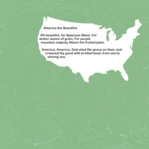
I did finish America the Beautiful and it doesn’t look like the above. Changed the background to a pic that Laurie took on our trip to the northwest of Pike’s Peak. Chose that because that is where Bates had her inspiration. The title font is Brush Script MT, 72 and the narrative script is Arial Rounded MT Bold, 18. The paper was from Cassel’s Fire and Ice kit. The outline of the USA is from NicePng.
August 28, 2021 at 6:13 am #62746Mary, great result on the layout. It’s beautiful (no pun intended).
Thanks so much, Sue. I didn’t recognize you. LOL
August 28, 2021 at 3:33 pm #62770Mary, I lovely layout and great use of the outline of America!
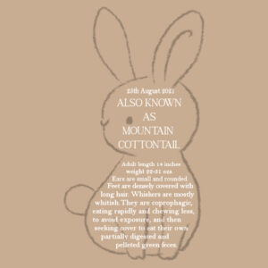
August 28, 2021 at 8:05 pm #62777I have a new resident. Arrived on Wednesday. Only a couple of months old. Slowly it’s gaining my trust. I have very little grass, so the dwarf rabbit pellets and pealed carrots are going down a treat. If I could hold JJ, it would fit nicely in the palm of my hand. My last text wrapping page for this challenge.
August 28, 2021 at 8:18 pm #62779The text will make for better reading on this page.
August 29, 2021 at 4:05 am #62780Love it, Sue. That new baby is so cute.
August 29, 2021 at 10:30 am #62790Sue what a cute little thing. I didn’t know that baby rabbits are called kittens; always something to learn overhere! Photos are great and I like the tilted effect on the corner of the stamp.
August 29, 2021 at 11:09 am #62793Michele and Corrie, thank you. Yes, they are called either kits or kittens. Baby hares are called leverets.
August 30, 2021 at 7:55 am #62829Annie, I have only just seen your revised Country page. The oval works so much better with the text wrapping tool. I actually prefer this one. Well done my friend!
-
AuthorPosts
- The forum ‘Challenges’ is closed to new topics and replies.


