Home of the Scrapbook Campus › Forums › Challenges › August SONG Challenge
Tagged: August SONG Challenge
- This topic has 18 replies, 8 voices, and was last updated 3 years, 4 months ago by
Mary Solaas.
-
AuthorPosts
-
August 7, 2021 at 7:14 am #60248
Once a week, there is a radio show that has been on for many years. It is called Vinyl Tap. It is 2 hours of songs that are picked around a particular theme. Sometimes, it has to do with a word, sometimes, a topic, sometimes it is another particularity (like “unlikely duets”).
Today, I suggest you find a song title that uses a COLOR in it. Use that song title as a title for your project, or quote it somewhere on the page. Your project does not have to be about that color, but it could be about any part of the lyrics. In fact, it can give us a new angle to listen to that song.
Are you up to the challenge?
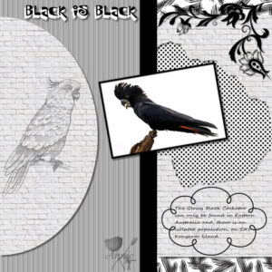
August 9, 2021 at 1:48 am #61474As soon as I read about this challenge the first thing that came to mind was the song “Black is Black” by the Spanish group – Los Bravos, way back in the sixties. I always loved that song and decided that was the way for me to go with my first for this challenge. I used the layout template that I created a few days ago, and the photo of the Glossy Black Cockatoo from an Australian travel magazine. The corner cluster I found recently just can’t remember where from … perhaps pngegg. Very hard to get shadows to sit up and take notice when working on a black and white project. I wanted the lattice to appear as though you were looking through some punched out bricks but not real keen on my result with it. If anyone has any suggestions on how to achieve that I would appreciate it. I ended up using a double drop shadow on an inverted selection. The font used for the title was P22Sniplash and the frame around the glossy black cockatoo was achieved using Cassel’s script “cutout edges”. Thanks for takin a peek my friends. ;D
August 9, 2021 at 5:39 am #61476Annie, your explanation of the song “Black is Black” gave me the idea of using the song “Back to Black” from Amy Winehouse… I love the idea of a black and white layout!… You have a special way of having various elements, textures, papers on a layout that make them look great… Mine would look very, very busy! lol
I am just finishing my Travel Tale layout, and maybe I’ll give this a try before starting the Magazine Challenge.
It looks like my mojo is coming back slowly.
Best wishes
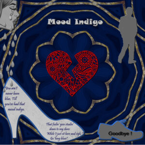
August 9, 2021 at 1:27 pm #61490I decided to do a song challenge. It may not look like there are shadows, but there are even after adjusting them it is hard to see on the really dark background.
August 9, 2021 at 1:45 pm #61491I don’t have any issue with those shadows. Even if they are not as obvious as they would be on a light background, we can “feel” them (for lack of a better word). Don’t you think?
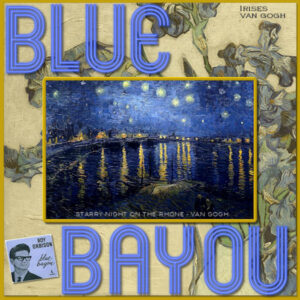
August 9, 2021 at 4:29 pm #61500Here’s my Song Challenge – Blue Bayou as illustrated by Vincent Van Gogh. The alphas are cass-neon, I had the art in my files and I found the album on Google. I played with opacity and hue a lot. I was introduced to Roy Orbison’s music by my husband and I enthusiastically became a fan, too! 😉
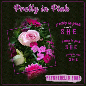
August 9, 2021 at 5:08 pm #61559This is my color song challenge. Whenever I see something pink I immediately think of this song by the Psychedelic Furs from the eighties.That group isn’t a particular favourite of mine but the chorus stuck in my mind! I used the Simply Artsy template by Carole and made a background with the Kaleidoscope. I did that with subtle colors but it didn’t work until I used the blend mode difference and now the colors of the flowers really shine. The title font is Wake the Warrior with the text outlined. The other fonts are Breakaway, Calligraphy and WhiskeyCool. I had the same “problem” as Anne with the shadow on the frame and therefor I gave the frame a bevel to make it more defined.
August 10, 2021 at 12:34 am #61599I am so glad to hear that Cristina. I love your work and have missed viewing it. Very much looking forward to the Magazine challenge … see you there dear friend. ;D
August 10, 2021 at 12:37 am #61600Oh Ann … this is really lovely work my friend. I am a fan of the big O as well … he was a very talented musician. You have done him proud my friend. 😉
August 10, 2021 at 12:46 am #61601This is very “Pretty In Pink” dear Corrie. I loved that song back in the eighties and I loved the movie. I always wished that Andie had ended up with Ducky but that is the way of movies for ya, lol! ;D
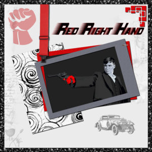
August 11, 2021 at 2:33 am #61625This is another for the song colour challenge. This time I went with Nick Cave and the Badseeds – Red Right Hand. Layout is my own with a few ideas from surfing the net. Artwork is by Joe Murtagh. Title font is Barbatrick. Papers are my own and the corner punch is Caroles. Thanks for takin a peek my friends. ;D
August 11, 2021 at 5:26 am #61627Annie: Very nice! I particularly like the touch of the red suspender instead of ribbon, rope or chain. I never heard of this artist but, then again, I’m not particularly up on current music.
August 11, 2021 at 6:16 am #61629Thanks very much dear Ann. Nick Cave has been around for a while and has his own particular style. The song is also the theme for Peaky Blinders and Snoop Dogg does an interesting version … I do prefer Nick singing it though. 😉
August 11, 2021 at 1:46 pm #61639Corrie – I like everything about this one, but I love the way it all jumps at you because of the black background.
August 11, 2021 at 3:23 pm #61643Anne, thank you very much. I was surprised myself when I got this effect because I mostly use more subtle colors! Maybe I should do this a little bit more often when the colors “dictate” it.
Annie I like your red right hand layout, it has just enough red in it to make that color stand out.
August 11, 2021 at 8:27 pm #61663Thanks dear Corrie, glad you liked it my sweet friend. ;D
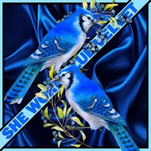
August 20, 2021 at 6:20 am #62193I’m going back to my sisters era … I miss her so much. She had big blue eyes and liked anything blue – especially songs with blue. Blueberry Hill, Love is Blue, and Blue Velvet, blue was her thing. 🙂
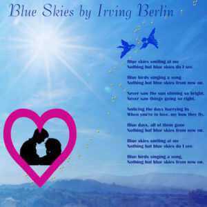
August 22, 2021 at 3:39 pm #62412Several “blue” songs here and I am adding another one. This one is from 1926 – Blue Skies by Irving Berlin for the show “Betsy”. This was once a favorite song for my mother’s sister.
Lovely work here people.
The background is a picture from Unsplash, Derek Sears with an overlay blend at 73% opacity. There are 3 layers underneath. The blue birds are a png from Nicepng as are the lovers silhouette (resized); the music notes are a picture tube; the heart frame is I think from Cassel originally and which I incorporated into the picture frame folder – it has been resized and recolored.
August 23, 2021 at 12:23 pm #62472Another “blue” song (?) – Lavender Blue. Children’s song updated in the 60’s. The flower frame was a freebie from Cassel. The hearts tube I created and the flower tube was a PSP tube. The background is one I created. The crown is from NicePng. The church is one from my stash.
-
AuthorPosts
- The forum ‘Challenges’ is closed to new topics and replies.


