Home of the Scrapbook Campus › Forums › Challenges › August COLOR challenge – Perle Noir
- This topic has 21 replies, 9 voices, and was last updated 4 years, 3 months ago by
libera.
-
AuthorPosts
-
August 15, 2020 at 3:42 pm #46053
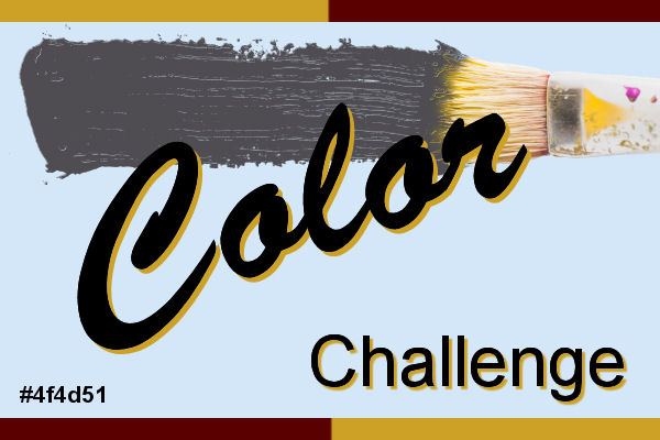
Did you know that Sherwin-Williams promote a new color every month? Of course, they are in the paint business, so it makes sense, but at the same time, it can be a great resource for colors and color palettes, so I thought that we can use some of their suggestions to use in our projects.
In August, their featured color is Perle Noir. It is very dark purple, almost black. Because it seems to be very neutral, it can definitely let you showcase other colors brilliantly. Add a pop of color in a cluster, or in your photo for a dramatic effect. Of course, you don’t have to create everything with that color, but use it to get started and let’s see where it will lead you.
What will you do?
August 16, 2020 at 5:10 pm #46065I had this color in mind.. and PAPER! .. AND STORIES..
See what I came up with..basically my PAPER resume
The font is Britannic Bold, the alpha is from a kit – Somewhere in Time
All the other illustrations I found on the newspaper websites and the little bundle at the bottom right is a free transparent png
I made all the colored papers myself..filling with a brick texture for the one. Background is SW Perle Noir
UPDATE: I added a frame and a nameplate. See what you think..
August 16, 2020 at 8:49 pm #46082great result Ann you have used the colour well.
best wishes,
Dawn
August 16, 2020 at 11:02 pm #46083I love it, Ann! Very creative! I was wondering what I might do with that color…you used it perfectly!
August 17, 2020 at 12:10 pm #46094Very nice layout, Ann! I liked it very much.
August 20, 2020 at 2:51 pm #46264Here is the layout I created for this challenge.
To the background color (Perle Noir), I added 2 layers of overlays: ps_sheila-reid_43504_word-scramble-OVERLAY_cu AND ps_sheila-reid_58974_distressed-set-2-texture-05_cu.
I added the “Ice Cream template” freebie by Cassel (2019Aug – Blog post “Theme-Ice Cream.” I also created a “Word Sticker” (Lab9-M05).
Ribbon by dedesmith “dedesmith_dreamvacation_ribbon1”
FONTS: Hobo Std – Ravie – Showcard Gothic
August 20, 2020 at 7:01 pm #46283hello dear Cristina.. what a wonderful page created!….. Great idea to have such a colourful title. ..every element on the layout and the background colour Perle Noir works so well together… love it !
as always, best wishes to you,
Dawn.
August 21, 2020 at 5:21 am #46310Hello Dawn 🙂 Thank you so much for your words of encouragement! They are always appreciated, my dear friend. Best wishes to you! <3
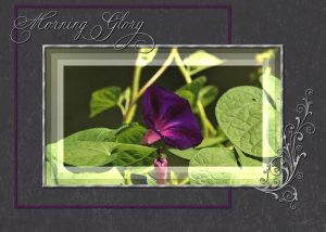
August 21, 2020 at 9:24 pm #46351Here is my layout for the August colour challenge. I used an overlay on the background paper (Perle Noir). Adjustment layers on the photo, with a silver frame. Fonts are Copper alt caps for the Morning Glory, and soft ornaments for the element. Sculpture texture used on both. The Morning Glory flowers have long gone over, but when they were in bloom, I would have my morning cuppa outside gazing at their beauty.
August 21, 2020 at 9:27 pm #46352I compliment you Ann and Cristina on creating such wonderful layouts. Well done ladies!
August 21, 2020 at 10:22 pm #46355Sue you have created a lovely page for the colour challenge .. that font is really nice and is well chosen for your layout.
best wishes,
Dawn.
August 21, 2020 at 10:34 pm #46359Thank you ever so much for your kind comment Dawn. Kind regards to you. Sue
August 22, 2020 at 5:40 am #46379Sue, thank you for your kind comment on my layout. <3
Your layout is beautiful, and so is the photo. I love how you add frames to the pictures, always very different from one another, and they really highlight the photos.
August 22, 2020 at 6:26 am #46380Lovely pages, all of you.
August 22, 2020 at 8:12 am #46387Thank you Cristina, you are always so complimentary about my pages. Coming from another psp artist, I appreciate it. I’m a fan of using the adjustments layers on photos. I can always go back a t a later date, and if I choose to do so, I can reverse the brightness, even change the photo.
Enjoy your weekend.
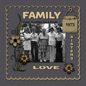
August 22, 2020 at 6:45 pm #46434Lovely layouts every one! I didnt consider this an easy color to work but here is my page of my mom, her mother and siblings.
I used a kit called “Bit of wear and Tear” by Gilda Paterson
August 22, 2020 at 7:46 pm #46441lovely page Sandra …. great colour choice to go with the background of Perle Noir colour.
best wishes,
Dawn.
August 23, 2020 at 6:31 am #46460Sandra, your layout is lovely, and it worked perfectly with the B&W picture.
August 23, 2020 at 2:22 pm #46507Wonderful layout Sandra, I like the metalic look, it goes well with the background colour.
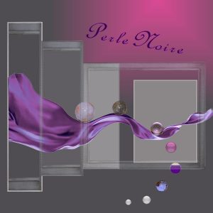
August 27, 2020 at 7:46 pm #46646Hi @ all, Perle Noir seems to be inspiring too,
Ann, Cristina, Sue, Sandra lovely creations and really good choice of colors in combination ;-)!
I tried to play around and added a few coordinating colors.August 29, 2020 at 7:28 am #46685Libera, thank you! You created a very nice layout and I love the colors you chose to match the Perle Noir. Great job.
September 1, 2020 at 7:24 am #46782Thanks, Cristina, when I started I had no real plan what I wanted to do, it came step by step :-)!
-
AuthorPosts
- The forum ‘Challenges’ is closed to new topics and replies.


