Home of the Scrapbook Campus › Forums › Challenges › April Photo Challenge
Tagged: freebie-kit, photochallenge
- This topic has 14 replies, 7 voices, and was last updated 6 years, 7 months ago by
bina greene.
-
AuthorPosts
-
April 17, 2018 at 8:08 pm #18329

The Campus is the perfect place to learn more about photo editing, various techniques, or PSP in general.
This challenge will give you an opportunity to practice some of those techniques or use some tools.
This month’s Photo Challenge offers you a single photo that you can use creatively. Will you change the colors? add an overlay? extra elements? combine it into collage? It is up to you to be creative and use whatever technique you want. Just make sure you tell us what you did so we can learn from each other’s projects.
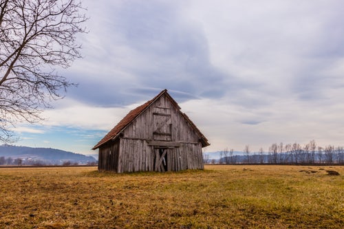
To grab this photo in full size, follow this link.
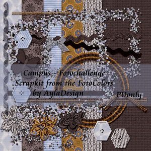
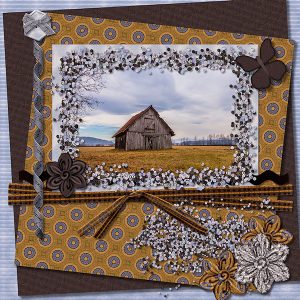
April 18, 2018 at 5:49 pm #18332I made a scrapkit from the colors of the picture and made a layout using the kit
I used lot of Scripts made by Cassel like , Quick tiles, custom kit buttons, folded flowers, ricrac script, knot 10, paperbutterflies, and a few more
everyone who want the kit for playing with
here is the Download link
April 22, 2018 at 4:30 am #18371Anja, this kit is beautiful! I love everything… Cassel’s scripts, tubes etc are amazing… we can create wonderful things with it.
Thank you so much for your generosity.
April 22, 2018 at 10:19 am #18379Thank you, Anja!
April 24, 2018 at 3:49 pm #18394Oh, such a beautiful photo. I guess I cheated. I dl’ed PSP but ended up in Filter Forge all the same ….. Thank-you, Anja, for this gorgeous kit.
 April 28, 2018 at 9:50 am #18454
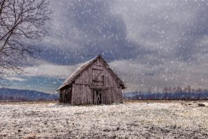
This is what I made for this challenge.
1_ I added frost and snow on the ground and roof following a YouTube tutorial from IrishActs – https://www.youtube.com/watch?v=uwpWMNkJA6w
It is very easy… Color Changer Tool (Tolerance=2 Edge Softness=20) Material Palette Foreground=White… Flood fill over the parts of the image you want.
2_ I wanted to darken the sky but didn’t know how to do it. So, first I selected the sky, promoted it to a new layer and then tried different tools… I finally got something I liked… Adjust > Brightness and Contrast > Highlight-Midtone-Shadow… Here I had to play with the numbers.
3_ Finally I added snow… This technique I learned from Cassel’s Winter Wonderland Masterclass. Great class.
Thanks to Cassel and the challenges I learn a lot.
April 28, 2018 at 10:23 am #18455Good one Cristina.
There is also a similar tutorial in this Master Class: Be the Master of Time
Bina, I find that top image quite interesting. Do you remember the name of the specific filters you used?
Anja, it is such a nice kit, and thanks for sharing it.
April 28, 2018 at 3:29 pm #18457Thanks, Cassel 🙂 I didn’t know this Master Class and from what I read is another wonderful class.
You have tons of great classes and if one wants to learn PSP, here is the perfect place. I will, whenever possible, become a Diamond Member, right now I am tempted to get the Time Masterclass Bundle. 🙂
April 28, 2018 at 3:40 pm #18458Oh Cristina, I didn’t want to “tease” you with the Diamond membership. I thought you were already a Diamond member. Didn’t realize you were a Lab member.
April 28, 2018 at 4:13 pm #18459I didn’t take as if you were teasing me with the membership but trying to help me and advising which class have all the information about this theme. 🙂
The Diamond membership is something that is in my mind since I joined the Campus, but I have to wait a bit… Meanwhile, I am very happy to be a Lab member… I am always curious to know which will be the new tutorials
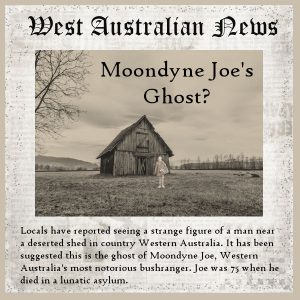
April 29, 2018 at 12:15 am #18472Here is my page for this challenge. When I saw the photo I thought the old shed looked a bit isolated and the perfect place for “strange” things to happen. I found a photo of Moondyne Joe which I thought could be made to look like a ghost, so I extracted it, added it to the photo as a new layer using the screen layer style, and then changed the photo using the Aged Newspaper effect which I tweaked by adjusting the saturation. The newspaper background was from a DSP kit Charming Victorian Garden. The newspaper itself and the story are, of course, completely made up – fake news if you will!
April 29, 2018 at 6:55 am #18475Anja …Bina … Cristina and Marlene …. you all have created great pages for this challenge.
best wishes,
Dawn.
April 30, 2018 at 3:37 am #18537Thank you, Dawn! <3 🙂
Marlene, very nice layout… I like the title font and the story too, even if it is fake news! Great idea!
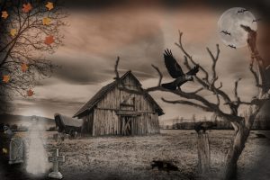
April 30, 2018 at 4:16 am #18539Marlene’s page reminded me of a Corel’s X5 tutorial for Halloween from 2012… It is called the Haunted House Collage and here is the link: https://www.youtube.com/watch?v=Q-d5j1JtabY
So I decided to watch it again and try with this photo. All the techniques I used were taken from the tutorial. Only for the tombstone, I used the Platinum Effect (Time Machine)
Techniques: Time Machine Effect – Use of Picture Tubes – Change the Brightness and Saturation of an image – Adjustment of the transparency – Airbrush (myst).
All additional photos are from the internet
May 2, 2018 at 5:47 am #18560I used the following: linear recession, watercolor or ink, sepia
-
AuthorPosts
- The forum ‘Challenges’ is closed to new topics and replies.


