Home of the Scrapbook Campus › Forums › Showroom › BOOTCAMP July 2020 › Reply To: BOOTCAMP July 2020
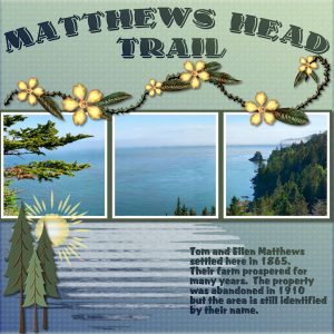
Carole … Yes, there is a definite legibility problem with the text but what I did to try and correct this was not done using a drop shadow. I duplicated the text layer, moved the duplicated layer below the original, used the Hue/Saturation/Lightness adjustment to make the text white (-100 saturation, +100 Lightness). I then tried two further adjustments … (1) moved the white text a few pixels to the right and a few pixels down, (2) using a second copy of the original white text, I did a Gaussian blur of 3. I kept viewing the results of first one and then the other. I eventually settled on (1) but was not satisfied even with that. The real problem is the background which has a slight embossing effect and blurring this would have made a big difference in the clarity of the text. I should have played around more with that and perhaps changed the font for the text. I just wasn’t feeling up to playing around with it. It’s always easier to use non-patterned papers but I so love designing and using patterned papers that it often makes problems with journaling that I wouldn’t otherwise have. ?


