Home of the Scrapbook Campus › Forums › Showroom › What are you working on (in Oct 2022)?
- This topic has 145 replies, 24 voices, and was last updated 2 years ago by
Ann Seeber.
-
AuthorPosts
-
September 30, 2022 at 10:18 pm #83888

It is a new month and new projects.
Show off what you are working on in October, be it a scrapbook page, a collage, a tutorial, or anything else you want.
We are curious and want to see, learn, and get inspired.
These threads are quickly becoming a fantastic source of inspiration, support, and friendship. Keep them coming!
Remember to size down your image to about 600×600 pixels and save in jpg format before posting it.
Here are a few guidelines for everyone:
- when you post a project, give as much information on your sources or techniques used. It will help others who are curious and would like to do the same.
- if someone uses something that you like on their page, ask where they got it. Sometimes, you can go get it too and it will be better quality than trying to extract it (as it would have been resized to post in the forum anyways).
- if it is something that they did from scratch, ask how they did it. It would be so helpful to everyone!
- if you like a photo and would like to “play with it”, ALWAYS ask permission. Sometimes, there are some limitations and the person is not allowed to let others use it. Don’t get them in trouble. Usually, people are happy to say yes (if they can) when you ask politely. And if you get permission, you might get a better quality image than the resized image anyways.
October 1, 2022 at 6:53 am #83923Happy October! Here’s my favorite of the big cats: The Caracal. (Love the ears!) Smaller than a leopard and slower than a cheetah, caracals can leap 10 feet in the air to capture birds on the wing. It roams deserts from Africa to India & Pakistan. They don’t make good pets. I posted a .jpg of this calendar page in our Facebook files.

-
This reply was modified 2 years, 1 month ago by
Ann Seeber.
-
This reply was modified 2 years, 1 month ago by
Ann Seeber.
October 3, 2022 at 7:49 pm #84081I’ve been playing around and today I spent the afternoon creating a pspimage of a federal highway sign. I was going to use my old Route 66 sign, but it wouldn’t do for not only different states, but different numbers. So, I played starting with the tutorial in Lab 10 Module 2 for creating an interstate sign. Instead of just working on the whole sign, I had to work on lower half and upper half, saving the text vectors for the state name in the top half and the number in the bottom half. This is my result.
October 4, 2022 at 4:23 pm #84126Mary very nice and I happened to make a interstate sign with the same tutorial. I just have to fill in the number when I want to use it on a project.
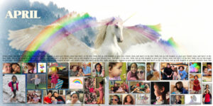
October 5, 2022 at 12:42 am #84134In addition to the calendars from the workshop, I had started work on Project 365 Double Templates from Andrea Gold. Although they are very detailed templates, I am using them to showcase the birthday of the month which is in the same theme as the wall calendars. This project will become a photobook.
At first, I was overwhelmed by having to come up with 365 pictures. Very quickly, I realized that the real problem was sifting through 1000s of pictures to narrow it down to 365.
The quote is:
Winter’s done, and April’s in the skies. Earth, look up with laughter in your eyes! – Charles G.D. Roberts.
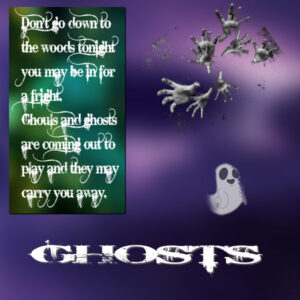
October 6, 2022 at 2:02 am #84167Hi, ghosts, you believe or you don’t. I’ve had a couple of close encounters of the spooky kind over the years; none of them sort. On the one occasion I was sort out by two entities, spirits, ghosts or whatever you wish to call them, that was quite a shock but ended amicably. I wonder how many will admit to having a close encounter of the spooky kind?
Thanks to Cassel for the little ghost tubes they may be coming in handy this month
October 6, 2022 at 10:03 am #84168Gerry, that’s a wonderful layout. I love the unicorn.
Colin, ghostly things freak me out. when I was a teenager, I was in the basement (where my bedroom was) and i saw something move fast out of the corner of my eye. Even the dog went to look. I thought it was a mouse but couldn’t find anything. I moved to the upstairs bedroom right after that. I don’t like scary stuff and there are two things I dont do…open the drapes to look out the window at night or look into mirrors when I get up in the dark of night to use the facilities. I’m always (even at this age- 57) afraid I’ll see red eyes looking back at me. Your layout is nice and creepy. love the faded out and smudged spots.
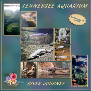
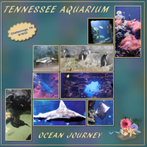
October 6, 2022 at 7:02 pm #84171Well, I know we are doing ghosts (Colin – that’s very creepy, ghosty and prepares us for Halloween), and finishing up on the Calendar workshop; however, I have been working on displaying some of the pictures I took in Chattanooga, TN a couple of weeks ago. These 2 layouts are from the Aquarium. We took so many pictures there, it was hard to choose what to display. This is my result. The font is AR Blanca and I chose to do cutout on them. The background is a halftone paper I did in one of the Labs. The cluster is my own taking the flowers and leaves from one of the kits (I think it was from DB Magnolia’s June 21 Summertime); the sea shell and starfish is from a picture tube and the ribbon is from PS, colorized. I did the Ocean first and thought the River should be a mirror copy as if the 2 layouts were a double page. The layout is mostly from a NicePng sketch of how to display pictures on a wall going up the stairs. Making the template was fun and involved math and a whole lot of guides – but fun. I also worked on most of the pictures especially with “sharpen” as the tanks were kind of misty (dirty?). Interesting how the aquarium is designed. We are sent up to the top and there are 5 to 7 layers. As you go down you see the fish (and a big turtle) which are comfortable at the different levels. They also show some of the animals that are air breathing, but like to play and forage in the sea (and some in the rivers). The ocean aquarium is in one building and the river aquarium is in the other.
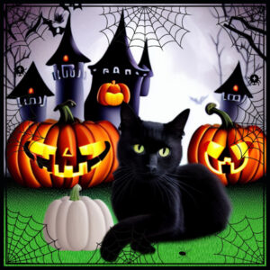
October 7, 2022 at 12:34 am #84176I played with Carole’s Halloween Spider Web Frame and thought it would be perfect to frame the black cat and spooky castle theme I worked on with the Spark program at Creative Fabrica.
October 7, 2022 at 1:13 am #84177Hi Love you all, your Art your work.
I been sick so hardly been on but Seen you all working on things, And I am going to try tomorrow to do somtmhing.
thank you Always All Carole Cassel.
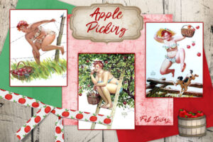
October 7, 2022 at 3:29 am #84179The game I make pictures for every day has been repeating old themes from 2015 so I’ve been cheating and basically reusing my old pics. I didn’t like what I did for this one back then so I decided to get creative and “scrapbooky.” Here’s today’s daily theme for my gaming group, Apple Picking. I absolutely adore Duane Bryers pinup, Hilda, who gave me the inspiration for this. I used a bunch of elements and papers from PixelScrapper (now known as DigitalScrapbooking) and Cass’s Wrapped Ribbon script.
October 7, 2022 at 8:58 am #84183Anita, I saw an email about Spark but never really understoood what it was. What is it? that layout is cool.
Michele, I love those pictures.
October 7, 2022 at 10:36 am #84189Thank you, Susan. Isn’t Hilda fun?
October 7, 2022 at 1:00 pm #84199I posted this in another Forum area, wrong place.
I teach tech classes to seniors (not so much during pandemic, of course!), and I like to have a desktop background that is fun or relevant to the season or day. My screen appears on a bigger screen so they can easily see what I’m doing.
Carole’s free ghosts got me going. I just love them! This is what I did.
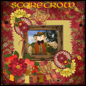
October 7, 2022 at 3:52 pm #84219Hello Carole, I have made a layoout for a challenge on goDigitalScrapbooking.com Forums with your template cass Hallowing Frame-Spider web and the kit: Friends In The Lord Paper Pack by Moore Blessings Digital Design
Scarecrow
October 7, 2022 at 4:38 pm #84223Michele your Hilda is great fun!
October 8, 2022 at 4:58 am #84235Thanks so much, Corrie.
October 8, 2022 at 2:54 pm #84247Lab 6-2
- Vector Flower
- String Tube
- Hand Stitched Alpha
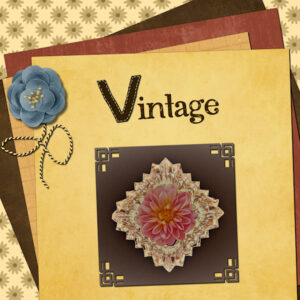
I really enjoyed making the vector flower and string tube. The hand stitched Alpha was hard and the stitching was as bad as my real life stitching. At tablet would surely be easier. I do like learning the settings for add noise, so that’s well worth trying to draw straight lines with a mouse. The photo is mine and it’s altered with an unknown program on my computer. I had never been able to view RAW files (Canon CR2 files) unless i was in PSP and now I can in windows. It only shows the raw files, the jpgs show up in MS office viewer. In looking for what program it is I found all these color edit modes and filters, really simple ones. This is a photo I just played around with and thought it looked Vintage-y. I also used paper stacking from the recent blog post.
oops forgot, font is Amifunky from Creative Fabrica and blue flower from Digital Scrapbook.com, corner stamps on the photo from Creation Cassel.
-
This reply was modified 2 years, 1 month ago by
Susan Ewart. Reason: forgot something
-
This reply was modified 2 years, 1 month ago by
Susan Ewart.
October 9, 2022 at 2:04 pm #84267I’ve been busy in the Lab 12 Module 10.
I tried the Bat Shape, but it didn’t work. I’m not that handy with the Pen tool. It’s also not my thing to make elements myself.
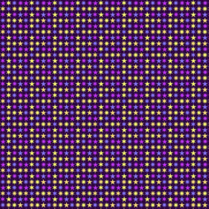
I did try the Multi Stars Pattern. I just wasn’t sure yet in which project I could use it, so I made a background with it for the time being to be able to show it here.
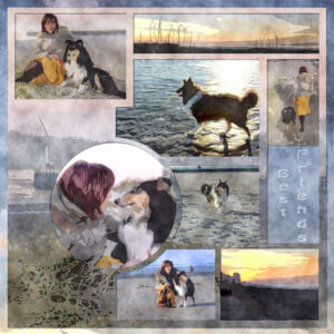
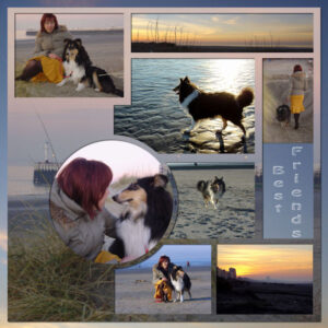
I’ve been working on the template for a while. I like that.
When it was finished, I also wanted to see what I could make of it with Filter Forge.
These are the results.
These are photos from 2005. The dog in the photo died in 2016. He got me out of depression at the time. I love my current dog Poncho, but I still miss Enzo, he was a great support to me.October 9, 2022 at 2:11 pm #84268Mary I like your layout with the aquariums and the colors of the background.
Anyta, Michele, Julie, Colin, Louyse, Susan what a nice results.
October 9, 2022 at 2:43 pm #84271OMG! Marie-Claire. I love that template. I have Filter Forge but have not tried making templates with it. I love both versions, I think FF one is my favorite though. The softness of the background is really effective. the photos are nicely painterly. Did you do the template and add the effect to the template, then added the photo’s that you added effects too, or added the effects to everything at once.
October 9, 2022 at 3:56 pm #84274Thank you Susan ! I added the effect of FF when everything whas done in PSP, photos included . When everything whas done I merged all layers , then filterforge.com/filters/7227.html
October 10, 2022 at 12:51 am #84283Marie-Claire – like your work – interesting to apply the FF to the jpg. I like it.
Susan – your Lab 6 mod 2 came out great. That string tube was heck to create, but is fun to use.
Michele – your Hilda is a hoot! Lots of fun!
Anita – your Halloween layout is really cool – like that big, black cat.
Louyse – like your Scarecrow – reminds me of “The Wizard of Oz”. The Wizard of Oz didn’t scare me, though it scared my daughter as she saw it when she was just a wee one. I didn’t get to see it until I was 17, so the flying monkeys and the witch didn’t scare me.
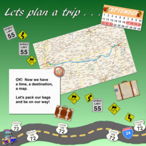
So I’m working on making a sort of travel challenge of my daughter’s and my trip to Chattanooga in September. This is using Lab 10 Mod 2 to create the Planning of the Trip. AR Blanca is the font. The month tag, ribbon of road, interstate highway sign are the requirements of this module. Made pspimages of each of them before the jpg images so that they can be reused later. Background paper and the map are mine (the map is from Microsoft Streets which I still use to plan trips. The car clip art I have used before for travel challenges. Not sure that the layouts of this trip will have a “theme” except that they are of the trip.October 10, 2022 at 1:02 am #84288Hi, Lab 6 02 with a poke a dot background, flowers, a string tube, patch alpha’s with white stitching (dusted off my old Wacom tablet for that) plus photo of my youngest from 2003. Not one of my better efforts but I got the lessons right just didn’t assemble it very well
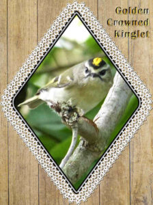
October 10, 2022 at 4:56 am #84293Trying out Carole’s new tatted frame. I had trouble trying to color the tatting part until I selected it with the magic wand. Not sure if there’s a better way. Part of my Angry Birds collection.
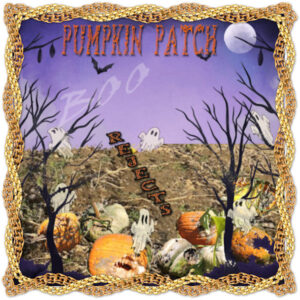
October 10, 2022 at 3:02 pm #84313Here is what I have been playing with. The background is from Watercolor-Halloween-Background-35226107 The ghost is from Retro-hippie-groovy-Halloween-Bundle-36687802 and I duplicated one and edited it several times. The title font is Tribalcase . The frame is from a freebee that Cass shared with us. cass-GoldChains-2-Frames. The pumpkins are from photos I took from my churches pumpkin patch after they had removed all the good ones.
October 10, 2022 at 3:14 pm #84315Just messing around with Marisa Lerin’s free mini kit, “Enchanting Books”. Bows are one of Carole’s scripts. Photo was found on-line, Creator: Wavebreakmedia | Credit: Getty Images. Dr. Seuss quote.
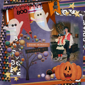
October 10, 2022 at 3:52 pm #84319A little Halloween…Kit is from Gina Jones of Pixel Scrappers- October bundle
Photo is of my sister, Sylvia and my son, Tony from a VERY long time ago. Tony would have been 40 last August.
October 10, 2022 at 7:25 pm #84324I wasn’t real happy with my last posting, so I changed it up a bit. The additions are picture tube of road signs; suitcase fro PS-Jessica Dunn and beige suitcase from PS – Marisa Lerin; the flair button is from PS – Marisa Lerin.
October 11, 2022 at 7:28 pm #84358Master Class “Halloween Effects” After a bit of trouble with PSP I finally got through the class
-
AuthorPosts
- The forum ‘Showroom’ is closed to new topics and replies.


