-
Posts
309 -
Joined
-
Last visited
-
Days Won
2
Everything posted by Anita Wyatt
-
Here is my final page 7. This one was very hard for me to do. I found a fat font on CF called Fat Kat, the papers are from CF, the cluster and elements are from Digital Scrapbooking and the picture is mine. I enjoyed this class and I learned a lot. I will need to practice more with the day 7 tutorial. You all did a wonderful job and I enjoyed looking at your artwork. Thank you Carole for your patience and guidance.
- 339 replies
-
- 10
-

-

-
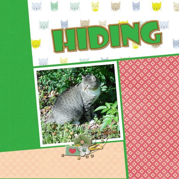
Here is my day 6 showing our cat Calico Tom. (He was not a calico, but somehow the name stuck). He traveled to the Rainbow Bridge a few years ago, but he will remain in our hearts forever.Papers and cluster are from Digital Scrapbooking. I added the heart shape to the cluster. Font is Showcard Gothic. I used the rope from my picture tube file and resized it. I am really enjoying this workshop and the beautiful projects that all of you are posting here.
- 339 replies
-
- 10
-

-

-
Here is my page 6 showing our cat Calico Tom. (He was not a Calico, but the name somehow stuck). He traveled to the Rainbow Bridge a few years ago but he will remain in our hearts forever. Papers and cluster are from Digital Scrapbooking and I added the heart shape to the cluster. Font is Showcard Gothic. I am really enjoying this workshop. luster.
-
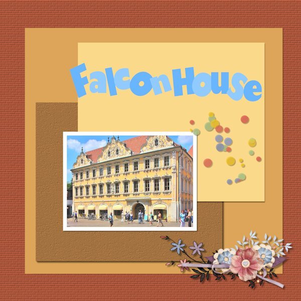
Here is my page 5:The Falkenhaus (Falcon House) is an iconic building in downtown Wuerzburg with a bright yellow rococo façade. The building was severely damaged during World War II, before being reconstructed using old photos to match its historic appearance. This 18th-century guesthouse today contains the tourism office and the municipal library. I used to spend a lot of time in that library. Font is Gil Sans Ultra Bold, scatters and cluster are from Digital Scrapbooking, and papers are mine. I used the brick texture on the red background and cork on the brown paper.
- 339 replies
-
- 10
-

-

-
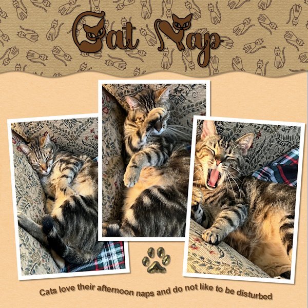
Here is my day 4. Papers and scatters are from Digital Scrapbooking.The fonts are from CF:Cat Mischievous and Blinten. Photos of Siegfried are mine. I caught him sleeping so peacefully, until I woke him up as I was taking his picture. He was not amused.
- 339 replies
-
- 13
-

-

-
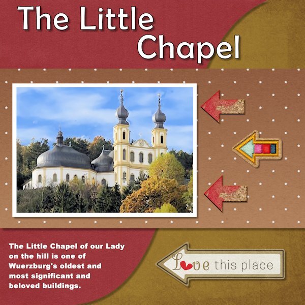
Here is my Day 3. I used one of my photos of the Little Chapel, called "Käpelle" which means little chapel.This small pilgrimage and sanctuary church is located high above the my hometown Wuerzburg on the mountain next to the fortress. Papers and elements (arrows are) from Digital Scrapbooking. Font on top is a simple Windows font, Berlin Sans FB.Thank you Carole for helping me out when I got stuck in adding drop shadows and showing me that I had to merge groups before I could add a drop shadow. I am still having a hard time with some of those and I will have to work on that. I think my drop shadow around the red part all of a sudden looks a bit blue, even tough I had black selected as a color. Also thanks for the tip about saving in compatible mode when using wrapped text.
- 339 replies
-
- 11
-

-

-
Here is my Page 2 of the Text Workshop. Our cat Bella loves to check the bookshelves for some interesting stories. I enjoyed playing with all the different fonts: Anberta, Calisto, Cherly, Black Chancery, Cat Paw, Arienne, Cat Paw, Brush Script, and Hesthia Austine. Some items are from Digital Scrapbooking.The cat and books are mine.
- 339 replies
-
- 14
-

-

-
Here is my text for day 2. I am still working on the project where I added this text and will hopefully finish it this evening.Used some kerning. This text class is fun. Fonts used: Anberta, Calisto, Cherly, Black Chancery, Cat Paw, Arienne, Cat Paw, Brush Script, Hesthia Austine, and I added drop shadow.
- 339 replies
-
- 13
-

-

-
-
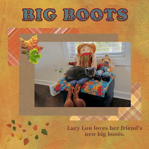
Here is my Day 1. My friend sent me a picture yesterday of her cat Lacy Lou and when I saw it, I asked her if if I could use the picture for this workshop. I noticed that after I added the background paper the blue text seemed a bit darker, even though I had used an opacity of 65. Papers and leave scatters are from Digital Scrapbooking and font is Cooper Std Black. (Thank you Carole). I used the clip-it mode to fill the shapes around the picture, but realized that after that the layers formed a group and 1 could not see the drop shadow that I added. However, I had a lot of fun playing with this layout and I am learning something new every time I join a workshop.
- 339 replies
-
- 12
-

-

-
I am in also. Could not do the one last year due to eye issues and am looking forward to try again.
-
I am in too. I find it hard sometimes to apply just the right shadow and this workshop will help a lot. I may be slow in completing the daily assignments as I am just recovering from my right eye band keratopathy surgery. This has to be done before I can have cataract surgery due to the calcium buildups. The left eye went well and then I had some problems with the right eye which and am taking meds for that. It is slowly getting better and I have a great team of doctors. It hurts when I look at the computer screen for a long time. and the right eye is still a bit blurry. Please be patient with me. I will try and do my best and I am looking forward to see what all of you are creating with the shadow effects.
- 262 replies
-
- 10
-

-

-

-
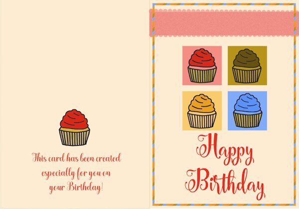
Here is my Lesson 2 Greeting Card. The Font on the Front is CF Carolina Script, and the font on the back is CF Halgeta.
- 356 replies
-
- 12
-

-

-
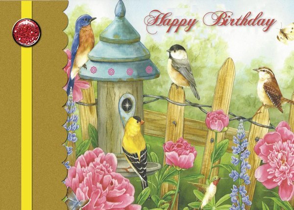
Answer to Carole's question above: I scanned the picture on one of my Birthday cards for Lesson 1. I am behind on all the lessons due to 2 tornadoes and golf ball size hail hitting our area in Temple and Belton TX on Wednesday May 22. We were out of power until yesterday evening and have a lot of clean-up work to do. Lost 2 trees, many tree limbs and need a new roof, but we are thankful that we and the cats are OK. Many people and businesses lost everything . I will keep working on the lessons, they will help me think of other things than tornadoes.
-
Here is my Greeting Card Lesson 1: I used a cover from one of the Birthday cards I received over the past years. The font is one of my favorites "Chase CallasSH. I don't remember where I found it a long time ago. Following Carole's tutorial I learned a few new tips. I took this workshop in 2022 and it is so helpful to get a refresher workshop.
- 356 replies
-
- 20
-

-

-
It has been a while and I forgot what maximum file size of our projects we can post here in the forum. I just completed my day 1 and was ready to resize it for the forum and it will not post if the file size is too large. Thank you. I just found out file size is up to 500 kb.
-
I'll be there and looking forward to it.
-
We live in Belton TX which is right next to Temple TX and in the path of the eclipse..My husband will watch it with his solar eclipse glasses. I am not able ti watch it due to the sensitivity and problems with my eyes and I do not want to take a chance even with the special glasses.The fur-kitties and I will be inside and I will calm them if they think it is too early to get that dark outside. Quite a few years ago we watched the eclipse in Germany when visiting my Mom. We watched it from her balcony. It was amazing. I will check if I have any pictures. I remember it got very dark and quiet in the city.
-
It is absolutely beautiful and a wonderful gift of memories for your family.
-
Lesson 7 as a double page combining Lesson 5 and 7. I really enjoyed this workshop and learned a lot about selections, masks, creating a layered template and double pages. Thank you Carole!
-
My Lesson-7: I followed Carole's tutorial and used Day 5 as the first page. On the second page I used horizontal rectangles and made them just a bit larger as my photos were larger also. I am posting both pages and will try later to combine them into a double page. This has been a great workshop. Thank you Carole and everyone here. Your artwork inspires me.
-
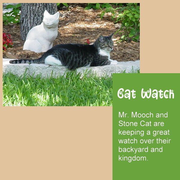
Changes to Magazine Lesson-2: Changed color of mat behind text to green from blue to better match the photo. Will be working on Lesson 7. I have enjoyed this workshop very much. Thank you Carole!
- 374 replies
-
- 10
-

-

-
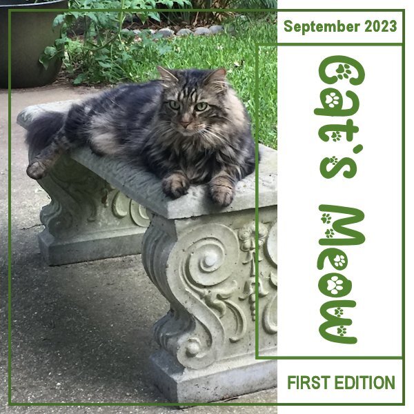
Changes to my Magazine - Lesson 1: I added the Date on top and FIRST EDITION on bottom. Font is Arial Narrow. Then I changed the frame colors from blue to green. Made the larger frame just a little bit darker green than the small frame.
- 374 replies
-
- 10
-

-

-
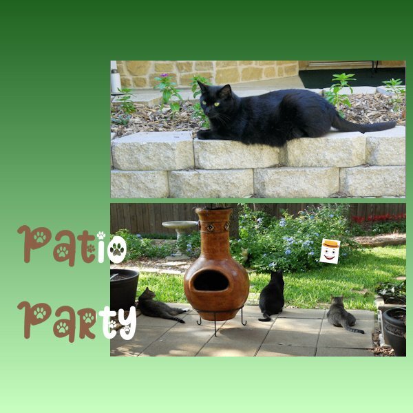
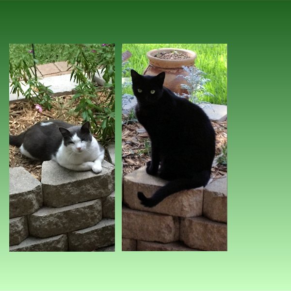
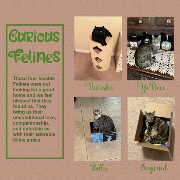
Here is my Day 6. This was a hard one for me, it is not perfect yet, but I am trying. Had a difficult time with text not showing until Carole reminded me to convert the text layer to raster. Even than PSP was acting funny and would not convert. I tried it with another sample and it worked OK. After stepping back a bit to get my energy back, it finally worked. However, I detected just a tiny border around the text, not the larger left side rectangle, just around the story text. After trying to get ride of that, I decided to leave it alone before messing up my whole project more. My photos were not quite the right size so I made them fit and deleted the grey area. My project showcases : Natasha, YaPurr, Bella and Siegfried. Because I had extra spaces below the photos I decided to add their names. Font used there : Amberto Bold. Font for Title as before Cat Paw. Added brown background with texture: Crumbled.
- 374 replies
-
- 13
-

-

-

-
He is so handsome, I love his facial expression. ? Thank you for sharing.


