-
Posts
3,097 -
Joined
-
Last visited
-
Days Won
44
Content Type
Profiles
Gallery
Forums
Everything posted by Corrie Kinkel
-
Ann isn't that often the way we learn more or better when we are somewhere we hear and have to try to speak a foreign language! Sadly this isn't the case for math or physics.
-
Nicely done! I almost used the same Wildwood Thicket and already had some papers on my template, but in the end decided to use something else. I love the work of Jessica Dunn.
-
Donna good idea to change to character shapes and your green looks indeed like grass, at least on the resized version.
-
Well I don't care as long as they will fix the text and textwraping problem!
-
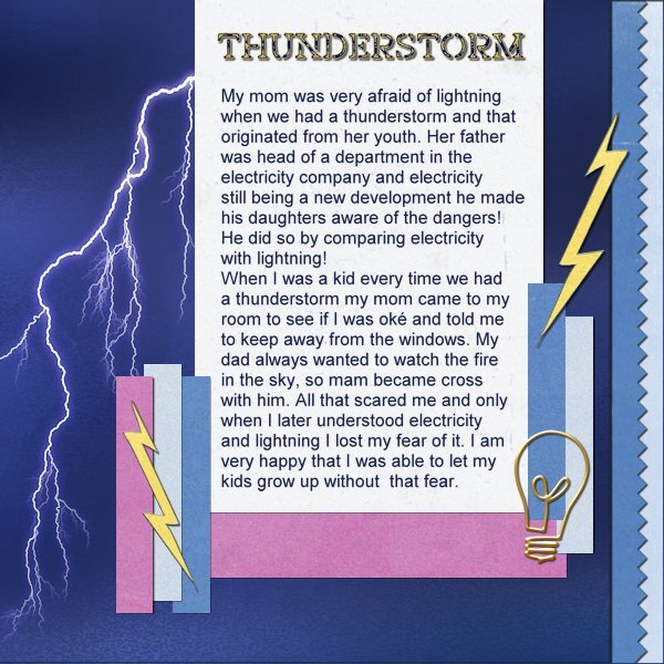
Day 6, but I used the template-day-5b because that fitted better with what I had in mind. I wanted to use fear for lightning as my topic for day 6 and I have a couple of overlays with a flash of lightning and this one fitted best. It is a simple page with papers from Jessica Dunn with some noise from me. The yellow flash is by Janet Kemp and where I got the lightbulb, no idea. The title font is Off War Stamp, text is ariel.
- 229 replies
-
- 12
-

-

-
Daniel you are right about no new PSP version, according to Carole that is because there were so many problems with it. We had updates on the program since and the latest update fixed most of the glitches and bugs, but created a new one with the wrapped text function and not being able to get back to edit your text. It is a real nightmare!
-
This one I saw on FB and knew immediately it had to be by you, who else?
-
When I was a kid we always had cooked liver once a week, which I didn't liked but my parents always told me I had to be grateful for the food they put in front of me because in WWII they had to eat tulipbulbs to stay alive. The only foodbattle I won was about rice. After being wedded to my husband I never cooked it myself, luckily he doesn't like it as well.
-
I'll take some parmesan cheese most of the time on my spinach when I'm home. But sugar 😝
-
Yes that was magical, did you see Celine ion perform at the end of the ceremony? English has some difficulties for those who want to learn the language, especially writing can cause embarrassing situations! Thank heavens for the spellingchecker and google translate.
-
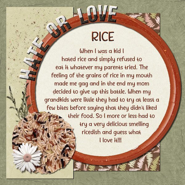
Although it is very late over here I just finished this day 5 about my hate/love of a simple food as rice. It took me a lot of time before I had something I can live with. The papers and flower + leaves are from the blogtrain of july 2021 by DB Magnolia, the font is Avelyn and the letters are MarisalScraps. The dish and the rice grains come from Pixabay.
- 229 replies
-
- 12
-

-

-
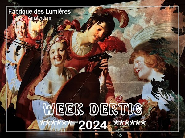
My cousin and I took a daytrip, something we do once a year and this time we went to Amsterdam. We wanted to see a multimedia spectacle about the old, world famous Dutch painters. The event takes place in an old, abandoned gasworks and is called Fabrique des Lumières. The makers used over 325 artworks from 50 different Dutch painters from the 17th century onwards. There were big laser projections on the walls, roof and floor of the building with an explosion of colors accompanied by music fitted for the topics presented like cityscapes, warscenes, romance, still lifes, flowers and it ended with Mondriaan in New York with the Boogie Woogie. It felt as if we were walking through the paintings. A great experience!
-
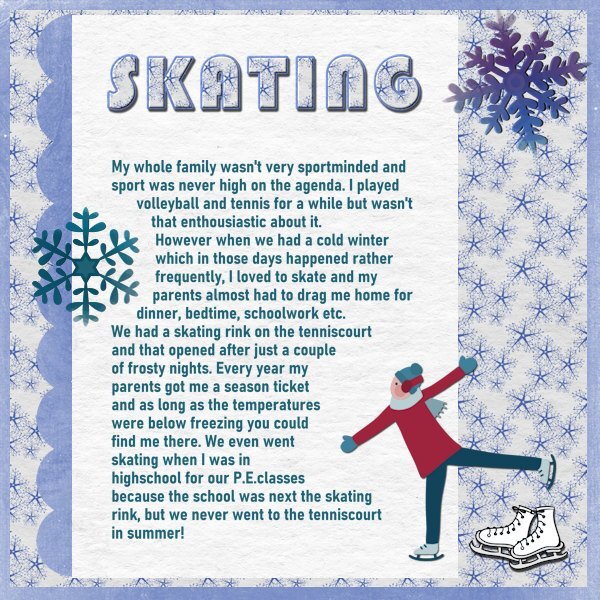
For day 4 I used the template from day 3; for day 3 I used the extra template for the diamond members. For a long time sports didn't play a big role in my life, my whole family had no interest in sports at all. Most of them, including my parents didn't have a car in those days and we all lived in Rotterdam, so we walked, used a bike or a ride on the tram. Maybe that is why I like to walk and I still use my bike almost every day, just to go get the groceries, go to the pool etc. I started swimming every week almost 25 years ago when there started aquafit and fiftyfit classes in our pool and I intend to keep doing that as long as I can. With a friend I go for a walk each week, although the weather is not playing along this year. For this page I made the title with 2 papers as was explained on day 3, where I didn't use that technique. The papers are from Wintermorning by DB Magnolia and the rest of the embellishments come from my stash. The title font is Bauhaus and the text is Bahnschrift.
- 229 replies
-
- 11
-

-

-
I'm sorry in the end it didn't work when I tried to correct a typo that I had specially made because I wanted to test it. We have to hope that Corel will fix it!
-
Yes I did. Normally I do: make selection - type my text - deselect - duplicate - change to raster and at that point it goes to one line . So now I did: make selection - type text - duplicate - change to raster - hide vector - deselect. To my utmost surprise it worked. Later this evening I will try if I can go back to the hidden vector text to change maybe a typo, or just alter a word. I sincerely hope it will still works. I'll let you know, but firstly I'm going to watch the opening of the Summer Olympics on the telly.
-
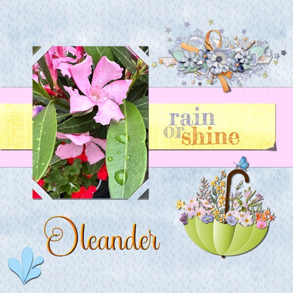
I started this layout last saturday but with the story workshop and a very busy week I just finished this one. I wanted to make the lifted corner by hand, but I'm not entirely happy with it. Next time I'll probably go with the script that I have. However I used the cass-SlippedInCorner2 which I won last week! I tried all the different options but settled here for this one. Script is nice and easy to use, love it! For the background I made an overlay with raindrops. Somewhere on the net I saw an umbrella adorned with flowers and made this brolly myself, just as the watersplash. The cluster is by Jessica Dunn and the rain or shine text comes from my stash. The title font is Star Bright.
-
Thank you I didn't use it but downloaded it for future use in case I need something quickly
-
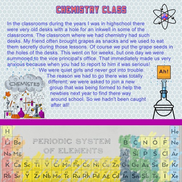
I never was a very naughty child and as mischief is concerned I can't remember much else as ringing the bell at someone's house and running away before they could open the door. I think almost everybody has done this. But in highschool my friend and I had a narrow escape and were almost caught. Yesterday I was away on a daytrip, so I'm running a bit behind and I'm still working on this week's challenge too. This layout has a background paper called Periodic System by Melo Vrijhof, just as the erlenmeyer and test tube. I made the extra "periodic" tile because I saw it on line and it fits to my theme. The atom is from kissping and the chemistry element I found on Freepik. Title font is School & College Outline. I have mentioned I have the same problem as others with the wrapped text in 2023!. I think that maybe I have found a solution. This time I made the selection for the wrapped text, typed my text and before I did anything else I duplicated the text and converted the duplicate to raster, which to my surprise indeed worked. Next thing was hide the vector layer and last deselected. I could resize to 600 for posting. Tomorrow when I do day 4 I'll try this again. But I wanted to mention this here already for others to test my theory.
-
This looks delicious. Over here we didn't had that tradition of eating turkey for christmas, it was mostly rabbit. Later we tried turkey but I'm not a great fan of it, if not prepared correctly it so quickly gets dry. Pheasant I have never eaten, I don't think it is available here, never heard about it either.
-
You did a fantastic job but I like this version better. The cards are a bit darker and look more used than in the first version where they are rather white. The metallic elements look great!
-
Julie I love carrot cake and had a piece today when I was on a daytrip with my cousin. I have backed them myself but not any longer. It is just my husband and me and hubby isn't a fan of carrot cake, so I eat it when I have an opportunity like today.🥕
-
My name really is Corrie and over here that is short for Cornelia, my parents only used my full name when they were very cross with me!
-
Wow that is quite an achievement! No simple reading stuff as well.
-
My mom and dad together with my aunties and an uncle were very fond of the cryptic crossword puzzle that was in the Saturday edition of our newspaper. There was a lot of rivalry between the different families and most of my cousins were involved too. I'm by far the youngest of all and of course I wanted to be involved too. So my parents started to explain to me how I should think in a different way. There were much simpler versions and I liked the to solve those riddles and started to ask them to let me try their puzzle too. I still know how it felt when I could solve a riddle they hadn't: triumph! We used the dictionary and some other books to find the answers, a lot of pencils and erasers were in use and many telephone calls to the rest of the family. Lab 14-3 has a tutorial about seamless pencils which I had made and could use here. The old fashioned telephone we used in those days is from Digitalscrapbook.com and the lightbulb is by Melo Vrijhof. Font is Table of Contents and the rest of the elements comes from my stash.
- 229 replies
-
- 13
-

-

-
Yah it is a nuisance and I have the same problem. I use 2022 or type my text without the wrapped function, but I have to hope that I have no typos/misspelling. And both happen to me often as everybody can see in my posts😢


