-
Posts
27 -
Joined
-
Last visited
Content Type
Profiles
Gallery
Forums
Everything posted by Sue Booth
-
I was away, have done them now.
-
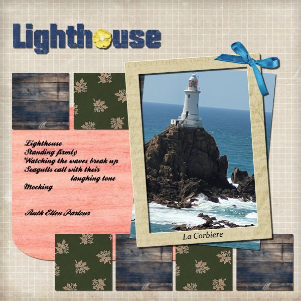
Here is my final project, hope you like it. Disappointingly tried to download some scrap book papers but they just came up as an image of the kit.
-
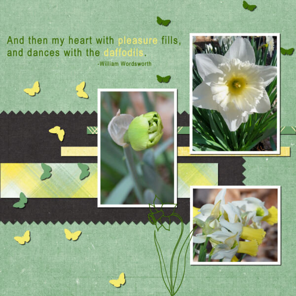
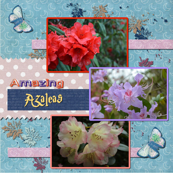
Day 4 (I am a bit behind as I was away at the weekend) I selected some photos from a trip last spring to gardens near us, and the papers were a variety from cpjess. I have varied the shadow a little, and changed some font colour but I only have so much patience and time!!
- 221 replies
-
- 10
-

-

-
2024 3 20 Day 9 Project 4 Daffs again 600.jpg
Sue Booth commented on Bonnie Ballentine's gallery image in Bootcamp - Project 4
-
I love that you are doing each lesson with same colour scheme and puppies - it will make it easier to focus on new techniques and not spend ages hunting for photos and papers. These look great!
-
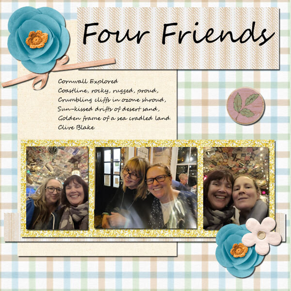
Can't always access the same resources as shown in the video, but I have downloaded some. This was last year when we had a nurses reunion in Cornwall, so a found a poem to go with it. Lost the will to live as it crashed on me twice (did that last night) so haven't changed the drop shadows between elements, but it was interesting how to do this. Are there still the download sheets for each lesson?
- 221 replies
-
- 11
-

-

-
I think I may have posted in wrong thread. Project #3, 'Adventure'. I was away for the weekend so catching up now
- 221 replies
-
- 12
-

-

-
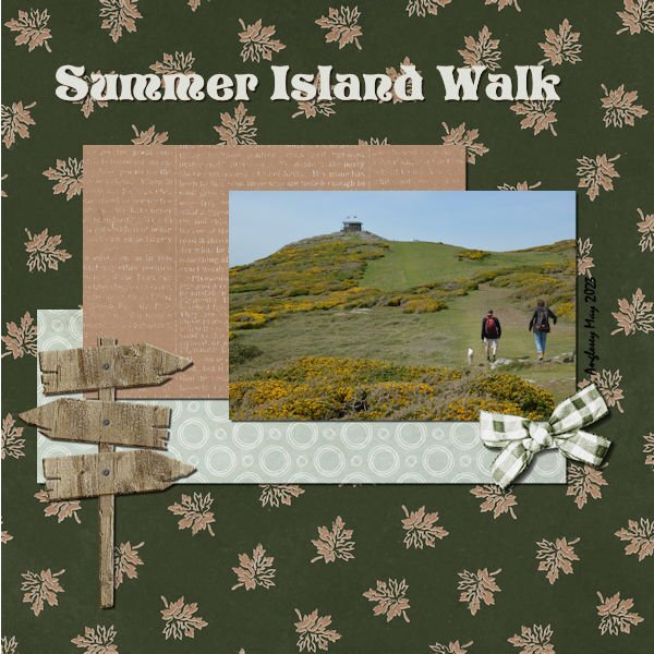
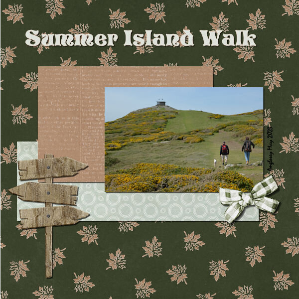
Project 2 - 'Adventure'. Took a bit more doing, as lost it all halfway through. This is from a long weekend last spring with daughter, hubby and dog. Downloaded a nice set of backgrounds, but I think it may be a bit dark and fussy to have writing on.
-
-
- 221 replies
-
- 12
-

-

-
I think I prefer the first, as the pink design reflects the green one behind the image. But it is all personal choice! Lovely layout
-
oh would you look at that!!! Thanks!!!
-
aah - group, that makes more sense (like in Office).
-

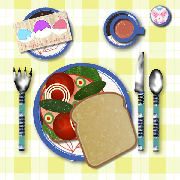
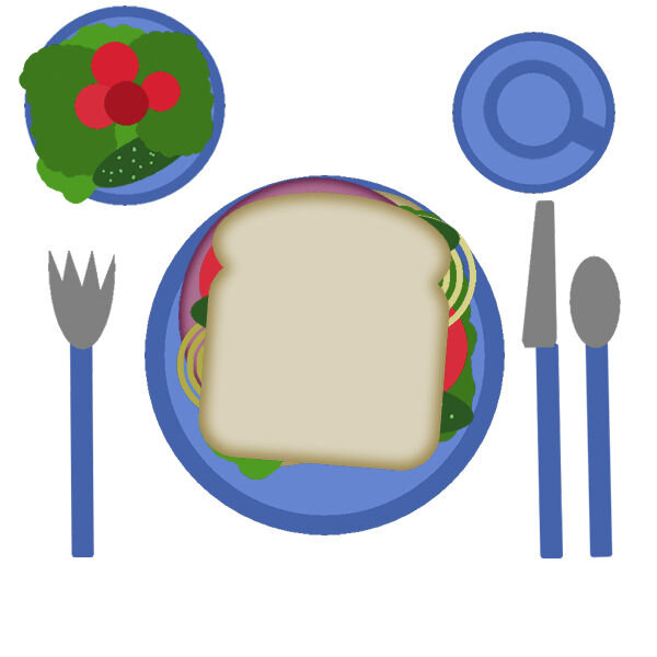
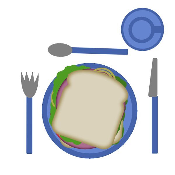
table and sandwich 600.jpg
Sue Booth commented on Dee Morris's gallery image in Bootcamp - The Sandwich
-
-
-
-
...and in reply to top comment (can't work out how to include quote in my reply?) Yes, I was in 'complete' workspace.
-
Ah I didn't think about changing colours! But I have not added any pickles - yuck! The tutorial is missing the last stage, where you stick all the layers together (merge/ flatten). I also seems an awfully long winded way of adding layers. Is there not a way to link them together, and move as one stack of images? Or am I ahead of myself?
-
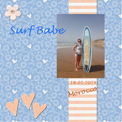
Hi all, my workspace only offers 'Photography' or 'Essentials' (as I am on PSP 23) - which one should I choose for this bootcamp? I have gone for mid grey with white background for the workspace. My photo is from a recent week in Morocco; not sure what to expect so not sure what other photos I will use, but I took plenty!!!


