

sharon thompson
-
Posts
58 -
Joined
-
Last visited
Content Type
Profiles
Gallery
Forums
Everything posted by sharon thompson
-
-
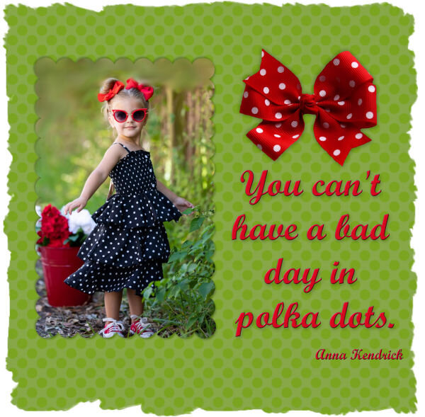
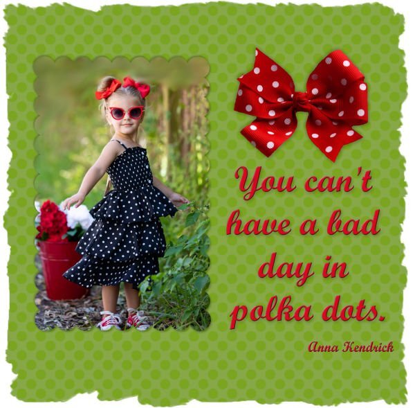
Day 7 - There is just something fun about polka dots..... No problems with this one. I used a soft light blend mode twice on the dots for the paper. The bow is from Pngitem.com & the font is Script MT. As for that day 3 assignment that gave me so much trouble, it was, as suggested, a mistake on my part. I did click on greyscale rather than negative image and that was my undoing. I did redo the image but, to be honest, the blood splattered paper that I wanted to use did not compliment the rest of the elements. The error ridden image one that I posted earlier is, in fact, the better result. So much for happy accidents or, in my mistake, stupid blunders. Thank you to Casell for all the great mask lessons. Now if you have any beginners brush lessons.......... Many thanks. Sharon

- 359 replies
-
- 16
-

-

-
Are you actually installing all your fonts? I loved the older versions of PSP where you could open a font in your workspace & it would show up for your use in your PSP font menu. When you were finished with it, you could close your project, including that open font. That way fonts did not have to be permanently installed. When newer PSP versions no longer had that neat trick, I snagged a freeware thing called FontLoader. You use it as a little stand alone program and browse to your fonts folders and add the fonts that you want to use to it then tell it to load them. It loads them into the font part of windows so they show up in any program that is set to use windows fonts. So, if I put a font into FontLoader, it will show up in PSP, Photoshop, Word, Wordperfect, Open Office etc. When you finish your project and shut down the program you were using, you then unload the font from FontLoader. That way, you can have thousands of fonts stored in a file somewhere, and only temporarily load the ones you need. It keeps your font lists inside programs short and manageable. And, since you can organize your fonts anyway you want in your computer files, it is easier to find a suitable holiday font, handwriting font, grunge font, fat font, etc. I also use FontRunner to show me samples of what all the fonts in a specific folder will look like (using "the quick brown fox jumped over the lazy dog" sentence as the sample). Both of these freeware programs are small and very simple to use so you can manage thousands of fonts easily. You probably don't need an intervention as much as these two little portable tools.
-
I convert abr files to a series of pngs using the abrMate freeware. Then I manipulate the pngs with all the PSP tools like any other png. For some things, brushes make more sense and are easier to use but, a lot of the times, pngs are easier to use since you don't have to deal with all those brush settings. Plus, if you have a lot of brushes, you can easily find a specific png in your files rather than scrolling through all the imported brushes. Just a personal preference. I am sure that there are many who adore brushes & can use them with ease.
-

-
Day 5 - I loved that linoleum effect though I had to make it a bit more subtle as I was using the same color as the photo background and mask. Added a small frame to make things pop out a bit. I don't remember where I got the butterfly photo, probably from a naturalist site, but the kaleidoscope of butterflies (yes, that is what a group of butterflies in flight is called) is from Pngitem.com and the font is MingLiu from Fontsgeek.
- 359 replies
-
- 16
-
-
-
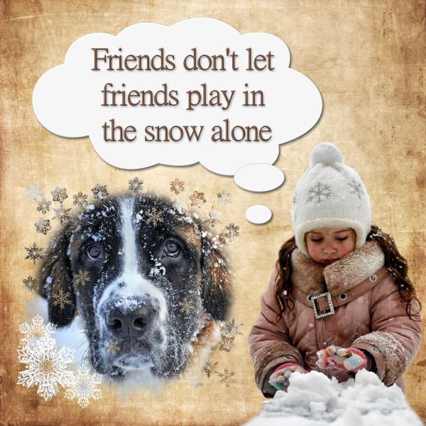
Day 5 - Am caught up now. Unfortunately, paint brushes are not my favorite tool. All their specific settings can be frustrating at times. Maybe that is why I make pngs of all my brushes & use them that way. Anyway, I had to do this assignment three times in order to get snowflake brushes as part of the mask. The photos are from Pixabay and HClipheart,, the background paper is from Freepik, the snowflake brushes are from Deviant Art, and the font is MingLiu from FontsAddict.
- 359 replies
-
- 15
-
-
-
Day 4 - Am a bit behind but hope to finish 2 assignments today to catch up. I used a watercolor brush from Sweetpoison over at Deviant Art (they have such intriguing names there). It took a couple of tries to get it right and I did cheat by placing the photo to one edge. Then I got the bright idea of using another photo as a background paper. The background that was being masked out was a bit dark so it doesn't really blend that well with the background photo but at least I got the concept right, I think.
- 359 replies
-
- 16
-
-
-
Thanks for the help Julian. My optimizer box is set up a bit differently but it does the same thing. When I took my first PSP course, the first lesson was on how to set up the workspace, arrange all the icons, and what settings to establish as the usual ones to use. I never changed the compression rate after that and forgot all about it. Just goes to show that I really should have bought the PSP for Dummies book after all. Again, many thanks. Sharon
-
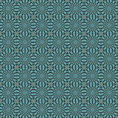
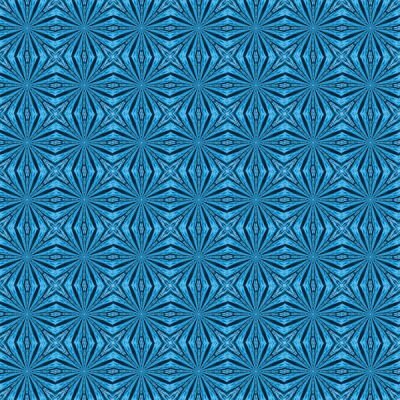
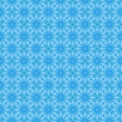
I said that I didn't care for the Kaleidoscope effect but that doesn't mean that I didn't try it out. Interesting results but too busy for my papers. The 600X600 pixel jpgs were large for some reason & would not load so I resized the to 400X400.
- 359 replies
-
- 10
-
-
-
-
I tried that and I still was stuck. Even if I add a colored image above it, the colored image turns to greyscale. I saved then exited the image and then reopened it and got the same thing. There is decidedly a gremlin somewhere . I decided to make it into a jpg & work from there.... more restrictive than I would have liked but you work with what you have. I shall try again from scratch later tonight or tomorrow morning. Sometimes the little grey cells need food and sleep to function better.
-
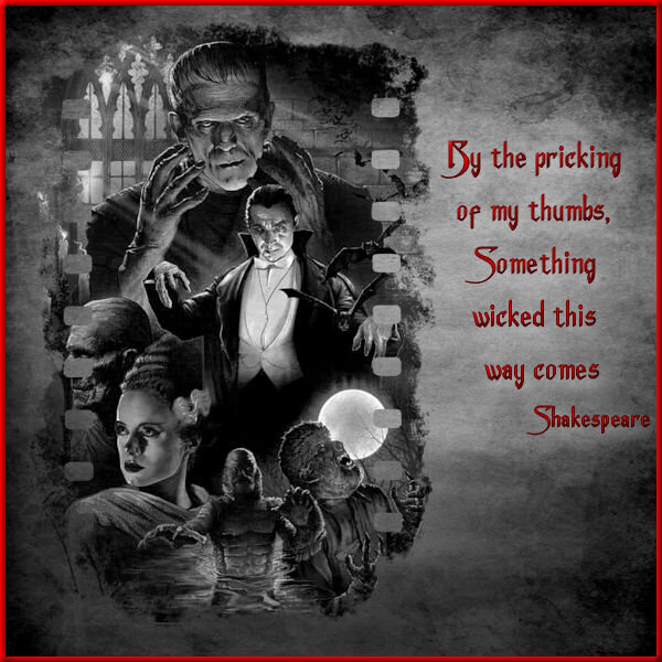
Day 3 - Still can't figure out how I locked that color palette for my project but decided to work around it. If anyone can help sort that for me, I will redo the project but with a colored background paper as originally planned. I flattened the image & exported to a jpg and then reopened it, treating it like any other jpeg & then finished the lettering & border. That restricted my background to b&w instead of the red bloody splattered grunge paper that I wanted but, it seems to work. I did have to change the quote though as my original choice went better with the bloody paper. The film style mask is a snag from Pinterest, the monster collage is from a horror movie archive, the paper texture is from Freepick, and the font is Anger Styles from Dafont. I am not a fan of the kaleidoscope effect but that is just a personal preference. I am too busy making more plaid patterns from yesterday's lesson.
- 359 replies
-
- 13
-
-
-

-
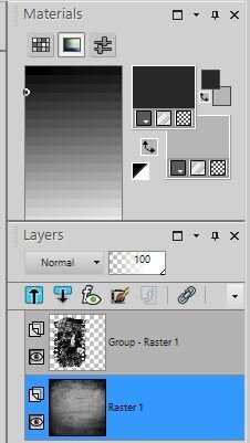
Day 3 - Yesterday good..... today not so good. I am alright making & using the mask but I did something stupid & I am not sure what nor how to fix it. I merged my mask group so I could add various papers and move the masked image around. I should tell you that the mask group is all black & white (yes, I went retro). When I went to add a colored textured paper, that paper became black & white and the color palette is also only in black & white. If I work on a completely separate image, i have the usual color palette. However, when I go back to my project, I am locked into a black & white color palette. Screen shot is attached. Help please. Thank you.
-
Orange LET font is available free from Dafont, Fontsgeek, & wFonts
-

-

-
Day 2 starting off great. I actually had that template that is no longer available (large stashes confuse but are can be helpful if you know exactly what you want). I think I have mastered the whole raster to mask group conversion enough to start altering the mask since I wasn't too keen on some of the streaky bits once the photo was added. Went back and forth several times and, between a paint brush and an eraser tool and the pick tool, managed to get rid of the offending streaks. Because of the theme that I was using, I couldn't make my plaid from the photos so I used a another photo of a greenish grain field.... lots of small edges and muted colors in it. That way it wouldn't clash with the plaids in the main photos (all snagged from free photo sites). Added a few very thin borders. Font is Brush Script. I tried using that trick of brushing behind the text to make the words more distinctive but, because my background plaid is so small & tight, the brushing was too obvious. When adding a shadow really didn't work either, I changed the color of the drop shadow to a mid green color from the plaid and it brought out the text a bit. The nice thing about these structured lessons is that, if you make enough mistakes & have to redo things, you get more confident & adventurous (though you still need post it note reminders on your monitors for the command sequences).
- 359 replies
-
- 19
-
-
-

-
The mask bits are getting easier. However, choosing papers & fonts to go with the layout is more difficult for me. I somehow always end up in scrap kits by Brown Owl & Cathyk for papers and then adjust the colours. Script fonts are a **** at times as they never turn out quite like you want even when using Fontrunner for previews. I kept getting error messages when trying to attach my image. It was 600 pixels but exceeded the max kb size by quite a bit. It took me several minutes to realize that I had saved it as a png rather than a jpg... rookie mistake.
- 359 replies
-
- 19
-
-
-
Day 7 assignment done.... and not without some pain involved. I was concentrating on getting all the elements resized & placed between all the layers and I forgot to save a copy here and there while working. Near the end, my crop tool had a hissy fit and somehow cropped all the layers & I could not undo. There was nothing on the Corel website or forum except some instances of crop tools getting stuck. So, when in doubt, start again. The papers are from a kit by Aimee Harrison and also from Freepik. The top part of the text is part of wordart from Creative Fabrica but I substituted a real rolling pin with Minion font lettering on it. The photos are all snagged from the internet and I tubed several of them (sorry about that crappy shadow on the tarts but the picture was the last one that I tubed (for the second time) so I let it go since supper is now two hours overdue. Thanks to Cassel for a great workshop. I learned a lot (sometimes the hard way) but I thoroughly enjoyed it.
- 426 replies
-
- 17
-
-
-
Day 6 assignment done. Kept to the template this time. I am learning so many new tricks like that "reversed shadow". The papers are from Freepik. Font is Polar Vortex (free from Dafont). The intricate snowflakes are part of a larger set that are available for purchase from Jane Creative over at Creative Fabrica. I tried adjusting the settings on the photos to get the two red jackets to match a bit better but gave up after several attempts and instead ended up with an underlying red paper that was halfway between the two colors in the jackets.
- 426 replies
-
- 17
-
-
-
Day 5 result. I had promised another new dragon themed tag for a guy who has a "Dungeons & Dragons" group (he has a truck, I don't, but I need one to haul soil etc for my garden so I make tags for his group emails all year). I did try and work with the template but, after inserting all those menacing dragon eyes into the photo slots, I quickly abandoned that idea and deleted them. There was a circle and some rectangles left and, in the spirit of moving placeholders and using the pick tool for scaling, I went completely off script. The paper was a rescaled and recolored wallpaper, the dragons & flames were already in my stash but, because I usually work in tagger scale, I was constantly rescaling things. The pale dragon at top right was a jpeg so I had to tube it (I hate tubing) and there was no clear color definition. After adding it to the paper, I realized that I should have misted it as blurring the edges didn't work well. It was going to be blended into the background so it doesn't look too bad unless you zoom in on some of the edges. It took several attempts with drop shadows to make the flames leap out a bit. Font is Brush Script Std.
- 426 replies
-
- 16
-
-
-
Day 4 (running a day behind). YEAH!!!!!!!! Finally got text to wrap around. Thanks to Cassel for that extra link to another video. I had my curser in the wrong place..... such a simple thing to learn the hard way. Got to use it in this lesson though. Paper is from a kit by ETD, font is Victoria Cat (free from DaFont) and the photos were snagged from the internet. Having all those layers makes it easy to change things but I have to label everything before I start scrambling them. And a bonus, now I know what to do with all those large grunge and watercolor brushes that I have - when in doubt, use them like masks.
- 426 replies
-
- 19
-
-
-
Day 3. Panicked a bit when I saw a different template in some of the members comments until I saw a reference to "diamond" so I guess that group is getting different templates, I hope, as I just did my day 3 using this one. Now that I have the use of papers and selections & deletes in the right way, I hoped to get to that wrap text that I missed in the previous lesson. PSPX8 is supposed to have a wrap text feature but I sure can't find it. I got into the Corel site and found it being demonstrated and I did what their video said but to no avail. PLUS, when I try and type in that selection area, the text defaults to a huge spacing between lines. I played around with the "leading" settings but still got huge spaces between lines. So, back to separate lines of text on separate layers and moving them around manually. At least I know how to do that..... tedious but less frustrating. The subject for the picture is shasta daisies, one of my garden favorites. I cut them to the ground in October and they were up and blooming again in early December (it helped that we had no snow yet).
- 426 replies
-
- 19
-
-
-
I am waiting on eye surgery so small fonts frustrate me at the moment and zooming in and out is so tedious. So, it is large fonts for now. I will have to try wrapping around the text later so I moved the text box to get everything in. Had some issues getting the inner paper to match the colors of the dress but, surprisingly, adding a bevel worked as altering the bevel settings can alter color depth. I was confused about the "layer...new mask layer" instructions & image in the video as I do not have that setting but I found it in the submenu for "new layer" in PSPX8. Can't get used to using those "Cntrl+C" etc commands. I find it easier to use my mouse and the dropdown commands at the top. Just a personal preference. It's a good thing that PSP has so many redundancies. Font is Comic Sans MS and the papers are from kits by CathyK and Brown Owl. I snagged the photos from the internet as no one wants to see a photo of my messy sewing room and I sure don't want to clean it up just for this lesson. However, the larger photo does mimic the inspiration board that I do make up with swatches, trim & ribbon scraps, buttons & thread that I select before starting on a garment. Sharon
- 426 replies
-
- 19
-
-
-


.jpg.7fd3de87bb5e1517d5ec1d61c35860e8.jpg)
.jpg.e868a0d9153568bc3a815544e9b65692.jpg)
.jpg.ea0de3bb5afd63d9d8be16f6b989c0f3.jpg)
.jpg.a470b800ab1ac9400350beff4e68bbc1.jpg)
.jpg.8e51df6b817b521b542679bbaae3bcfb.jpg)
.jpg.997fdcc81ae7a0dc4cd95750ebd45d6e.jpg)