laurie solaas
Members-
Posts
170 -
Joined
-
Last visited
-
Days Won
2
Content Type
Profiles
Gallery
Forums
Everything posted by laurie solaas
-
- 486 replies
-
- 10
-

-

-
- 486 replies
-
- 10
-

-

-
- 486 replies
-
- 12
-

-

-
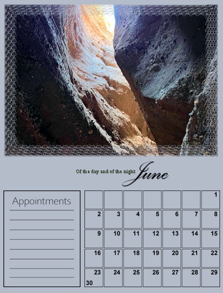
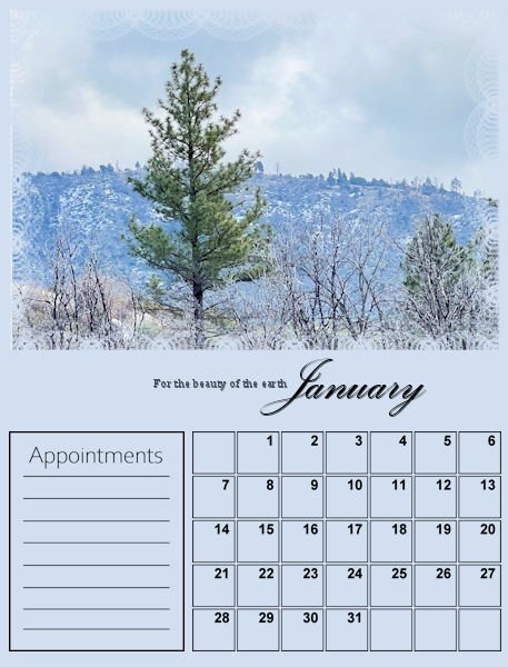
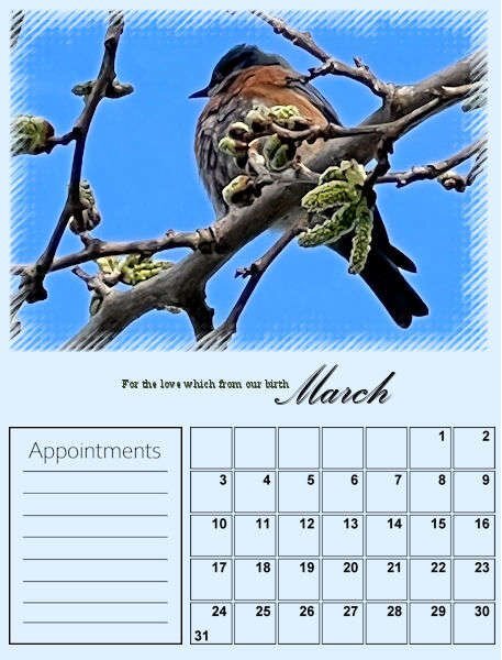
I decided to be ambitious and try to complete two calendars: one featuring our Labradoodle Lucy and one focused on Nature. When I was a little girl, my mom signed me up for the children's choir at our church. The very first and only Hymn I learned from the experience was "For the Beauty of the Earth." Still today, it is my favorite church Hymn. The lyrics resonate deep with me because I love the beauty of nature. There is beauty all around us. We live full-time in our motorhome, and I am fortunate to be retired, in good health, and can spend time traveling the United States. Someday, I hope to travel around Canada as well! I love taking pictures, and all of the photos I post are my own. Here are the first three pages of my Nature Calendar set.
- 486 replies
-
- 11
-

-

-
Yes!! Thank you!! While messing around with guides, occasionally I would accidentally right click the triangle, and because I did not understand (or realize) that I did a right click, when I tried to bring up the dialog window on purpose nothing I tried worked!
-
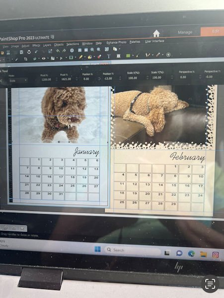
This is my idea for one of my calendars. But, I need to ask for help, once again! Because I moved the month over, and I extended and moved the Calendar dates a little bit, is there anyway to set move permanent guides for all of my templates so I don't have to set the manually for each of them. Because I work on a laptop, (we live in our RV and haven't purchased a good desktop computer yet, my rulers are really hard to see. Which makes setting the guides up uniformly (twelve times) really hard! I appreciate any feedback. thanks bunches!!
-
When I think of Fast Food, my mind automatically goes to Hamburgers and Fries. Although we don't care for McDonald's, I do love a good burger! Our favorite burger place is Huey's! I created my own papers and used elements from Pixel Scrapper. The heart was from Rebecca's Kit: Enamel Heart, and the button was from Avivia Elements Button 2. The word strips came from Food Day Pizza Word Strips.
-
Prayers for you guys.
-
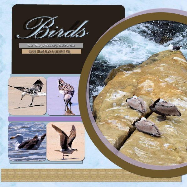
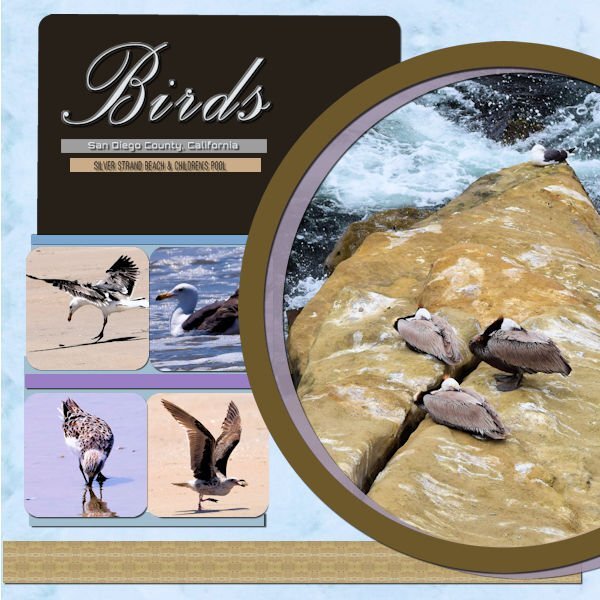
This is the cleaned-up version of my design. I fixed the kerning on my font by setting my kern value to -25. Then I swapped two of the square pictures and adjusted my circle layers so they did not over-power any of my squares. Finally, I fixed all of my shadows. My background paper used the pattern effect on my picture of the three birds. I used the same effect to create the brown band across the bottom of the design. The thinner bands and the large rectangle were created using the colors in the circle picture. Thank you to everyone who offered me advice and suggestions.
-
Thank you, Sue.
-
Thanks Ann, I am not sure how I unlinked them. But I think I did. Because the shadow didn’t look like it moved with the picture. I will play with those things tomorrow, when I am fresh. Also, today when I was messing around, trying to fix it, I deleted the shadow layer, and tried to redo the shadow. It created an enormous shadow with a larger offset and a bigger blur. I had not changed my values. Can anyone tell me why? I will restart my computer to see if it was caused by a program glitch.
-
Thanks Bonnie! Can’t wait to see what you come up with to make this DIY work.
-
Sue, I totally agree with all photos taking precedence in layouts as well. Once again, thanks for the feedback!
-
Thanks Sue, you were not knit picking. That’s exactly the kind of feed back I am looking for. Tomorrow morning I will see if I can link layers together, and I will see if I can fix the Bird text. Thanks for the idea of swapping the square photos. I wasn’t sure how to make my composition totally work without resizing anything. I didn’t see that swapping the photos would help. Sometimes i need someone with a fresh eye to look at things.
-
This was a lot of FUN! But, oh so Challenging!! I duplicated one of the squares so that I could use four photos. The skinny bands presented me with another problem! I ended up duplicating one of the two bands to add balance to my composition. I wasn't sure how to shadow this one. So, I shadowed it like we did all of the other projects. I went to try and tweak things after I applied my shadows to another layer, and that presented me with another problem. My shadow did not move correctly with the images. I'd appreciate feedback and suggestions from all of the seasoned vets out there. Thanks!!
-
Z = Zaxby’s
-
-
-
Somehow my shadow is in the wrong place. Oops! I will try to fix it.
-
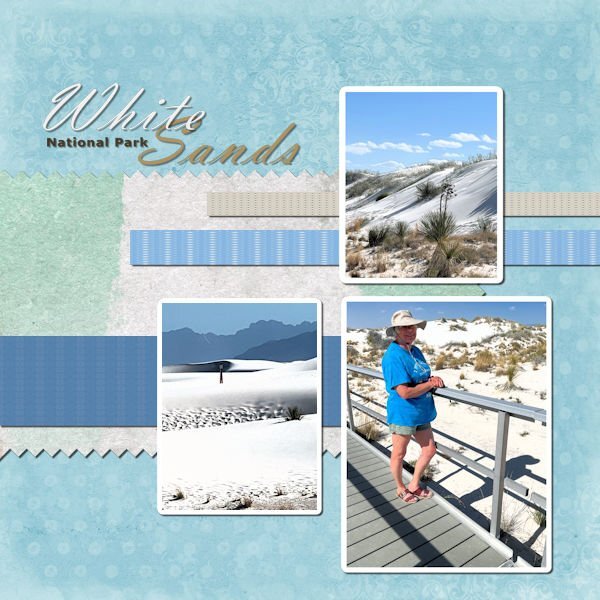
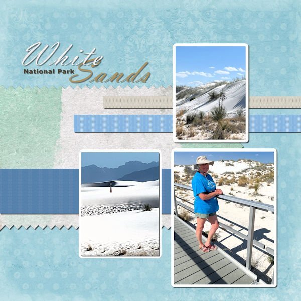
We love visiting White Sands National Park, located in New Mexico. The white dunes are incredible, and even on a warm day outside, the sand is still cool because it is made up of gypsum. Have you ever been to this National Park?
-
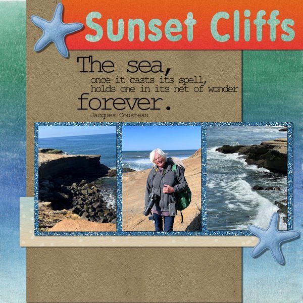
Sunset Cliffs is one of my favorite sights in San Diego, CA, because I love the waves crashing into the cliffs. I didn't realize there would be days when we would appreciate having a winter coat!! Even when it's a bit cool outside, I thoroughly enjoy the ocean.
-
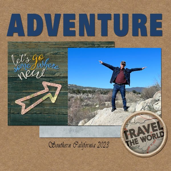
Thanks Ann! That's exactly what I did for this project. I had it set way up to the best quality, and I didn't realize it! It is nice to be back in PSP land. I haven't done any layouts in a while, so I have forgotten a lot. We traveled out west last winter and enjoyed every minute of our time in California, Arizona, and New Mexico!
-
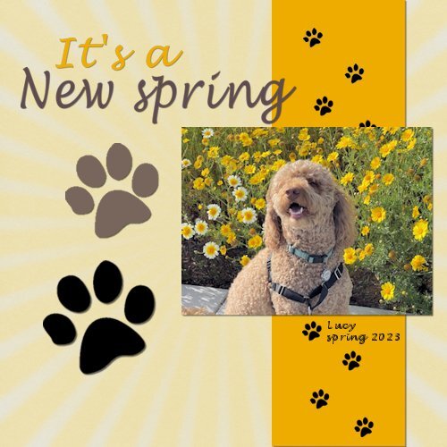
Hi I am a little late to the party. Here is my project for New. When I saved it 600x600 the forum told me my file was too big. I don't what I did wrong. I resaved it 500x500.
- 222 replies
-
- 11
-

-


