Natalie Spooner
-
Posts
25 -
Joined
-
Last visited
Natalie Spooner's Achievements
")


-
This beautiful book will be read over and over. Pete's daughter in law prints off the photos they have taken as a family in a simple soft cover book monthly ( she has some sort of subscription she uploads to with a set quantity of pictures) and her two young children love to go through them over and over and over. Your magnificent creation is much more elaborate and a consistent story line that Xavier will learn to read from as well! Your talent shines as glossy as those pages! Priceless. Thanks for sharing with us.
-
Hi @Sue Thomas, I did take your advice as I agree it was a bit distracting. It led me on a whole new adventure about seamless tiling LOL! Decided to make a tag as I had been inspired by those made in the Travel class and here is the revised result. Thank you sharing your thoughts from experiened eyes!?.

-
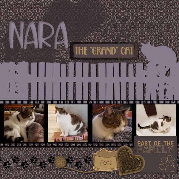
Hello everyone, I'm enjoying seeing your creative juices at work, for some reason my reaction button is not working, but I do like what I see! ? Here is my take on the Freebie Challenge Wood Fence, a happy accident to start! I had placed Carole's fence on the plain raster layer and then when I went to fill in the background on the under layer with the fence layer open it did not fill behind the fence...so I took it as a sign to create a silhouette and went from there. The paper I created myself from round about trials and really no idea where it was going. I did set out to create the film strip (vector shape and square eraser brush tip) and convoluted it into a mask of sorts ( need to continue the mask class!) and saved it as a paint tube. I think that's what I love most about this program the playing around with colour and shape until you get something you like. Fonts: Back to Love (label) With you forever (Nara) Elements: from PS designers, Elif Sahrin (heart paint spatter), Gina Jones (yarn ball) Jessica Dunn (plaid label) Marisa Lerin (all the rest)
-
Here's my page for the Random Challenge "Numbers". Photos are mine, the blankets I made as each was born, and the little girls had fun being babies again like their new cousin. Apparently there is an unhappy baby! lol. Not a spelling mistake his last name really is Kidd! Hence the tongue in cheek! ? Oh how fast they grow! The papers I made from the Mask WS lessons, those were a lot of fun! I couldn't stop playing around with the new knowledge! The leaf /petals from the recent vector Class, the number brads I created from inspiration from @SueThomas beautiful and so neatly done Robin LO. Fonts used are Hello Honey from Fontspace and Schadow BT already on my computer ??, picture tube was a freebie from PSP with one of the versions. Cheers for now...
- 75 replies
-
- 10
-

-

-
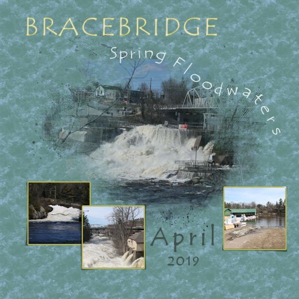
I started the Masks Workshop and decided to combine the August Palette Challenge. The pictures are my own of the heavy flow of spring melt which flooded some properties like the lumber yard in town. The Template is from the class courtesy of Alinamaria. I used the Wet Fall Leaves texture scaled to 250 to give the background a tumbling water look, and used Tempus Sans font with some kerning near the end on a vector path to give the look of the letters going over the falls. ? Both are included in PSP. Thank you Carole for all the lessons taught that I managed to learn to create this page. @Sue Thomas your Humming bird layout is beautiful and your back stories are always so interesting.
- 11 replies
-
- 10
-
-
-

-
Susan, I especially love that while you did not resize you simply used only a part of the large circle and used a longer rectangle as another photo creating a very different layout. That, and the fact my favourite colour is purple!
-
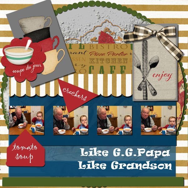
This was a great challenge, and by that I also mean brain smoking! Somehow it came together, I never really feel I'm in control of the out come, I just go with the flow that seems to evolve in the process. There are some fabulous results being posted and tricks / tips shared. Thank you all. This tells the story of my Sister's grandson having lunch with our Dad, his GG Papa. The request was for tomato soup and crackers which is a favourite for both of them! The papers, tags and graphics are from a DS kit of Jessica Dunn's called Bistro. I overlapped a lot of the rectangles at varying opacities. The inner circle was filed with a paint transfer and shadowed which gave it some texture. The large font is Ravi, and the pointers are Gigi, both in my collection, probably from Creative Fabrica, but I'm not sure.
- 94 replies
-
- 11
-
-
-
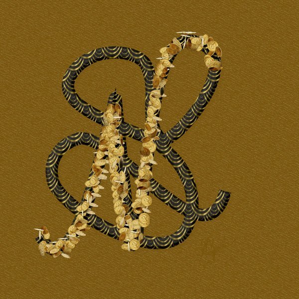
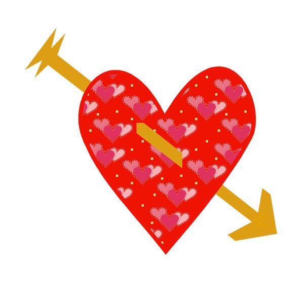
Having finally completed Lesson 7, I just wanted to say thank you again Carole for always encouraging me to step out of my comfort zone. I played around a lot with this lesson and I think I have created MY new dollar sign if ever I own a currency! I decided to free hand draw my stylized initials. I used a coin picture tube and then filled in the under vector with a pattern that was just on my pallet swatches ( maybe from the coins?) Played around with bevels, shadows, layers, blend modes, and opacity until I got something I liked. This workshop was challenging, sometimes frustrating, full of information and tips, and SO MUCH FUN in the end. I will definitely use vectors more often. My classmates are / were inspirational and have a great deal of talent . I loved looking at all of the submitted work. Thank you for having me. CHEERS until next time.
- 714 replies
-
- 16
-
-
-
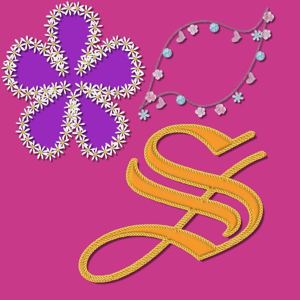
I too loved this lesson, it was so much fun to watch the script run around! I too played a lot with this script. Here are some of my favs...
- 714 replies
-
- 23
-
-
-
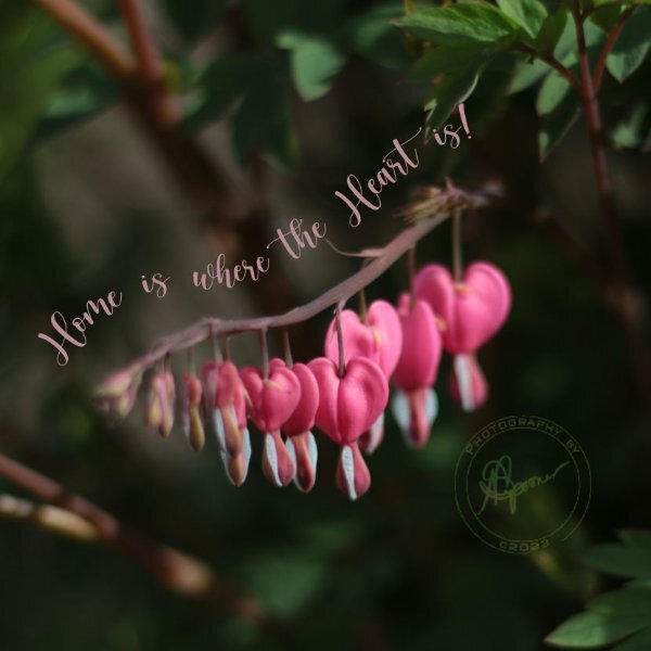
Here is my Lesson 5, Text on a path and a circular "stamp " with text top and bottom. I had already created a brush tip of my photo signature a long time ago and just added it to the center of the new "stamp". As I use mostly all my own photos for these clases I decided to make the stamp a Logo of sorts and turned it also into a brush tip. I then put it on a separate layer so I could change the blend mode to Luminence and the opacity to 59 for this lesson. I usually blend my signature to barely visible on my work so it acts more like a hidden watermark and doesn't take away from the photo. Now to tackle lesson 6!
- 714 replies
-
- 24
-
-
-
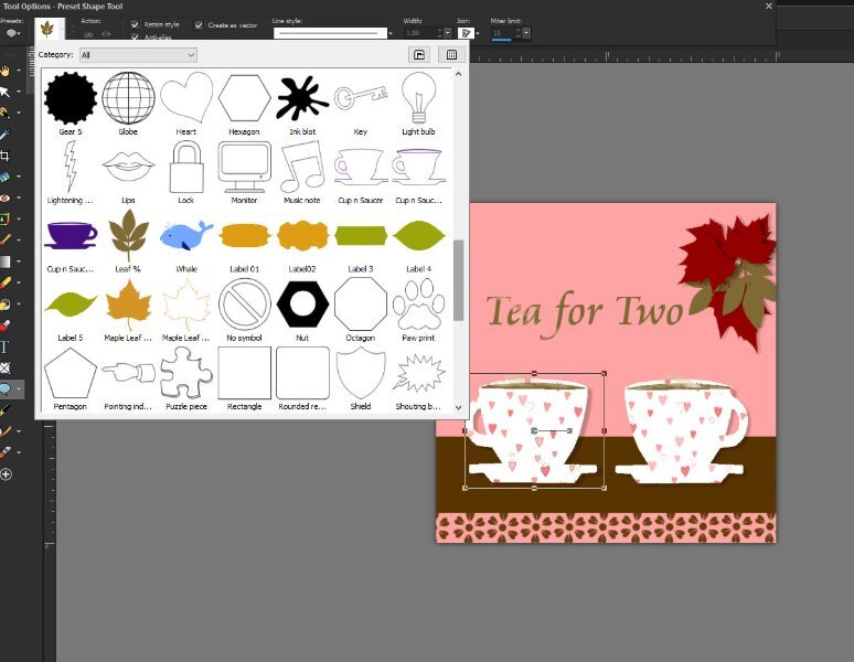
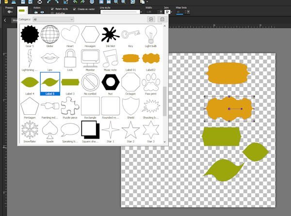
I am enjoying this deep dive into learning about and working with vectors, however it does seem to take me a long time to get through the lesson with understanding I decided to post one picture which shows lesson 3 & 4 together. You will also see a "sea creature" preset (in the presets drop down) which was extra practice for the Diamond gang. Looking forward to trying my hand at the next lessons after seeing all the creative work posted here. I too was sizing my working using pixels and so have the jagged edge which confused me as it was a vector.... Thanks for the tip off to that Carole.
- 714 replies
-
- 16
-
-
-
-
Thought I had better get going on this workshop as you are all handing in such awesome work. SO here goes my versions of the first two lessons. Like some of you I struggle with getting the order correct for getting to the nodes and changing them but I am loving the learning curve. Thanks again Carole for sharing your expertise. ?
- 714 replies
-
- 18
-
-
-
Finally took some time to complete a challenge. Thank you as always Cassel for stretching my comfort zone and teaching me countless lessons. Paper inspiration from Marisa Lerin"s - Hello Spring Kit but were coloured to follow the given pallet. I created the Elements and filled them with the paper patterns. The fonts used were Culrz, DeVinne, and Cooper Black Out . The photos are mine taken on a sunny morning when the sun was back lighting them so they had some transparency which I found interesting. Love seeing all the creative talent in this Campus,
-
 Natalie Spooner started following April PALETTE Challenge (2023) , And here is the book!!!! , September FREEBIE Challenge (2023) and 4 others
 -
Bracebridge ON