-
Posts
2,661 -
Joined
-
Last visited
-
Days Won
22
Content Type
Profiles
Gallery
Forums
Everything posted by Michele
-
Me, too, Cristina.
-
L = Love There's nothing like a mother's love.
-
G = Gloria, my mom. I miss her.
-
Thank you, Cristina. I fight against the lack of creativity all the time. That's one of the reasons I'm making more of an effort. It took me many hours between searching my few original pics and getting inspiration from looking at templates.
-
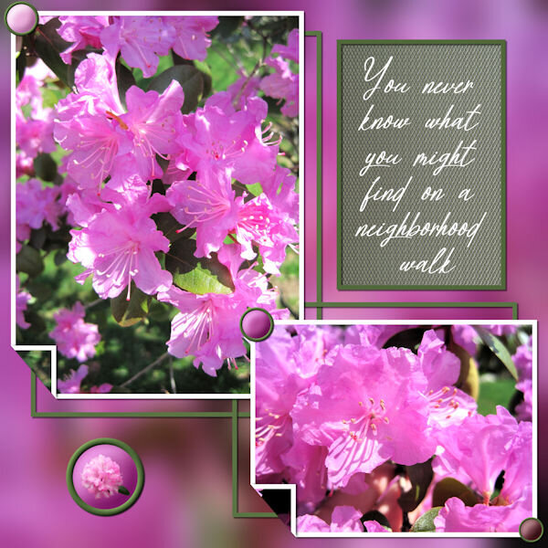
I'm making an effort to participate in more challenges and for a change everything is mine. I used cass's brad factory and filigrane scripts. It's my first 1-2-3 challenge so I hope what I did qualifies. Any and all suggestions are welcome.
- 42 replies
-
- 10
-

-

-
From the album: Michele Fineron
-
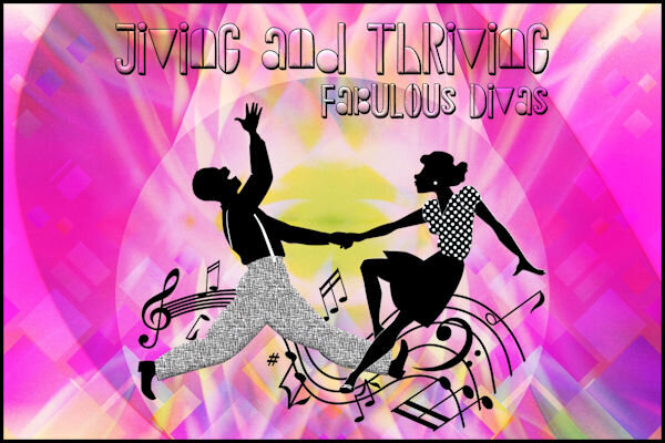
I combined four or five different backgrounds including an old swirl I had made; erased some areas, used negative image on one, and played with the blend modes and opacity. The font is Rambutan from an old $1 deal from Font Bundles. Using the text cutter is a fun difference sometimes.
-
From the album: Michele Fineron
-
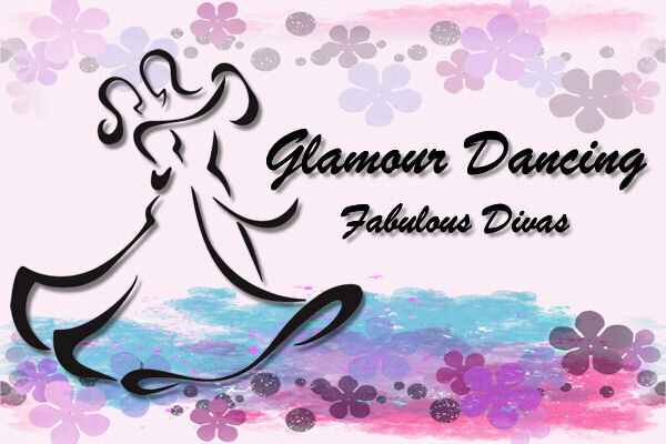
Here's today's pic for my gaming group. Used a bunch of layers and effects. The florals are from Marisa L at PS/DS (I wish I had more time when I do these so I could be a little more creative instead of using other people's work). I picked Brush Script MT to keep it simple and to match the width of the silhouette.
-
From the album: Michele Fineron
-
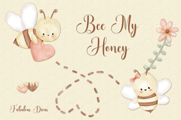
Being the resident fontaholic, I would be remiss if I didn't participate in this challenge. I took the pic I made for my gaming group today and adapted it to this challenge. The Honeycomb font and clip art are from CF. The font on my original is Abongia which was in the Absolute Font Collection bundle from CF, too. I believe it might still be available for the next day or so.
- 24 replies
-
- 12
-

-

-
From the album: Michele Fineron
-
From the album: Michele Fineron
-
Something new to put on my wish list. (And, Carole, are you sure you're not a hobbit? You keep showing us miniatures that you make at home. lol)
-
Love these! I had to go get the Squiggles script.
-
I started with a template by AnnieC Digitals from the A Love For Layout Templates March 2021 Blog Train. AnnieC makes probably my favorite templates (she has a couple of FB pages and an Etsy shop if you're interested). The photo was found on google and the font is Floural from Creative Fabrica.
-
Carole, if you communicate further with the family, please tell them he will be missed here in the Campus.
-
From the album: Michele Fineron
-
M = Marshmallow Peeps
-
I'm not surprised that you've been crafting since you were a child. Do you still have any of the things you made back then? I have a couple of books that my father gave my mother when they were dating. I also have a book called, "The Wonderful Story of How Your Were Born." I kept it and read it with my daughter when she started to ask questions. If I ever get it out of storage, I just might have to make a page for it.
-
Looks like Julie and I both enjoyed Di Hiller's freebies this month!


