

Randy
-
Posts
173 -
Joined
-
Last visited
-
Days Won
2
Content Type
Profiles
Gallery
Forums
Posts posted by Randy
-
-
Carole,
Thank you so much for your lessons on Vector.
I like what I have learned so far and expect to review to get a better handle on what I have not "mastered" yet.
Everyone else,
Thank you for sharing your work.
Thank you for helpful input.
Thank you for encouragement by showing what can be done, and encouraging words to push ahead.
This is great!
And having something that I have learned that I can use in the future is really the best part.
-
 3
3
-
 5
5
-
-
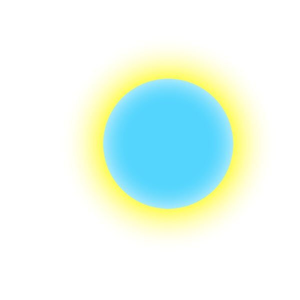
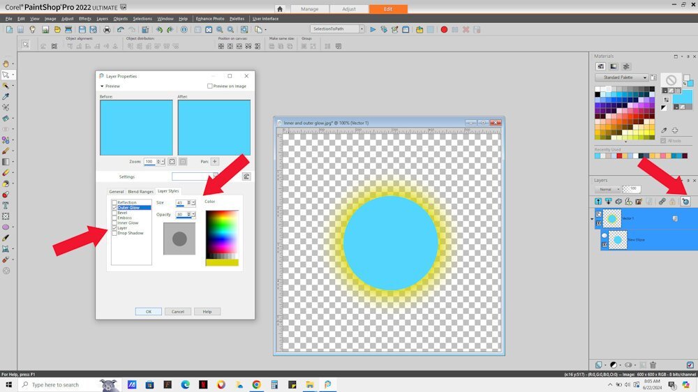
On 6/22/2024 at 10:27 AM, Mary Solaas said:
@Randy Inner and Outer Glow are available if you use Layer STyles on your layer. With this vector I used both inner and outer glow. There are other effects available with them

Thank you. This sounds promising.
-
2
-
-
I wanted to do text on a path in PSP but kept missing something 🙂
Anyway, I am quite enjoying that part and that is my focus of the vector workshop.
I used text to path for the introduction to a video for the service from our church today.
I like learning things.
I like it much better when I can use what I learn.
Thank you again, Carole.
I so appreciate this.

-
2
-
7
-
-
8 hours ago, Gerry Landreth said:
Randy - Open File Explorer and right-click on OneDrive. In the pop-up menu, locate OneDrive. From there, you should be able to choose how you want the folders to be stored: locally on your computer, solely on OneDrive in the cloud, or both.
Thank you. I was not expecting any help on this but am very grateful for your suggestion.
-
1
-
-
13 minutes ago, Cassel said:
A few things to check.
If it is the first export you make (I doubt but just in case, for others), check that the File Location is correct for where they are saved, and also for the folders it is pointing to.
If you have previously exported without issues, it might be a problem with the name of the shape. Did you rename the object/group? If not, it might be using "New rectangle" or "New path" as a name. Check in the drop-down list if it might be under a different name.
I sometimes experience a problem because I somehow set up so that things get moved to Microsoft Cloud (one drive I thinK) and sometimes to my actual computer. I have not been able to figure out how to get everything to "stick" on my computer and so sometimes things just seem to disappear.
-
A follow up to Lesson 5.
I decided to try something different with my pointed border.
I wondered what would happen if I started with a Vector instead of a Raster.
So I created a triangle with the pen tool. Then I created a script to rotate so that I had 8 triangles. Then I merged visible to a new layer, duplicated, rotated, then merged visible to a new layer and rotated again. This came out exactly as I wanted it.
I may change the script to make it more flexible but for now, using a vector, I have what I wanted.
And I have somewhat of what I want a glow by duplicating a layer, changing the colour and using Gausian Blur (multiple times).
-
4
-
5
-
-
10 hours ago, Minka Glasier said:
Haven't had much time to play as a major house project started much earlier than I expected .... but I am following along. Love seeing what everyone has been doing! I am looking forward to July 4th ... a traditional day of BBQ around this family!
EYE CATCHING!
-
1
-
3
-
-
15 hours ago, middie said:
Second parts of lesson5 is enclosed. The image (which does look a lot like me) is from Pngtree where I have a premium subscription.
This is lovely!
-
2
-
1
-
-
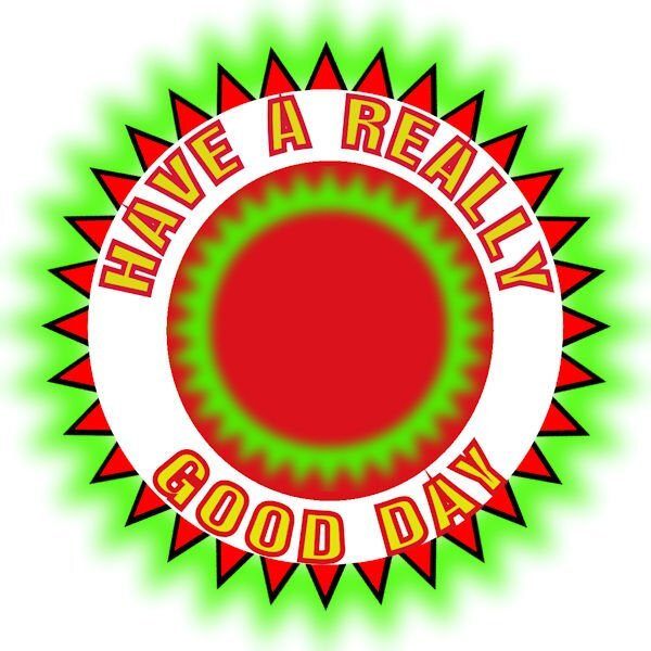
LESSON 5
I found this tricky. I now see why Carole keeps emphasizing to convert to path. It is so easy for me to forget that step.
I like how far I can go in PaintShop Pro.
I usually use AAA LOGO Software to create text on circle. I like the fact that it has a lot of shapes that come with the product. It also has the ability to add things like an outer glow and inner glow.
How can I go from my PaintShop Pro version to add the features I can in AAA Logo?
I know that I could try to create a shape with the points but expect it would be tedious and would probably not be 100% symmetrical.
I have a script that I created to duplicate and rotate and used that to create the points (but it is not vector). I added that behind my text on path and can get part way to where I can with AAA Logo software. For some reason, as I duplicate and rotate, the size of each eventually grows so that my last triangle is noticeably larger than my first one ... I don't know why this enlargement happens It is most noticeable at the top .
Any suggestions on how to get it all the way to look like AAA Logo creates it would be appreciated.
Anyway, in PSP, I think I may be able to replicate results. I have tried now a number of times with some success.
NOTE: The one with the green glow is the AAA Logo one.
-
7
-
4
-
-
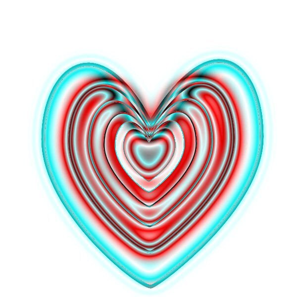
Well, I had to try something different.
(1 - Heart4) (I wasn't sure if this would work with a layer that was not raster which is what I have used it for in the past.) I ran a script I created to take copies of the layer, decrease the size of the copied layer. Repeat. Then merged the layers.
Then I flood filled with red in some areas.
(2 - Heart3) I then took a copy of Heart4 and applied the Colored Foil. I did not show this.
I then took a copy of this layer and used the blend mode to get Heart3.
(3 - Heart2) Then I used Heart3 layer with blend mode against Heart4 and ended up with Heart2.
(Conclusion) I liked the variations that I was able to produce.
I like it when it gets to be fun.
-
4
-
 4
4
-
5
-
-
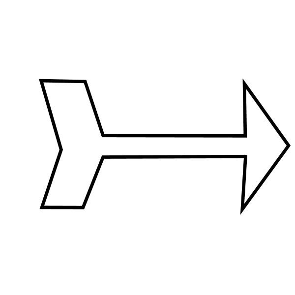
2 minutes ago, Randy said:
Here are my heart and arrow.
I hope to use this in future.
I think I should have added some colour and pattern 🙂 I think others figured this out. Maybe next lesson for me.
-
8
-
-
Here are my heart and arrow.
I hope to use this in future.
-
7
-
6
-
-
23 hours ago, Julie Magerka said:
Just hang in Randy. You will see how it's done in the workshop. Carole will set you straight.
thank you
-
2
-
-
Mention of PSP 9..
IT APPEARS TO BE AVAILABLE BUT WOULD NEED KEY. NOT SURE IF WORKS ON WINDOWS 11
-
2
-
-
I was wondering if we will be using text on path. I watched a Corel video and was able to get it to work once but not second and later. So I ended going back to original and modifying it. I do like using AAA LOGO MAKER But wanted to familiarise myself with how to do in PSP. I had success at one time in last but not again until this week.
-
2
-
-
I am interested in learning more about Vectors and look forward to this workshop.
Thank you.
-
2
-
-
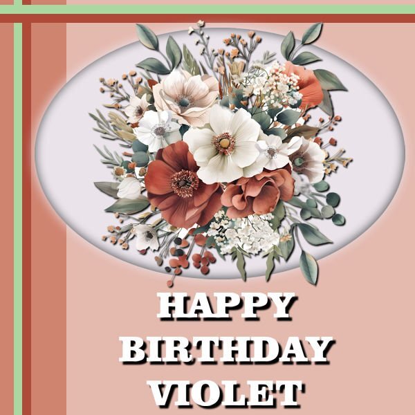
DAY 6 - A HAPPY BIRTHDAY CARD
Just in time ... A friend's Mom is celebrating her birthday and I wanted to create something a bit special.
The Flowers are from Creative Fabrica.
The font used is called Clarendon Blk BT, I don't remember where I found it.
-
2
-
11
-
-
Day 4
The Rose is from Creative Fabrica, Paris Valentine Collage Art Tumbler Wrap Graphic by CraftArt · Creative Fabrica. This was free today (May 25, 2024).
The font used is Cheers. It may be this link ... I am unsure where I got it from, but I found this link today Cheers Font - Dafont Free.
I did do a selection around the Ellipse from the template to do a cutout of the rose. It had blank space at top and bottom, so I took a small part and stretched it, at top and bottom. Then I decreased the selection by a percentage, inverted the selection and used Gaussian blur on just the outside of the rose part.
-
1
-
12
-
-
Day 3
There are so many cool things to do.
I appreciate every item.
-
2
-
10
-
-
day 2
the font is Kayla Extrude - don't remember where I got it.
I really like the custom selection ... if I saw it before, I forgot it.
-
3
-
13
-
-
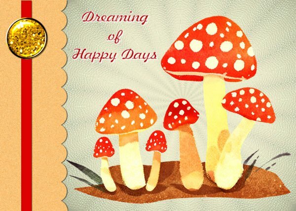
Day 1
I used a background and mushrooms from Creative Fabrica.
Font Freehand526 BT
The button was as suggested by Carole. I did adjust the colour.
I could not get the canvas to get to correct size so just left it as it was.
-
7
-
13
-
-
19 hours ago, Susan Ewart said:
Very nice paper and those colors go well together.
thank you ... getting colors to go well together is one thing I really want to understand better. Maybe someday 🙂
-
2
-
-
DAY 7 - a bit late but I wanted to finish it
For the background, I did the dots at 100%.
Then I decided it might be interesting to do another layer, in a different colour, with dots at 50%.
I like them both so used them in the background.
My image was just something that I liked that I created using the Kaleidoscope tool.
Then, I thought it might be interesting to remove the image and have just a paper at 3600 x 3600. I am including the picture of that as well.
Thanks everyone for the great work you have done.
Thank you, Carole, for hosting this.
It has been fun.
-
2
-
10
-
-
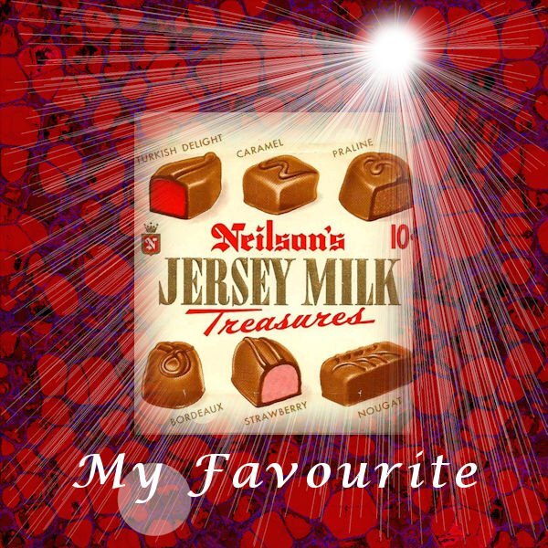
Day 6
Years ago, I used to enjoy this bar. My favourite part was the Turkish Delight. I have never found any as good since they stopped making this bar.
For the Linoleum effect, I tried originally a blue. When I tried red, it just seems to blur into itself. SO I used the color changer tool and used different shades of red. Then I duplicated the layer and used the burn blend mode.
-
2
-
12
-


Vector Workshop 2024
in Showroom
Posted · Edited by Randy
Possibly VECTOR related question.
I downloaded an EPS file from Creative Fabrica.
It says 100% EDITABLE | VECTOR EPS FILE. WORDS AND FONT CAN BE CHANGED.
I was able to open in PaintShop Pro but it just appears as a single image .. cannot see how to edit text.
Is there some way that I need to open an EPS file in PSP that allows me to apply the effect to the text?