

Sue Thomas
-
Posts
2,564 -
Joined
-
Last visited
-
Days Won
75
Content Type
Profiles
Gallery
Forums
Posts posted by Sue Thomas
-
-
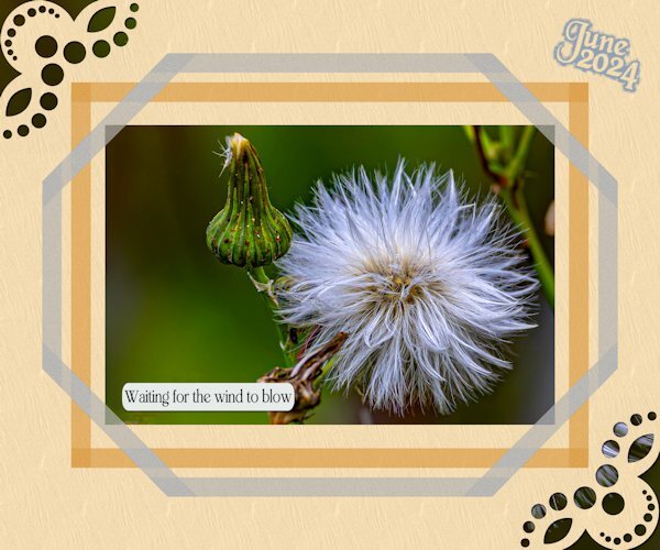
1 hour ago, Sharla said:
A delightful and restful photo - I could look at it for hours.
I'm much obliged, for those meaningful words. I was thinking the same, as the window of opportunity to take the best shots was closing.
-
 2
2
-
-
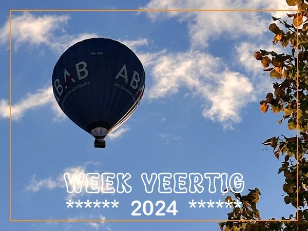
7 minutes ago, Corrie Kinkel said:
Sometimes, depending on the wind and weather conditions we have hot air balloons coming over our house. When we hear the sound of the burner we will have a look where the balloon is. Today was such a day and I went to look at the back on the patio if I could see the balloon which was quite low and just right over our house but already to far to take a photo, so I quickly went to the frontdoor, which was still locked.... I was on time to take a couple of shots, but I had backlight. Luckily there is a little tree and by standing a bit in the shade I could take the photos.

I had the opportunity, to go up in a hot air balloon, many years ago. It was a wonderful experience. A whole different view of South Glamorgan, and it's diverse coastline. A lovely capture. It always pays to sieze the moment.
-
1
-
-
31 minutes ago, Julie Magerka said:
Not me, not ever! Going to have to brush up on that tool.
I encourage you to do so! There is a masterclass, 'Adjust What!' I can see this technique being used in your exquisite layouts, with impressive results.
-
2
-
 1
1
-
-
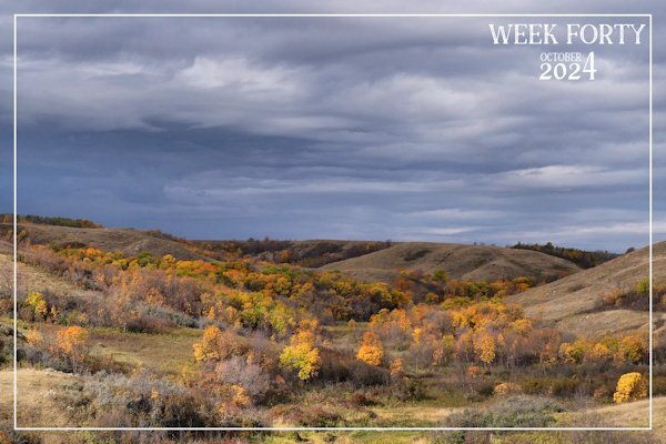
An ever changing landscape! I drive through this valley en route shopping once a week, or once a fortnight. An incredible display of colour as the sun was rising yesterday morning. Well worth leaving early, even though I had to wait for the shops to open.

-
 1
1
-
5
-
-
Snowdonia National Park. Eryri National Park, covers 823 square miles of Welsh natural beauty. It is Wales' largest National Park.
-
Last one for this challenge. Again, I used one of my own painted frames. When was the last time anyone used the adjustment layers?
-
3
-
-
1 hour ago, Julie Magerka said:
Love the choice of colours and the elements you worked in.
I greatly appreciate your words.
-
59 minutes ago, Michele said:
I'm a day late, but I'm here. I used one of Cassel's edge punches on a straight line, then ran the Mitered Corner script for both frames. The original tries were done manually, but I'm hard on myself and couldn't get them to line up perfectly. I couldn't resist adding a little gnome. I found the pic on Google.
I too love the gnome in the corner, a nice touch. Between the punches and the mitred corner, there are endless possibilities. Even, with the punches on their own.
-
3
-
 1
1
-
-
3 hours ago, Corrie Kinkel said:
Making my own frames is on my ever growing list of ideas that I want to follow and create. There are just not enough hours in a day to do everything that I want or must do. I'm not really a "house wife", if my windows are dirty well it will be going to rain again, but there are things that have to be done. 😉 Maybe I'll have more free time in the winter months. October is a busy month with birthdays that we have to attent, I'm making and printing the cards now because 2 of those are for dear friends that will be 80! For the more common numbers I can choose cards from my stock. But these are the first 2 that reach 80, so for the next one I already have a card.😀
As I get older the less time I get to accomplish what I set out to do in a day. I thought I'd have more time on my hands, but apparentely not. It isn't as if I sit on my laurels either. Winter is the time to be more creative on PSP, once I have organized my photos, identified and documented insects, birds and other creatures I may not be familiar with. Long cold, dark Winter days and nights is the best time to while away those hours on PSP. Even preparing for the following year's calendars and cards.
-
4
-
-
Here is another one using my own template. The beauty of creating one's own allows you to have wider and narrower spaces between the frames, and widths of the frames.
-
5
-
-
15 minutes ago, Corrie Kinkel said:
Nice frames and a bit wider then the freebies. I love the simplicity of the layout and the colors.
I was going to go with a mask, but saw that you had already created a gorgeous birthday card using a mask. Creating these frames are ever so easy. Saying that the more corners, and overlaps you have the more work it involves. Yet worth it in my opinion.
-
1
-
-
I didn't use the freebie, I used one of the templates I created myself, as I don't have the script. The tag is from my own resourses, the backgroundpaper is a paper template. Colours taken from the photo, and the leafy element.
-
6
-
-
2 hours ago, Michele said:
I did use the texture command. If Corel added an angle option, that would be great, but it doesn't sound promising. Adding the texture was a last-minute decision and I was tired so I left it as is. I like your idea of rotating the file and saving it as a new one. I'll keep that in mind (if my mind works lol).
Assuming the elements are all the same shape and size, you could even flip, rotate, or even mirror them once the texture had been applied.
-
3
-
1
-
-
2 hours ago, Julie Magerka said:
I watch most PBS dramas, but this is one that comes on late and is very dark. I usually turn it off, but I'm sure I'm
Marc is a renowned British actor, I remember him as a child in Grange Hill. Van Der Valk, is an excellent program.
-
3
-
1
-
-
11 minutes ago, Bonnie Borntrager said:
I was board so I come up with this.
I love it. Interesting background pattern.
-
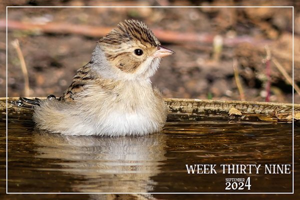
8 hours ago, Corrie Kinkel said:
It looks like this little bird is enjoying its bath! Great photo, even in this reduced version I can see the fluffy feathers so well.
It was enjoying itself sitting in the water. Having the bird bath to itself. It was quite happy to sit there, posing for many shots. Which gave me immense pleasure, for a short while.
-
3
-
-
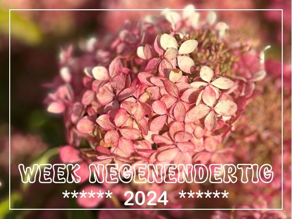
4 hours ago, Corrie Kinkel said:
It is going to look a bit like autumn with the Hydrangeas slowly getting browner. In one to two weeks time all its flowers will be brown and stay so over winter. Most of the leaves are still green. When I was taking a short stroll I noticed this autumn beauty. My own plants are getting brown too, but I haven't taken a photo yet.
You know even as flowers fade and decline as summer draws to a close, and enters Autumn, their organic pigment diminishes. Yet, even those diminishing pigments have a beauty all of their own, when you look closely, just like the flower in the image. A laudable shot Corrie!
-
2
-
1
-
-
6 hours ago, Michele said:
It could be my bad memory, but I think this is the first of your pics that doesn't have wildlife in it.
I believe, I have posted 12 non wildlife pages in this challenge alone. Only the other week, week 35 was a photo of an old local red barn. I had to check myslef, as I created the pages, and yet doubted my memory of what I had and hadn't posted. Lol !!!
-
 2
2
-
-
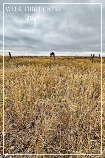
Week 39, I do two per week, one wildlife and the other landscapes. Seeing as we are now into Autumn I thought I'd post a shot taken the other day. I love earth tone colours.
-
3
-
-
Week 39
-
1
-
3
-
-
2 hours ago, Michele said:
I already told you on FB that I may be "scraplifting" this idea; I love it so much.
I am much obliged. Please do scraplift it. I'd love to see how you'd use the technique.
-
3
-
1
-
-
22 minutes ago, Susan Ewart said:
WOW! and WOW! I love this. It blows my mind all the different ways you come up with.
I am most appreciative of your mind blowing words! The photo I used, although I love it for it's simplicity and plainness, it isn't really a wow shot. Saying that I could see it had potential for this challenge. The 2 juxtaposed images after editing shows the contrast between the bright colours of the robin and the light shades of the other. Thanks to the power of PSP editing.
-
2
-
1
-
-
I decided to do another one, something quite different, but a layout I like to do, as many may know. Hopefully, whilst abiding within the rules of this challenge. Duplicated the photo, promoted a selection, in this case the Robin. Created the frame using a heart font, extracted the head to give that out of bounds efffect. All I did for the background was to lower the brightness and contrast, Keeping the framed Robin colours as they were taken by the camera. Male Robin taking a blueberry back to the nest. After he had, had his fill.
-
1
-
7
-
-
48 minutes ago, Corrie Kinkel said:
It may have taken a while but now I have used that paperclip as I promised I would do. Actually it was fortunate that I didn't do it before because I won the cass-Broken script this Sunday and it came in sooo handy! Thank you Carole and I can show you immediately what I have come up with. I had great fun making this layout and I must admit that the paperclip wasn't all too difficult to use. The clip is in essence the same as a regular paperclip, they are both made out of one piece of wire. Therefore I looked at how I would use a normal one and then I saw how to use this one. I can't believe it is that simple after all the discussion about it, but when I follow the line of the clip I think it is oké.
I used the Broken script not only on the words but on a paperclip too and I hope it is all visible on this reduced page. I have given the words and the clip a slight bevel to make the effect better to see. The other paperclip and the word distressed are treated to a brush with distress effect. The 2 papers and the stain come from Marissa Lerin in the Work Bundle and the font is Bahnschrift.
Well done you! Now I see how you used it, it looks better untitled.
-
2
-
1
-
.jpg.842103ccb6f9f02de4e83e844a8dc3b4.jpg)

.jpg.28ad1d4ff4781c56fcc0f07c467f01f7.jpg)

.jpg.6a3d56a5a88f925eac65549fb66f89b8.jpg)

October 1-2-3 Challenge (2024)
in Challenges
Posted · Edited by Sue Thomas
I must say I'm most definately not a glittery person. I rarely use glitter in my layouts. Saying that I turned my paperclip I created some time ago into a gold glittery one. The leafy elements I turned into a soft glitter, along with the wording. It is glittery, as I used the glitter 2 tutorial from the creative scrap, but toned it down somewhat. All my own work. 1 folded corner on a polaroid photo. For the papers I applied textures and blend modes, after selecting colours from the photo.