Julian Adams
Members-
Posts
107 -
Joined
-
Last visited
-
Days Won
3
Everything posted by Julian Adams
-
That is beautiful.
-
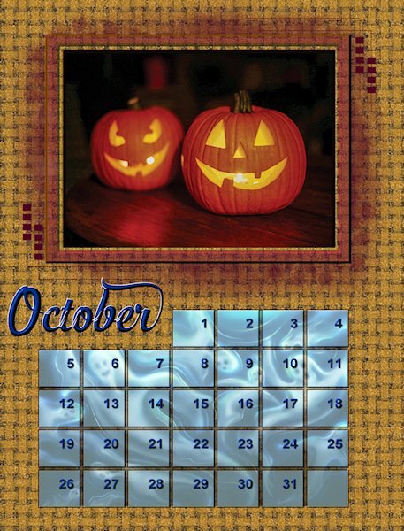
Thank you for the compliment! Pun intended - I play with complimentary colors a lot. In April, I picked an image with gold in it thinking my main color would be blue since yellow and blue are complimentary. Then I like to go slightly off from the complimentaries. Gold instead of yellow, rust instead of gold, slightly unsaturated and lighter blue than solid blue, etc. If I used bright yellow and bright blue it would be horrible but by sticking with that basic combination and making variations it gets interesting. I developed these ideas when I was making computer generated fractal art. Choosing colors was half of the process.
-
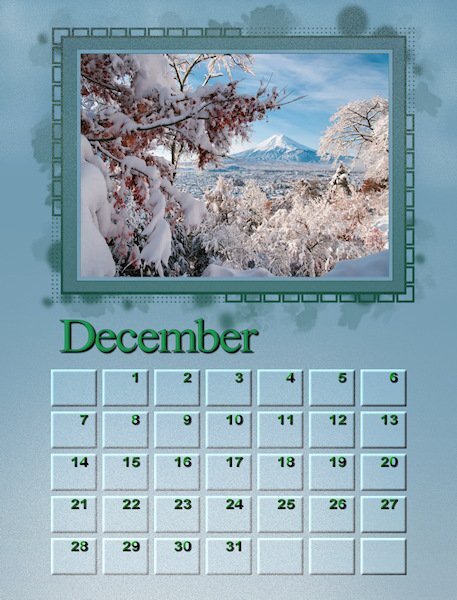
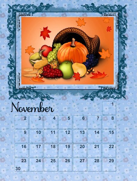
Your colors and layout are so tastefully done. I love the boxes with rounded corners. What is the name of the script you use for that? Also I have been wanting to color the frame differently from the frame like you did for November. How do you do that?
-
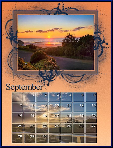
I decided to make them a little darker so they'd match the golden colored bushes in the photo better.
-
- 430 replies
-
- 11
-

-

-
That's exactly what I mean about doing things the hard way. I've been working on the frames too, but I haven't isolated them by promoting to a new layer. That's a great idea will probably make things much easier for me. Thank you
-
I feel flattered you took the time to write that response. I need to study it. Thank you very much! I've used PSP for a couple of decades now to tweak photographs, and my computer generated fractal artwork, but it's all been on a single layer. I'm just venturing out in using layers gradients, masks, and all these other things in the past year. So nearly all the stuff that were learning in these workshops is brand-new to me. I think the reason why my projects look as good as they do is because I have a good sense of color, I'm very creative in a lot of ways, as well as being really good with computers. The ideas just come to me and I figure out ways of getting done what I pictured in my mind. I'm sure that I'm doing many things the hard way!
-
- 430 replies
-
- 10
-

-

-
I'd love to get a lesson from both you and @Gerry Landreth on the techniques you used in your gradients.
-
I don't understand what promoting a layer does? Could someone please explain? I used the Background layer to color what I want the mask to let through around the photo. Then I created a new raster layer and pasted the image that is to show through the dates there. How would it work by promoting a layer?
-
I'm sure Carole has the definitive answer but I always use png, not jpg for printing because the quality of a png is pixel for pixel perfect whereas a jpg always loses a little. The originals are 2400 X 3150 pixels which at 300 dpi would print out at 8" X 10.5". What I did last year was use the AI resize tool to get them to fit on an 8.5" X 11" sheet of glossy photo paper. It wasn't much of an enlargement or distortion so they printed very nicely. I don't understand why you are getting 100 to 200 px. Maybe you're reading pixels/cm not pixels/inch? @Cassel ?
-
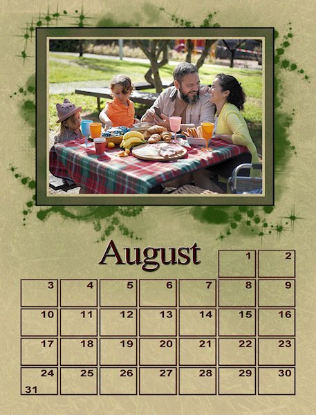
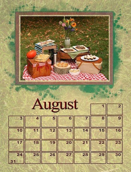
Thank you for all the replies about my August project. I agreed with everyone actually. The original picnic photo is much larger than I need so I was able to resolve the blown out bllacks and whites on the high rez copy (they got blown out reducing mostly) and reduce it and use the frame and background that we all liked better. It is perfect now.
-
Blend mode? Is that the drop down menu next to the opacity adjust? I just use normal. I haven't played with the other options. What are you suggesting? I ♥ your July and August!
-
- 430 replies
-
- 13
-

-

-
I liked the photo with the people better but both whites and blacks were blown out so I couldn't tweak the contrast to my liking for printing. I also tried a little more saturated color peeking through the mask and more texture on the background "paper". The "paper" is a layer of a photograph of grass on top of my background with the transparency quite low. I thought grass would make a good background but the color was too bright.
-
That's what I did and then adjusted the transparency.
-
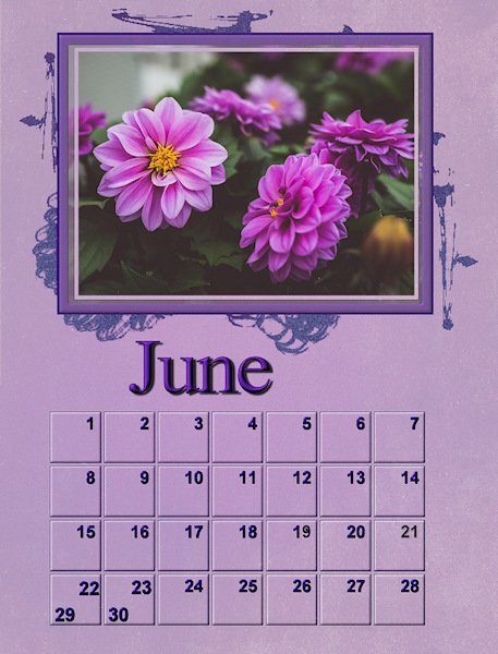
Just wow, Gerry. The color combinations on your gradients are amazing not to mention everything else.
-
-
There are so many creative styles people have developed here. I learned a lot from seeing what I like in other people's ideas. I sort of developed a style of doing this last year. I was pretty happy with a lot of the calendars I came up with then. This year the first few calendars were trying to remember the techniques that I used to use. Then I started trying to push the envelope on those. I'm not really sure what my style is yet, but I think you can tell that I'm leaning in a certain direction that works for me. I do want to push the envelope though doing things like I mentioned above strong in an airbrush to modify a gradient and the color underneath the mask. This is really so much fun and teaches you so much about the nuts and bolts of Paint Shop. I have been using paint shop back to version 8 to edit my photographs and the digital fractal artwork that I created. I logged many many hours just working on a single layer. It's taken me all these years to learn how to use layers.
-
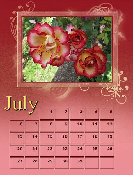
I used an airbrush on this. I wasn't happy with the way the gradient was blended into the lighter pink so I just touched it up with an airbrush to make it look more smooth. Then I decided to do a little bit of random variations in the color during the transition. Then I got the idea of adding yellow under the mask to accentuate the yellow coloured month. I don't know much about how to use masks so I created a masks y selecting all and then using the selection tool removed the rectangular picture frame so I would not get yellow paint on it. The possibilities are just endless!
-
- 430 replies
-
- 11
-

-
