Susan Ewart
-
Posts
4,930 -
Joined
-
Last visited
-
Days Won
196
Content Type
Profiles
Gallery
Forums
Everything posted by Susan Ewart
-
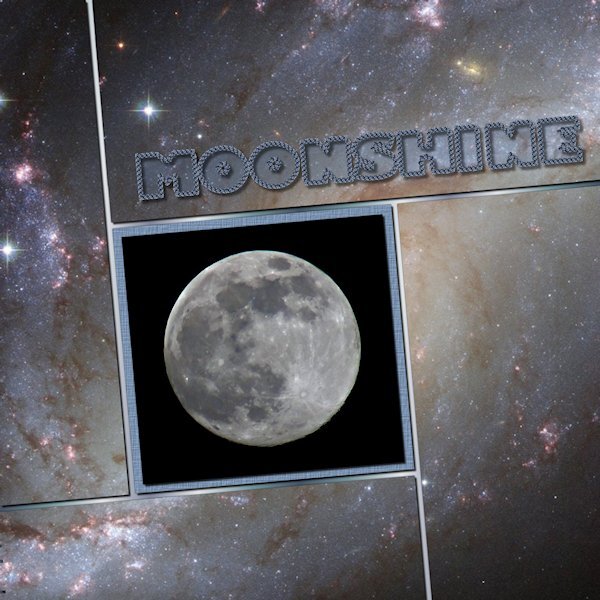
Day 6 and I'm caught up. Now to catch up in the Build A Kit workshop. I really like all the templates we've gotten and this one I especially like. I love that free Vector Tube script. I got it a long time ago but had no idea how to use it until today. What a great tool to have in the virtual toolbox. I used the who photo (creative fabrica I think) as the back ground. Putting a duplicate above each layer and used the magic wand and deleting, as we learned from the start. The moon photo is mine and the font is windows Gill Sans Ultr Bold, one of my favorites of the "fat" fonts. That still makes me laugh to see that..."fat" fonts. I used a gradient for the base paper.

- 331 replies
-
- 13
-

-

-
HOly WoWzerS! That is something to see. How lucky you are. I hope you can catch more good shots. If you knew is it was a 'she' you could call her Betty White.
-
Wow, thank you. She is a woman who wears many hats! More better for us.
-
OMG! I love this. I worked on Race Horse/Thoroughbred breeding farm. I still love horses. He is a beautiful horse, I alway loved the bays over the chestnuts Have you ever seen the movie Pharlap? And the one called War Horse, it broke my husband and I to see what this horse went through. If we'd known (particularly the barbed wire scene) what we'd see we'd have never watched it.
-
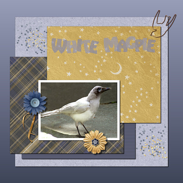 Text Workshop Lesson 5 Overlapping Text
 -
yay, Lesson 5 done and I'm catching up. This white magpie I think is the progeny of the famous St. Albert White Magpie. It lives in an area a bit aways from me. Last this guy showed up for two days. I think it's a baby as it looks like there is still a little bit of pink around the corners of it's beek (mouth?) and the eye looks slightly blue. Of course my camera was set to studion work and i had to shoot through really dirty windows with the sun haze coming in. the before of the this picture is quite bad, I'm surprised I could get this much out of it. This bird looks kinda of ugly up close and rather like a raptor (dinosaur), but when it flew up to the fence and I saw it's wing and tail spread from the back it was like a white Angel. I was just about to delete any photo's I got as I thought they wouldnt be useable, so I tried and this is okay. At least I have a record of this guy/gal. Fonts is Harlequin Extra Bold. Background is graident base originally from the around the eye of the bird and I chose the lighter color and then Foreground/background graident (is that what it's called, I can only see part of the first word in the gradient materials list). the rest of the supplies from Digital scrapbook, the following designers: MarisaL, cpjess, apjess (is this the same person as cpjess), Billie Irene, Elif Sahin and Gina Jones.
- 331 replies
-
- 14
-
-
-
"does this FAT font make me look fat?" hahahaha. Fat fonts is a funny term, but I find I dont have enough of them either.
-
I quite agree Mary. You dont realize how far you've gone until you look at your watch or your stomach starts to growl and you have to turn back.
-
Thank you for your compliments. I should try that, I've only used it making the engraved metal and on the leather tag so I dont quite understand it yet. I agree about text on a curve, once I tame that pen tool that is.?
-

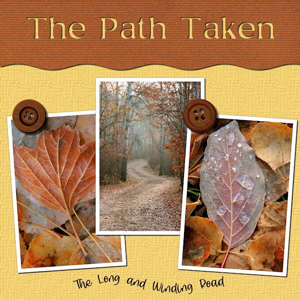
Text Workshop Lesson 4 The Path Taken-600-gallery
Susan Ewart posted a gallery image in Text Workshop
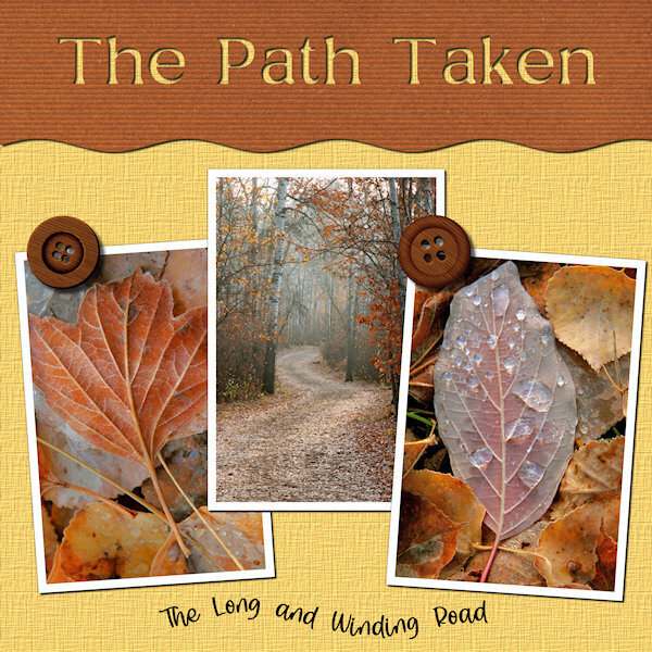 Text Workshop Lesson 4 Text on a Path
 -
Day 4. Text on a Path. I like being reminded how to do text on a path. At first I thought my Text too was out-to-lunch because I couldnt highlight the text. Are you ready for a laugh...well, I had not put the paper in place of the grey holder spot so I couldnt see the text being highlighted because it was the same color. I put a temp paper in and there my text was, all highlighted and happy. The temporary paper (yellow) I kept and added a texture effect. The brown paper is from APJess-Furry cuddles (Digital Scrapbook) that I also added the Blinds texture. The buttons are from Digital Scrapbook - I forget who. Font is Stay Latte for the bottom and Mustard Med for the top, I cut it out of the top paper, using the magic wand to select the letters and then hitting delete on the paper layer...and initially forgot to hide the grey layer, another Duh moment.
- 331 replies
-
- 16
-
-
-
 Text Workshop Lesson 3 Wrapped Text
 -
Here I am back at Lesson 3 still. Errands are done and now to play catch up. The fonts for the whole thing is The Blowar. Two of the papers (Brass, green metal patina) from Digital Scrapbook KMRD-Steampunk-brass metal, and metal patina. Photo by my hubby a loooong time ago, probably around 2006. Yup that's me in the yellow top, my one and only attempt at glass blowing. I already had a huge studio with Lampwork and Fusing glass that I didnt want to add more glass and more expensive equipment. What did I make? A nice 'horse hoof shaped blob of glass...that was supposed to be a nice round sphere. Much easier to work glass in a flame, or cut it up and stick in a kiln, for me anyway. PSP was acting very sluggish today, dont know why.
- 331 replies
-
- 15
-
-
-
I do this too. It helps to make it stand out a bit more.
-
Look who's becoming a "Word Art" pro. Beautiful layout, the colors work really well together.
-
What a beautiful layout! The background is stunning and the flower cluster is very nice.
-
This is a beautiful layout. The colors go very well together. I found I need to make changes to mine too. Two colors I knew I didnt get right from the start, but I went with them. And the dark colors dont seem to be dark enough, as well as I should have had more colors in my pallet.. I absolutely love your arrows and your awesome cottage visitors. I used to live very near the ocean and worked a few blocks from the ocean where I could stand on the beach and see America (Blaine, WA). Now I'm living in a prairie province. I miss the ociean and the mountains. Side note: have you ever watched the Hercule Poirot shows (I think filmed in the 80's-90's? The show is set in the 30's and so much Art Deco pieces in it. We've been watching them on U-tube(we cancelled Netflix, who knew U-tube had all kinds of movies for free).
-
Great advice, thank you.
-
BEAUTIFUL images! Your daughter is a natural. You will have loads of images to come I hope.
-
Wow Ann! This is fabulous. The quote is purr-fect! Those photo's are really give the layout a great atmosphere.
-
I'd say that makes you efficient. I admire any one who can grow anything. I manage okay to grow Parsley, Thyme and Rosemary, but nothing else I grow survives. My husband says it's because I forget to water them..hahaha. It's true. I start out all gung ho, then I just neglect plants. Going on that, I would have made a bad mother.
-
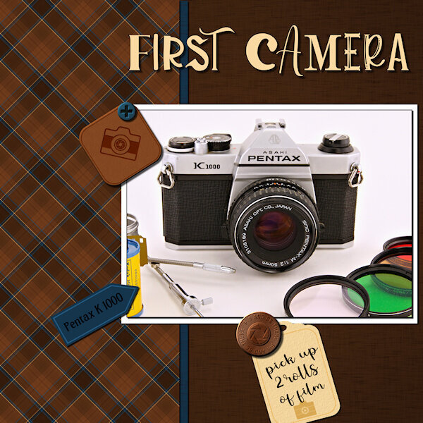
That is so cool, your Ricoh. Not many people know that brand. My sister in law sent all her old cameras to me recently (as did my brother - only he sent me his Nikon F3!) and one of them was a Ricoh XR1. I had being mostly collecting cameras from the 20's up to the 60's but ended up also with a number of 35 mm SLR's from my era of starting out. So now I display them as well. You can still get film too. I saw some in a store recently. I heard there's a bit of a revival in shooting film. We sure had to nail our exposures, when shooting film, didnt we? Often you couldnt re-shoot the subject if you blew your exposure.
-
That is a striking plaid. I love it.
-
 Text Workshop Lesson 2