middie
-
Posts
25 -
Joined
-
Last visited
-
Days Won
1
middie's Achievements
")


-
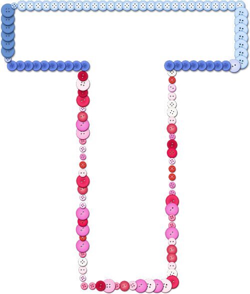
Lesson 7 assignment enclosed. Stil having trouble matching font & tube styles & sizes. This looks like I used one tube around one complete path but I did cut the path in half so I could work on the top and bottom of the letter separately (that actually was the easiest part). After numerous combinations, I decided to use one button tube for the top and another button tube for the bottom. When I was cutting & moving nodes, I didn't get the images to line up properly & had to use the pick tool to do so before merging the layers at the end. Some mistakes are easiert to hide than others........

-
Enjoyment yes, but lots of tedium in finding letters and tubes & tube settings that gel together perfectly. I probably need basic lessons in using picture tubes. The more you learn the more you need to learn... it never ends.....
-
Lesson 6 assignment is attached. Love that script..... you can play with all sorts of variations before committing to one. I got a bit lost in all the tube settings so went back to the basics. However, I am noticing that I am getting a small "dot" if you will at the same bottom right of the capital M no matter what setttings I am using. Is this just an artifact of that particular tube? I had tried with a flower tube but got some gaps in the sharper inside corners of the M despite the tube being set at continuous so I guess that the size of the angular space has to do with the flower tube fitting in that space. But I still can't figure out that dot on the sample below..
- 409 replies
-
- 13
-

-

-
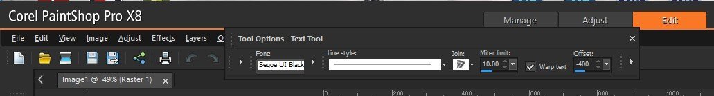
Hi Jeni. I had the same problem with PSPX8. I eventually found it, not in a popup box, but a bit further along in the text toolbar at the top. You won't see it until you click on one of those teeny faint arrows to expand the toolbar. It should appear to the right of the mitre limit area and just to the immediate right of the warp text. Screenshot of my PSPX8 text toolbar is enclosed.
-
Second parts of lesson5 is enclosed. The image (which does look a lot like me) is from Pngtree where I have a premium subscription.
- 409 replies
-
- 15
-
-

-
-
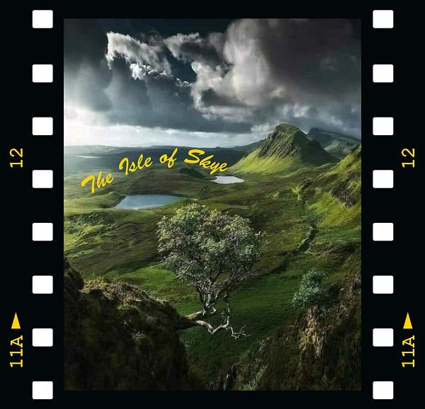
Getting better.... only took 3 tries to get these assignments done. the first is enclosed.... sending second one separately as I am not sure if the two together will create issues. This one doesn't fare well in a small size but it is gorgeous as a wallpaper. Couldn't resist adding the frame.
- 409 replies
-
- 10
-
-
-
Don't bang your head against a wall as it achieves nothing. Eat choclate or shortbraed instead - calories are calming..... vey calming..... as I munch away during this lesson.
-
I tried that "sculpture" effect a couple of times but it never seems to give me what I want. It is great for some things (especially grungy stuff) but not for delicate brocade or lace effects. So, when in doubt, buy or borrow from people who are far better than I am at this stuff.
-
For Cassel - Thank you for that deletion information. PSP can get bloated if you are not careful and I always like to bury my mistakes as I get better. I agree about the scripts & picture tubes for PSP. I must have about 95% of the ones in your shop. I guess that PS actions are the closest to PSP scripts but I find the PS actions to be "clunky" and the PSP scripts to have more finesse. I do love the PS layer styles though, especially any that have to do with brocade or lace. I start my projects in PSP, import to PS for the styles, then import back to PSP to complete the project. It took me a while to learn how to manage that without creating a disaster. My photography club has been trying to get me into Lightroom but that is were I draw the line. I can create rolling fog, rain with lightening flashes, softly falling snow, and blowing leaves in PSP9 & AS which is more than they can do.
-
Lesson4 - nothing fancy. Just tried to get the nodes & layers right. looks like something I did in my first pottery class (it didn't survive the kiln).
-
It's true what they say..... dogs have masters and cats have servants.
-
Been there... had to do that. Once I found out how to call up a list of all the passwords and their sites in my computer's memory, I print out the list every month (as I change my passwords often as recommended). That way, I have the currrent ones as well as the previous ones. I never want to have to go through that pain of loosing them all again. I hope that you get your passwords and accounts sorted out.
-
I think that working with vectors in any program is going to be tough. I am going to do a couple of Photoshop lessons later this year and see if it is any easier there. My preference is always PSP but I was tempted to use Photoshop for some specifical applications (like all the lovely styles that you find in scrapbooking bundles and in some of the online shops). I will probably switch back & forth once I master both. At least PSP is less expensive, there are way more free online tuitorials & Cassel is always helpful. With Photoshop, you sort of are thrown to the wolves.
-
I believe that the adjective that you are looking for is "mephistophelian" derived from an evil spirit to whom Faust sold his soul.
-
Lesson 3 went more smoothly as long as I zoomed in to add nodes, otherwise they end up all over the place. I do have a question. At the end of the classes, how do we delete all our admittedly poor first attempts at saving the shapes so that they do not clutter up our shapes library? I am sure that I will get better at these over time & I doubt that I will want to reuse my pathetic initial assignments. Can I just delete the pspimage file in my documents or do I have to also delecte them somehow from the shapes library?
- 409 replies
-
- 12
-
-