-
Posts
58 -
Joined
-
Last visited
-
Days Won
1
Content Type
Profiles
Gallery
Forums
Everything posted by Dan Greenwood
-
I use Microsoft Edge and it also has live captioning. Drop down the ellipse (...) at the upper right and choose "Settings." Click on the three stacked lines to the left of the word "Settings" and choose "Accessibility." Finally, choose "Open system preferences for captions." Turn on captions and allow the caption update to download. You can set caption styles here (font size and color, background color and transparency, etc.). Then use the Windows logo key + Ctrl + L to turn on live captions, while on a page with sound.
-
Not too bad. I have a plastic unit with many small drawers to hold parts. I will admit that all the drawers are full!
-
From the time I was very young, whenever any appliance or mechanical object was going to be thrown away, I took it apart and saved all the parts that I could. For instance, when my mother's reel-to-reel tape recorder that she'd had since high school stopped working, my sister and I bought her a more modern one, but which still used the same reels. I took apart the old recorder, saving springs, bolts, screws, spacer posts, the power cord, etc. Thirty years later, I needed a specific bolt with an uncommon thread. The one I found and used I recognized as being from that tape recorder. I also have old-time punched nails that I inherited when my grandfather died.
-
In the USA, you can get paid for blood or plasma, but your donation can't be used for transfusions, if you're paid. However, the American Red Cross does sometimes offer T-shirts or gift cards, to entice donors. I've proudly donated over four gallons, since 1990. (I donated more before that, but a changeover in their recording process lost the older records.) I've had many operations, starting at age 6, so I understand how necessary it is to keep up the blood supply.
-
In the 1980's, I worked with Gina, a lady of Italian descent, who always brought pizzelles for carry-ins. Although her family made them with traditional anise, she knew that many people don't like black licorice flavor, so she only brought in vanilla cookies. We became good friends, and I asked for all the details of how they were made. One Christmas season in the late '80's, I was in Chicago, shopping the Miracle Mile. I was looking around in Marshall Fields and I happened upon an electric pizzelle iron. But it was $50! (Worth about $145 today.) I really hesitated to spend that much. But I had never seen one in my hometown and didn't get to Chicago very often. (And this was before online shopping!) So, I bought it. When I told Gina, she made me promise to never bring in pizzelles at work, because it was her thing. But my family loved my pizzelles. Especially because I experimented. I've made chocolate, pecan, almond, chocolate/peanut butter, cinnamon, peppermint, orange, mocha, cherry, and even rose flavored pizzelles. This year, I'm painting them with luster dust edible glitter, to make them even more magical for Christmas! I guess that wasn't too expensive of a purchase, considering that it's been nearly 40 years that I've been using that same appliance!
-
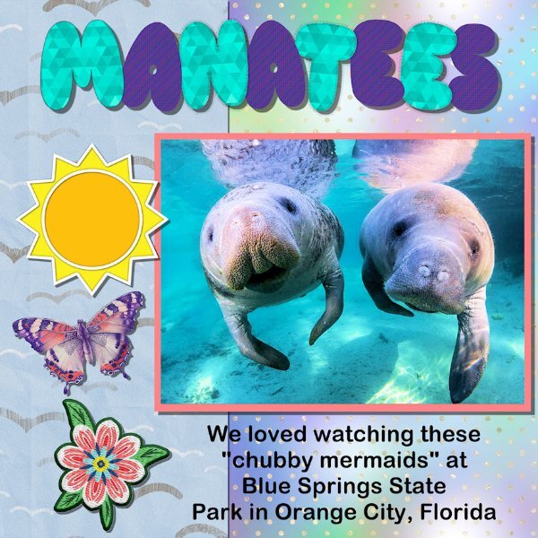
Thank you for this class! Also, for your Black Friday classes! I just viewed "A Beautiful Mess," and the mention of Brusheezy.com alone was worth it, as it got me free watercolor brushes. Which I used to create this:
- 339 replies
-
- 14
-

-

-
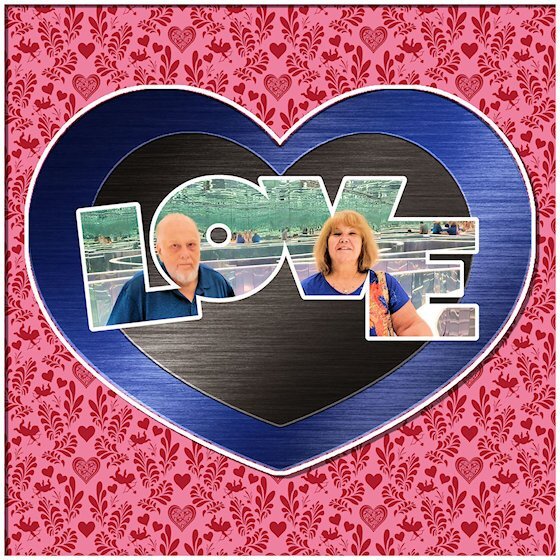
Here is my lesson 7. Sort of a different valentine. I added the outlines because I think it makes it look like a travel brochure!
- 339 replies
-
- 13
-

-

-
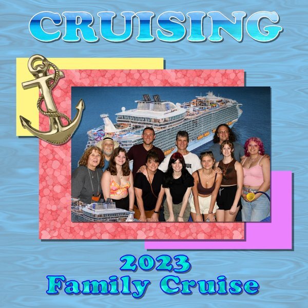
My lesson 6. Revisited my earlier "cruising" theme. I found I had a gold rope picture tube and I just used Arial Rounded MT Bold for the letters.
- 339 replies
-
- 14
-

-

-
- 339 replies
-
- 12
-

-

-
Thanks. It was a photo of the sea and sky, lightened a bit from the original.
-
- 339 replies
-
- 12
-

-

-
Here's my lesson 3. The words appear to be off-center, and it's because Paintshop takes the spaces between words into account when centering. I could use a return instead of a space at the end of each line, but that would defeat the whole purpose of the text wrapping.
- 339 replies
-
- 13
-

-

-
Dang! I don't usually do scrapbook pages, so I forget about the drop shadows. Here's lesson 1 - again! BTW, the filler in the letters of the title is an actual photo of the sea and sky. But it's hard to picture that in such a small space.
- 339 replies
-
- 14
-

-

-
- 339 replies
-
- 10
-

-

-
- 339 replies
-
- 12
-

-

-
Hello everyone. I haven't taken this one, so I can't wait to see what I learn.
-
Thank you, Ann!
-
- 430 replies
-
- 10
-

-

-
Here's my July page, as an example. I used the Vervelle font for the month days, because it has glyphs. These are two of my grandchildren, whose birthdays are in July. Their favorite colors are pink and green, so I faded those colors as a background.
- 430 replies
-
- 12
-

-

-
Here's my cover page. My calendar has friend and family birthdays. This is my wife and sister. But I had a challenge: The picture cut off right above their heads. So, I cut a thin strip above them, pasted above them flipped vertically, pasted the original above that, etc. You can see the repeating images above them in the mask. I don't think the result is too strange... The font for this page is Gigi.
- 430 replies
-
- 11
-

-

-
I took last year's class and my family loved the result. So here I am again! Thank you, Carole!
-
They never found out, that I know of. I'm thinking that took "secret Santa" to a whole new level! :>)
-
- 229 replies
-
- 13
-

-

-
- 229 replies
-
- 10
-

-

-
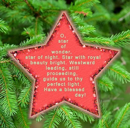
Day 6 - Used leading to fit all the words. Also, wanted to make a comment: If a word splits at punctuation, instead of adding spaces, I just put the cursor after the previous word, delete the following space, and press Enter (for a new line). Please let me know, if you need me to post the words. I think they're readable, though...
- 229 replies
-
- 12
-

-

-


