-
Posts
3,337 -
Joined
-
Last visited
-
Days Won
80
Content Type
Profiles
Gallery
Forums
Everything posted by Ann Seeber
-
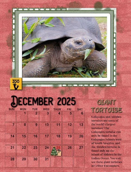
And here's December featuring one of the Nashville Zoo's Giant Tortoises. The background is a paper that I colorized. I've been using the same fonts throughout.
- 430 replies
-
- 10
-

-

-
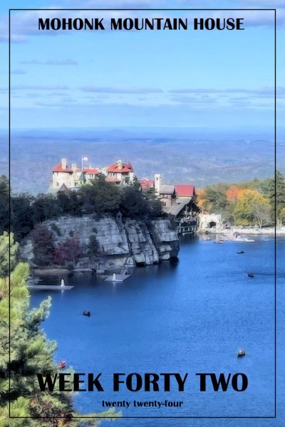
P52 -WEEK 42-THE MOHONK MOUNTAIN HOUSE HOTEL above its glacial lake. Photo by daughter Debbie Lennox.
-
Oh, that reminds me. I forgot about slipping a photo or graphic behind the date grid. Actually, I did it on my monthly calendars occasionally. I didn't use a mask, just sized the art to fit.
- 430 replies
-
- 10
-

-

-
Corrie, I have used both. It's just what fits the feeling of the photo and masking. Plus, I'm flexible when experimenting like this. 😉
-
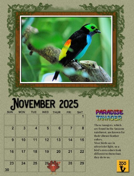
I consider this November page as totally finished, instead of preliminary as are the rest of mine. This time I added a title and journaling. The title is filled with a rainbow metallic gradient. The fonts are Play On and Playfair Display. Again I used a few promoted layers moved up to be outside the group in order to create the frame and mat effects. This is really a fun workshop!
- 430 replies
-
- 11
-

-

-
Wow, Julian, all your pages are gorgeous! 😍
-
I announced my plans to add journaling on my post for September which will include common names if I can.
-
Hi Suz - I had to resort to promoted selections and even had to park those up out of the group. These mask groups are really different but I'm getting the hang of it now.
-
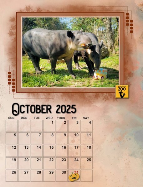
And here's October - the Tapirs are designated Endangered. This zoo has a breeding program for them. The background paper is ID_AllThatsFall and the pumpkin sticker is from Sheila Reid.
- 430 replies
-
- 11
-

-

-
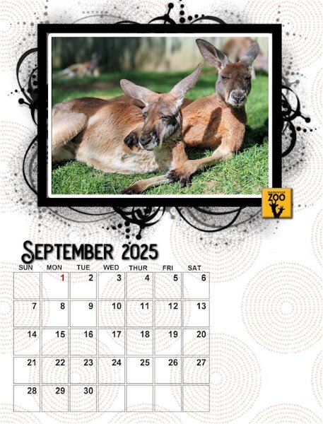
Here is my preliminary for September. I'll be adding some journaling later on all of them. This is "Rooben" & Matilda the resident kangaroos. The background is a paper from a collection called Boho Digital Papers.
- 430 replies
-
- 10
-

-

-
sadly, I had the same problem
-
I'm in. Did this one once before and need a refresher.
-
Julian, that is the original template design for May. She turned it 90 degrees.
-
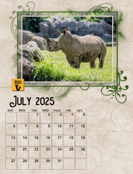
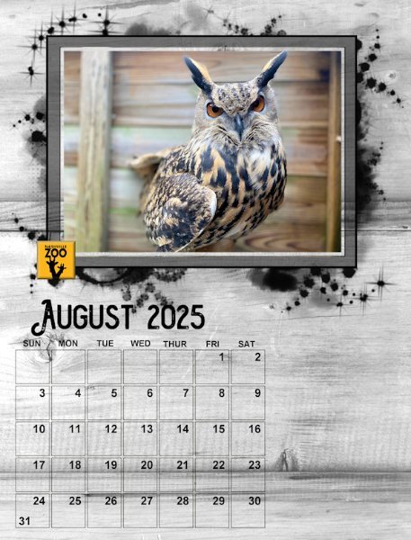
Here are July (White Rhino) and August (Eurasian Eagle Owl). I'm finally figuring out how to play with the mask group to get different effects.
- 430 replies
-
- 11
-

-

-
Beautiful, Sharla! How did you get the green color on the mask? Oops, I figured it out, just add color to the PHOTO HERE layer. 🙃
-
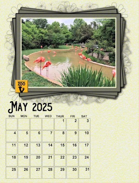
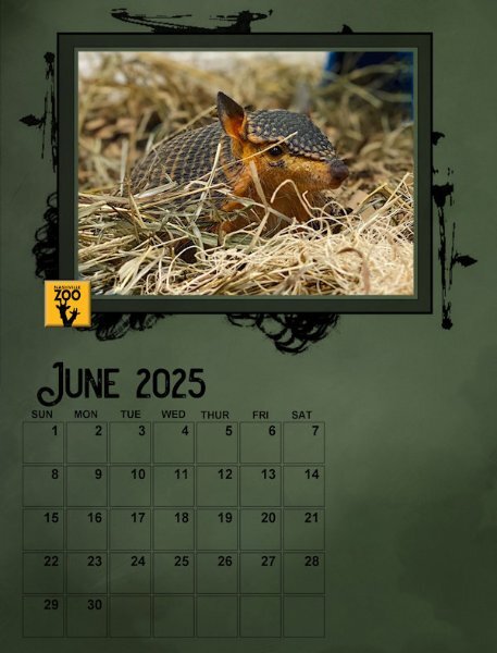
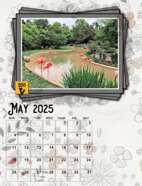
Here are my May (Flamingos) and June (Screaming Hairy Armadillo-yes, really!) May background is color fill with a citrus peel + noise texture and June is a paper. Is it possible to color the flowery background to the mask and the frame?
- 430 replies
-
- 11
-

-

-
Funny, they are not showing on my May calendar I posted above...
-
Oh, I didn't know you could do that. It must be while it is still in vector format but how do you adjust it?
-
Not really. As I said, I first merged the frame/mask/photo group, then I added a background paper underneath it in the layers. I was astonished when the background paper pattern showed on top (or through) the frame/mask/photo group.
-
Nice Sue. Wondering how you got those whisps on top of the photo/mask/frame?
-
Here's an example of the strange effect from the mask group. I merged the mask/frame group and added a flowery paper as the background, under the group. As you can see, the paper ends up showing on TOP of the frame?? I decided to use a fill instead for May but I've used papers on my other months.
-
Oh, thanks, Anne. Glad I'm not alone. I can't figure out how to reproduce the effect so I can share it here. Those layers are definitely strange, though they work ok, just not as expected.
-
@Cassel I have a question about the templates. The mask group seems odd in that the PHOTO HERE layer must be retained as it contains the design which underlays the frame. First time I've ever seen that. In the past you've advised to hide it or delete it, but you can't with these. Also, the font Arial is displayed in POINTS rather than PIXELS on the templates. I get some odd size reactions when changing the font for the name of the month. Your videos show you using pixels, but they come out way too small on my PSP2023.
-
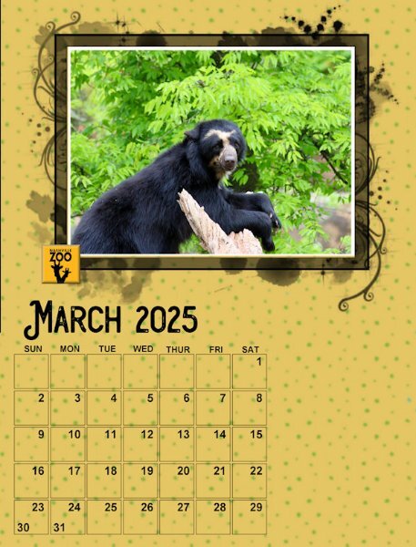
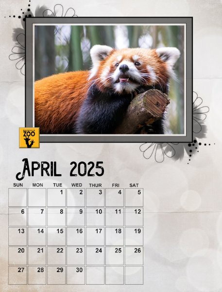
Here are my preliminary March (Andean Bear) and April (Red Panda). I'm on a roll with papers as backgrounds...
- 430 replies
-
- 12
-

-


