Leaderboard
Popular Content
Showing content with the highest reputation on 11/21/2024 in all areas
-
9 points
-
Day 2. I used a pic I had AI'd in 2023 (the only thing I do in 2023) -- it's a great pic that Laurie took when they were in Mobile Bay. The background is a paper I created in the 2024 Calendar Workshop that I thought would work well here. the cluster is one I developed for my Beach Kit. The starfish element is from Pixel Scrapper. The font is Arial Black but the M in Mobile and the B in Bay are Baghira. I had a time separating the other letters to make something different of them. If I was making this layout for display I would not have worked on the letters which I kept in Arial Black. But - this is a workshop and so I did do different things with them - sometimes using effects>Texture Effects>Sculpture, sometimes blinds, and then I just used the beginning letters from the 2 words with the effects Inner Bevel. This was an interesting trip. (PSP trip)9 points
-
8 points
-
I went back to Lesson 2 and redid the title. Looked at the instructions again and tried doing it again - this time I actually highlighted each letter and was able to change the font AND the size as well as the color. Used the sculpture effect on the letters except the beginning letters, the beginning letters I just inner bevelled them.8 points
-
Due to a serious shortage of time I reuse this layout from the StoryTime Workshop that has the textwrapping. I liked to use that feature very much but PSP2023 has a big problem with that and although Corel knows about it there hasn't been a solution to it yet. The problem lies in the fact that you are not able to convert your text to a raster, it goes to a single line and disappears and thus you can't resize it for posting. Very annoying!!!! The only option to make text with textwrapping is to use an older version of PSP and then import it into your project in version 2023.8 points
-
7 points
-
Day 3 I like to use two fonts at the most in any project I do, haha, there goes Day 2 I began with Billboard in bold for Chocolate, then Angora for the word Hot. Well, Angora wasn't going to work for the journalling, so I went back to Billboard, no bold for the text there. Thanks, Carole, for that hint about the text, and later versions. I didn't know that. Mind you, I'm new to 2023, using x8 or x9 for years, yet it is relevant to both those versions. I have always ensured my images work with PSP7, and the jpegs can still be saved for that version. For this page, I have used an image I took years ago of a beautiful rose, Hot Chocolate. It was only when I was looking for info on this rose, I found out it was a Kiwi who created Hot Chocolate. This particular rose bush had a family of baby birds living in a nest cradled in the fork where the branches come out from the trunk. In this composition, I have used staples from Sharon Dewi Stolp available from Digital Scrapbook. She had a lovely green paper with white daisies on it, so I used the green from her paper for the backing of the photograph, not her paper itself, which is very pretty. The beige and coral colours are in the photograph. The nest down below the flowers. Interestingly enough, others around me, at the time, did not see these birds in their nest.7 points
-
I can think of a couple of ways to do that...first, make a selection of what you want covered up, and then pixelate it. Or, still selected, you can create a blur. Or, still selected, you can place a shape (like a circle, square or X for that matter). Add an image over top of their face. There are many, many ways to do this...good luck!7 points
-
7 points
-
7 points
-
6 points
-
6 points
-
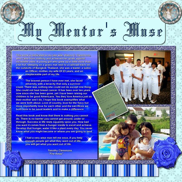
That backdrop for the text on the Mentor's Muse project was from the below photo, taken while we cruised rapidly through the "Red Sea" near Egypt on our way to the position from which we launched 23 Tomahawk missiles at the start of Operation Iraqi Freedom. I did some cropping, duplicating, mirroring, and flipping along with some blending to achieve the result in the project. I guess it was "sort of" lights but actually a reflection off the waves in almost perfectly calm water as the ship sliced through it.6 points
-
6 points
-
6 points
-
6 points
-
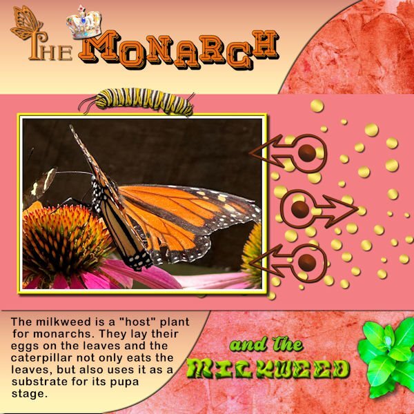
Day 3 - I love monarch butterflies and took a lot of photos when I visited the Butterfly house. The background is one of my own with a gradient on the other curve. The caterpillar, pupa and milkweed are from Canva. I made the arrow fasteners from an arrow dingbat font from CF. The first letter of "The" is Butterfly Monogram from CF, and the title is called MeLove also from CF. The word milkweed is from some png letters downloaded from CF and recolored. The gold circles are from my Build a kit 2. The crown is from AI, Adobe Express.5 points
-
5 points
-
5 points
-
For day 4 I used a card from the Mask Workshop - Extra 2b and a photo I took in Yosemite NP in may this year. When I took that photo I already thought X-mas card! 😃 It has text on a path and the 2 embellishments are from my stash. I don't think I am able to finish this workshop but that isn't a problem I have done this one before. The reason is I have a photo assignment and have to make a album out of it. The lady of our swimgroup has her 85th birthday this week and we decided to give her a surprise buffet in the cafetaria part of the pool. Everybody paid € 5 and one of the members is a cook and the pool director donated all the coffee and tea and the plates/cutlery etc. Today was the big event and I had to take all the photos, so for the next couple of days I'm busy to make an album that then will be printed and presented to her. If I was making this only for me I would take the time to finish this workshop, but now there is a little bit more pressure to hurry up. I'll have a look her what everybody is making and see you all in a while5 points
-
5 points
-
Love it, Corrie. Years ago, when working for a newspaper, we received our opposition's newspaper to check out. This was great because the Cryptic Crossword was done by so many o us in the various departments. We telephoned around about clues and answers, etc. It really is quite an addiction.5 points
-
5 points
-
Here is my attempt at Text for Day 1. I am using PSP2021 and when I was watching the video clip and clicked away from PSP to rewind (I have two monitors), the programme "accepted" my text, and so I had to delete and start again. Used Cooper Blkoul BT, and the Tube I had was a glitter ball. Not quite what I had in mind, and of course it ended up not quite following the instructions as I had hoped, but here it is...5 points
-
4 points
-
4 points
-
Something that I always do to make black text darker is always select bold on the text tool bar. The other thing that I do that is actually against everything everyone says about text and drop shadows is to add a very small drop shadow to my text after I rasterize it. I use the settings: 01-01-50-05. Horizontal/Vertical offset being the 01. Opacity is 50 and Blur is 05. I only use these settings for black text but I do usually use black text anyways. I want the text readable which is also why I very rarely use a patterned background for my text. I know if I can read it, anyone can!4 points
-
4 points
-
Oh, I get it. I guess I never read it correctly and that the question was about the portrait photos. 😬 I learned this from Carole, and there is a 2017 blog post titled "4-ways-to-hide-a-face-with-paintshop-pro/." Since then, I have been doing this with the family and my own photos when I post here. There are other ways of doing it, but I prefer pixelated.4 points
-
3 points
-
3 points
-
Ann, I love the fog page, the blues are colours I particularly love, and the poem is superb, the photos are so soft and misty looking. It is lovely to see the work Jackie is doing with these beautiful creatures. What a great job your granddaughter has.3 points
-
3 points
-
Select the face using freehand, then apply Gausian Blur to it in whatever strength is sufficient for you.3 points
-
3 points
-
Wow!!! That is a lot of projects posted. I am so happy to see that many participants! @Jacques That perspective distortion on the Sleigh Ride is quite ingenious! That story of the old fashion cribs is lovely! @Anita Wyatt That Storytime title is so appropriate with that photo! A big smile on my face. @Cindy Sheets With practice, most of this should become more automatic for you. @Dan Greenwood Whatever you used to fill the cruise title worked very well (photo or gradient!). Yes, the wrapping is not always 100% perfect. It sometimes, also changes line when there is an apostrophe or a punctuation mark. I think it is less obvious with the spaces when the text is smaller compared to the area. @Susan Ewart The Texture effect is an interesting one that is not used very often. I just wish we could rotate the pattern in that command! @Jeni Simpson I love that steampunk title. I think that it would give more 3D effect on the title if you added some shadows which would be consistent with a thickness of metal. @Carolyn Rye Great Amsterdam project. @kasany Lovely colors on the Tatry layout. @Jannette Nieuwboer Interesting selection of fonts on your flower. Have you tried without an outline? With such variety of fonts, adding a stroke around makes it a bit harder to read (at least in the resized version). @Emerald Jay Did you also have a chance to see the Northern Lights? Those are such great colors. @Cristina That is smart to just complete an older project! @fiona cook With the resized version, the poem is hard to read so we won't be able to say it is "awful"! And to answer your question about covering faces, there is an article HERE for other ideas if you want/need to conceal someone's identity in photos. @Anne Lamp Great way to use that shape. Even though it was initially created for making gemstones, there are obviously other creative ways to use it! @gwen jewitt Great use of the wrapped text. @Krystyna Nicholls Welcome to the workshop. We are here to help you get re-acquainted with PSP. @Teri Cleaveland You will have time to catch up, I am sure. @Cristina Mochetti Since you added some "volume" in the title, you might want to add also shadows on the elements and papers on the page to be consistent. @Daniel Hess That hen/cat layout made me laugh! It is interesting that you shaped your text around the "lights". Very clever! @Corrie Kinkel The problem with the text wrapping in 2023 is not really that it disappears (unless you use a compatibility mode to save your pspimage file lower than X7), but that it does not resize. I think it is the same with other versions. Could it be the compatibility mode that is different between your versions? @Mary Solaas It is ok to just do projects as a practice. You might just use the same technique later, in a different project. @Linda J Walker Yes, the baseline can differ from font to font, especially for the less "basic" ones. This is a great thread to get inspired by all the projects posted and ideas shared. Keep them coming. And if you are ever stuck on one tutorial or if something does not seem to work, don't hesitate to post, so we can help you over those hurdles!3 points
-
3 points
-
Just starting Lesson One today. I'm already behind!! I've done it before, but It's been a long time!3 points
-
That is not what I meant. I need the way to blur someone's face who does not want it on the internet.3 points
-
I'm not able to do the Text Workshop this time, but I enjoy seeing the output from others who are. I don't actively look for photos online, but if they happen to appear in front of me, and they touch me somehow, I grab them as a layout possibility. National Geographic is a good source, and I get plenty of emails from them (even though I don't pay for a subscription to read the articles). This one is from their Photos of the Century collection, and I just loved the face. So many of the pix they present are sad and reflect the steady decline of wildlife species and flora of the world. Since 2005, this photographer has taken pix of over 10K species to document their peril and to encourage people to be aware. I think Nat'l Geo is preaching to the converted, unfortunately. I did an extraction of the image since it had a black background and was straightforward to do (but not perfect I fear). Anna Aspnes and Katie Pertiet design elements used. Font for 'cheetah' is Stardust.2 points
-
2 points
-
2 points
-
Once you have the Text tool, you can either double-click directly on the text OR you can double-click on the text object inside the vector layer (you have to click the little arrow on the left to "open" it). At that point, you should see the cursor blink. Beware that when you highlight the text, sometimes, the highlight is hard to see if the background is grey.2 points
-
Me too, I'm in. Have done this before, but as it has been such a long time now since I played with PSP, I feel like a newbie!2 points
-
Susan, the entire town is beautiful, with limestone buildings. There is an older part, which is beautifully decked out in a mix of vintage and steampunk. We go there whenever we travel to Christchurch. A little way out, north of Oamaru, is a castle and gardens with a restaurant, and shops galore, owned by the same family.2 points
-
2 points
-
2 points
-
2 points
-
Yes, I have a few steampunk files, it fascinates me. I have some friends who dress that way, not me, though.2 points
-
Ik houd ook van steam punk. Ik heb een paar files vol met SP attributen. Maar om te kijken, niet om te dragen.2 points


