Leaderboard
Popular Content
Showing content with the highest reputation on 10/21/2024 in all areas
-
I am also participating in this calendar workshop. The very first Up to date challenge I participated in was in December 2016 (2017 calendar). Which was a very different challenge. A return to that particular challenge may be a thought. I believe that it precedes any of the challenges and workshops.7 points
-
I made this for someone in the PSP Maniacs group. She realized she had pictures of both her late father and mother on the porch of their cabin. She supplied all three pictures and the quote. I colorized a paper from DiHillerDesigns and lowered the opacity over a paper from AnnieC. The mask is from Lady22 template 245 and the birds are from ALFL Blog Train Jan 2021. I made the tag using one of Cassel's edge punches; it took a long time and I patted myself on the back when I was done 😂. The text font is Melinda Script and I made the hearts using a dingbat font called Heart.7 points
-
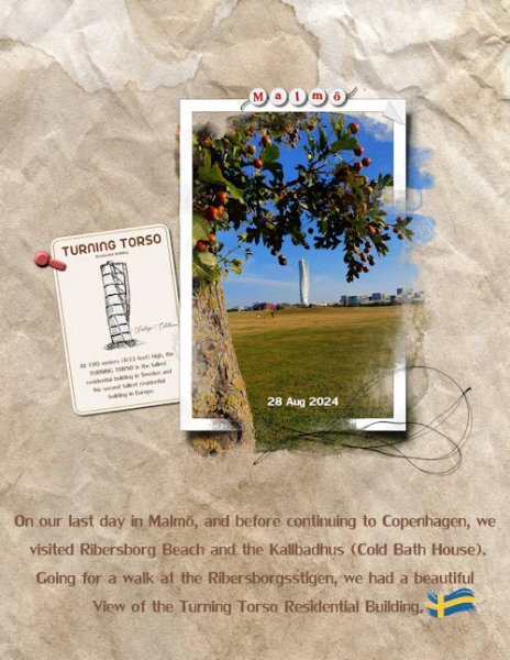
This is the layout I created to practice the tutorials from Lab12-Module 02 (Flash Card / Photo Prong / Worn Frame). Sometimes, it takes longer to find a photo that I can use for a specific Module. Again, I used 8.5x11 size. Credits: Cassel— Alpha-beads Script and the Metallic-Rope12 PictureTube. I was reminded of using this script after Julie posted a layout with Marisa Lerin's beautiful Alpha beads. Papers: From dunia (Lilypad) – Background: essentials_krafts_20 & Flash Card: essentials_whites_16 with a tad of Sepia Effect. Anna Aspnes: Art Mega Pack Freebie (Thread_ UrbanThreadz3 _UrbanThreadz3_1) Palvinka: Photomasks - Palvinka_MoreThanWords_photomasks_2frame I am very much enjoying this kind of photomask with frame. I used the photomask from Palvinka as a base for the one I created (worn frame). Edited: I forgot to name the fonts I used. Arista 2.0 -- LilyUPC -- Aurellia Script7 points
-
6 points
-
@MoniqueN. If you refresh the page, I have added a separate downloadable set of months to start on Mondays.5 points
-
Hi everyone. I have done the Calendar workshop before and now give calendars to my relatives each Christmas. I don't always use the formats from the workshop, but I always learn something new that I can use in my designs.5 points
-
No I hadn't read that other comment. So what I thought was misspelt, was correct and the others were the ones spelt incorrect. What a twist that was. At least it has been spotted, and you can rectify it, just as well you have saved it as a psp file. Haven't you??? Lol5 points
-
Easy to do when the work is right in your face, I often find stepping away for a cuppa helps. I am fairly visual and 'see' things others may not, at times.5 points
-
OMG! Thank you so much Jeni. And weirder thing is that's the ONLY one spelled right. He spells it Micheal, and it's really hard for me to spell it that way. It's like when I'm typing I have finger memory and automatically spell it the other way. At least the invite and reception cards are right. What's even funnier, is I did a bunch of test samples of the cards in the wedding suite (invite, reception, accommodation, details) with different wording as the bride hasn't yet decided on the details other than their names, the time, the date and the place. So I was making different styles with different words and one of the tag lines on the bottom of the reception card was "Drinks, Dinner and Dancing".....my niece looked at the sample and started to laugh. I had forgotten the "r" in Drinks. YIKES! The final will be spell checked by numerous people...perhaps I should send it to you and Ann S, you both have a keen eye 🙃.5 points
-
Mine is correct: January 2025, starting on a Wednesday, and February 2025, starting on a Saturday. By the way, I love the new templates!4 points
-
We will miss you. I hope you procedure goes smoothly and you have a swift recovery!4 points
-
4 points
-
It's actually called Joker, I kid you not. And it's from Creative Fabrica https://www.creativefabrica.com/product/joker-8/4 points
-
4 points
-
3 points
-
Oh, that is a good point. The months are based on Sunday being in the first column. Hum... Let me see if I can create alternate 'months' for those who want to start on Monday.3 points
-
3 points
-
Does the start of January depend maybe on the day your week starts? Sunday is for me day 7, weeks start for me on a monday (IMHO) 🙂3 points
-
Thank goodness for you and other in the Campus. Did you read my post above about the other misspelling, it's a duzy. Thankfully I'm still in the sample/testing stage. it will be proof read by more competent people than me. It's so funny that after seeing these for weeks now and not even noticing it. I must have too much going on in my head.3 points
-
3 points
-
I am preparing for a procedure, so I will be checking in and saving the work for later. It will give me something to do while recuperating. Plus, I get to peek at other posts for inspiration!3 points
-
3 points
-
3 points
-
3 points
-
Maybe not so much postage, but sort of, since the finished card will look like a mailable card - they are being hand delivered. This will be the the piece that will affixed to the belly band that wraps around the wedding card (pocket fold card with envelope like flap that wraps around the card) that I'm making for my niece's besties wedding...and the reason I haven't been as active in the campus lately. I will redo the hearts since they weren't a vector and have being problematic to work with. I ended up making a vector version. I'm still in the sampling phase and finally found the cover weight paper I will use since what I really want just isn't available in Canada right now (despite Neenah having a mill in Canada). It's a bummer as I had to reduce the size from the more traditional 5x7 format. The card required 13 inches to construct so I had to get it down to 12" and use a scrapbook paper. Nothing will be as nice as Neenah's Classic Linen in 110-130 lb cover, but this other one I got will do.3 points
-
3 points
-
I'm in too. 🙂 Of course it will be an Outlander calendar, but maybe a second one too about trips we made this year, we have seen so many nice places! 🙂3 points
-
2 points
-
I did save it as PSP thankfully. And it's the early stages of this process. the bride sill needs to fill in the details of the reception and other stuff (shuttle service, parking at the event etc). I just needed something to put in the card I make so she can get an better idea of how it would look completed and if there will be changes or additions to the various cards in the suite.2 points
-
2 points
-
Wow, that's gorgeous, Michele! Great job!! That edge punch is particularly effective. I don't know about you, but I always pull out all the stops when I create something for someone else. They are usually my best work.2 points
-
January 1st 2025 is indeed a Wednesday. The pspimages are good. Not awake yet 🙂2 points
-
2 points
-
Beautiful, Susan. However, check your spelling on the lower wording at the bottom right. You have Michael spelled Micheal only once. I, too, love the fonts used.2 points
-
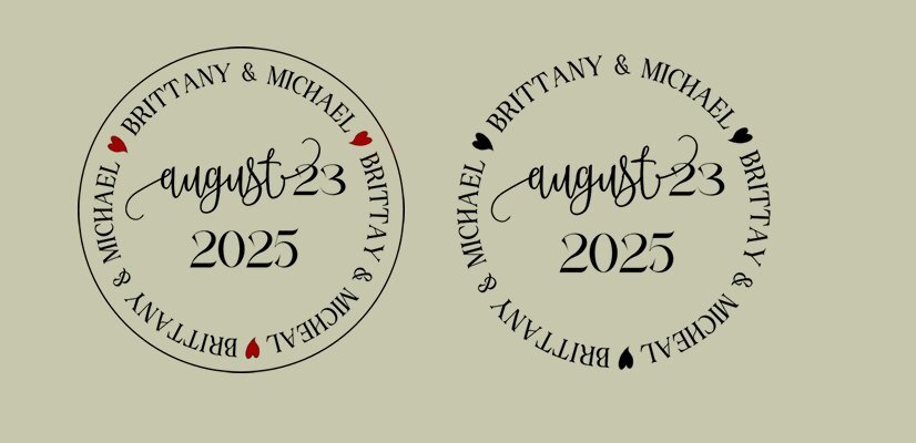
I use postmarks quite often and I use either a script from Carole or I make them myself if I want something different. I had no specific layout in mind at this moment because the Calendar Workshop is starting tomorrow and today I had guests. However I probable will need some new postmarks for my Xmas cards and that is what I made, they are a bit different and with the festivities in mind.2 points
-
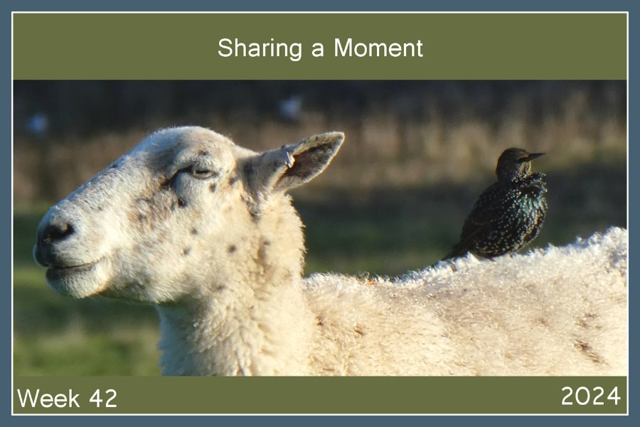
I love this Sharla. Are you in the UK? My friends just moved to Scotland (on the Moray coast in Nairn) and they send me photos. The birds are so cool, lucky to have jackdaws. They also sent ones of a Rook. Wow, what a prehistoric looking corvid. I love the speckled starlings and just was told that's their winter coat or something. When I lived on the Westcoast (Canada) we had starlings (invasive species there) but they were just black-ish that I noticed, I wasnt as into birds then).2 points
-
I used Hortense for the Script font (Michele I.D it for me as it was the Brides pick - I paid for it from Monotype, a type foundry that's be around over 100 yrs). However it is problematic, the glyphs at smaller sizes seem to get cut off - on some letters - with the bounding box. It's not ideal, as the smaller version "r" cuts off - look at the "a" above, cuts off part of the bottom middle of the loop (I was writing "reception to follow" so the "r" is important. At size 300 or 450, it's totally fine. This font has glyphs for lower case but none for upper case letters. I think CF would have a similar font with more glyph options. The Display font is Adeston from CF I think. I'm really drawn to the Display fonts. At the same time, even with the issues with Hortense, for a bouncy script it's the nicest I have seen. And I spent hours looking for one just like it, but I liked the curve of the swashes and so I used it.2 points
-
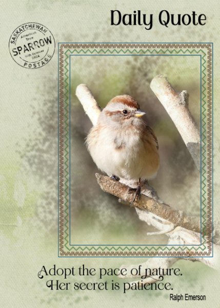
Here is the postmark I created for this page. I often create postmarks, as I find they are a wonderfully novel way to record dates, names of birds and other useful information. The background paper is from Ann Aspnes designs, mega bundle. Where I used different layered papers, blend modes, opacity. The mask is my own. The frame is Carole's freebie.2 points
-
2 points
-
Besides enjoying the mild weather we had this week I have been playing with the enormous amount of supplies from Anna Aspnes. First it took a while to sort through the whole bunch and watch the videos. She works with Photoshop and not all the techniques from the videos is 100% appliable to Paintshop but most of the supplies and PSD files can be used. I tried to make an artsy layout with some of the papers/overlays/ brushes and 3 of my photos from a walk in our woodland park this week. I'm not 100% happy with what I got but wanted to show it anyway before we start with the calendar workshop which will take most of my time in the coming weeks. I used a lot of blendmodes on the different parts of the layout. It certainly is another way to work and I'll have to do more of this.2 points
-
1 point
-
1 point
-
1 point
-
1 point
-
1 point
-
I haven't scrapped for over a month. Got deep into my genealogy and counted cross stitch then was on vacation for 8 days. There were some awesome photos posted on FB of the northern lights in Ohio (which I missed again!) so I borrowed them and made a layout. It will be inserted in my vacation album since I reference missing them again! I did note that the photos were not mine on the layout. Template is Photo Palooza #430 by Cindy Schneider and the kit used was Stargazer Aurora by Meagan's Creations both available at Sweet Shoppe Designs. The font is Freehand591 BT. The word art was actually a sticker in the kit that I used a bevel on it.1 point
-
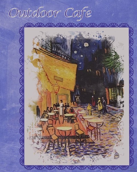
This picture is on the wall of one of our favorite restaurants. It is unsigned - a print of a painting. I just started playing around with it and how to display it. Decided on doing a vertical format this time. the picture is in a mask from Jessica Dunn - April 2024 challenge mask. I put a cream color mat behind it and a frame around that of Cass stitching. The background is made up of 4 layers - white, bluish purple, picture, overlay of RileyBgraphicsLondonFog7 from CF and colored a bluish purple using HSL and blend mode of multiply. the other layers have different blend modes as well. Several of you use your "logo" on your layouts. My daughter was telling me that my graphics designer daughter-in-law had said that everyone needs to put their initials or logo on all their work. Maybe it's time for me to develop one.1 point
-
1 point
-
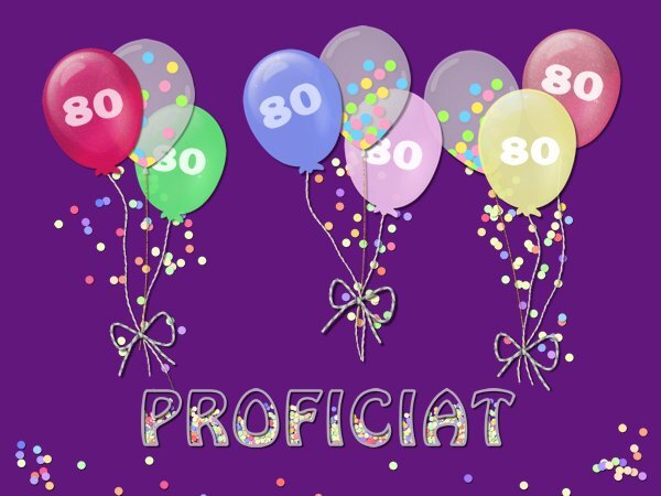
Something totally different and not what I make often. This card is for my very dear friend who will be turning 80 in a couple of weeks. It is just a miracle she is still among us and I have sent her a card every week when she had chemo with a lot of complications in the early days of the covid pandemic. She is doing well but has a lot of side effects from the ongoing treatment. She always loves birthdays with all that comes with it like pendants, flags, garlands around her chair, balloons and so on. Of course I could have made a nice card with some flowers but I have sent so many like that to her that I wanted something different this time. I have a couple of balloons in my stash and changed the colors to my liking for this card. Duplicated each of the recolored ones, put 80 between the two layers and reduced the opacity of the top balloon. In my stash are some translucent balloons with confetti in them, so I made confetti with cass-ConfettiMaker script also round and in the same colors. That confetti in a smaller size is inside the text too. It will be a double card with my logo on the back, probably with a small balloon as well. My birthday wishes will be handwritten inside. I sincerely hope she will like it.....1 point
-
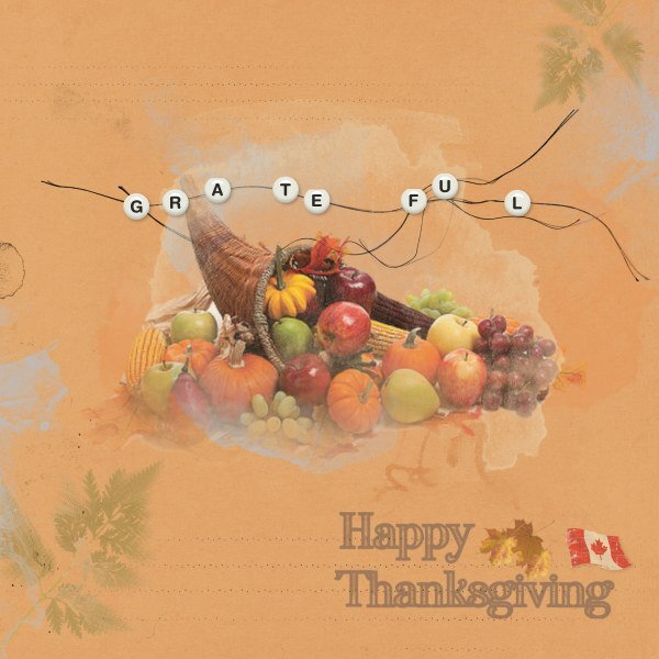
Just playing around with pieces from the Anna Aspnes freebies. And wishing my fellow PSPers a Happy Thanksgiving (well, the Canadian ones anyway). The only bit I "created" was the beaded string effect. It's an idea taken right from AA. I used her strings and the alpha beads come from Marisa Lerin (I started making my own and then gave up!). Oh, and the text is something I made some time ago, just added the Canadian flag to it.1 point









.jpg.a2f507e8763dc4094b7cdc0a8ebc6109.jpg)


