Leaderboard
Popular Content
Showing content with the highest reputation on 10/17/2024 in all areas
-
6 points
-
I haven't scrapped for over a month. Got deep into my genealogy and counted cross stitch then was on vacation for 8 days. There were some awesome photos posted on FB of the northern lights in Ohio (which I missed again!) so I borrowed them and made a layout. It will be inserted in my vacation album since I reference missing them again! I did note that the photos were not mine on the layout. Template is Photo Palooza #430 by Cindy Schneider and the kit used was Stargazer Aurora by Meagan's Creations both available at Sweet Shoppe Designs. The font is Freehand591 BT. The word art was actually a sticker in the kit that I used a bevel on it.4 points
-
I only post my work at the Campus, and like Michele, I can't imagine anyone here using somebody else's work and passing it off as their own. But, of course, if anyone posts elsewhere, it is something to think about. I only use my logo on the place cards I create yearly for the Christmas dinner. But this is more for fun, as it's only family, and they are well appreciated, as many take them home. 🙂 By the way, Michele, I love your signature, beautiful font!4 points
-
Do you mean "locate" them in the list? If so, you can always name them with !! in front so they will appear at the beginning of the list.4 points
-
4 points
-
4 points
-
3 points
-
Actually, just the opposite, as I find picture tubes awkward to locate. They don't line up like computer files for me.3 points
-
Try making a picture tube out of it. Maybe it will be easier to remember.3 points
-
3 points
-
I only have a very short answer, we do not have any variation of Thanksgiving at all! However there is a religious link; on the first Wednesday in November there is a church service where thanks will be given for the harvest. The produce will be brought into the church and there is a festive display of all the grains, apples, pears, potatoes, beef, etc. Everything is then distributed amongst the people in need. It is thought that this probably is the background for Thanksgiving. The first settlers brought it to America and Canada.3 points
-
3 points
-
3 points
-
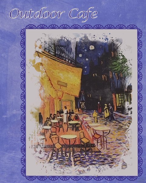
This picture is on the wall of one of our favorite restaurants. It is unsigned - a print of a painting. I just started playing around with it and how to display it. Decided on doing a vertical format this time. the picture is in a mask from Jessica Dunn - April 2024 challenge mask. I put a cream color mat behind it and a frame around that of Cass stitching. The background is made up of 4 layers - white, bluish purple, picture, overlay of RileyBgraphicsLondonFog7 from CF and colored a bluish purple using HSL and blend mode of multiply. the other layers have different blend modes as well. Several of you use your "logo" on your layouts. My daughter was telling me that my graphics designer daughter-in-law had said that everyone needs to put their initials or logo on all their work. Maybe it's time for me to develop one.3 points
-
Thanks, @Corrie Kinkel for the info on the Outdoor Cafe artist. I redid my layout to acknowledge that the painting was Vincent Van Gogh's. And then I realize that I hadn't been acknowledging the photographers when I use family's pics. So I went back to the recent layouts and did so. Won't post them here, but I will be more mindful of that in the future. On all the ideas on logos - I haven't begun to think of what I want to do along with the initials (I won't use my name - just initials). I have seen Susan Ewert's, @Lynda DiGregor and I remember Annie Tobin's.2 points
-
That is a good idea, maybe I will and hopefully remember to use as well2 points
-
2 points
-
I agree, it's at the bottom of a very long list for me too.2 points
-
I have a logo that always goes on the back of my cards, maybe I should adapt it to go on my other work as well. Whenever I have time I'll give it a try, but that probably will not happen very soon 😢2 points
-
Mary the picture you are using is made from a very famous painting of a caféterras by Vincent van Gogh. It is called "Terrasse du café le soir, Place du forum, Arles" and that is in France.2 points
-
Mary, glad you love my work:). I must say 'It's been a fast action' JK's walk, rain and sun in the same short time. Pics had to be presented;)2 points
-
That's a good idea, I'll look into over the winter...hahaha, if you saw my post about all the projects I was "saving" for the winter months, you'd laugh at my deluded thinking that I'll actually get it done.2 points
-
I think that someone could print/cut them for you but also, maybe there are printing services that could do that. I seem to remember one Canadian company that prints game cards, game boards, etc. I remember searching because I thought of making a "Snakes and Ladders" game with people's photos so the kids could play with a board that had familiar faces!2 points
-
I'm not sure what I will do with them. They'd look cool as cards for sure. I will do some fun layouts with just the cards I think. Like a Royal Flush or Full House or something like that. If I had a printer and I guess a cricut I could maybe print and cut them.2 points
-
Did your kilt come with a large safety pin to wear vertically on the skirt? I remember that mine did. Your mom got you to work hard at school! Clever lady!2 points
-
What a lovely photo from 2 girls in their finery! Your layout is so you I will recognize it even without your name!2 points
-
I don't recall anything special from my early childhood. Fabric was still only available (after WWII) if you had enough coupons and there wasn't much choice either. One of my aunts knew a good seamstress and she often used an old coat of my mom or dad to make one for me. Old dresses, skirts or blouses from my cousins came my way, it was a real treat when I got something new. Later of course the situation improved and we could buy in the shops but because the seamstress had to earn a living too much of my clothes were still made by her. I hated to have to go for a fitting session because of all the pins in whatever I had to try on. When I was in my teens and starting in highschool there were lot of fashion shops and that's the background for my layout and story. It took some time to find what I wanted for this layout but luckily Marissa Lerin has a minikit called Scotland and that is were I found the buttons, cluster and plaid paper which I used to make a title. The mannequin is also from Marissa and the dress comes of a freebie with different dresses. The skirts and loafers are from the internet. Background is made with 2 papers by Anna Aspness and the whole layout is based on the template Lab 10-4.2 points
-
It was Thanksgiving weekend, in Canada. I know in the US it is in November. What other countries celebrate a variation of Thanksgiving? When is it? How is it celebrated? Share your stories here (and photos are welcome).1 point
-
1 point
-
1 point
-
1 point
-
do you want to change that email for everything (account, email list, store, etc.)?1 point
-
Great Mary and I think you will enjoy it. For me it is the 5th time and I love this workshop!!! The calendars are very fine gifts, but because of the work involved I only give them to family and friends who appreciate them. I have to make 3 versions in 3 different languages, of course the layouts and the photos will be the same. Some of my friends have already asked if there comes a new calendar this year.1 point
-
1 point
-
Yes, you joined... twice, on the 9th and the 16th. Did you not get any confirmation email?1 point
-
1 point
-
1 point
-
1 point
-
1 point
-
1 point
-
Because it's October and I just enjoy this month so much, I have to keep making some layouts to showcase the colours around. The photo is mine from last fall at the dog park in town. The papers in the background are from Jessica Dunn. There are Foto Glows from Anna Aspnes behind the framed image. The frame is a cluster from Melo Virjhof at Digital Scrapbook from a while back. And a bunch of other bits and bobs from my Autumn stash.1 point
-
Yah but you see the possibilities and how to do it and that is what makes it so special!1 point
-
Thank you Cristina, but with such colors in the sun it is very easy to take good photos!1 point
-
Are you going to print all of these wonderful playing cards? They would look great framed together, I think, if they would all fit. Such a fab collection you've created.1 point
-
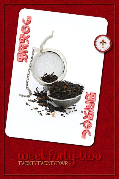
Week 42 I had to check to see if I was in the right week or working ahead (hahaha, that would NEVER happen for me!). This is the red joker, same style magnet as the black and same photo since the photo I chose for it didnt work out. I started out looking at gradients for the background then used the one at the bottom, I forget the name...radial? I added many repeats and didnt like it so then I started running down the list of Distortion Effects, piling them on top of each other. Sometimes I'd duplicate if I liked something, and use the duplicate to keep going. I ended up in the Reflection Effects with Kaleidoscope and played around until I got something I liked. This reminded me of some kind of knit fabric. On the text for Week Forty-Two I had it original in the yellow color like the other two vectors which I rasterized and gave a bevel and drop shadow to. I thought it looked a bit boring and flat so I duplicated the raster layer and selected the text and used the background pattern as a pattern and filled the letters, then I used a blend mode to make it a similar color to the background yet still stand out enough to be readable. The texture doesnt show well because I had to really compress this to get it to upload here. It will eventually be on FB at the full size, soon as I get around to catching on the posts there.1 point
-
This layout adheres to the "spirit" of this challenge, but since I have few photos to choose from, I decided to make do with this one. My mother would deck me out for special occasions (like church or holidays), and I guess I went along with her wishes. But I really don't recall much in the way of specific outfits that I had. I know she made a lot of clothes for me (and my older sister) when we were young, but later we went on trips to Detroit to shop at the great Hudson's Department Store for some new school gear. No photos however and only scattered memories of what we got there. Of course, at that time, little girls wore only dresses/skirts to school. How very impractical since we were always rough-housing in the schoolyard at recess. This picture captures me (on the right) and a friend (and we still are) decked out for Easter. The little bags we're clutching just make me smile! And oh, those bonnets! Background elements from Katie Pertiet and Anna Aspnes. Frame from Natali (PBP?).1 point
-
Thank you Cristina. I am enjoying trying to make a different background each time. Thankfully, we dont have 104 weeks in a year! hahahaha1 point
-
kasany, I like very much how you used a photo as the background. Did you use a Blend Mode or other technique to make it look like this? I also love the other photos, especially the sunset ones (or sunrise?). No matter how often we see it, I think sunrise and sunset are magical. Cassel's Alpha fits the theme perfectly; I have used it a few times. She has tons of beautiful Alphas as freebies.1 point
-
1 point
-
Hi All, Your all so talented but I want to learn so bad, wished I could meet at the library ad watch you guys. I tried the Calendar before couldn't get any of it done. I think it was Ann who gave me some of her calendars it was so nice. Your all wonderful so Talented!1 point


