Leaderboard
Popular Content
Showing content with the highest reputation on 10/07/2024 in all areas
-
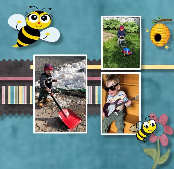
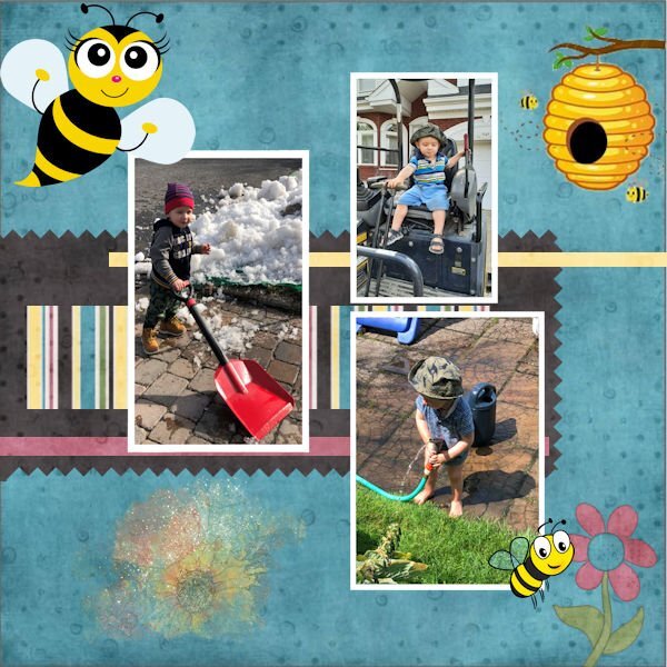
I know most everybody is probably done with all this projects but I am still plugging away & trying to find the time to get more done! Those pesky grandkids! 😁 I just finished lesson 3 and hope I got it right. Can anyone tell me how you comment on someone's post, not quite sure how to do it! Thanks!!!7 points
-
I am posting this layout (without my own approval) to get it over with! I have started and stopped so many times with different attempts at using the 1-2-3 elements required and I just couldn't get it to work. So I figured - glitter? must be for a celebration, right? So I made a kid's birthday (photo from online) layout using some stuff from my stash. Bits and pieces from Billie Irene (the folded edges on the corally-coloured background paper); Rachel Jefferies for much of the birthday things (e.g. balloon sketches and striped paper at the far right); also some glitter bits from Marisa Lerin. The only piece I was involved with was the striped folded-corner paper in the background. The whole effort felt forced and unnatural to me, but I really wanted to produce something I could post and live with. If anything is missing or not according to instructions, please don't judge me too harshly. I have to let it go!6 points
-
Gonna try this one more time. Papers PBS-Escale amoureuse- Talie and Flolinette-PBS-EscaleAmoureuse. Rest is original and off the internet.5 points
-
Susan, you have also been creating beautiful pages, elements, papers, etc. Don't be too harsh on yourself. 🙂💟 I have had the same feeling, and I just did not like what I had done. Now, I am more of the opinion that I should practice the techniques more, post what I have, and try harder next time if it is not a piece of art. 😉😄4 points
-
this is beautiful Julie. It's a style I love, but can't replicate. So keep posting so I can see what love! I go through the "love-it, hate-it" with everything I create. I find I need to warm up creatively before anything I like happens. Sometimes that period can day hours to days. It doesnt come easy to me, and at some point we just have to let go and put it out into the world.4 points
-
That's how I understood it. I'm happy you both did something different so I can see the possibilities. Either way, both layouts are as beautiful as you both always do.4 points
-
I do like calendars and look forward to something new for 2025. We had a workshop in November of 2023 when I created a 2024 series for the wildlife of Botswana. I've also been re-using those templates for my 2024 Wild Cat Calendar that I do every month. The first calendar I created here on the Campus featured the TV show, Downton Abbey for 2023, intended for my granddaughter Anna for Christmas that year and I recall one of my classmates here did one for the show Outlander. I'll be looking for a new theme for this calendar workshop.3 points
-
This challenge is packed with beautiful layouts. It's a joy to go through each one of them.3 points
-
Sue, this layout is just another example of your amazing work. It has so many well-thought-out details and techniques. I love the paper clip with a text. Brilliant.3 points
-
To reply to someone's comment, highlight their comment (or part of it) and you will see a "bubble" appear at the end of the highlighted text, saying "Quote Selection". Click on that and it will automatically include that section in a response, while notifying the poster. And don't worry about others having finished the Bootcamp. This thread will stay open.3 points
-
Oh Julie, it is my opinion, that you have created a superb page, depicting your own delicate style. I also feel that you judge yourself far to harshly. Using glitter, took me outside of my comfort zone, which can be good thing. Allowing to experience something a little different. I look at your work, and I see a sensitive creator, producing perfection.3 points
-
Corrie,I think you may have misunderstood my comment. I like the colour you chose. After looking at your page, I should have used a colour other than white.3 points
-
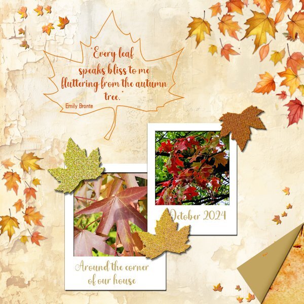
And here is mine and I am not so fond of glitters either! But I have managed to make 3. I used a background from the recent ACD freebie template because it goes nicely with what I had in mind. I already had polaroid frames and because of the background and my photos I made leaves confetti from a photo with cass-Custom Confetti script; the new script from this week would have come in handy, but that is on my wish list for now. I have used the same extracted leaf to make a frame around my text and used it again to make 3 glitter leaves. The folded corner is done with cass-Folded Corner script, after I had to ask Carole why my script wasn't working as expected. It happened to be one of the older scripts that doesn't work in the more recent versions of PSP. So if anyone has a problem with that, there is a new script, thank you Carole. Of course I know how to make a folded corner manually but I still have some problems with my eyesight and those very precise actions are still difficult for me at the moment. Besides that I have the script to use it!3 points
-
3 points
-
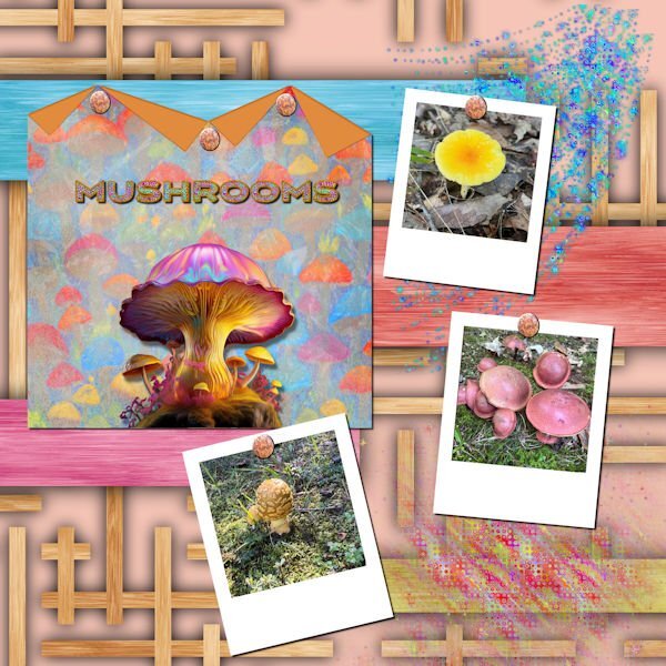
My daughter just sent me photos of some of the mushrooms that see saw on a walk in a Fredericksburg park. The background is called Wood Art from FF. the folded paper is one of mine with a mushroom background created in AI and blended. The big mushroom in the center is from Adobe Express AI. The title was also created in Adobe Express, imported into PSP where I converted it to a vector using the selection to path script so that I could add a glittered stroke with a layer style. I used a star sparkly brush to create the glitters. I used Carole's polaroid lab video to create the polaroid frames. The rusty nails are from Canva. I love glitter, and the stars brushes are great for creating scatters.3 points
-
3 points
-
I have joined the ranks of the calendar people. Not because I plan to actually make/print a calendar, but to be involved and learn some new tips and tricks. Now I have to think of a theme?2 points
-
2 points
-
Keeping you on your toes! 😉At least you may get to learn a new technique. Have fun, as that is what we are all about, whilst showcasing our photos in a creative way.2 points
-
I appreciate that Julie. If it's of any help to you, I always start by putting the photos onto a bank page. In this case the polaroid images. From there I create the papers. The size, shape, placement and number of the papers will be taken into account, of where the text, journal, title and so on will go. Elements are more often than not created and placed last. Quite often rule of thirds play a part in the initial layout. Direction of a bird, mammal insect in which it is facing, is also important. I suppose, it's my eye that determines the layout I go with. Maintaining a balanced minimalistic layout is what I aim for.2 points
-
Im going to have to repost. Just realized I forgot part of the challenge....duhhhh ! It'll be back soon.2 points
-
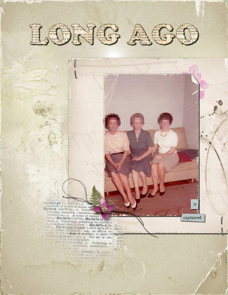
Instead of 12x12, this time, I created a layout with 8,5x11 dimensions. It does feel unusual, but I am trying to get used to it. I tried to use some of Anna Aspnes's freebies (MegaPack Plus Class) and elements from other designers, some of whom I recently got to know. EDITED: I got this mega freebie thanks to a tip from Julie, who shared where to find it on a post. -------------------------------------------------------------------------------------------------------------------------------------------------------- Credits: Cassel: Old Book Alphabet 2019 freebie Anna Aspnes MegaPack Freebie: Papers: AASPN_ArtPlayPaletteHeath_SolidPaper3 and 5 Paper Texture: AASPN_PaperTextures4_2 and 4_9 Others: AASPN_ArtPlayPaletteHeath_ArtStroke2 -- AASPN_ArtPlayPaletteHeath_Transfer7 -- AASPN_FotoGlowMix1_2 -- AASPN_MilieuWordARTMix1_WTHistory -- AASPN_UrbanThreadz3_9 Lynn Grieveson Frames & Borders: lgrieveson-worn-photo-edges1-4 & lgrieveson_retro_pop_1 Rachel Jefferies Bloghop freebie and from Art In Simplicity kit rjefferies_portraits_BLOGHOP-stamp (freebie) rjefferies-AIS-artistry03-flower10 rjefferies-AIS-artistry03-messystamp04 rjefferies-AIS-artistry03-sentiment01 rjefferies-AIS-artistry03-trinket-staple2 points
-
2 points
-
2 points
-
Day 7 - Project 3 The papers and flower are from a mini kit by Marjan De With that I obtained in the Nov 2018 Blog Train. I made the scatter using Cassel's Punch Confetti script. For the glitter, I took a maroon glitter paper from Marisa Lerin, added a layer on top with the foreground/background gradient using the maroon and green from the papers, and changed the blend mode to Hue. The title font is Romantic Crafty and the text font is Segoe Print.2 points
-
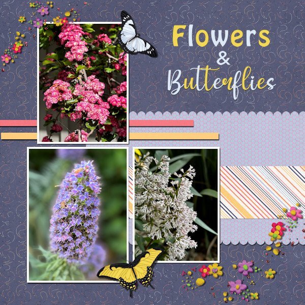
Project #4 I continue to use my photos from California and to me it is amazing to see the wide variety of flowers there when I take a stroll through the neighborhood where my family lives. All the papers are from Rachel M Hailey; the butterflies are from the Meadow bundle by Jessica Dunn and the scatters from Marissa Lerin. The fonts are Impact and My Butterfly. No pinky shears for me, I like scallops more. I mirrored the layout from the lesson because my photos are more tilted to the right and this way is more pleasing to the eye, at least to mine. As always the most time goes to selecting the photos which is a pleasure!2 points
-
Julie you did a superb page and kept true to your delicate style! It seems that there are a lot of us that don't like it too glittery! I often have to rethink and retry different ways and layouts before I finally decide on the one that you all can see here! Sometimes it is a hate or love affair.1 point
-
Ok, sometimes it can be difficult to grasp a meaning in another language then my own!1 point
-
You're right Sue. I might have felt the layout was forced and unnatural, but it is good to step outside our usual zones and try something different. It's a good reminder for other aspects of our lives too. Not just layout styles!1 point
-
This morning, I watched the Halloween Effects2 Masterclass, and I loved the trick of using the Quick Script to speed up a technique I have used quite a few times since I learned it from the Pop-Up Masterclass. Back then, it was shown using the long way. It's good to learn both ways of doing it! Great effects are taught in this class. 👏1 point
-
1 point
-
Thank you, but I'm happy with this color. I tried others but those didn't do it for me. Of course when it comes to colors it always is a personal preference. However the reverse shadow is missing.1 point
-
Autumnal themes are always most delightful, their colours alone adorn any layout. Looking at your folded corner, I should have used a different colour, in order for it to stand out more. I did use a reverse shadow, but with the compression of the page, it isn't evident.1 point
-
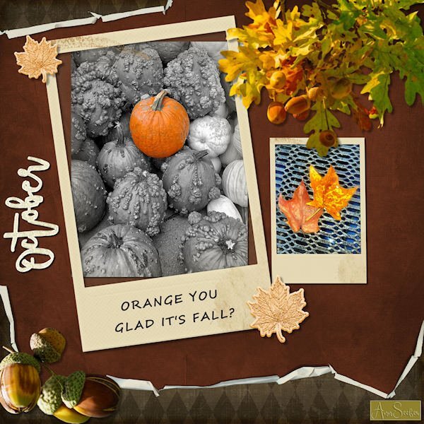
ORANGE YOU GLAD IT'S FALL? Folded paper, Polaroid frames and glitter leaves and word art from Merisa Lerin. Corel fall overlays are freebies this week. Font used is Segoe Script. I got most everything on Digitalscrapbooking.com as daily freebies today. The photos are by Chuck Calio on the Hudson Valley in Pictures Gallery.1 point
-
This is the layout I finished yesterday. It was amazingly fast, considering that nowadays, I take a long time to decide on colors, papers, and elements, so I have something I like or can live with. 😄 One interesting thing happened while working with the cat (Eyespire). I wanted to add a bevel and started playing with the "Randomize Parameters. " At one point, the cat's eyes turned red, which fitted perfectly with the theme (setting below). For the background, I selected the girls, promoted the selection to a new layer, and used the "Time Machine" filter (Effects>PhotoEffects>TimeMachine>Daguerreotype & Albumen) on the background and some of the elements/text. Credits: DiHiller: Papers and some Elements: 2019/2020 Fan Freebies --- DigitalScrapbook (ex-Pixel Scrapper) ThePumpkinPatch2023 black paper Corel 2018 Cliparts freebies Other elements: Eyespire (Halloweenies) / SheilaReid (Spookalicious) / ZaZa (Element_Scrap and Tubes19) Font: CF Halloween Girls1 point
-
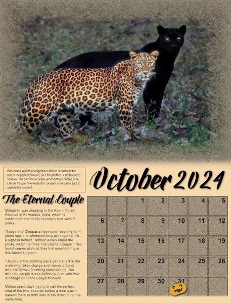
Here's my monthly Wild Cat Calendar. This one features two leopards, a pair, one spotted and the other black. The photographer, Mitha Hunugund, based in India, was published in National Geographic Nature. The title font is Babilonia and the story is Arial. The pumpkin sticker is from Sheila Reid. The calendar template is from Carole Cassel for our Calendar Workshop on the Campus in Nov. of 2023. The version posted on Facebook is full size and prints @ 8.5" x 11".1 point
-
I did use the texture command. If Corel added an angle option, that would be great, but it doesn't sound promising. Adding the texture was a last-minute decision and I was tired so I left it as is. I like your idea of rotating the file and saving it as a new one. I'll keep that in mind (if my mind works lol).1 point
-
As per Cassel's request in the Day 12 email, here is something I learned (or relearned) during this workshop. Believe it or not, I don't think I've ever used the Magic Wand Tool set at opacity to select an element. I've always used it to select outside of the element, and then invert the selection. It's definitely quicker using the opacity setting.1 point
-
1 point
-
1 point
-
Thank you for your comments, Carole. I was very unhappy with the scatter and font colors on the original. I created a new scatter using VectorPaint and VectorTube. The used shadows on each layer of the scatter before merging since I didn't like how they looked on the merged file. I created a coneflower tube from a coneflower downloaded from Canva. I also tried to fix how the pictures looked. All shadows have been saved on their own layer for future adjustment. The Butterflies font is from CF. The glitter in the scatter is from a brush downloaded from Deviant Art.1 point
-
@ Carole, I had a look at that shadow and luckily I have it on a separate layer, force of habit. The shadow really is there and not under a paper. In the layers palette it is right under the photo layer. No idea what happened, maybe it has something to do with my PSP acting strangely and suddenly shutting down. I didn't had that specific problem for some time now, hopefully it was a hiccup and not something structural again. I removed the shadow and did it again and now it is there, strange!1 point
-
1 point
-
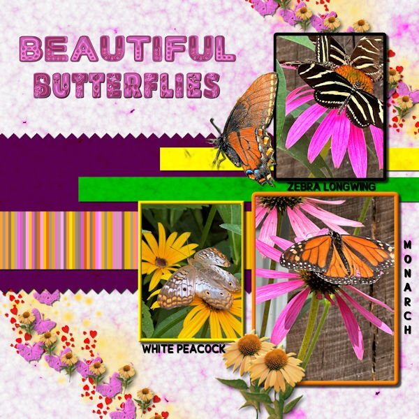
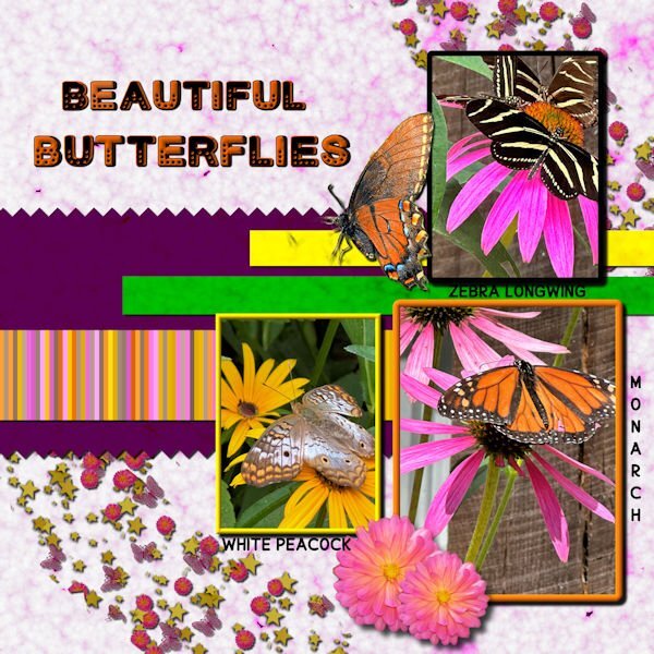
Day 6 I've used bees in the past, so this time I switched to butterflies. All of the butterfly photos were taken by me at a beautiful butterfly house. The single monarch is an extraction from a photo sent to me by my grandson. I made the background papers using FF and changing the colors for the papers. The stripes were made with cass stripe 2. I made the scatters using cass script scattered elements. The stars, flowers and butterflies were from my kits. The font is Cute Dots from CF.1 point
-
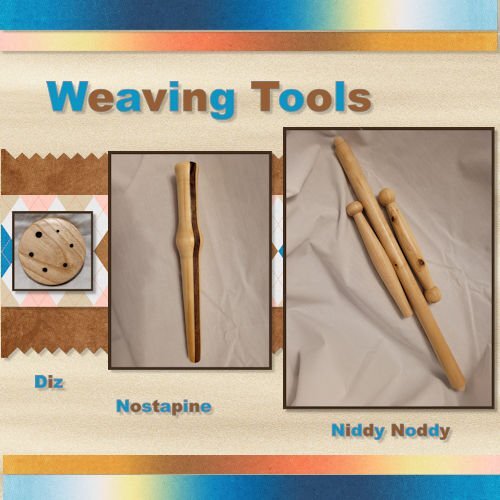
Here is my Project 4. I used some pictures of Weaving tools that I turned this summer. I am not a weaver, but I belong to an organization that has Woodturners, Weavers/Spinners and Gourd Artists so we cross paths quite a bit. Most of the papers I used came from DigitalScrapbook.com (formerly Pixel Scrapper).1 point
-
1 point
-
A = Asheville, NC...unfortunately, Asheville was devasted by Hurricane Helene.0 points










Resized.thumb.jpg.d25811db03a63358cedab1e79f527635.jpg)