Leaderboard
Popular Content
Showing content with the highest reputation on 09/24/2024 in all areas
-
I didn't read the directions carefully but here is my take of the challenge. Jerry and I play with each other once a year or once every 2 years. (He lives in Georgia; I live in VA.) We have learned to play together and do pretty well. This photo is from last week at the Georgia Golden Olympics. We competed against 70-75 year olds and were undefeated. We won the gold medal for the age group 80-85. This was our first 80+ tournament. We hope to competed in Des Moines, Iowa next year in the National Senior Games.8 points
-
The Ole Country Store has long been a favorite. We had spent a week in Georgia where I competed in the Georgia Golden Olympics. We passed right by the Ole Country Store on the way home so we stopped for one more adventure before arriving home. Lunch, ice cream and a walk by the lake...perfect end to our trip! Template 252 by Lady 22.8 points
-
A nearby community invited our women to come to their courts for a tournament. We played a round robin...meaning each team played against each team...and had a great time. Each layout features players from each community. Our team had more than the required number of players so we took turns playing. Some of the host ladies come to play at our gym so some of us already knew each other. Template 05C and 05D by Billie Irene at Digital Scrapbooking.8 points
-
I also managed to get Day2 lesson done and my all time favorite sandwich is a BLT with lots of bacon and tomato on wheat toast. And no meal is complete around our house without dessert. ☺️7 points
-
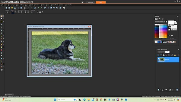
Hi everyone! I am so late getting started with this bootcamp, but I will try my best to keep up. Just finished Day 1 lesson. I have PSP Pro 2023 Ultimate and I prefer a dark gray background to work with and I always have the materials and layers palate available and just move them out of my way as needed. I have tried to teach myself how to use it & have a basic knowledge of some of it but I know I have a lot to learn. Looking forward to all the lessons. I have included a screenshot of how mine is set up with a photo of my very spoiled dog, Dozer.7 points
-
WOW! and WOW! I love this. It blows my mind all the different ways you come up with.6 points
-
I decided to do another one, something quite different, but a layout I like to do, as many may know. Hopefully, whilst abiding within the rules of this challenge. Duplicated the photo, promoted a selection, in this case the Robin. Created the frame using a heart font, extracted the head to give that out of bounds efffect. All I did for the background was to lower the brightness and contrast, Keeping the framed Robin colours as they were taken by the camera. Male Robin taking a blueberry back to the nest. After he had, had his fill.6 points
-
For my 80th birthday my friend, Michelle, came up and the 3 of us went to Skyland Drive. It was a fun day with good food, ice cream and the best of time spent with friends. Template from Lab 14-09. Word art from Creative Fabrica.6 points
-
5 points
-
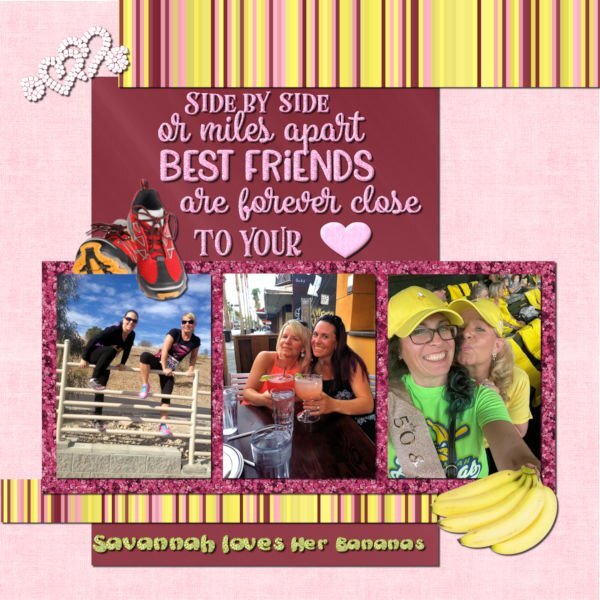
My daughter and Heidi have been BFF for over 30 years. They celebrated their 50th birthdays in Savannah, GA where Beth lived at the time. If you haven't heard of the Savannah Bananas baseball team, you should check out their hilarious videos on YouTube. They are so popular that you have to enter a raffle to get their tickets even if they are playing in Cleveland. I made the background using FF. The glitters are from ones that I made in the past using the cass glitter script. The stripes were made with cass stripes 2 script. The bananas and running shoes are from Canva. The saying is from Creative Fabrica. I converted the hearts to a vector using selection to path script and then my diamond tubes using VectorTube. The saying was selected and filled with my pink glitter pattern. The heart was a vector shape converted to a raster and filled with the pink glitter. I chose the colors based on Heidi's love of pink and of glitter (my kind of girl!). The photos are from Beth (I didn't get a good one of them wearing their banana costumes).5 points
-
5 points
-
Project 4. Background started out as an internet image for Flamingo Wallpaper you can purchase for your home (in what room would you put that LOL???) which I completely transformed to make a pattern for my paper. Butterflies were from ps_elif-sahin, watermelon heart from Janet Kemp, Barcode from Marisa Larin, the striped ribbon was modified from one got from Flolinette-PBS, the other I can't remember but it was modified and originally from digitalscrapbook.com. The dragonfly, I found on the internet.4 points
-
i like what you did with the flatware (metallic effect) and the addition of the napkin. I'm going to have to break out the tutorial(s) on creating metallic elements and practice on that until I can remember the steps without having to use notes or re-watch the videos.4 points
-
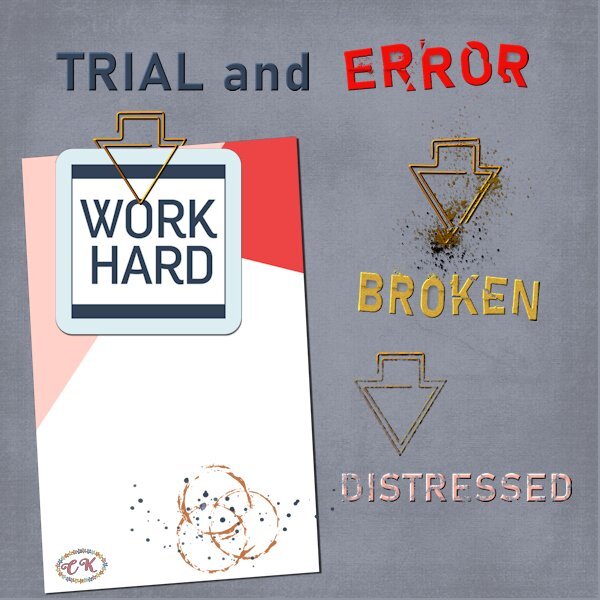
It may have taken a while but now I have used that paperclip as I promised I would do. Actually it was fortunate that I didn't do it before because I won the cass-Broken script this Sunday and it came in sooo handy! Thank you Carole and I can show you immediately what I have come up with. I had great fun making this layout and I must admit that the paperclip wasn't all too difficult to use. The clip is in essence the same as a regular paperclip, they are both made out of one piece of wire. Therefore I looked at how I would use a normal one and then I saw how to use this one. I can't believe it is that simple after all the discussion about it, but when I follow the line of the clip I think it is oké. I used the Broken script not only on the words but on a paperclip too and I hope it is all visible on this reduced page. I have given the words and the clip a slight bevel to make the effect better to see. The other paperclip and the word distressed are treated to a brush with distress effect. The 2 papers and the stain come from Marissa Lerin in the Work Bundle and the font is Bahnschrift.4 points
-
You put all your "stuff" to a very good use! It is so nice when people can keep up a good friendship over a long period of time.4 points
-
You know, it happens to the best of us. Myself included. I find when I'm working on a page, for some time, it's easy to overlook obvious errors. As I become so absorbed on something else. It is a good idea to walk away for a distraction and come back with fresh eyes.4 points
-
4 points
-
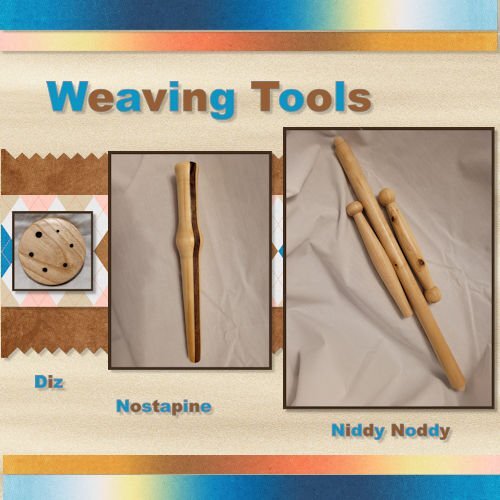
Here is my Project 4. I used some pictures of Weaving tools that I turned this summer. I am not a weaver, but I belong to an organization that has Woodturners, Weavers/Spinners and Gourd Artists so we cross paths quite a bit. Most of the papers I used came from DigitalScrapbook.com (formerly Pixel Scrapper).3 points
-
3 points
-
It's good when I don't do anything right after Carole makes any goodies available, as I have the answers to any questions I might have had right here. 🙂 I liked very much how you showcased all the techniques, scripts, brushes, etc., in this layout, Corrie.3 points
-
I already told you on FB that I may be "scraplifting" this idea; I love it so much.3 points
-
Great layout! And you can see the broken paperclip. I bought the script but will be awhile before I get to try it out. Great ideas here Corrie, I never thought to use it on something other than text.3 points
-
Thank you so much Corrie. That makes me feel good after a not-so-good day at work.3 points
-
You're fortunate to have good (simple) backups. I wonder what we would do here (Canada) if other sources of power went down.3 points
-
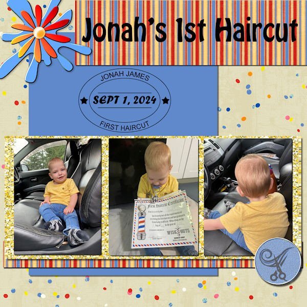
Yes, and initially, the shop put the wrong date on it, but mama Ilana declared she was going back to get a correct one because it's a "keepsake!" 😄3 points
-
3 points
-
2 points
-
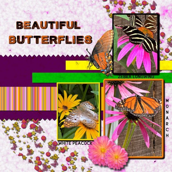
Day 6 I've used bees in the past, so this time I switched to butterflies. All of the butterfly photos were taken by me at a beautiful butterfly house. The single monarch is an extraction from a photo sent to me by my grandson. I made the background papers using FF and changing the colors for the papers. The stripes were made with cass stripe 2. I made the scatters using cass script scattered elements. The stars, flowers and butterflies were from my kits. The font is Cute Dots from CF.2 points
-
I really liked the inked edges and found them and tried one. I don't know what embellishments you tried, but I used the magic wand on one set to inside-tolerance 70-not contgious -no feather--and was able to flood fill that selected area with a gradient and it worked OK. It did take a bit of playing around to get it to select just the colored part with no white on the inside. Here is one corner of it.2 points
-
Thank you and the description of the script says that it makes the broken effect on text or shapes! Well that instantly gave me the idea to use it on that paperclip after I had figured out how to use the clip.2 points
-
You are not alone in your admiration of this technique and how to implement it so beautifully. We have a lot learning and experimenting to do!2 points
-
I am much obliged. Please do scraplift it. I'd love to see how you'd use the technique.2 points
-
I like the layout very much. Mad Max is very persistent, Julie; he doesn't take NO for an answer! 😄 I got to know Katie Pertiet some time ago through Pinterest's suggestions; I like her style. Last week, I even purchased a template —#KPertiet_FramedSpillLayersNo3 ---, which I haven't had the opportunity to use yet, as I have been working on a multi-photo layout for the last trip.2 points
-
I am most appreciative of your mind blowing words! The photo I used, although I love it for it's simplicity and plainness, it isn't really a wow shot. Saying that I could see it had potential for this challenge. The 2 juxtaposed images after editing shows the contrast between the bright colours of the robin and the light shades of the other. Thanks to the power of PSP editing.2 points
-
Well done you! Now I see how you used it, it looks better untitled.2 points
-
I adjusted some of those things and more and posted the edited one under the first one. Thanks, especially for catching the misspelling that I can't believe I didn't catch.2 points
-
Yes we did, but this challenge cries out for the script to be used. You maybe didn't have a lot of time but you made a stunning page with those flowers.2 points
-
Very nice, Leslie. I do like the colors. If I may make a suggestion, and it just may be my opinion, but I'd put the larger photo in the center with the two smaller ones on either side to balance the layout. What do you think?2 points
-
2 points
-
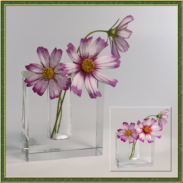
I've been busy lately with another project so this is a sparse layout from me. I needed a little PSP time so my brain could reset for the other project that I'm running into more challenges than expected. the little photo is framed with a cutout. I actually extracted the flowers and vase then made the selection around them and added the cutout. the good part was I didnt need to be perfect with the extraction as it blended in with the background. I got lucky on that. I also used the pencil sketch 2 script. I played with the opacity of the layers and used a mask to make the centre yellow part show through a little more. I turned on the photo layer that the sketch leaves intact to allow the the color to come through. maybe a little too much though.2 points
-
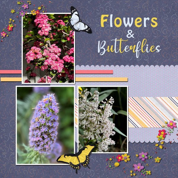
Project #4 I continue to use my photos from California and to me it is amazing to see the wide variety of flowers there when I take a stroll through the neighborhood where my family lives. All the papers are from Rachel M Hailey; the butterflies are from the Meadow bundle by Jessica Dunn and the scatters from Marissa Lerin. The fonts are Impact and My Butterfly. No pinky shears for me, I like scallops more. I mirrored the layout from the lesson because my photos are more tilted to the right and this way is more pleasing to the eye, at least to mine. As always the most time goes to selecting the photos which is a pleasure!1 point
-
I agree, in this case you didn't even need to put a postage stamp. It's almost out on a limb. The pencil sketch and title is all it requires. It's nicely balanced.1 point
-
1 point
-
It's not a fluke just because it wasn't planned. It's creativity on the fly. 🙂1 point
-
1 point
-
1 point
-
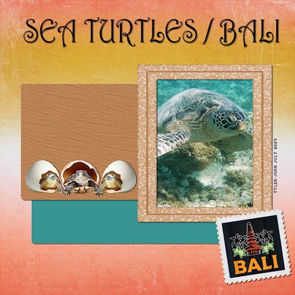
Here is my Project 4 - Adventure Park - I downloaded the kit Carole offered: By the Stream so I chose a photo taken by my grandson Tyler-John on his trip to Bali, Indonesia in July. The title font is Harrington; the frame is from Jessica Dunn's Nana's Kitchen kit, the background paper and the stamp format from By the Stream. EDIT: @Corrie Kinkel I added a sand texture to the brown paper and found some baby turtle clipart to replace the original.1 point
-
Daniel thank you, they look very nice and they can be used in other projects too. My McAfee was acting up too saying that the download was unsafe, but trusting you I choose to override it and downloaded them.😉1 point
-
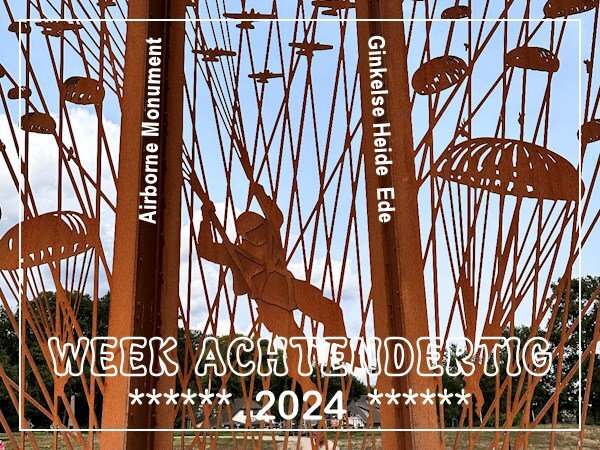
Over here this week it is 80 years ago that the airborne landings that were part of operation Market Garden in WWII took place. There is a special monument to commemorate the droppings on the Ginkelse Heide in Ede where they landed with their materials and vehicles. It is made out of Corten steel, 6 meters high and has 5 panels. At the bottom of the panels are plaques that tell the story. A couple of weeks ago when I visited my son we took a look at it when we were passing by on a walk on the heath. It was impossible to get all the panels in one photo because there were way to many people. In this photo is a full size para in his harness with the planes and other parachutes around him. The other panels all have planes and parachutes with all their gear and some other much smaller figurines. Besides that you could take a walk that had a great number of info panels at the side with the complete story of the Battle of Arnhem. The book "A bridge too far" and the rather famous film with the same title tell that story in detail. In the end operation Market Garden failed and the Netherlands had to face a terrible famine in the winter before we were liberated in1945 and the war ended. Sorry for the history lesson, but otherwise there isn't any context for this photo.1 point
-
1 point

Resized.thumb.jpg.d25811db03a63358cedab1e79f527635.jpg)



.jpg.6a3d56a5a88f925eac65549fb66f89b8.jpg)

