Leaderboard
Popular Content
Showing content with the highest reputation on 08/06/2024 in all areas
-
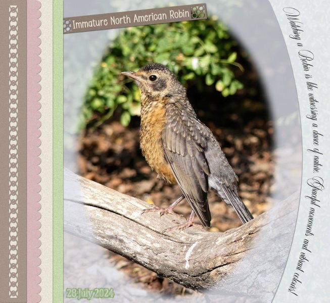
I used one of Carole's Punch brushes, I created the scallops to make the papers more interesting. Text on a curve. Seeing as I used a vector elipse for the photo. I feathered it to soften the edges of the photo. Text on a path. I created a stencil mask for the date. An ever so simple layout, which I saw on Annie C's site. So I decided to relicate, making it my own. Just the sort of layout I like. Again all the colours came from the photo. The pinky colour came from the bird's feet and legs, beleive it not. The text reads Watching a Robin is like witnessing a dance of nature, graceful movements and vibrant colours. This young one was actually dancing back and forth the branch. The text is actually legible on the full size page.7 points
-
This is OUTSTANDING Donna! I love it. It's very Art Deco, my favorite.5 points
-
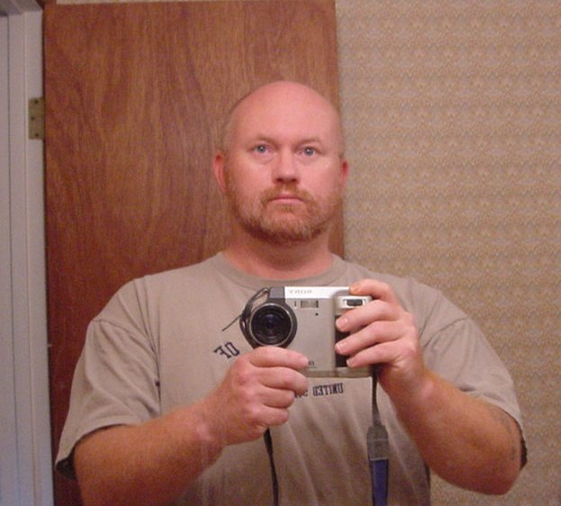
Over the years, we have had several Doberman's, almost all, rescues. I have been working on a "Heaven's Gate" layout for all of them. I have left a "spot" to, in the future, add our current dog, who is starting to slow down. I have very few photos of a couple of them, and alot of the photos I have were taken before the current level of digital sophistication (anybody remember owning and using a Sony Mavica, complete with the "3.5 inch floppy disk" film?). I took a large "cloud" image and using the pen tool in freehand draw, created a "hole" which I cut out and made transparent. Before losing the vector, I ran the vector tube script on it using the built in cloud picture tube file. I ran it three times then single clicked a couple of clouds into the remaining gaps. Found a suitable heaven's gate image and put it behind the clouds. After that I added the dogs and used drop shadow with zero offset and high blur settings (twice on each dog) to make them "glow" just a bit. Font is Vineta BT at 150 pixels with some bevel and shadow. I did the font on an elliptical path after making a duplicate of the vector. I moved the duplicate elliptical path down, then ran the vector tube with the cloud tube again, added bevel and shadow and deleted the vector. (Note: going to add a photo of me and my Mavica from WAY BACK....in the next post LOL).4 points
-
I would consider using the brush variance palette, such as the colour blend, if you fancy blending some of the colours together. The warp brush, and several overlays should achieve a similar effect. I'll think of some some tuts and masterclasses that will be of help. Grunge magic, overlays and Textures and Overlay masterclasses come to mind.4 points
-
I agree. In my planning of an album, I usually plan the pages as facing each other and so the look is cohesive. Worked with my Chattanooga album which I had printed for my daughter who shared the trip with me. The trip that my son and daughter-in-law and I took in the RV out west, I did that in double pages and it was a chore in getting it printed and not losing anything in the center.4 points
-
4 points
-
I really love the overall simplicity but the lovely details in this layout. Beautiful.4 points
-
working on Lab5 - 10 a stich brush scattered kit elements Template Work title work - using 3 fonts, pattern with dots3 points
-
3 points
-
Go through the Double Page Workshop and get some ideas! You got this. Once you start the ideas will flow. It takes me a while to "warm up" when I sit down to do a layout. Lots of "yuk" moments, then trying to fix the yuk, I get inspired by something and then that directs the layout. It's rare to know what I want to do when I start.3 points
-
Ditto me too. I sure there is NOT a 12 step program for that, I want to keep feeding the "need".3 points
-
3 points
-
Sue, beautiful as always! I love the photo; it looks like he is posing for you. 🙂3 points
-
Rene, I agree with you. My first double pages were for the Workshop Travel Tale in 2017, which later changed its name to Double Take. Back then, I already chose a template that would not have a photo across two pages.3 points
-
3 points
-
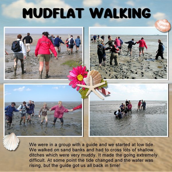
Many years ago we went mudflat walking with the company where my husband worked. Every year there was some sort of activity, like visiting something work-related but that year (2005) we had a whole weekend in the north of the Netherlands. Part of it was a tour with a guide on the mudflats or "Wadden". It is a popular activity because it is a real adventure. The guide had a long pole with him to measure the depth of the ditches we had to cross and had to get everybody of the group back before it became high tide. The tour started with a speech about the mudflats and a warning to stay together and do as he said to keep it safe. At first the going was fairly easy, we walked on a sandbank but later it became rather difficult. The soil became muddier and especially the ditches we tough. We helped each other because it was difficult to keep your balance and we got muddier and muddier and the water started to rise again so the ditches became deeper. I will never forget this adventure, but it is once and never again.3 points
-
I do a lot of "2 page layouts" but I do each page separately as a 12x12 page. First off, it is easier to do a single page at a time and secondly, it is easier for printing. Most of my "2 page layouts" are actually companion pages where I use the same papers and elements on each page so that the look is cohesive. I am not a fan of spreading a photo across 2 pages in a 24x12 workspace because in printing part of it gets cut off. I'm thankful that the template designer I use a lot will split a 24x12 template into 2 12x12's in her downloads so I don't have to split it myself!3 points
-
That's what I've done so far. I created one narrow long rectangle in grey, saved as PNG. Then adjusted it with the Warp Brush and then each time I duplicated the rectangle on the actual canvas, I adjusted it more with Flip Vertical and Horizontal and used the Shear or Freehand tool to change the shapes a bit. Kept the widths on the page slightly different too. I have lots of overlays with dots and other shapes I can lay over the stripes after I colour them separately on their own layers. It's kinda slow but fun. It will be interesting to see if I even LIKE the effect after I get 'er done! I'm with Ann Seeber. Scraplift of the month sounds good to me. Maybe we can take turns choosing a layout for the others?3 points
-
The unevenness of the lines can be achieved with the Warp Brush set to Noise. The polkadot effect could be made with an overlay. Maybe a Scraplift tutorial of the month could be an additional feature in the membership?3 points
-
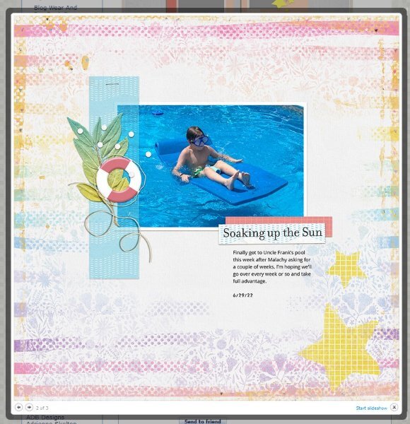
OK expert and creative comrades, I need some assistance. I have found a layout I like for some of the scrapbook pages I'm going to attempt to produce. Can you suggest the easiest way to re-create the lines in the background of this layout? I would use different colours, I think, but I like the effect. (From Gingerscraps)3 points
-
I hope you're right, Cristina! Now that I'm looking at how to do the pages, I'm starting to worry. I've not done any two-page spreads so that's the first hurdle! I perhaps spoke too soon! 🤥3 points
-
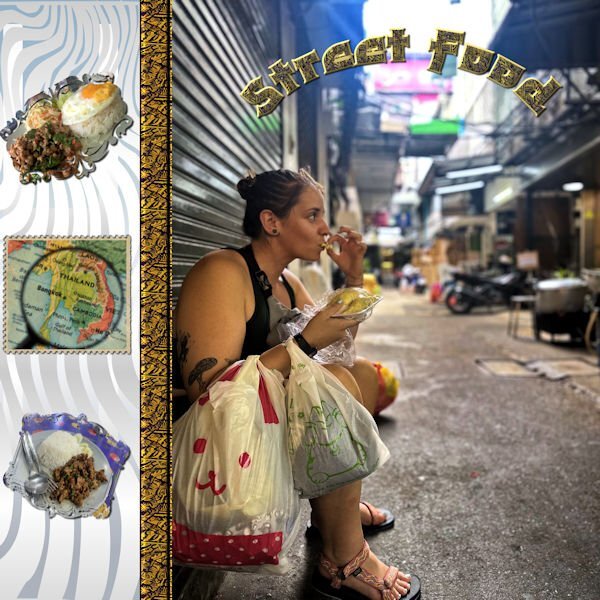
I redid my scrapbook page to make my letters easier to read. I downloaded a font from CF called Shizuko which is thicker. I eliminated the side font and used a map from Canva turned into a stamp from FF to identify the location. I added 2 masks with photos of the food that the kids sent to me. Food is very inexpensive in Thailand, and David informed me that they ate at a Michelin star restaurant and paid $1.50 each for their meals. They were there for 6 weeks playing rugby and working out with the Bangkok rugby club, and, of course, eating.2 points
-
2 points
-
Oh boy my editing skills are atrocious. I should have said, "I sure HOPE there is not......etc". Yes, we are actively recruiting members. Just touch base with our National President (Michele) and she'll set you up. I wonder if we should get cards made, so we can say (and prove) we are "card carrying members". Maybe the prez (Michele) will get on that. Hint Hint.2 points
-
I'm so lucky that the printing service I use here in the Netherlands offer a binding that uses a flat lay technique which allows me to do a double page and is seamless. They offer it only with rather thick paper and only on a somewhat bigger format for the album.2 points
-
Julie we talked about this project and it is so nice to see the unveiling of the plaque, a great result of all your hard work! I'm sure you can make wonderful pages to commemorate the event for those who couldn't attent that day.2 points
-
2 points
-
Actually, it took several shots, to get the one I liked, as he was impatiently waiting to be fed. You are always so kind with your comments. Which is always appreciated my dear.2 points
-
Since I am a Diamond member, I downloaded both the pdf and the mpr of Playing With Vectors Master Class. The very end of the mp4 mentions the upping of the Tracking # in the pen tool. This is not mentioned however in the pdf version. Anyway. Thanks for the update for me. I love what you do, Carole. I guess I'm going to also go to the Master Classes as well as the Labs. Will I ever catch up??????????2 points
-
Wow, Julie, what an achievement for all of you who were part of this project. Seeing how this lady was partying made everything even more worthwhile. As I imagine it was a big project, you will probably need many double pages to tell the whole story, which will be cherished by everyone who was not there. You will have no problems with it; your layouts are beautiful.2 points
-
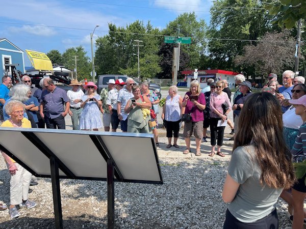
I have no layout to display here, but I decided I'm going to do a more traditional scrapbook project for a big event we just had in my home town: the unveiling of a heritage plaque that celebrates (with words and images) the founding of the place. I plan to make it for the Seniors' Club so those who couldn't attend will get a sense of how fun the day was (on Saturday) and how the planning and execution came about. This is not my comfort zone! But I think it will be fun. I am one of the authors of the plaque along with a friend who is also into our local history. BTW, the little lady in yellow at the left was one of our unveilers. Her family name is on the plaque, and it was her 90th birthday! She danced the rest of the day away at an open house bash and then at karaoke that night!2 points
-
2 points
-
Oh Julie! There isn't anything sexual about the photo. I'm not even going to ask what ran through your mind when you saw the photo. 🙂 lol2 points
-
The way I see it, and please, I'm not being critical, only my observation, and the way I work. I feel that all the early tutorials, mastercalsses, creative scrap, and blog has covered the majority of techniques and tools. Of course newer versions introduced new tools, all of which you have addressed. It seems to me that in many of the newer tuts, masterclasses you are going over what you have already covered. Also in my view many of the questions asked in the Q&A, are answered in previous tuts etc. It appears to me it is far easier to ask the question rather than spend some time to search out the answer in the wealth of information provided. Whilst, doing a search you get to see and pick up little things along the way. The campus has grown beyond anyones expectations. In all honesty, I find the it all overwhelming on occassions. Adding some references to past posts and classes is a great idea.2 points
-
2 points
-
My grandson pointed out the problem with the font. I wanted to use a Asian looking font, but I am going to have to correct it. I also am not crazy about the title going up and down.2 points
-
1 point
-
Although I personally would not use those as SCRIPTS, they make for nice templates that you can tweak. There is no real reason to run them as scripts, since they are really just templates. I call those scripts "Templates-in-disguise". Some designs are interesting, and with your knowledge of PSP, you can tweak the results much more and use the elements with more variations.1 point
-
G = Gardening You never know what will grow (except the weeds) It can be fun add some plants you never tried before.1 point
-
I am in too, the hardest thing for me is the lifted shadow, i think my problem comes from making the warp bruch too big or too small1 point
-
You really do create wonderful Alphs. A lot of time and thought goes into them. I had to look hard at the title in order to read it correctly. There was a time I would use some fonts, not taking into account of who is going to read it. Will the text be legible for eveyone. As not everyones' eyes are healthly, which makes reading some text/alpha even more difficult. Fortunately my eyes are fine.1 point
-
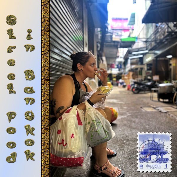
I made this picture for the Maniacs site. It is a picture that my grandson sent to me from Thailand where he and his girl went to play rugby. The ribbon separating was made from a scrap tutorial using a pattern that I downloaded from CF. The font is Asian Pacific, also from CF. I may change the font because the L and the F look more like a P with the pattern and the stroke.1 point
-
Annie is one of my favorite template designers. I've gotten some beautiful ones on the ALFLT Blog Train.1 point
-
1 point
-
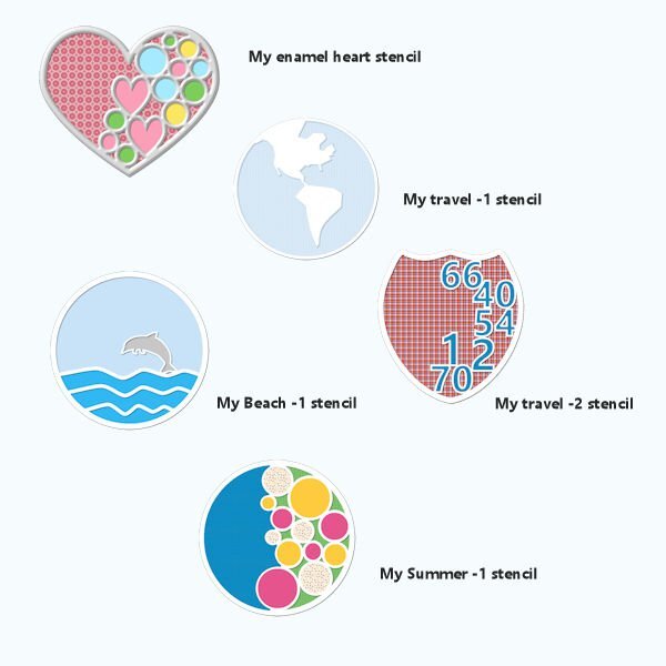
Mary, I love the results of the stencil technique, which you've used in so many different ways—all very creative.1 point
-
Donna, you are not alone! 😁 I love the font, and you've created a beautiful, beautiful Alpha!1 point
-
Donna you will be our Alphabet Queen! You do lovely work with all the alphas you create and I'm sure there will be much more to come.1 point
-
That was my thought too and I find most of her templates are easy to replicate in my humble opinion. It is mostly a combination of lines and circles if you look closely. I only have bought 1 template from her because it was about my own country and I replicated that for Switzerland, California and Washington State. For the numbers layout it was fun to do, but in essence not really a creative challenge.1 point
-
1 point
-
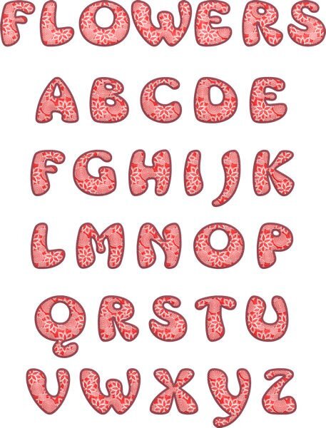
I really think that I need to go to rehab for a font addiction. I can't stop downloading them from CF. I have been working on letter templates using patterns and different fonts. This font is called Mrs. Beasly which is a thick, free font. The pattern is from a dingbat font called Seamless patterns. I made the pattern for the letters using cass seamless pattern script, the cass script element stacker to make the layers and then the cass script text creator for the title. I used layer styles for the bevel and saved as a vector so that I could later change the pattern, colors, etc.1 point


