Leaderboard
Popular Content
Showing content with the highest reputation on 08/05/2024 in all areas
-
That is why I started adding some references to past blog posts and classes in the newsletter. 🙂5 points
-
Yes, you have mentioned it. In the masterclass Playing with Vectors. Which is an older masterclass. Thinking back, I set the tracking to a higher number, which is where it has stayed. Unknowingly to me I must have had a gremlin change it to 8. Of course I didn't think to check the tracking. I thought my steady hand was failing me. Many of the earlier masterlasses and other tutorials are worth revisiting.5 points
-
The unevenness of the lines can be achieved with the Warp Brush set to Noise. The polkadot effect could be made with an overlay. Maybe a Scraplift tutorial of the month could be an additional feature in the membership?4 points
-
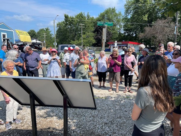
I have no layout to display here, but I decided I'm going to do a more traditional scrapbook project for a big event we just had in my home town: the unveiling of a heritage plaque that celebrates (with words and images) the founding of the place. I plan to make it for the Seniors' Club so those who couldn't attend will get a sense of how fun the day was (on Saturday) and how the planning and execution came about. This is not my comfort zone! But I think it will be fun. I am one of the authors of the plaque along with a friend who is also into our local history. BTW, the little lady in yellow at the left was one of our unveilers. Her family name is on the plaque, and it was her 90th birthday! She danced the rest of the day away at an open house bash and then at karaoke that night!4 points
-
The way I see it, and please, I'm not being critical, only my observation, and the way I work. I feel that all the early tutorials, mastercalsses, creative scrap, and blog has covered the majority of techniques and tools. Of course newer versions introduced new tools, all of which you have addressed. It seems to me that in many of the newer tuts, masterclasses you are going over what you have already covered. Also in my view many of the questions asked in the Q&A, are answered in previous tuts etc. It appears to me it is far easier to ask the question rather than spend some time to search out the answer in the wealth of information provided. Whilst, doing a search you get to see and pick up little things along the way. The campus has grown beyond anyones expectations. In all honesty, I find the it all overwhelming on occassions. Adding some references to past posts and classes is a great idea.4 points
-
@Cassel I never thought to look at the tracking! Wow! What a difference. Could we have a workshop or something to give us practice on just using the pen tool??????4 points
-
You are such a great problem-solver. I had a similar problem with the Step value when using brushes. I don't know how you keep so much information in your head.4 points
-
Lately I grow my subjects, then cut their little heads off...that way they cooperate. 🤣3 points
-
That might be part of another Vector workshop? I am sure I have mentioned the Tracking at some points, but can't remember in which tutorials.3 points
-
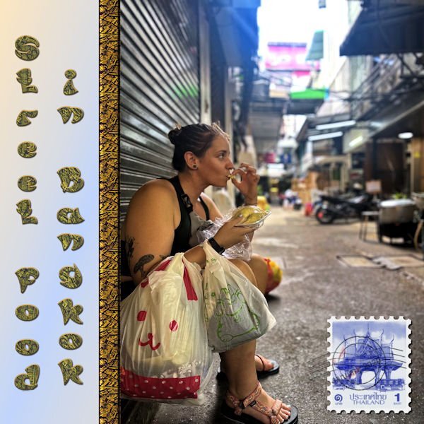
I made this picture for the Maniacs site. It is a picture that my grandson sent to me from Thailand where he and his girl went to play rugby. The ribbon separating was made from a scrap tutorial using a pattern that I downloaded from CF. The font is Asian Pacific, also from CF. I may change the font because the L and the F look more like a P with the pattern and the stroke.3 points
-
I will now be using her site as a new source of inspiration.3 points
-
3 points
-
I agree. In my planning of an album, I usually plan the pages as facing each other and so the look is cohesive. Worked with my Chattanooga album which I had printed for my daughter who shared the trip with me. The trip that my son and daughter-in-law and I took in the RV out west, I did that in double pages and it was a chore in getting it printed and not losing anything in the center.2 points
-
That's what I've done so far. I created one narrow long rectangle in grey, saved as PNG. Then adjusted it with the Warp Brush and then each time I duplicated the rectangle on the actual canvas, I adjusted it more with Flip Vertical and Horizontal and used the Shear or Freehand tool to change the shapes a bit. Kept the widths on the page slightly different too. I have lots of overlays with dots and other shapes I can lay over the stripes after I colour them separately on their own layers. It's kinda slow but fun. It will be interesting to see if I even LIKE the effect after I get 'er done! I'm with Ann Seeber. Scraplift of the month sounds good to me. Maybe we can take turns choosing a layout for the others?2 points
-
2 points
-
2 points
-
2 points
-
2 points
-
My grandson pointed out the problem with the font. I wanted to use a Asian looking font, but I am going to have to correct it. I also am not crazy about the title going up and down.2 points
-
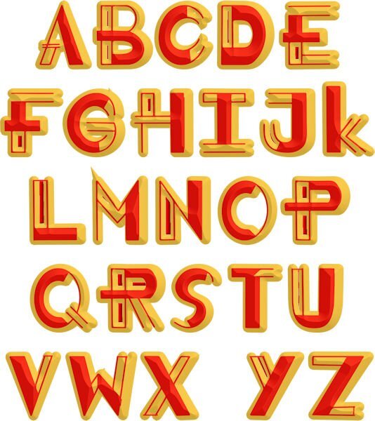
You really do create wonderful Alphs. A lot of time and thought goes into them. I had to look hard at the title in order to read it correctly. There was a time I would use some fonts, not taking into account of who is going to read it. Will the text be legible for eveyone. As not everyones' eyes are healthly, which makes reading some text/alpha even more difficult. Fortunately my eyes are fine.2 points
-
That probably explains my problems and the following dislike of drawing with the Pen tool too. I'll have a look at my settings!2 points
-
2 points
-
Annie is one of my favorite template designers. I've gotten some beautiful ones on the ALFLT Blog Train.2 points
-
2 points
-
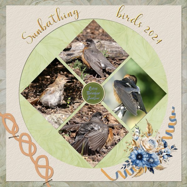
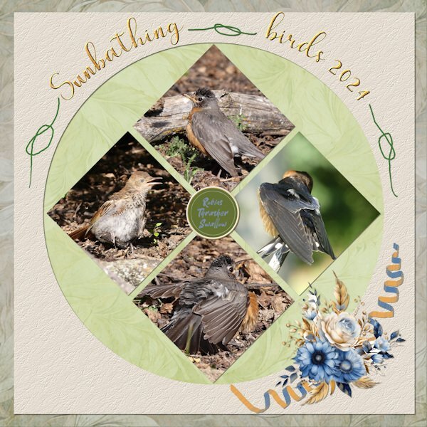
My hand is getting to shakey to do a decent job drawing with the pen tool using a mouse these days. Athough I used a cass rope, It looks more like string, and hides the shakiness. I went with a goldy metalic title. Created the curly streamer, placing it under the flowers. I will remove the flowers, streamer and knots to make room for some info at a later date. I have only ever photographed 2 birds with their uropygial gland exposed. Also known as the preen gland. It secretes an oily fluid which the bird uses in preening its feathers.2 points
-
Day 7 I was determined to finish this workshop and I did! (Pats herself on the back.) I mostly used things from a kit by Billie Irene from Digital Scrapbook. Cassel's twisted strings picture tube came in very handy. I made the embellishment on the top left by adding an inner bevel and some texture to a character from a decorative font. The text font is Miliki. Great workshop, everybody. ❤️2 points
-
I do a lot of "2 page layouts" but I do each page separately as a 12x12 page. First off, it is easier to do a single page at a time and secondly, it is easier for printing. Most of my "2 page layouts" are actually companion pages where I use the same papers and elements on each page so that the look is cohesive. I am not a fan of spreading a photo across 2 pages in a 24x12 workspace because in printing part of it gets cut off. I'm thankful that the template designer I use a lot will split a 24x12 template into 2 12x12's in her downloads so I don't have to split it myself!1 point
-
Since I am a Diamond member, I downloaded both the pdf and the mpr of Playing With Vectors Master Class. The very end of the mp4 mentions the upping of the Tracking # in the pen tool. This is not mentioned however in the pdf version. Anyway. Thanks for the update for me. I love what you do, Carole. I guess I'm going to also go to the Master Classes as well as the Labs. Will I ever catch up??????????1 point
-
I am in too, the hardest thing for me is the lifted shadow, i think my problem comes from making the warp bruch too big or too small1 point
-
1 point
-
Oh Julie! There isn't anything sexual about the photo. I'm not even going to ask what ran through your mind when you saw the photo. 🙂 lol1 point
-
No way I could use PSP on a tablet! I don't even like surfing the internet on them. I used to use PSP on a laptop when I would go to scrapping retreats but I would have a hard time even doing that now... I need that large monitor space I'm used to!1 point
-
1 point
-
I've finished another layout. Thank goodness it didn't take that long like the previous one... Some pages come easily, others not so much. Credits: Carole’s Adhesive Tape script Background papers: marisa-lerin_1456_distressed-6-tan & Talie_DiCtonS_pp01 (I played with the Blend Mode) Lilypad-lgrieveson_worn edges 2 page 1 Lilypad- rjefferies_Eucalyptus Impasto Palvinka_SpecialHug_photomasks_1 Lilypad-mommyish_AAM_stickers Fonts: Handlee & Farofa1 point
-
Sue, some templates I can replicate, but others can be tricky.🙂 Sometimes, I prefer to work with templates; other times, I am up to create my own... Not to mention scraplifting. 😄 It's like using scripts: I love to know how to do it myself, but sometimes, I want the comfort and speed that a script gives. Not to mention, I could never create such beautiful bows as Carole does!1 point
-
My subjects are rarely cooperative, they are after all wild and free spirited. Which makes photographing wildlife a challenge. Always having to seize the moment, which makes life interesting.1 point
-
Wow, I never knew this. How cool and interesting. Thank you. Must not be an easy thing to capture. Those little LBJs are so fast as everything they do.1 point
-
1 point
-
N = New York City...several years ago, 4 of us went to NYC and returned home the same day. We packed our day and it was an adventure.1 point
-
If you go to the pages with visual thumbnails, you can use the search field to find all the "knot" tutorials 🙂1 point
-
Michele I'm so happy for you that you were able to finish this workshop despite you being so ill at the beginning! You finished on a high and with something we all could do to make this world a beter place.1 point
-
I can recommend it to you, if you ever get a chance to do this: do it!!!!! It was a wonderful experience, at least for persons without fear of heights. You are very safe in those baskets but wouldn't be able to enjoy it. The pilot of the ride I took told that he once had to do an emergency landing because of a person that became afraid and was endangering the rest of the passengers.1 point
-
1 point
-
@Michele HOW TRUE HOW TRUE HOW TRUE. Love you for displaying this bit of truth.1 point
-
I absoloutley agree with you, her templates are relatively basic, as you say, lines and circles. What you do with the template is where creativity comes into play. Expanding circles, ovals and so on, to delete parts of other layers, is what I have been doing for a very long time. It was a bit of an eye opener for me as I had never been onto her facebook page or website.1 point
-
Nothing wrong with the photo but with the watercolor mask it becomes more interesting, especially for a card. As I already said on FB a good reminder of that technique!1 point
-
1 point
-
Thank you so much, Mary I love playing with the different fonts. I hope it will save me time on making titles. I have used layer styles so that I have the option of deleting the style, converting to raster and using the raster effects. If anyone wants to use my alphas, let me know.1 point
-
1 point
-
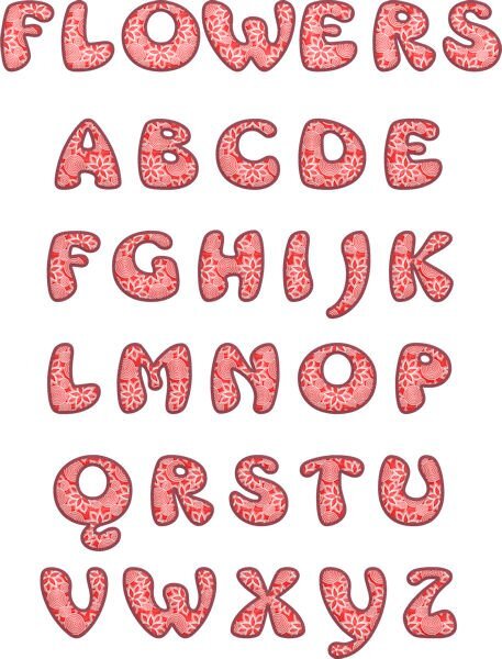
I really think that I need to go to rehab for a font addiction. I can't stop downloading them from CF. I have been working on letter templates using patterns and different fonts. This font is called Mrs. Beasly which is a thick, free font. The pattern is from a dingbat font called Seamless patterns. I made the pattern for the letters using cass seamless pattern script, the cass script element stacker to make the layers and then the cass script text creator for the title. I used layer styles for the bevel and saved as a vector so that I could later change the pattern, colors, etc.1 point







Resized.thumb.jpg.d25811db03a63358cedab1e79f527635.jpg)
