Leaderboard
Popular Content
Showing content with the highest reputation on 08/02/2024 in all areas
-
Annie C Digitals...number template. I found the sign on the web. The palm trees are by Marisa Lerin, Felt Palm Tree-Mexico. Nail heads by Brooke Gazarek, Crisp Fall Air Elements Kit.8 points
-
6 points
-
6 points
-
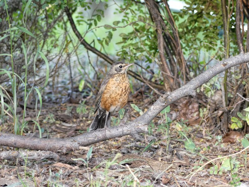
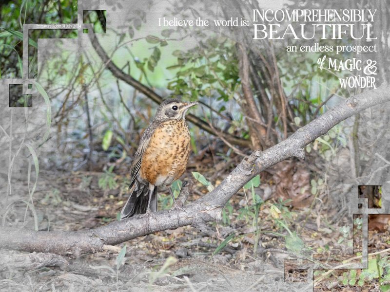
A birthday ecard for a friend at home. I replaced the birthday greeting with a quote. Duplicated the photo. I used the watercolour mask technique. Changed the duplicated photo to black and white added a texture. Carole's corner punches always come in handy. A photo I took yesterday, specifically for this card. A subject even perched on the branch I had placed amongst the trees. As I didn't want to much depth of field. I wanted some detail. As any bird that perched there would have sufficed, or mammal come to think of it.6 points
-
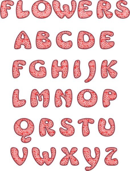
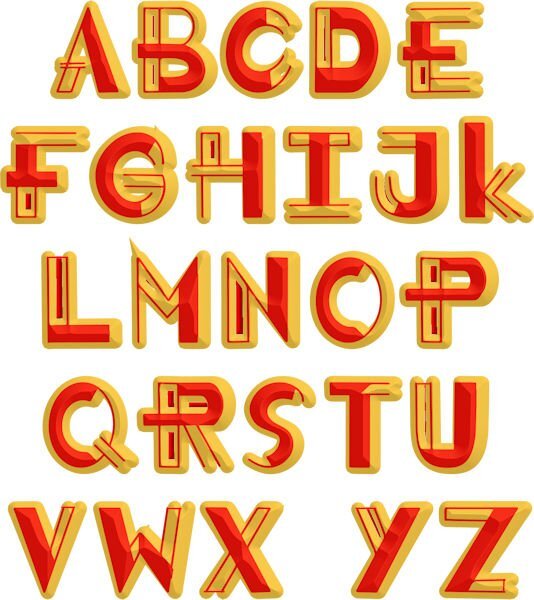
I really think that I need to go to rehab for a font addiction. I can't stop downloading them from CF. I have been working on letter templates using patterns and different fonts. This font is called Mrs. Beasly which is a thick, free font. The pattern is from a dingbat font called Seamless patterns. I made the pattern for the letters using cass seamless pattern script, the cass script element stacker to make the layers and then the cass script text creator for the title. I used layer styles for the bevel and saved as a vector so that I could later change the pattern, colors, etc.4 points
-
When I started here, one of the things I wanted to create was Masks. I had downloaded a few free masks, but I wanted to know how to make my own. Sue was already creating lovely layouts (I think we joined the Campus in the same year - 2016). When I commented about the masks, she answered that they were not difficult to create—and she was right. 🙂 I've learned so much from Carole and other members over the years, and now, looking at some layouts, I think, "I can replicate this".4 points
-
3 points
-
How time has flown, developing our own unique styles in that time, whilst having fun and learning lots. I will reiterate again by saying, use the 'from vector shape' tool rather than the magic wand to maintain sharp clear curves. Before converting to masks if you want to use the shapes for adding photos. Cristina, I don't think, I know you can replicate those templates.3 points
-
I loved what you did with the letters you used. Looking at Corrie's number 8 layout, it would be easy enough to replicate her templates.3 points
-
With your experience, you can surely replicate the main parts as if they were sketches!3 points
-
She has/had the letter templates on sale 55% off...for all 26 letters...55% off...still too much. I love her creations but seldom buy.3 points
-
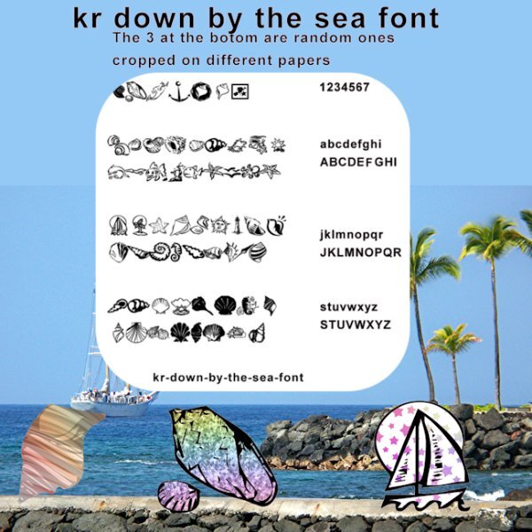
I went in a totally different direction with this. I got to playing with some of the dingbat letters to see what they would look like extracted from different papers. Then I decided I would like to know what each letter looked like. One thing led to another. Well you know how that goes. LOL I did not put any shadows on anything, but I did make the page of dingbats darker to show up better. I also posted this pick on the facebook page in a larger file.3 points
-
2 points
-
As do I, with countless works of art posted, they are quite simply ineffable. Many of us have our very own distinctive, unique styles, you are no exception. Yours, I would describe as exquisitely delicate. Our styles develope with time.2 points
-
2 points
-
You and I posted at the same time. We were thinking along the same line, of replicating those pages.2 points
-
Even at a good discount, it's a bit pricey for me too. Don't think I could use the whole alphabet. Maybe I'll buy one or two letters.2 points
-
Anyone who wants to have a cheat sheet for dingbats can check this article.2 points
-
I was playing with the July font challenge and though I would post this here too. "I went in a totally different direction with this. I got to playing with some of the dingbat letters to see what they would look like extracted from different papers. Then I decided I would like to know what each letter looked like. One thing led to another. Well you know how that goes. LOL I did not put any shadows on anything, but I did make the page of dingbats darker to show up better. I also posted this pick on the facebook page in a larger file"2 points
-
2 points
-
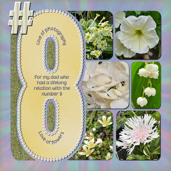
Anniedigitals has a new project Numbers and i noticed this one on time! This is the layout I did with the template for number 8. It was the first time I participated in something on her FB site, I started following her recently. I requested the #8 because my dad had something with that number, major things in his live had to do with it, like the month he was born was august, he was the 8th child, lived on #8 and I was born on the 8th of april and so on. All photos are by me and I use the free script Selection to Path that Carole mentioned in the Featured Resource blogpost in June 2024. After using that script I could run the VectorTube script to get a border with flowers around the 8. I love that Selection to Path script, it worked fantastic and I think I will be using this often!2 points
-
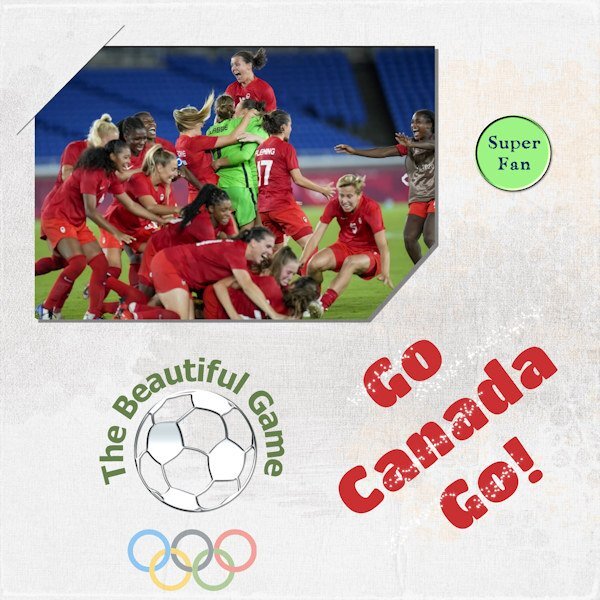
I'm a soccer fan, love watching it. Men or women. It really is the beautiful game! Despite the cloud of controversy that appeared over the Canadian Women's Soccer team, I am still cheering them on. I hope they kick some butt and win gold (again). This is not any sort of political statement. Just my enthusiasm for their efforts. I wanted to use the slit corners. Seems I got only the one and the bottom right looks funny. Oh well, next time.2 points
-
2 points
-
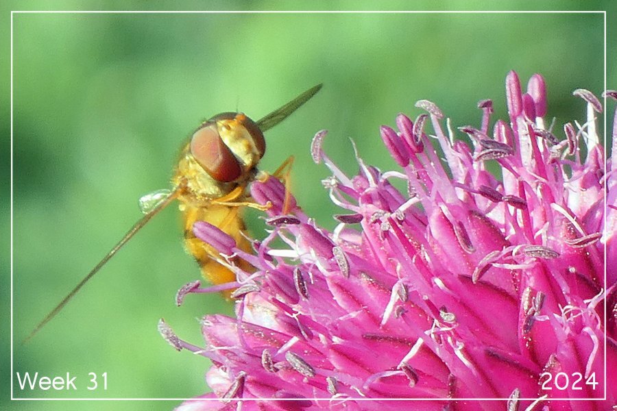
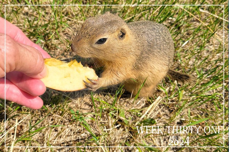
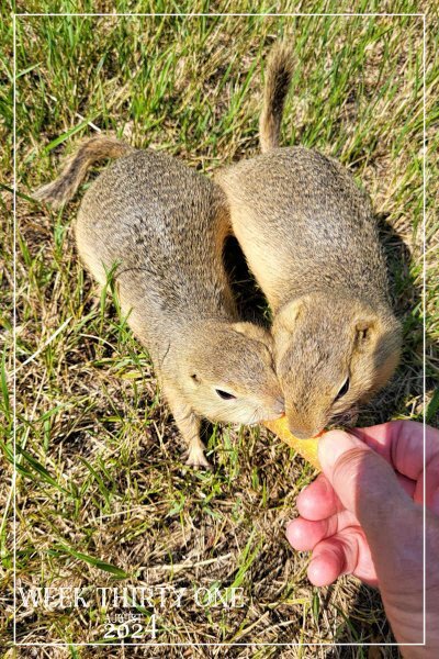
Week thirty one . I can only ever add one image to each post. I've tried editing the post to add another image, but it will not allow me to do so. Anyway, I would like you to meet some of my many seasonal wild friends. Richardson's Ground squirrels. Many come to the call, for a treat. I do not attempt to touch or handle them. I let them come to me. Although they are very teritorial, somtimes they will share a treat. Which is quite rare. As it usually sparks a fight, with the dominant/older one winning seeing off the subordinate. The other image is of a baby, following in the steps of older ones. I'm unable to take shots with the camera as I can't operate it one handed. Using a tripod or monopod doesn't work either, as they won't pose for me in a specific spot. These were taken using my mobile phone.2 points
-
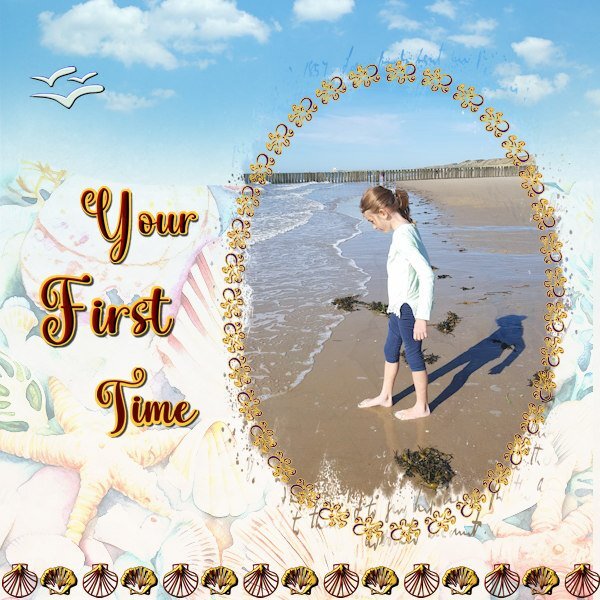
I haven't many photos of the beach, we like it better inland. In summer the beaches at our North Sea coast are packed with people. When we are going to the beach it is in winter to take a stroll along the waterline. My grandkids lived in Switzerland before the family moved to the States. My oldest granddaughter is adventurous and visited us for the first time on her own when she was 7! Of course minors have to be accompanied by airline staff and my daughter brought her to the airport and I met her on arrival, I had to sign a paper that I had collected her and my passport had to be checked etc. But there she was and she stayed a week. One of the days we went to show her a beach, she only knew lakes at home. Now the family goes to the pacific coast and I have been there as well, but she hasn't forgotten her first sight of the sea. I used several fonts: the jelly fish for the frame, the seagulls and 2 shells. I only wanted to use the dingbats that represent what can be found on our shores. The background is made with a couple of papers with different blendmodes and opacities until I got something I can live with. The mask is by Jessica Dunn from Into the Wild and the font is Vallentina2 points
-
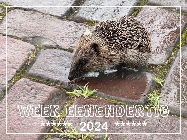
Today when I looked out of my kitchen window I saw something on the street that I couldn't immediately identify. Often birds are searching for little insects or worms between the stones especially after it has been raining. I went outside to have a closer look and it happened to be a small hedgehog! When we lived in our old house we had hedgehogs visiting in the garden, but here I haven't seen them around. This is a more buildup area although there are some small spots like the one where I took the flower photos for the weeks in July. The lady from across the street saw me and came to have a look too. We didn't know what to do because the hedgehog was in danger to get overrun by a car but he was looking okay and walking around. She is the caretaker of a Jehova Witnesses community center and lives on the premises which has a decent garden. We decided to try to get the hedgehog to walk into a box without us touching it and he/she obliged and is now in her garden. Surprise of the day........1 point
-
Donna you will be our Alphabet Queen! You do lovely work with all the alphas you create and I'm sure there will be much more to come.1 point
-
Nothing wrong with the photo but with the watercolor mask it becomes more interesting, especially for a card. As I already said on FB a good reminder of that technique!1 point
-
That was my thought too and I find most of her templates are easy to replicate in my humble opinion. It is mostly a combination of lines and circles if you look closely. I only have bought 1 template from her because it was about my own country and I replicated that for Switzerland, California and Washington State. For the numbers layout it was fun to do, but in essence not really a creative challenge.1 point
-
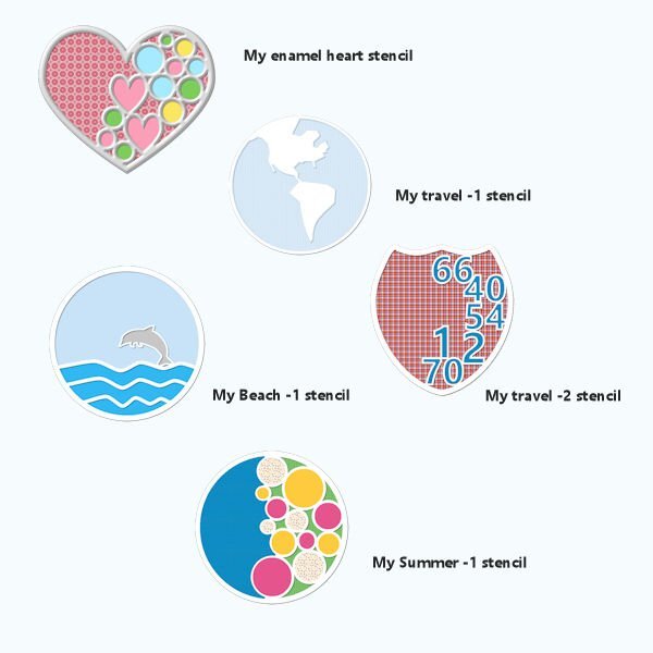
I love them, especially the dolphin stencil, which can be used in any beach layout, including this week's font challenge.1 point
-
Beautiful capture! It is in fact a Hover Fly or known as flower flies. They are dead ringers for bees and wasps. Not only are they harmless, they are valuable pollinators of flowers. The easiest way for the untrained eye to tell apart from those that they mimic, is that their antenae are very short in comparision to bees and wasps. Although there are other distinguising features too.1 point
-
1 point
-
1 point
-
1 point
-
I used to do that so I could better see the dingbats, but I didn't save them. Character Map is usually too small for me to see. I now have a few free font viewers that make it much easier for me.1 point
-
There's also enochlophobia which is the fear of crowds and cleithrophobia, the fear of being trapped. So many phobias that I don't fully understand. Maybe I have a little bit of everything. LOL1 point
-
You made a nice reference page for those dingbats, very handy if you should want to use for something else in the future. If you don't mind I'll take a screenshot, so thanks 🥰1 point
-
Annie C's whole alphabet is on sale on Etsy for 55% off in case anyone is interested. The numbers are not posted there yet.1 point
-
Nice! Soccer is more or less our national sport and I have been watching a lot of games. Nowadays mostly on the telly because my hubby always tries to follow the competition for the UEFA and FIFA games. For me that is getting a bit too much soccer or voetbal as we call it. Who knows with the Olympics going on now, maybe the teams of Canada and Holland will meet on the field!⚽1 point
-
1 point
-
1 point
-
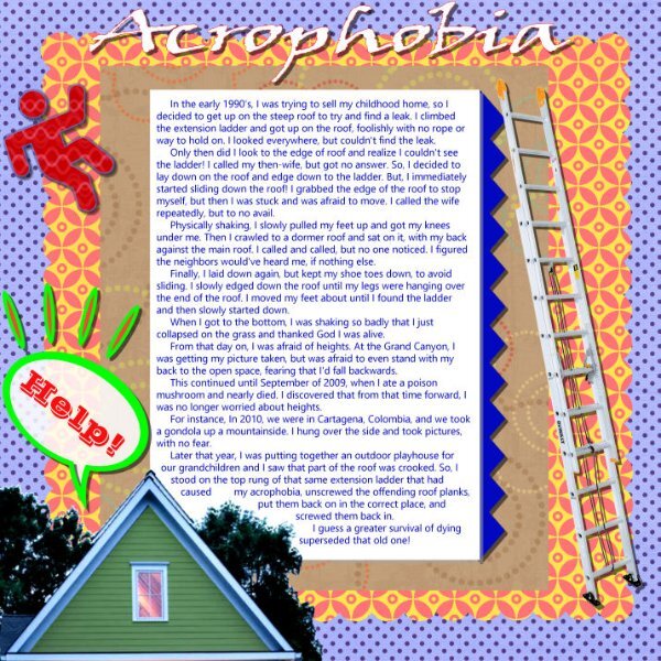
Day 6 (one more day to go!) I don't remember any specific childhood fears so I went with an adult one. It might have just been the mood I was in, but I wasn't inspired by this topic. I didn't want to skip this day so here it is. The background paper was originally in bright colors so I used Image: Greyscale. Then I used Adjust: Hue and Saturation: Colorize until I got a color scheme I liked and went on from there...plaids and polka dots. I went on a Google search for pics to use. The title font is, appropriately, Claustrophobia from CF and the story font is Adventure from Pixel Sagas.1 point
-
There will be opportunities enough for us where we use similar things, we tend to think along the same lines in many cases.😉1 point
-
We have one similarity, in that we both used one of our granddaughters. I had thought to create a frame in my usual way of using dingbats on my frames, but there wasn't anything that suited. Hence the mask. Either way I thought you created a lovely page. I would have liked you to have used the same dingbats to see how you would have used them. It was a challenge for us.1 point
-
I agree the font isn't easy, it took me a while to find a way to use it. You have made such a lovey layout with it and I didn't want to use the same dingbats in the same way, so I had to come up with something else.1 point
-
Thank you and I loved my grandparents so much. I was lucky they lived to the very old age of 89 and 92, which was really old for people being born in the late 1800th. They were my maternal grandparents; my paternal grandfather had already died and my grandma just lived long enough to at least saw me when I was born. At that point she was already bedridden and my dad put me in her arms as soon as he could take me there, but of course I only know the story.1 point
-
1 point
-
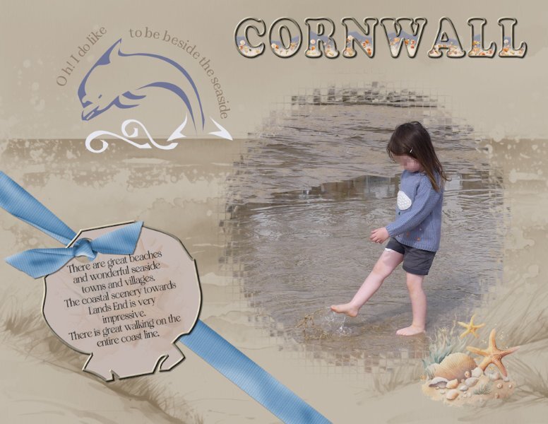
I used a photo I took of Ffion one of my granddaughters at the beach when I was home last. They live in Cornwall. I used a mask from one of the calendar challenges. I used the Dolphin and one of the shells from the font to create the tag, and text on a path on the dolphin. I filled the word Cornwall with water, sand and seashells. The bow is Carole's bow 3 script. It's not the easiest of dingbats to work with. Although it is a fun beach font.1 point
-
1 point
-
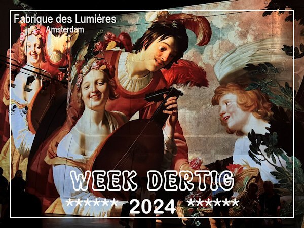
My cousin and I took a daytrip, something we do once a year and this time we went to Amsterdam. We wanted to see a multimedia spectacle about the old, world famous Dutch painters. The event takes place in an old, abandoned gasworks and is called Fabrique des Lumières. The makers used over 325 artworks from 50 different Dutch painters from the 17th century onwards. There were big laser projections on the walls, roof and floor of the building with an explosion of colors accompanied by music fitted for the topics presented like cityscapes, warscenes, romance, still lifes, flowers and it ended with Mondriaan in New York with the Boogie Woogie. It felt as if we were walking through the paintings. A great experience!1 point


Resized.thumb.jpg.d25811db03a63358cedab1e79f527635.jpg)

