Leaderboard
Popular Content
Showing content with the highest reputation on 08/01/2024 in all areas
-
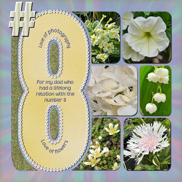
Anniedigitals has a new project Numbers and i noticed this one on time! This is the layout I did with the template for number 8. It was the first time I participated in something on her FB site, I started following her recently. I requested the #8 because my dad had something with that number, major things in his live had to do with it, like the month he was born was august, he was the 8th child, lived on #8 and I was born on the 8th of april and so on. All photos are by me and I use the free script Selection to Path that Carole mentioned in the Featured Resource blogpost in June 2024. After using that script I could run the VectorTube script to get a border with flowers around the 8. I love that Selection to Path script, it worked fantastic and I think I will be using this often!5 points
-
Day 6 (one more day to go!) I don't remember any specific childhood fears so I went with an adult one. It might have just been the mood I was in, but I wasn't inspired by this topic. I didn't want to skip this day so here it is. The background paper was originally in bright colors so I used Image: Greyscale. Then I used Adjust: Hue and Saturation: Colorize until I got a color scheme I liked and went on from there...plaids and polka dots. I went on a Google search for pics to use. The title font is, appropriately, Claustrophobia from CF and the story font is Adventure from Pixel Sagas.5 points
-
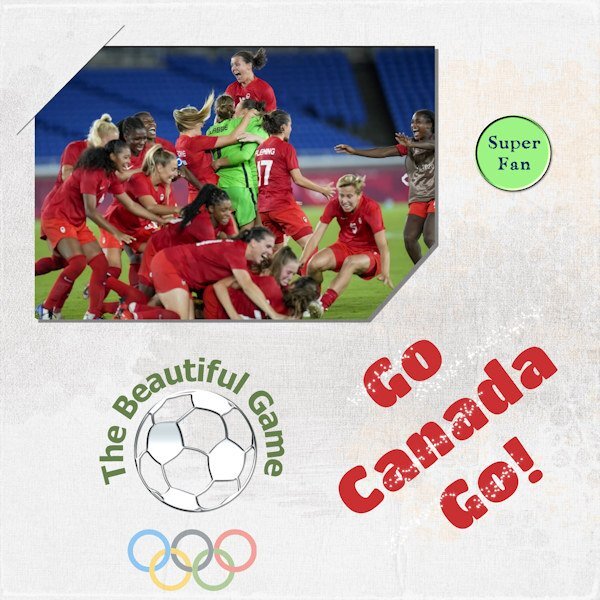
I'm a soccer fan, love watching it. Men or women. It really is the beautiful game! Despite the cloud of controversy that appeared over the Canadian Women's Soccer team, I am still cheering them on. I hope they kick some butt and win gold (again). This is not any sort of political statement. Just my enthusiasm for their efforts. I wanted to use the slit corners. Seems I got only the one and the bottom right looks funny. Oh well, next time.4 points
-
4 points
-
I used the script from Carole to get this effect, my try was not very succesfull, I made paper from the T-shirt, Alpha , staples and arrows are from a Collabkit - over the moon - at Gingerscraps. Journaling font is Arnold Story again. the edge I created in Lab 5 -10 crayonedge.4 points
-
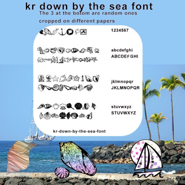
I was playing with the July font challenge and though I would post this here too. "I went in a totally different direction with this. I got to playing with some of the dingbat letters to see what they would look like extracted from different papers. Then I decided I would like to know what each letter looked like. One thing led to another. Well you know how that goes. LOL I did not put any shadows on anything, but I did make the page of dingbats darker to show up better. I also posted this pick on the facebook page in a larger file"2 points
-
I know it's called football but if we use that term here people think of American football which, to me, is not very fun.2 points
-
Thanks, Julie. I don't particularly like green, but since the subject was brussel sprouts, I thought it was appropriate.2 points
-
Love the green. Don't see it much in layouts and it's so fresh! I had a friend years ago who had to stay at the table until he ate all his peas, and he hated them. Still does.2 points
-
Your mom and my mom must've being soul sisters. I was told I couldn't leave the table too. My go-to was crying or having a temper tantrum. And my nemesis (to this day) is fish. I also won, lots of tears were shed, but I didn't have to eat it.2 points
-
2 points
-
since 2023 doesn't have that option anymore (you have to edit selection and choose the pick tool to resize and/or move it) I totally forgot until I watched the tutorial. I think I should go back through all the workshop tutorials to see what else I have forgotten. that might be a good project for the dark, cold winter months.2 points
-
She is working on the numbers and they will come to Etsy as soon as she has enough pages done. The alphabet is lovely but I don't think I'll buy it at this moment in time. Today my new glasses were ready and they cost a small "fortune". August didn't start cheep and it is only the 1st day of the month!😢1 point
-
I went in a totally different direction with this. I got to playing with some of the dingbat letters to see what they would look like extracted from different papers. Then I decided I would like to know what each letter looked like. One thing led to another. Well you know how that goes. LOL I did not put any shadows on anything, but I did make the page of dingbats darker to show up better. I also posted this pick on the facebook page in a larger file.1 point
-
Nice! Soccer is more or less our national sport and I have been watching a lot of games. Nowadays mostly on the telly because my hubby always tries to follow the competition for the UEFA and FIFA games. For me that is getting a bit too much soccer or voetbal as we call it. Who knows with the Olympics going on now, maybe the teams of Canada and Holland will meet on the field!⚽1 point
-
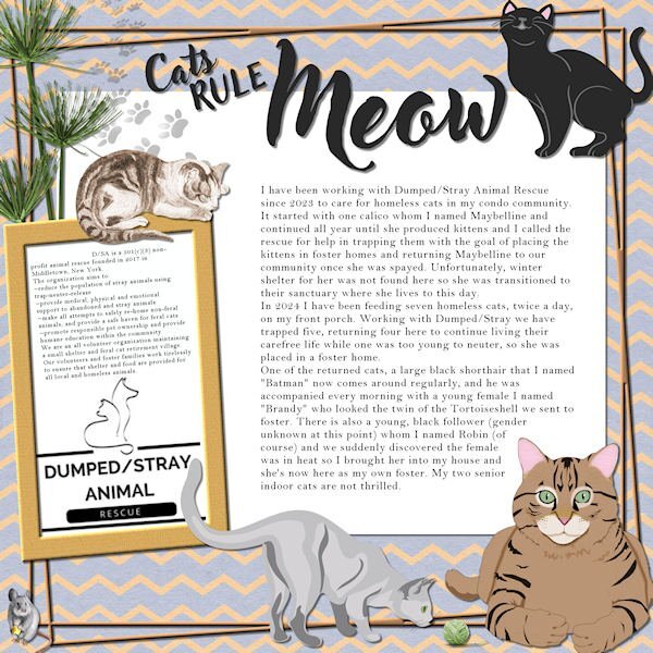
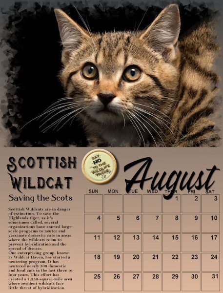
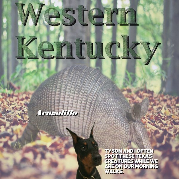
That could be a common house cat. Hope the efforts to save them make a difference.1 point
-
1 point
-
1 point
-
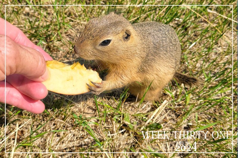
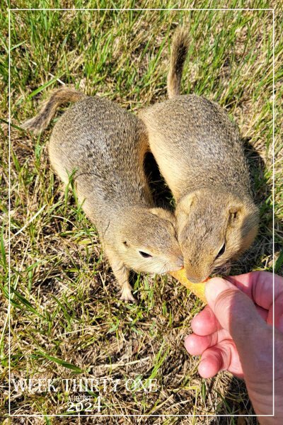
Week thirty one . I can only ever add one image to each post. I've tried editing the post to add another image, but it will not allow me to do so. Anyway, I would like you to meet some of my many seasonal wild friends. Richardson's Ground squirrels. Many come to the call, for a treat. I do not attempt to touch or handle them. I let them come to me. Although they are very teritorial, somtimes they will share a treat. Which is quite rare. As it usually sparks a fight, with the dominant/older one winning seeing off the subordinate. The other image is of a baby, following in the steps of older ones. I'm unable to take shots with the camera as I can't operate it one handed. Using a tripod or monopod doesn't work either, as they won't pose for me in a specific spot. These were taken using my mobile phone.1 point
-
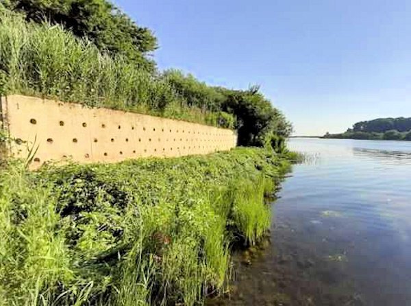
We have bank swallows too in the Netherlands; here it are migratory birds and they arrive in Spring from North Africa's Sahel region. We even have a saying that one swallow doesn't make Spring. They nestle on riverbanks or even sand piles on building sites where the builders aren't happy with them because they are a protected species. Because their numbers went down and there weren't enough places for them to nestle any longer artificial walls were build along rivers or lakes. They needs places with plenty of water where they can find small insects to feed their youngsters. In Etten-Leur, the place where I live we have such a wall, like the one in the photo and it is a great succes. It it a sheltered place where the public can't disturb them, but you can see it from a distance and of course you can see the birds flying around. The track from where you can see it is too far away to take good photos and there is a lot of greenery obscuring the view.1 point
-
1 point
-
1 point
-
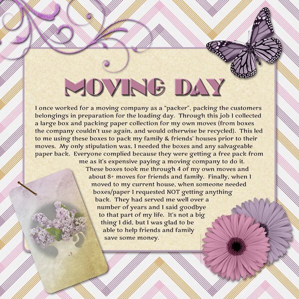
Too bad you don't have those supplies anymore. I might've contacted you to send them when I decide to move. Getting that stuff is not easy these days! Love the colours you used.1 point
-
I agree Cristina...good memories. Sometimes I just scroll thru my layouts. It always brings a smile as I remember each event. Thank you.1 point
-
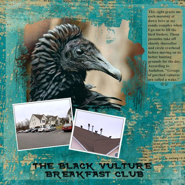
I think the main text is readable but not the Dumped/Stray in the sidebar. Here it is in text form: D/SA is a 501(c)(3) non-profit animal rescue founded in 2017 in Middletown, New York. The organization aims to: ~reduce the population of stray animals using trap-neuter-release ~provide medical, physical and emotional support to abandoned and stray animals ~make all attempts to safely re-home non-feral animals, and provide a safe haven for feral cats ~promote responsible pet ownership and provide humane education within the community We are an all volunteer organization maintaining a small shelter and feral cat retirement village. Our volunteers and foster families work tirelessly to ensure that shelter and food are provided for all local and homeless animals.1 point
-
Day 5 ~ I'm getting there. In my story, I wasn't trying to be a smart-ass. I just really couldn't deal with the taste when I was that young. I love brussel sprouts now along with many other foods I didn't like as a kid, e.g. spinach, @Ann Seeber. LOL I don't often use alphas so I found a wonderful font called Green Delight Leaf on Fontspace that fit my title perfectly. I added texture and an inner bevel to it. The story font is Candy Berry Solid which I got a few years ago in a CF bundle. The various papers are from blog trains.1 point
-
1 point
-
Day 7 I used the pretty finished page. Although, on the lower right hand side by the pink flower, there is a weird line. Does anyone else have that? I happened to have a recent lilac photo and thought's I'd use it even if it has nothing to do with the subject of the journaling. I wanted to try the technique. I like it. I hope I remember it so I can use it again. I did all of it in 2022 and forgotten how nice it is to be able to right click on a selection and move it. I'm so used to using edit selection and the pick tool to move (or resize) my selections. Fonts are Marline (title) and Marko One (journaling). Thank you for this workshop Carole. there was techniques (feathering) I had forgotten how to do.1 point
-
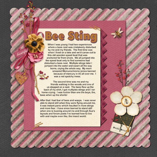
Day 6 I use Jessica Dunn's bundle, "Heard the Buzz", except for the bee that is from Creative Fabrica. the font for the title is Hillray Reg. (probably CF) and I duplicated the vector, added more outline and had not fill on the second version. Convert them to a raster so I had an outline version and a fill version in raster form. I used Inner Bevel on the outline and Used Effect>Texture Effects>Tiles (hexagon shape) on the fill layer - I learned this from Digital Scrapbooking Made Easy book. I'm already referring to the book for techniques.1 point
-
Cow by Marisa Lerin, Animal Color Illustrations-cow. Shoes by Marisa, Mix & Match Elements-tennis shoes. Quote by Marisa, A pair of shoes can change your LIFE-Cinderella.1 point
-
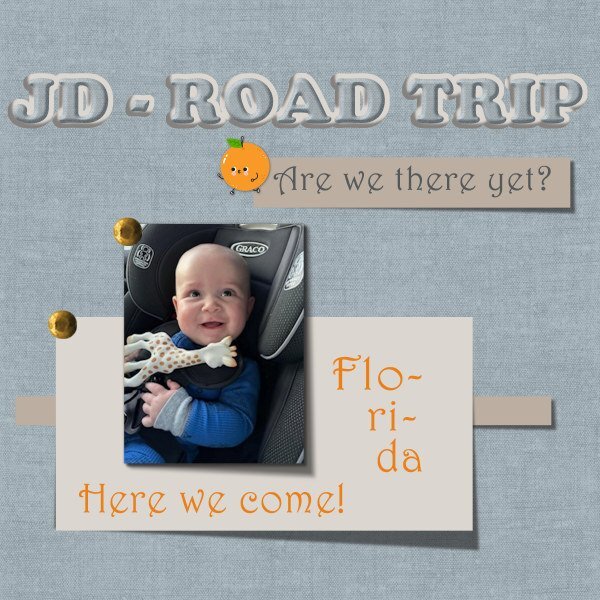
Since I recently got another pic of my friend's great-grandson, I wanted to play with more lifted corners. The baby's folks (young couple) set out from near Windsor, Ontario, to drive with a four-month old to Florida! The baby looks happy; wonder what the parents look like? That's a long drive.....!1 point
-
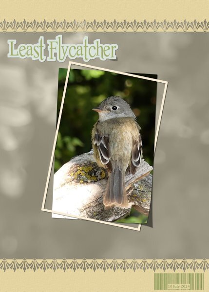
Here is one more for this challenge. I used one of Carole's edge brushes, as it resembled the bird's slightly fanned tail feathers. For the background I used the photo as an overlay. I created a barcode in order to date when the photo was taken. The Least flycahtcher is such a beautiful little bird, not much bigger than the Wren. I have several pairs here, they are very secretive birds, keeping low in wait on branches, catching insects on the wing.1 point
-
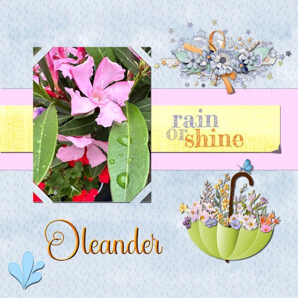
I started this layout last saturday but with the story workshop and a very busy week I just finished this one. I wanted to make the lifted corner by hand, but I'm not entirely happy with it. Next time I'll probably go with the script that I have. However I used the cass-SlippedInCorner2 which I won last week! I tried all the different options but settled here for this one. Script is nice and easy to use, love it! For the background I made an overlay with raindrops. Somewhere on the net I saw an umbrella adorned with flowers and made this brolly myself, just as the watersplash. The cluster is by Jessica Dunn and the rain or shine text comes from my stash. The title font is Star Bright.1 point
-
I've never seen doves or dove babies. My hubby and I was talking about having never seen Pigeon babies either, even though I seem to get a yard full of them.1 point







Resized.thumb.jpg.d25811db03a63358cedab1e79f527635.jpg)
