Leaderboard
Popular Content
Showing content with the highest reputation on 07/29/2024 in all areas
-
I used parts of Jessica Dunn's journal cards...2017 destination Florida beach kit. The sea gulls are from Creative Fabrica.10 points
-
9 points
-
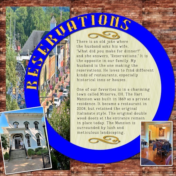
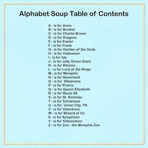
Day 5 was easier for me because I took the photos Friday when we went there. The photos are mine. The title font is Silverblade, a free font, and the type is Vintage Remington. I made a alphabet page and the used cass elementstacked script to put each letter on it's own layer. I love that script; it saves so much time. The background bricks are from Resource Boy and the embellishments are preset shapes. Resource Boy website has many textiles and gradients.9 points
-
Day 4 I found the pics on Google and changed them to B&W to give them a nostalgic look. I added some texture to the pink papers just to add a little interest. The title font is Travel Soulmates and the story font is Lavanderia.8 points
-
Here's my day 5 again, fixed. I dont have time to take over the world today, as I have some folding to do. PS...My husband asked if my "coup" involved locking my parents in the basement and taking over the house. I said yes, so you better toe-the-line or there might be a take over in this house too! 😨7 points
-
7 points
-
6 points
-
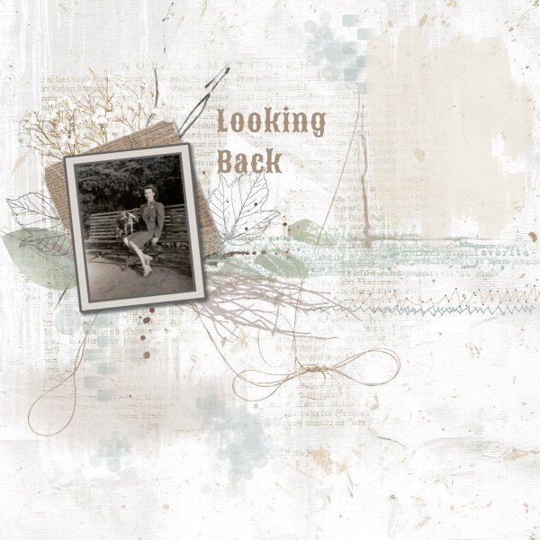
I wanted a wee break from StoryTime. Thinking of what to say in journal form is trying my grey matter too much. So I was looking at old pix and came across this one of my mother, taken oh so many moons ago! She's been gone from my life for such a long time, I look at her photos to remind me. This layout has so many brushes and elements, I couldn't begin to list them. I just played and played until I liked what I got. It's based on a scraplift I took from Lilypad. It's my last "what are you working on" for July. Hello August! Christmas will be here in no time, and I bet Sue T is all prepared by now!6 points
-
6 points
-
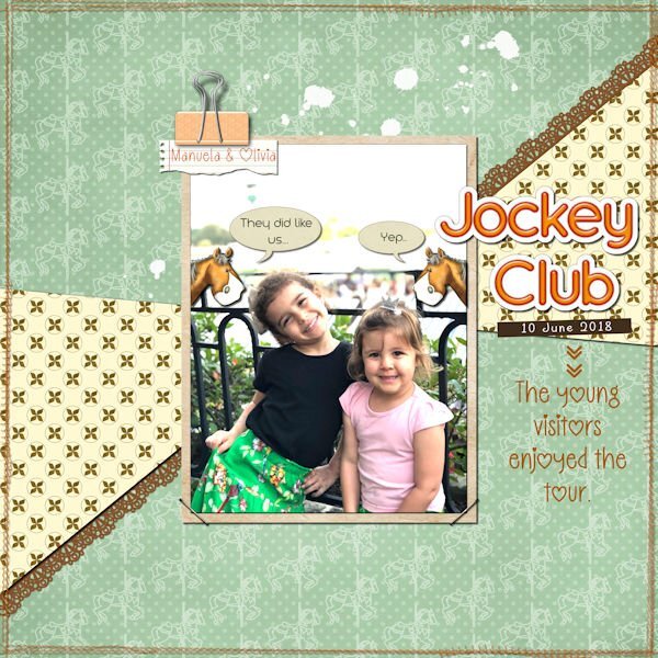
I finally finished the layout for the Lab11-Module 11. I struggled with the colors, not liking anything, until I declared it "done" and will move on to the next module. 🙂 Lab 11-11 Tutorials: Cross Pattern2 / Edge Cutout2 / Paper Clip3 Credits: Template - Scrapping with Liz - SwL_MBC_4_19Template Background Paper _ marisaL-DST13-09Sep Horse-paper143 Alpha - Delicious Scrap DS_SpringIsIn_Orange_Alpha Horse Graphic - DiHillerDesigns_June2024_Horse Staple - ShabbyPrincess_Promise_Staple Stitches - KAagard_ByAir_BorderStitches_Yellow Extra Tutorials: Tags & Journaling > Notebook page & Text & Tiles > Word Sticker Fonts: High Notes & KG Arrows I changed the background paper's color to green with Adjust>Hue and Saturation>Hue-Saturation-Lightness. Later, I changed it again with Blend Mode. Including the original paper by Marisa Lerin.6 points
-
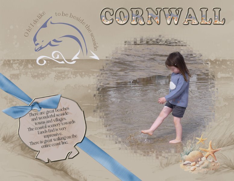
I used a photo I took of Ffion one of my granddaughters at the beach when I was home last. They live in Cornwall. I used a mask from one of the calendar challenges. I used the Dolphin and one of the shells from the font to create the tag, and text on a path on the dolphin. I filled the word Cornwall with water, sand and seashells. The bow is Carole's bow 3 script. It's not the easiest of dingbats to work with. Although it is a fun beach font.5 points
-
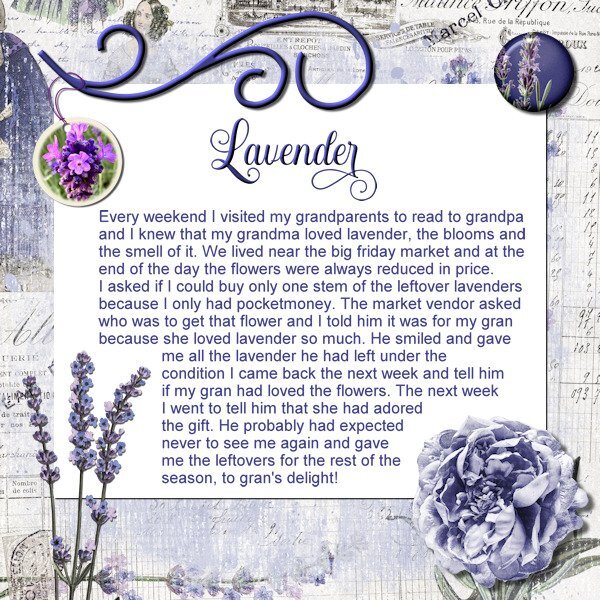
Already day 7 and I used the template for this day. In another Story Time Workshop (or challenge as it was called) I told the story of me going to my grandparents each weekend to read the newspaper to my granddad because he couldn't read it due to severe eye problems. My gran had to read it to him every day and was glad that I came to relieve a bit of the burden. I had a strong bond with grandpa and loved to come to them. So my story continues with the lavender I started to bring for granny because she loved those blooms and the smell of them; she always had lavender soap and lotion as well. I used the kit Lavender Fields by Jessica Dunn and only the tag doesn't come from that kit. I used one of my own photos of a lavender plant which I once had in the garden and placed it in a round tag that I have in my stash by following the tutorial for this lesson, I had forgotten how to do that........ Title font is Hesthia Austine, the rest Arial4 points
-
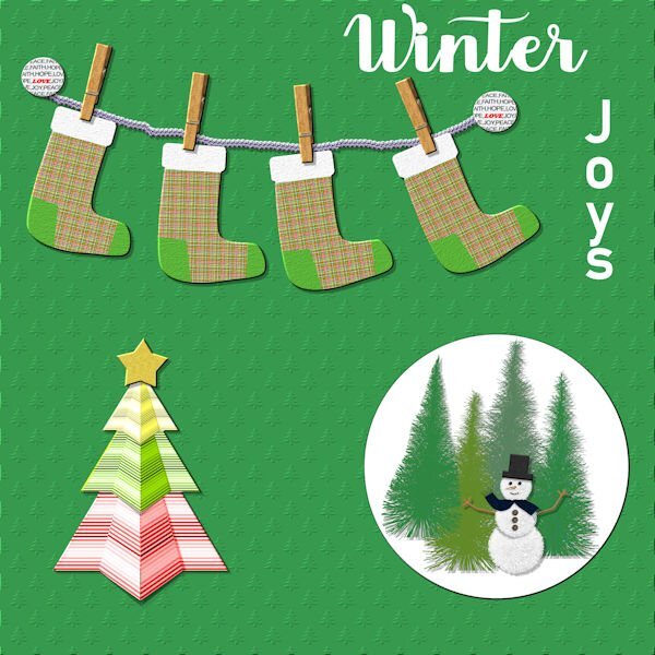
Lab 12 Mod 12. Finally finished with Lab 12. Will I ever catch up????? Title - Winter: Aryadata; Joys: Arial Black; Requirements: Christmas Stocking; folded tree; bottle brush trees. The snowman is by Rachel Martin (PS); the rope is by Cass; the clothes pins are by Brooke Gazarek (PS). I've had fun with the embossed paper and have made several of them with different elements. I've also made several different brads - some with Cass-brad factory and I believe these were from that script.4 points
-
4 points
-
4 points
-
Yikes, Susan the overthrower of govt's. Thanks for the heads up. Now that I read "coop" and "coup" (and we just discussed this in this very forum a few pages back). I stand by what I said before, "English is weird!". It will be a no-brainer, since I did it in 2022, if I had done it in 2023, I'd be crying right now and it would just be easier to overthrow a govt than it is to get 2023 to text wrap...am I right? Glad to know you got my back. Get your pitchfork and come help me overthrow a govt.4 points
-
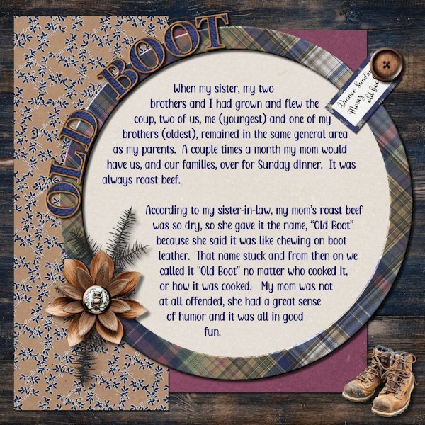
Day 5 Fonts are Adorable Mother and Adinda Sayang. I used Jessica Dunn's Wildwood Thicket bundle for everything except the boots that I found on Vecteezy http://<a href="https://www.vecteezy.com/free-png/hiking-shoes">Hiking Shoes PNGs by Vecteezy</a> the Alpha is by Marisa Lerin and just says it's called Alpha 59 cork. I filled in the middle with a leather texture. Again, used 2022 for the wrapped text for a more smooth workflow. This is one of my favorite templates so far.4 points
-
My mother was quite disappointed when I signed up for Spanish in high school. She had done French and wanted someone else in the family to appreciate it. Unfortunately, she never confided her wishes in me, so I just chose Spanish, like my girlfriends. Also, unfortunately, I hated it and kept skipping class which did not put me on the teacher's pet list. I had to repeat Spanish One and then I did Two and when I started college, picked it up again, to no avail. I learned more when we visited Mexico than I ever did in classes.3 points
-
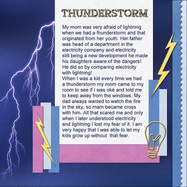
Day 6, but I used the template-day-5b because that fitted better with what I had in mind. I wanted to use fear for lightning as my topic for day 6 and I have a couple of overlays with a flash of lightning and this one fitted best. It is a simple page with papers from Jessica Dunn with some noise from me. The yellow flash is by Janet Kemp and where I got the lightbulb, no idea. The title font is Off War Stamp, text is ariel.3 points
-
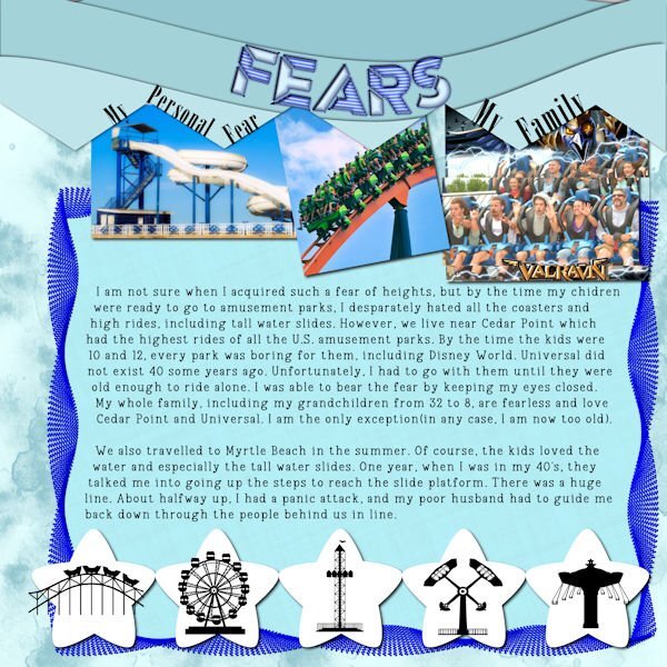
Day 6 - Fear of Heights The picture of the waterslide is from Canva, the coaster from Unsplash and the last one is from my daughter. I made the background and the waves from cass waves script. The border was me fooling around with directional tubes and vector tube. The pattern is from a cass preset. The title font is Ampera, a layered font from CF, and the text is Vintage Remington. The stars are from the template and put in a row using cass repeat script. The little black carnival objects are from a CF dingbat font called DBAmusement Park.2 points
-
Ann isn't that often the way we learn more or better when we are somewhere we hear and have to try to speak a foreign language! Sadly this isn't the case for math or physics.2 points
-
2 points
-
Ah, Suz, that looks like my favorite template, too, especially how you dress it up! I think there's a chance for you to go back and test the "way-back" of text wrapping as there's a spelling error on the 3rd line. It's more of a homophone, actually! You really "flew the coop" (like chicken coop) rather than "coup" which is more political and an overthrow of a government and is actually pronounced "coo." 😉❤️2 points
-
Well I don't care as long as they will fix the text and textwraping problem!2 points
-
2 points
-
2 points
-
2 points
-
P layout: Does it surprise you...pickleball? I would like to do another for Poppy and Penny. The smaller words on the P were created by Carole's script, Shadow Text.2 points
-
2 points
-
I've been a bit distracted. Yesterday Annie of AnnieCDigital designs asked her FB group to help by creating layouts using a new, unpublished Alpha kit. I requested C and P. Here is one of the C layouts. Font for "Cats" is best paws font. Heart paper by MarisaL, Pets kit. Paw prints on the C by Janet Kempt, toolbox calendar, metal paw print doodle.2 points
-
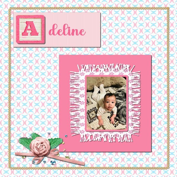
Lab 12 Mod 11. Swirl - background paper; block letters - I had an alphabet from Jessica Dunn and I used that rather than building my own - I recolored it as it was originally in green letter and frame. The bow, flower, scatter were also from Jessica Dunn. the fringe blanket was made in a previous lab; the lace frame I developed myself building on a previous lab and making it into a tube2 points
-
2 points
-
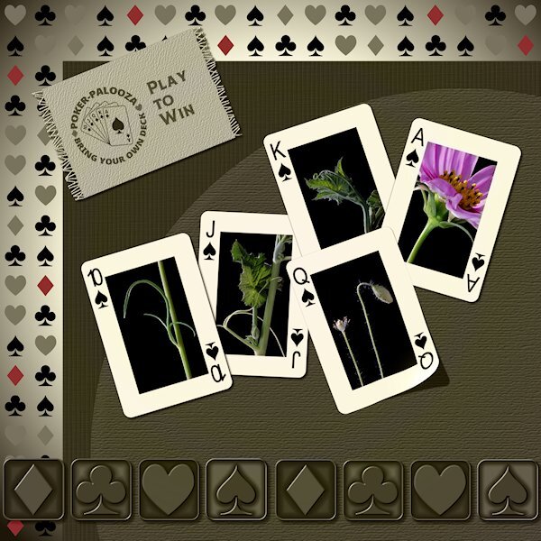
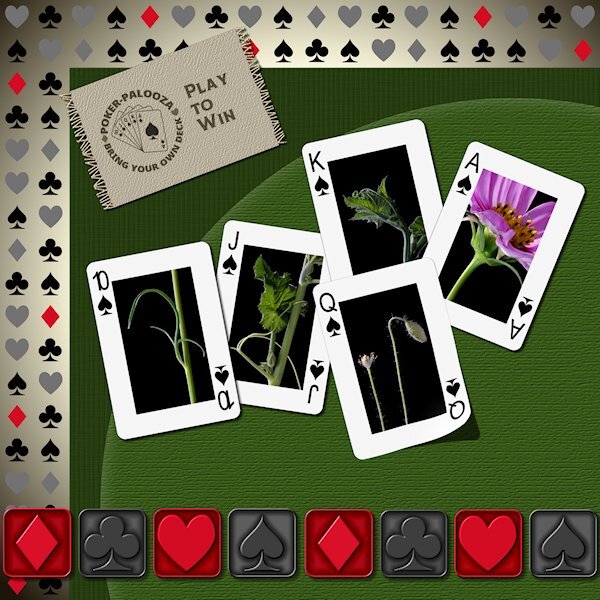
Lab 7-3 here is an alternate version. I took the gradient background and duplicated it then moved it to almost the top and added a blend mode. I like what it did to the metallic elements. they really look metallic now. I still wanted some color so I selected the "red" diamonds from the background layer and promoted them to a new layer and brought them above the blend mode layer and lowered the opacity of them (they were red already). I also brought another duplicate of the background gradient above the playing card group and made a mask of the gradient (New Mask Layer > Show All) and used black to block the layers below that have the blend mode so the middle of the cards would retain their original colorful-ness.2 points
-
Lab 7-3 Pattern Paper Metallic Element2 Fabric Tag As it turns out I used the same pattern as Carole used in the tutorial, only because my P52 challenge is playing cards so I ran with that theme. I loved the Pattern Paper and Metallic Element2 tutorials. The Fabric Tag was also good but I did encounter a problem I couldn't overcome. I couldn't get the eraser too to un-erase. I followed the video and used the written instructions, but it just would not erase and I'm not sure why. I really wanted the fringe part so I made the background of the fabric available for a pattern fill, and use the brush tool with the same settings and added the fringe on each side. I have them as separate layers (fringe below the fabric layer) so I could slightly change the saturation of the fringe and add a bit of noise and the tiniest of bevel. I merged the layers so i could add a drop shadow. I used the Custom Playing Card script and the Lifted photo script. Font from Creative Fabrica.2 points
-
2 points
-
Sadly, I haven't had a lot of PSP or pickleball time lately. Lots of work in the garden...and now, the yard needs attention. It will wait....tomorrow is pickleball, picnic and table games. Clusters and background paper by Jessica Dunn, Into The Woods, at Digital Scrapbooking. Template 242 by Lady 22.2 points
-
1 point
-
you crack me up! Being the "good" Canadian that I am, I failed French in the most spectacular way.1 point
-
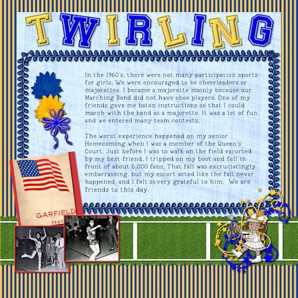
Day 4 - I know I am way behind, but hope to catch up in the next few days. I had difficulty deciding on this topic and ended up dragging out my old yearbook since I didn't have any good pictures from my majorette days. I made the striped paper blue and gold for our school colors and scanned pictures of me from my yearbook. The little majorette is a black and white from Canva, colored by me. The flowers are a my own mum with one changed to blue. We used to wear the corsages on football Fridays. The bow and ribbons are from cass scripts. I tried to make the green paper look like a football field. The embellishment twirls are from a brush. The main title is Preppy Varsity and the typing is Vintage Remington, both from CF. The text border is a cass tube, gimp. I had a typo and could not correct with PSP2023, but I changed the text to character shapes and managed to make it look ok. I also made the title letters character shapes in twist them.1 point
-
They might be small and secretive, but your patience paid off with this pic.1 point
-
I am so jealous, Minka! I've always wanted to do something like that. Great layout for a great trip!1 point
-
new and Knew gave me a laugh. English is weird. Sad for the kids in from your church.1 point
-
@Anja Pelzer Make sure you don't try to combine everything in one layout. The experiments (and even the tutorials) are not meant to be together. If it fits, that is ok but make sure you don't force anything while you go through all those modules! 🙂1 point
-
1 point
-
Since Cassel went with Christmas for Day 2, I went with Hanukkah. We always had a big family get-together on the first night until my mother retired to Florida. December brought a plethora of presents for me...Hanukkah, my birthday, and Christmas. The rest of the year...nothing! I found some beautiful papers and elements by Maria Lerin from Digital Scrapbook/Pixel Scrapper. I also had some things in my stash. The font for the tag is Malgun Gothic, and for the story is Mandala Handmade.1 point
-
1 point
-
1 point
-
1 point
-
Nathan's Dairy Bar...a favorite and much visited place. CD digital scrapbooking template 339 (Chantahlia Design).1 point
-
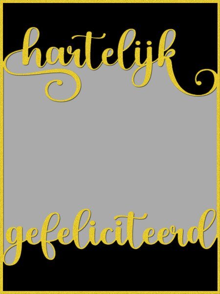
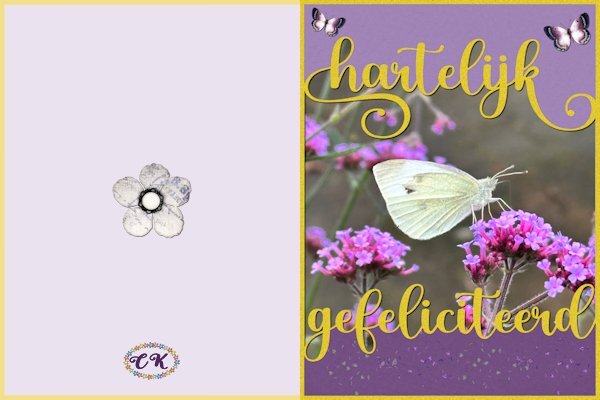
What about old-fashioned handy work after all the talk on Copilot, Spark, AI etc...... I wanted to make something were the text touches the frame and creates a kind of bounding box were you can put a photo, a paper. first I made a template with the Dutch text of happy birthday and the spaces in between are mask layers, so I can use it again with different photos and colors for a totally different result. Then I made a card out of it for my cousin who adores butterflies. I'm going to experiment a bit more with this technique, I like it1 point


Resized.thumb.jpg.d25811db03a63358cedab1e79f527635.jpg)


