Leaderboard
Popular Content
Showing content with the highest reputation on 03/22/2023 in all areas
-
17 points
-
13 points
-
here's my Day 2 all credit on my gallery (clic on image ☺️) @Cassel I use your template (je ne sais pas si tu vas le reconnaître ? ) thanks ))13 points
-
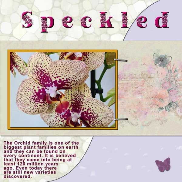
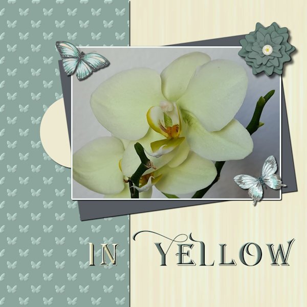
I have chosen my orchid photos for this workshop. I haven't that much new photos at the moment as I was the last 5 months not very mobile and now I can go walking again the weather isn't very good, for taking photos, much rain and dark clouds. I used my Build a Kit supplies again with the exception of the butterflies which come from a set of watercolors by Creative Fabrica. For the title I chose 2 fonts in the end, because I tried all different ones but found it not to my liking. Instead I gave the words a different color to stand out better against the papers. The fonts I used are: Arienne and Agreloy.13 points
-
Not my best work, it's too busy and too much focused (hahaha pun intended) on the right side. I used stuff from my kit and learning I need way more stuff and that "stuff" needs to be in different orientations. The photo was a test for me getting ready to photograph my camera collection. The Pentax K1000 was the first SLR camera I ever used, it has a soft spot in my heart. And of course this isnt the actual camera I used, cause then I would have stolen it from my high school...and I'm a good girl and don't do that sort of thing?. Anyway, my brother, who at the time was a commerical diver living in Borneo, came home to visit the family and came to the open house at my high school. He was blown away by the schools dark room and my interest in photography, so much so, that he bought me my first camera, a Ricoh KR10, which I sold and now wish I still had. I know. BEST. BROTHER. EVER! Looking forward to Lesson 3, it looks wonderful.12 points
-
12 points
-
12 points
-
For this 3rd day, I used Carole's template (thanks @Cassel for this template) and I tried to remember the live for the snow on my title (hope it's not too bad LOL). The credits are in my gallery by clicking on the image ? Translated text: "SNOW - January 2021 This year is the first time that the snow hasn't melted since Moïra was born. With a piece of cardboard covered with a garbage bag, she improvises a sledge and slides down the slope. And with his father and his sister, prepares a battle of snowballs."11 points
-
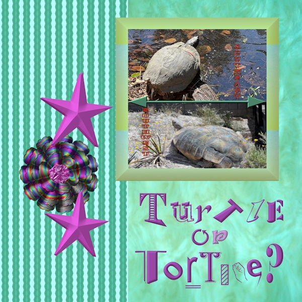
I am still using my kit papers and some of the elements that I made. The pictures are my own--one taken in the desert in Nevada and the other taken in Hilton Head. The crazy flower was made using the hue up and down brush which peaked my curiosity. It sort of fits my Art Deco theme. I should have made a list of all the fonts that I used, but I just sort of scrolled through my fonts until I found one that suited me. The orange font is Mesquite and the arrows are a preset shape. I used a Layer Style bevel on the title.11 points
-
10 points
-
10 points
-
10 points
-
10 points
-
9 points
-
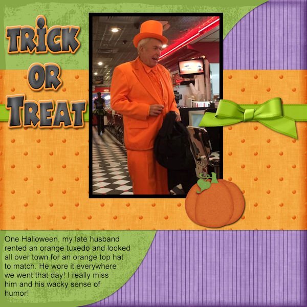
Here is my day 3 project. The pumpkin element is from Pixel Scrappers and the bow and ribbon are from Cassel's blog. All the papers and the title are from my stash and not really sure where they came from. I did switch the order of the two bottom papers so that the shadow would show some separation. I didn't pay enough attention to the last minute of the video and lost my story on the first try....good thing I saved my PSP file.8 points
-
8 points
-
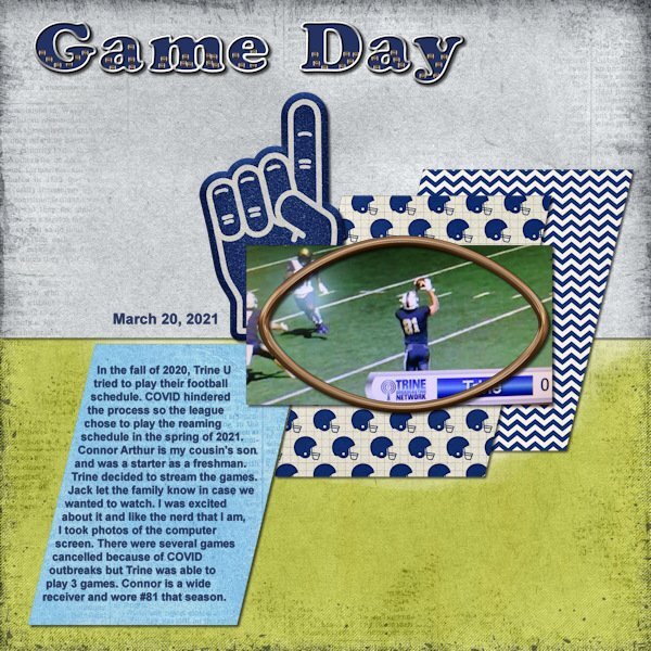
I did a layout for the project that I am using for this workshop. So this layout actually combines Day 1 title and Day 3 text wrapping. I used a template by Scrapping With Liz (October Mood Board) and the kit is by Kristin Aagard called Sporty Football, both available at The Lily Pad. For the title I wanted a fill that pertained to football. There was a football element in the kit so I made it smaller and made a tube out of it to fill the title. I also didn't make the fill translucent as I wanted to keep the dark blue color that is the school's color. I went with a silvery outline of the title. Font is Cooper Black. For the text wrapping I used the remove selection to take out the corner area where the photo covers the paper. I tried the paper over the photo but it didn't look right with the football shaped frame there as well. Font is Arial. This is a very simple layout and not my normal style since I usually have at least 1 cluster on them. But I wanted this layout to be about the story and the photo. I will do a second layout with more photos of this game then move on to the next game which is where my Day 2 title is being used.8 points
-
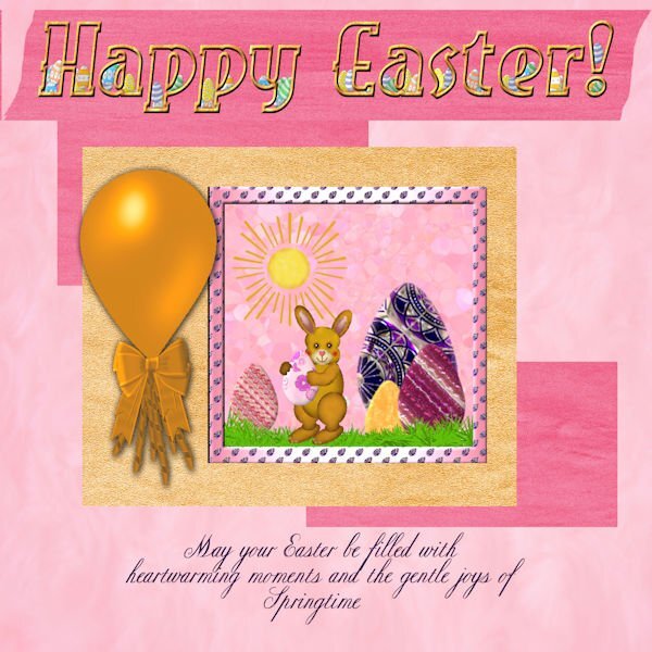
I finished Text 1 a day late, but it's finally done. I used Carole's template and papers from my build a kit. The picture was created a couple of Easters ago by me, although mainly I kept the background, grass and bunny. I created new eggs using patterns in PSP with Filter Forge Plastic and some bevel. The balloon was created from a Photoshop tutorial using PSP and the ribbon is from my build a kit. The sun is clip art. The journaling text is CopperInline and the title text is EastMarket. The frame on the picture is a combination of a gradient fill and the egg pattern from the big egg. I tried to make the patterns on the eggs Art Deco in style.8 points
-
I was so ready for Day 3. And Carole gave us a template to work with! So, how hard was it going to be? Well, let me say...I spent way too much *@^$# time on this project! The text tool has a mind of its own (which is what I thought before I started this series). When I clicked on the Text Tool and tried to change the size, the colours would change. So, then I'd click on the Materials Palette boxes to change the colour, and the text size would revert. Or I'd click on the Font colour button on the text toolbar, and nothing would happen. And this went on and on until I was ready to do damage to the laptop! Sigh. So here is my Day 3 with wrapped text. I'm so over it. (I used an old photo b/c I happened to have it for some work I was doing on a history article.) And then, I wanted to go back to change a couple of things, and I saved the .pspimage merged. Not my day. EDIT: I just couldn't walk away from the project. I had to try again. I started with the template and same image, and worked it through. I still had a few glitches with the text tool, but not nearly as many as the first attempt. Now, I AM DONE with this!7 points
-
I was first thinking of posting only the Text/Title work, as suggested by Carole in the email. But after seeing Corrie and Susan, I decided (at least for lesson 1) to create a layout using papers/elements from the Build a Kit workshop. I hope to finish the workshop this time. The photo is from Pixabay.7 points
-
7 points
-
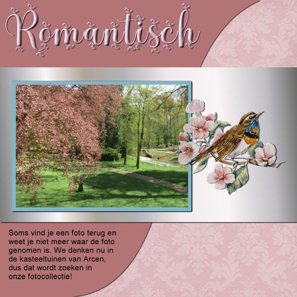
I stayed with my orchids an my papers! But I didn't want much embellishments for this. The font is Peaceful Nature. When I wanted to resize nothing happened; I had my wrapped text as a raster layer, but by close inspection I noticed I had lost one of the staples. It took me some time before I realized that when resizing the resize all layers box wasn't checked!5 points
-
5 points
-
5 points
-
5 points
-
5 points
-
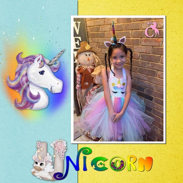
Day 2 - All of the fonts are unicorn related: Cute Alphabet Unicorn, Unicorn Express, Star Unicorn, Magical Unicorn, and Groovy Unicorn. The monogram at the top corner of the picture is Star Unicorn Monogram. My niece loves unicorns, just like her Uncle. Although, unlike her uncle, I think she is starting to outgrow them. Such is life in "Honah Lee" ...4 points
-
4 points
-
I like spiders, especially Jumping Spiders. We had a black one that lived in out window a long time ago. I named him Spencer.3 points
-
Cindy, echoing Michele's words, you are doing great. One day at a time. Be proud of yourself for what you have achieved so far! ?3 points
-
3 points
-
Just be patient and keep at it. It's taken me years and I still have so much to learn.3 points
-
I wouldn't say this historical village is near me as I live in BC and Highland Village is in Iona, NS. A few years ago my wife and I decided to return to NS for a memory tour. We were both in the Navy and received our basic training a HMCS Cornwallis near Digby. NS. As we toured the province on our way to Sydney, we found, by chance, this wonderful little farm that was set up as a historical representation of when the Scottish first settled in Nova Scotia. The people there were dressed in costume of that period, as were the buildings and contents. The best part of this adventure was that people you spoke to talked as if the past time period was now. When you asked a question they answered as if it was the 18 century. We felt like we had just time travelled back 200 years. Well worth a visit.3 points
-
My day 1 with a mini I create for a Challenge on the DSS forum )) I use my cloud on the top of the letters ?3 points
-
3 points
-
3 points
-
3 points
-
2 points
-
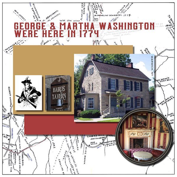
My late husband and I lived and worked in the Historic Village of Warwick (NY) for over 40 years. No one goes around in period costume but there are many buildings restored to their original glory from the 16th and 17th centuries. It was dubbed the Queen's Village after the citizens rallied for King George during the Revolutionary War. Then General George Washington visited and stayed awhile. There was an iron forge that created this huge chain that was shipped to the Hudson River and stretched across to repel British invaders.2 points
-
As I reread my note after your reply, Cassell, I realized that I forgot to mention the name of the farm. Just in case anyone wants to visit this site, it is the Highland Village, in Iona, NS.2 points
-
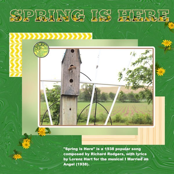
That was an unexpected super quick response! ? Thank you ever so much, I appreciate your comment. The photos I take of everything nature, inspires me to create as natural as possible pages. I'm not one for bright colours, or frill. My pages are also very minimal. You have certainly captured the essence of Spring in your page. Well done!2 points
-
2 points
-
2 points
-
A very simple lay out, but it doesn't need more I think ? Tried a mat and other things , but didn't like them much ? When I added the gradient, I thought, this looks familiar, it looks a bit like the one I used on my granddaughters birth announcement I had the honour to make for sending to family and friends ?2 points
-
2 points
-
2 points
-
2 points
-
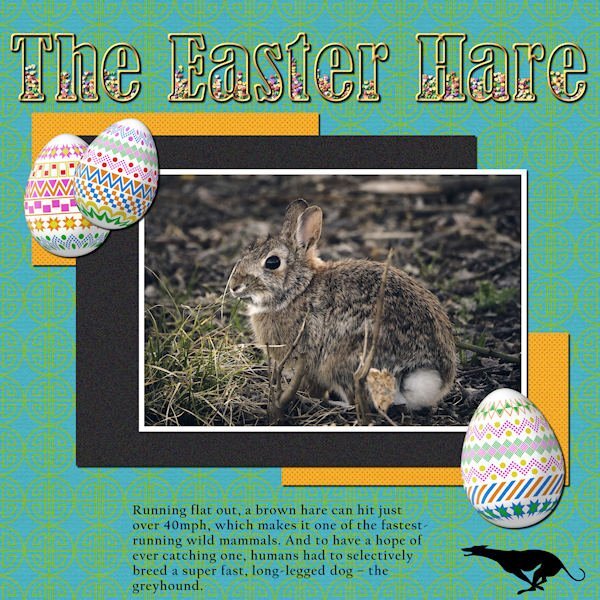
LESSON 1 - THE EASTER HARE - Photo from Pixabay by Matteo Baronti; Cass-decorated eggs; TITLE - Bernard MT Condensed filled with PSP Tube candies (for Easter, of course); Greyhound silhouette from Vector Stock. I also used Cassel's template and the MarisaL Tangible Hope kit. (Thanks for the kit, Carole, I noticed it was free because it was from your account)2 points
-
2 points
-
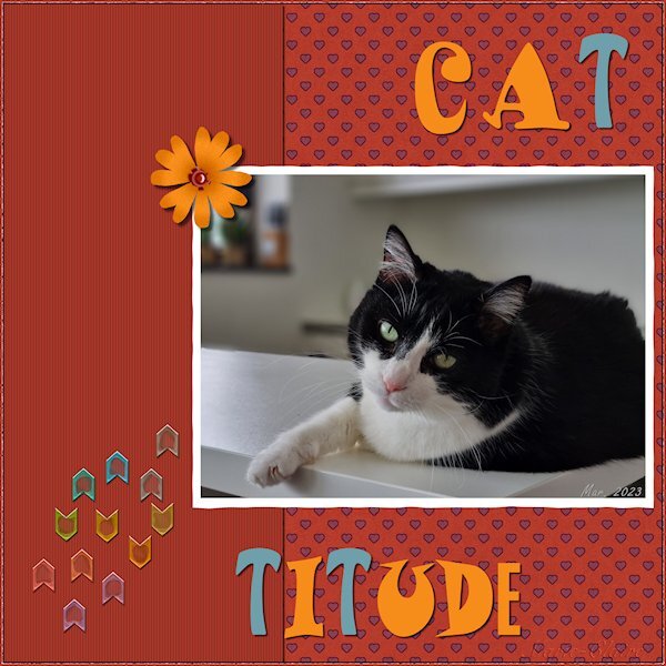
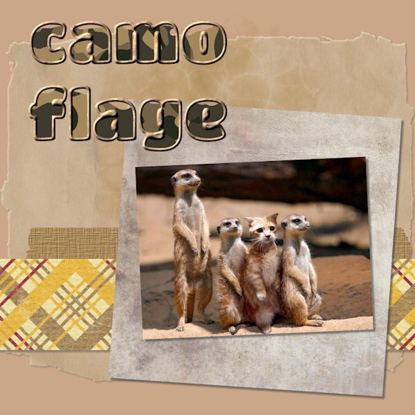
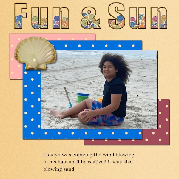
I decided to post right away before I see the wonderful work that others will produce. The layout here is simple, but it's a photo that always makes me smile. I had to work on the outlined & filled text a couple of times before I got it to cooperate. Those layers mess me up sometimes....which one I AM on vs. which one I SHOULD be on! The font is Titan One, and it's nice and thick for this purpose. I'd never used the Effects>Texture>Sculpture and was happy to try it. Nice effect.2 points











Resized.thumb.jpg.d25811db03a63358cedab1e79f527635.jpg)

