Forum Replies Created
-
AuthorPosts
-
Very pretty Sharla.
Bonnie, you are the model of the the 3 “P’s”…Practice, Patience and Perseverance. Lovely commemorative layout.
April, your pages are as beautiful as your cards.
Sue, your out of bounds effects really take the layout to the next level.
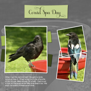
here is my go at it. I’m not sure if I’m quite happy with it or not. It was the first time I used a photo as the background. I love when everyone else does it. But the bird bath is red and red is a very strong bullish color so it was very busy in color. So I desaturated it. I think I’ll try a paper as a background and see if I like it better. The fonts are Samantha Upright (Creative Fabrica) for the title and Arial (windows) for the journaling. Photo’s are mine from yesterday (July 23) taken through the dirty dining room window.
Wow Lisa HL! Beautiful and inspiring layouts.
Wow! Sue, beautiful. Such pretty flowers lilies are.
THAT’S IT!!!
Carole, my compatibility mode was set to PSP X8. I don’t know why or how it was like that. But I am a clumsy clicker sometimes so it is like I thought. I did it and didn’t know I did it. If that makes sense. No wonder the text tool was also acting weird in the box itself. It was “blinky” and it hesitated when I’d type, probably trying to tell me, “change the compatibility mode you idiot”.
Thank you for your help. I was getting anxious every time I’d save something.
Carole, I may have set the compatibility mode by accident. I don’t know how to do that. I think you had a post about that, I will look and see if I can find it.
That is beautiful Pirkko. I love the country and I lived on several horse breeding farms in my 20’s and loved it. I am lucky to be in a city where we are surrounded on 3 sides by countryside.
Karen, that’s so pretty.
Thank you Sue! Your experience is greatly appreciated. I did not know having two vectors in play would have problems, which goes back to I don’t know what I don’t know. Thankfully you do know. I didn’t know there was limitations and it explains a lot. That’s makes me feel better about it. If I know there is limitations then I can find a work- around like what you have done. I’m glad you jumped in to help get me straightened out.
That’s cool Ann, I had originally started out with the red one, then abandoned it and went with the green one. I still had the three papers in my layers palette, with two hidden. What a surprise when I tried them out. I’m leaning to the blue first, then the red and lastly the green one. It’s also the first time I did an adjustment layer ever. I’m going to watch the master class on Adjustment layers and learn more.
I’m not sure what a “bounding box” is. I’ll add that to the list for the next Q&A. Or is it just what the selection box is called. I’ve had weird messages pop about about a bounding box and I have no clue what it meant. So much more to learn. Keep speculating please, I don’t want to have to abandon PSP 2022 and go back to 2021. I am presuming it’s operator error, but I don’t know enough to know what the error is that I’m making. ? I am going to try doing some tests, I haven’t tried adding text without using the selection box (I just love doing it that way).
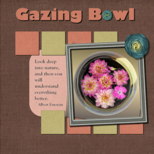
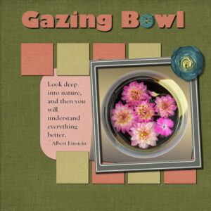
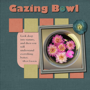
Day 11 Project 5. I have three different backgrounds. I had worked through the layout with the green background and when I was adding shadows I turned on the blue one and thought hey, I like this one better. Same with the red one. then I just couldn’t decide. I don’t normally choose papers from the same kit and this time I did, even the flower and frame. although the flower looks like a blue cabbage. They are from Digital Scrapbook (Gina Jones “my everyday” July 2021). The title font is Gills Sans Ultra Bold and I think the journaling is Gloucester, both windows fonts. Photo is mine from my Gazing Bowl series that I extracted and put on a gradient background. You can see I have journaling text this time. And yes, I had the same error where it wont save. always right after I’ve used the selection tool and put text inside the box. So I hit undo, made the selection and put my text inside and then converted it to a raster and it would save. I must’ve gotten the only PSP 2022 lemon. I think I’ll go back to 2021 and see how it performs. Thankfully I have never had the saving error message on the title vectors.
Carole you have eagle eyes. Yes, I see I did something wrong on the shadows of that big picture. I’ll fix that up tomorrow.
Mary, beautiful layout for your lab9-mod8. The color choices are perfect
Ann, so lucky to have chipmunks, you are a master at making templates.
Michele, I love your use of templates and how you’ve changed them. Thanks for adding the before and after, it’s quite a change and wouldn’t think to do that.
Bonnie, I love the colors you chose in both your templates. And I like the look of both, especially the single one and how you have the subject perfectly in a frame of it’s own .
And I agree, I hate the border FB adds. Good ideas to change the size of the layout to match or make the black border. On Marketplace they have a big blurred background and a smaller picture of what you are selling and that drives me nuts. What a waste of pixels and space.
-
This reply was modified 2 years, 4 months ago by
Susan Ewart.
Hahaha, Gerry…yikes! the flower police, I forgot about them. I think I see them on my street today, with a police dog. (they were doing security training cause the Pope is comin’ to town – he really is).
Harmony, I have started doing that and that’s where I learned it seems to be right after I do the selection box to put text into. I’ve done it lots of time and the last two times is when i got the error.
Carole, thank you for the psd tip. I would have never thought it could do that.
Thank you Ann, that makes my heart sing! The feeling will be stamped out (my singing heart) soon as I walk through the doors at work (at a newspaper web press…really hot warehouse and we are still wearing masks, while the rest of the building doesn’t have to. UGH).
As you may have come to know Ann, I am a strange girl so the layouts will be perfect! Seems like a lot of work, something I will try sometime. It all adds to getting experience with PSP right? Off to work now, just sweating thinking about how hot it will be. (TMI moment of the day: think of when you go swimming and you visit the washroom. It is darn near impossible to get the suit off to the do your business, then get it back on again – that’s us in the warehouse.).
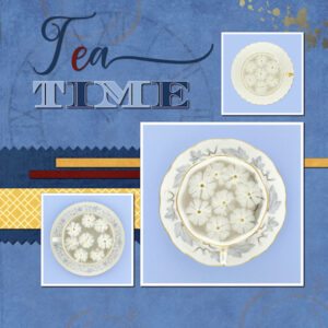
Day 9 Project 4. This time no problems. The error I’m getting that wont let me save my layout is when i used the selection tool to create a box to journal in. It has happened twice in a row…good thing I’m not a journal-er. Apparently PSP thinks so to, it wont save it?. It has to be the user (me!) not PSP. Although, now every time I go to save a project I feel a little tension.
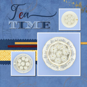
Papers and elements (paint splash, tea cup stains & stamped clock) from Digital Scrapbook. “Tea” font is Leisha Script, “Time” font is Diplomata SC and I stretched it a bit upwards, both from Creative Fabrica or Google. The stamped clock in the background I faded with lowering the opacity and using the eraser tool with different grunge textures to fade it out more. Lined up the “e” in Tea to also serve as a dot for the “I” . It’s so relieving when nothing goes wrong (except the normal learning curve stuff that I expect to have).
This bootcamp is going very fast.
Edit: here’s the one with the shadows. My PSP file and the large JPG had the shadow, not sure why the resized one didnt.
-
This reply was modified 2 years, 4 months ago by
Susan Ewart.
Ann, are you making the templates from scratch or with a script? They are very cool. thanks for making them.
Gerry, very pretty layout. Your flowers look so vibrant. I’m doing a Flat Lay Photo project with flower heads right now. My husband thinks I’m a flower serial killer as I have to decapitate them to photograph. I’m not good at growing things except weeds (which are pretty too, right?) and thyme, parsley and rosemary (for cooking, which I’m not at either). ?
-
This reply was modified 2 years, 4 months ago by
Susan Ewart.
Q=Quirky
Dawn, those are so delicate and beautiful. Love the colors and the floral elements have a really nice dimension to them. I’ve heard people mention Eye Candy before, it looks like an interesting plug in.
Harmony, I love all your color choices. You layouts are beautiful.
Pirkko, you pages are inspiring, I always look forward to them.
I wish I could comment on everyone individually; I am inspired and motivated by all of your layouts.
Mary, those fans are fan-tabulous. kidding aside, they look really good. Especially the bottom one. It’s so real looking. I too dont play well with the pen tool. Maybe because I’m using a mouse. I downloaded that freebie too, you made good use of it. thank you for posting the fans. It’s going to be a while before I get that far in the Labs. I’m till in Lab 5!
Yes I did forget the shadow, but it’s flattened so I cant add it now. I had this one saved to this point before having the problem that I did add the shadow to. I found out where it wont save from. when I make a selection to put the text inside the selection. Once I add the text inside and click the apply button then deselect the selection and try to save that’s when i get the error message that it cant save it. If I undo to this point ( shown below) it will save the layout in PSP image format without errors. I must be doing something wrong. at least I can use this one below and try and save as a psd. I didnt know I could do that.
I just tried the psd and it worked! it did lose one of the raster layers ( the top left flower, but kept the raster shadow for it, that’s funny). That’s minor compared to losing a whole layout without layers. I added the journaling in the same way with the selection tool and no problems saving as PSD. I dont know why PSP doesnt want to do that. It’s done it before with no problems. So it must be something I’m doing.
TIFF was flattened, no layers?
I just looked at the last one this happened to (Lab 5-11 layout) and it also had journaling where I used the selection tool to make the “box” for the journaling to be in.
-
This reply was modified 2 years, 4 months ago by
Susan Ewart.
-
This reply was modified 2 years, 4 months ago by
Susan Ewart. Reason: added more information
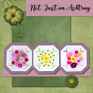
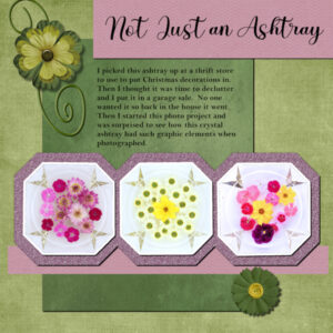
Here is my project for Day 7 Project 3. Well, it happened again. when I was doing the journaling part the words were lagging behind my typing (I’m NOT a fast typer). I knew something was up and sure enough I couldn’t save as PSP. I am still able to work in the project, just not save it. So I hurriedly did the shadows and saved as a TIFF and JPG with no problems. I also copied and pasted as a new image each element/paper layer to see if I can recreate this page and save it as a PSP file. My first project this happened, my second was okay. I blame windows 10.
Papers and elements from Digital Scrap book. Both flowers are two flowers merged. I used the eraser tool to cut the corners off the glitter paper and to notch out between the photo’s, which are mine, part of a Flat Lay Photography project I am doing on Gazing Bowls. The title font (Baby Heart) I think is Creative Fabrica (I have a font viewer and it includes Google fonts so now I don’t know whose is whose. The Journaling is Bell MT which I think might be windows.
I love seeing the creative and interesting layouts from everyone. Lots of good ideas.
Thank you Carole on your comment about my shadowing. I try a lot of different versions to see what seems more realistic… and if I get stuck then I then I go with WWCD (What Would Carole Do?).
-
This reply was modified 2 years, 4 months ago by
Susan Ewart.
Mary, I love the fans you made. I wish I could see them closer up. The pattern looks really interesting. I’m doing the bootcamp again and will resume the labs right afterward. When I see your pages it’s motivating me to keep going. I see the techniques and elements you make and wonder how long it will take me to get to that lab so I can do them too.
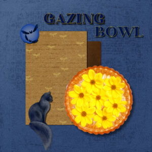
Day 5 Project Two. I tried working the layout with horizontal paper elements but it was flat and boring looking. I had the same problem Corrie (I think i was Corrie in the Q&A) had where my text outline had little horizontal lines instead or a solid continuous line. Sure enough my line style was not on “solid”. Font is from Creative Fabrica I think, called Hustle Bright. Same with the cat and bats. the papers are from Digital Scrapbook and the photo (extracted) is mine. this time with no frame like in Project One. The Gazing Bowl idea is from June Hunter, who photographers her dogs outdoor water bowl, usually in the fall, which collects falling leaves. She did one with Hellebores (not in the dog dish!) that knocked my socks off. So, I took the idea and ran with it as an abstract project.
Wow, that’s really nice looking. And a lot of work. I will use whatever you come up with.
Thank you Ann. Let’s do that tea, coffee, or wine (or all three!) at your place. We can sit and watch the cool birdie visitors you get, while dining on shrimp?. Kidding of course, I don’t make a habit of eating my friends pets. I’m glad I’m not alone in that weird transparency issue. Here I am thinking I’m rockin’ this PSP program and then that happens and I’m all humbled again.
Thank you Carole, I will look for that box. That might be a question for the Q&A. How does one know when to “use” all layers or uncheck and “not” use all layers?
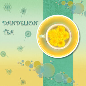
Day 3 Project 1 in the bag…or the t-cup in this case. Papers from Digital Scrapbook, dandelion line art from Creative Fabrica (changed color by locking the transparency), font is Curlz not sure if that’s a windows one or not. Photo is mine and I extracted the t-cup and added a white border. I used a thicker shadow on this as the white border looks like part of the saucer, so I added the shadow as if it was a thicker element.
Carole, when I first extracted (t-cup was shot on white background for this purpose) the t-cup image, I used a selection set to circle. then I cut and pasted to my blank canvas. when I went to flood filled the canvas’ bottom layer it left the t-cup impression transparent. the t-cup layer was just above that layer. Is it because the image itself is a background layer and I should have first promoted the background layer. I think I did something like that trying to figure out why I couldn’t flood fill that whole layer. But in clicking (and undoing) many buttons I don’t know how I did it.
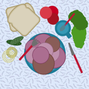
Just finished my workout and I need PROTEIN! So off with the carbs and on (the plate) with the meat! ‘Cause baloney is a good clean protein, right?? That’s my story. I bought new dishes this year and some complementary cutlery. Now I better go and eat…I am like a bear out of hibernation after a workout.
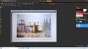
(379017) Ann! You are brilliant! I did 1/2 the instructions, no wonder why it didn’t work. Here is my *New* *Improved* screen shot. the photo is mine, of my friends painting (1 of 6) that is currently at a gallery showing. My hubby and I have to dismantle the show of her paintings this weekend, YIKES! The canvas’ are about 4.5 feet x 6+ feet and mounted to the wall then framed out. Putting them on stretchers was a too expensive for the price of wood these days and they have to be mailed back (to Quebec where she lives) in tubes.
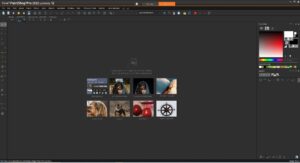
Here is my workspace. I like it dark and have the organizer and learning centre palettes closed to give me more space to work. This is a windows snipping tool shot. I’ve still yet to figure out how to do a screen shot with PSP. It’s not high on the priority list. Now I must get my photo’s organized. It’s some flower shots but mother nature has been conspiring against me. I am shooting this project with diffuse light from overcast skies and the when the perfect time comes I am either heading to work or I get all set up and then there is a thunder/rain storm. I finally had to take it inside to my studio and shoot some of it with continuous light. Nice to see the familiar faces and welcome to the new faces. I’m sure I will learn lots from all of you. this is my 6th time through the bootcamp. I really love doing it and like Gerry, I keep learning new things and am inspired by all the layouts I see.
-
This reply was modified 2 years, 4 months ago by
-
AuthorPosts


