Forum Replies Created
-
AuthorPosts
-
Awesome!
J = Joy
Brian. I’ve been enjoying your projects very much and I love your web page.
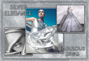
I think these are the two backgrounds I used for the Silver Elegance project; I had them in my Patterns folder. I wish I could give you the source, but I’ve had them for years and my record-keeping was not as good back then as it is now. I rarely purchase backgrounds so I’m sure they were free. If you do end up using them, I would love to see the results.
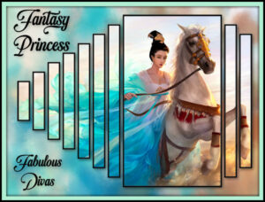
With so many using the Block Shape technique, I thought I would give it a shot. The font is Jumpbox and I used the 2nd method in the tutorial. I think I’ll be using this more often. Fireworks are one of Corel’s picture tubes included in PSP.
To all my neighbors up north, have a Happy Canada Day!
Thanks, Brian. I would be happy to share the backgrounds I used. Let me know if you want me to send them to you.
Thanks so much, Dawn. I didn’t create the silver texture from scratch. I used a combination of glitter and some silver background papers I had.
Just a little something to show any newbies that you don’t need anything too complicated to present a page. Pretty much every element on it was done like this: Use the magic wand to select the area outside of the element. Then selection: invert; selection: modify: select selection borders and flood fill the border. I did this several times on each and added drop shadows. Looks harder than it is.
The font is BOOWIE.
Can’t wait to see your cards again, Dawn. <3
Oh, Dawn, it’s so good to see you here. I haven’t heard from you in quite a while and I was worried. <3
I finally used the Paper Cutout script to create the “people” at the bottom of the page.
Very cool, Brian.
Lovely, Ann.
Cristina, I relapse all the time with CF, but only the freebies. CM doesn’t seem to have its weekly freebies anymore so I rarely go there although they do offer some freebies.
Susan, be careful as font addiction is very prevalent! lol
Another good source for inexpensive fonts is FontBundles.net. I don’t know if they still do, but they used to have $1 deals monthly that included bundles in addition to single fonts. Fontaholics Anonymous made me cut myself off a couple of years ago. LOL
I’m sorry if I haven’t been commenting on everyone’s projects. They are all so wonderful and I don’t want to bombard this thread. Just know that I love everything I see.
Thanks so much, Mary. Arial Rounded MT Bold is one of my favorite fonts, too. In fact, I used it for today’s theme.
I’ve been receiving Creative Fabrica’s daily offering for years now. It’s one of my favorite sites.
Thank you so much, Susan. You’re very generous. 🙂
Thank you, Ann. The Fabulous Divas is a FB group for people who play City Girl Life (formerly Disney City Girl). It’s a simulation game that I started playing after the Sims Social on FB shut down. We dress up our avatars according to the theme the game gives us every day. We also decorate our apartments. Sounds silly and you’d think it was for little kids, but the vast majority of us are adults. I’ve pretty much lost interest in the game itself, but I love doing the pics and I love the friends I’ve made over the years. And that’s how I ended up here at the Campus. I don’t remember how I found the Campus, but I wanted to learn how to do pics for the group and luckily stumbled across it. The rest is history. 🙂
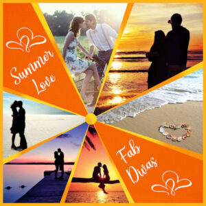
For this one I used a starbust template that Cass gave us as a freebie. I haven’t purchased the script yet. I found some wonderful pics on Google (my best friend lol). In order to get the two-tone effect behind the template, I used the orange background with a yellow layer on top. Then I erased some of the yellow using a brush set with lower hardness, density, and opacity. The font is Hello Summer and the hearts are just some doodles.
Here’s one from last week. Using the Painted Background script with the air spray option and then a little Gaussian Blur, I got a great result for the background paper. The Slats script gave it a sense of movement, I thought. The font is White Dream.
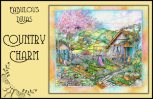
As usual, came to share some of my daily pics from my gaming group. I found a lovely illustration by Kim Jacobs on a google search for this theme. I used an original mask to try and mimic a cross stitch effect on it. One of Cassel’s flower corner punch brushes added an nice embellishment. The font is Coventry Garden NF.
Fun stuff, everybody!
Way to go, Sue and Lynda! I just read the newsletter and was so happy to see that you’re both finalists. Good luck <3
I’ve been using it for many years, Anne, and I’ve never had a problem. It gives you the option to copy (ctrl c) or save (ctrl s) the screenshot to your own device. I’ve never seen any option to download it to their servers. Additionally, it doesn’t show a URL like bitly (a URL shortener) does. Like any other screenshot, you must be aware of everything that it shows before you share it with anyone.
I use Lightshot for my screen shots. It’s free and easy. And it will capture everything on your screen.
Welcome to the Campus, rjay. It is filled with lovely, supportive, and creative people. I learn so much from them.
Looks like everyone has caught Mandala fever! They look great.
Nicely done, Brian. I like how you altered the result with the perspective tool.
G = Gelding
-
AuthorPosts


