
Digital scrapbooking is often a digital representation of traditional paper scrapbooking, and as such, it would require some shadowing to show the 3D effect that you would get. Not adding shadows will leave your work look flat. However, there are times when digital scrapbook projects will NOT need shadows. Let's see what those are.
Why shadows?
Shadows are normal and expected when you have a tangible, paper element. The shadows are created by their thickness and you can't avoid them. That is why, if you want to replicate the same effect in digital scrapbooking, you have to add shadows. However, in some projects, you won't want or need shadows because what you will replicate, simply does not have a thickness to start with.
Text in a project
Whether you have 3D elements in your digital project, text and other writing will not have shadows, because they have no thickness. The same goes for doodles, paint splatters, inked shapes and such. So if your project has mostly text, you might not need to add shadows.
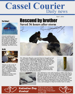
Magazine cover
If your project is replicating a print medium, it rarely uses shadows. The title of a magazine does not have shadows. The price tag on the cover does not have shadows. That is why, you won't need them either.

Print format
Maybe you are creating a digital scrapbook page, but you want to arrange your photos and texts that is similar to what you would find in a printed newspaper or magazine, where the components are not layered or overlapped; they are neatly arranged around each other. Adding shadows would just not look real anymore since the inspiration IS flat.
Cards
Greeting cards are often made of printed designs and if you want to replicate that format, obviously, you won't need to add shadows. However, you also have the option to add shadows if you include elements that will look like they are glued and layered on the top of the card. And if you want to use a blended photo, obviously, no shadow is required.
Collage
Sometimes, collages and mosaics of photos don't lend themselves much to adding shadows. Although you CAN add shadows and pretend they are glued on your background, it is quite all right not to and the result is still eye pleasing.

The important part is to be consistent with your own project and make sure that your choice will make sense. If you have shadows on some layers but not on others, it will look like you forgot them. If you don't add shadows where they obviously need to be (like if you have an element with inside shadows), again, it will look odd for the viewer.
In fact, you might be able to have a combination of shadowed and unshadowed elements on the same project if it makes sense. Imagine that you want to replicate a magazine cover (no shadow) but you want to place a set of beads on it, then it would be better to have the beads shadowed, even though the rest is not.
Can you think of other projects that will not require shadowing?


2 thoughts on “Shadows or no shadow”
I find myself looking closely at layouts (from other sites) now, to see the shadowing and often find nice ones but with shadows going all over the place in different directions and have words that are flying. I still find shadows scary Cassel but you have taught us a lot so it is getting less so.
Yes, shadows can “make or break” a project when we look closely. They are a whole topic to learn but with practice and guidance, it becomes easier.