Home of the Scrapbook Campus › Forums › Let’s talk › Scrapbook Stuff › New logo for the Campus – your opinion
- This topic has 29 replies, 29 voices, and was last updated 8 years, 5 months ago by
Valerie.
-
AuthorPosts
-
October 18, 2015 at 2:42 pm #7533
I have been considering changing things a little bit in the Campus in the recent months. I am not talking about rebranding EVERYTHING, but mostly to get a recognizable logo to identify the Campus itself and all its content. I had some submissions for logos and i would like to know which ones of those seem to be more meaningful to you. Those are NOT definite, and can be changed (for example, the bottom ones use the wrong colors and they would still be changed to the yellow and burgundy), and the text part is also easy to change. I am mostly looking for your input for the logo part, the design and the meaning to you (also if you find it looks good!).
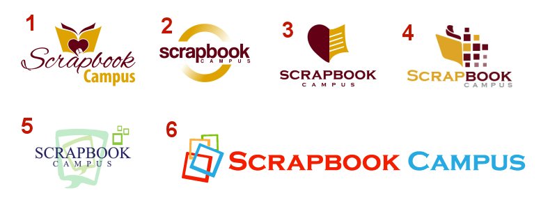
Of course, i would love to know WHY, or even why not if one of them really seems out of place for you. Or if you even have suggestions on tweaking one of them.
As a member of this Campus, tell me what you think.
And remember that not all logos are telling everything about a brand. Think of Nike, or Apple, or Twitter; their logos don’t say much about the company itself, yet, they have become memorable!
Remember that the colors are not to be taken into consideration, as they SHOULD be yellow and burgundy, once the design is picked.
October 18, 2015 at 3:38 pm #75354 was the one that immediately caught my attention
October 18, 2015 at 3:53 pm #7537I like number 2 very much 🙂
October 18, 2015 at 4:09 pm #7538I like number 2.
Simple , concise, the circle surrounds all things, easily readable and remembered.
October 18, 2015 at 4:17 pm #7539I love number 1! I like it because it is not only a logo but it shows creativeness and inspiration in the logo as well, so it is my favorite!!
October 18, 2015 at 4:20 pm #75401,3,4 are a little to busy for a logo IMO, 2 is good but not particularly unique or meaningful, but it does look more modern. but I think I like 6 best, though partly because of the colors! The gold/burgundy doesn’t do much for me, it feels dated. Colors aside though, 6 is strong, the name of the business is prominent, with a hint of what it is in the logo. the stacked photos would work as an avatar in square format, perhaps with a SC on top? Just my two cents! Glad I happened to get online to see this, good luck!
October 18, 2015 at 4:41 pm #7544I like the logo of 3 with the font/text of 4 🙂
October 18, 2015 at 4:42 pm #7545I have zero experience with logos, but #4 appealed to me because it combines the idea of a [scrap]book with pixels [digital].
October 18, 2015 at 5:20 pm #7547Bonjour Cassel,
1 et 4, mais ma préférence va vers le logo 1 parce que suggère un livre (tutoriels) et un coup de cœur.
October 18, 2015 at 5:41 pm #7549I like #1 best. At first sight, it appealed to me. I think the mouse icon could be a bit bigger or more prominent though. #4 is my second choice.
The reason I am not choosing the others: #5 is my least favorite. It has the wrong colours for the site, and is too pale, and easy to overlook. #6 is also wrong colours, and is too long for an effective logo. #3, I am sorry but to me it looks more like a football kick than a scrapbook. #2 could be anything, and a logo should suggest what you are promoting.
Thanks for allowing us to help!
October 18, 2015 at 6:00 pm #7550I am torn between #1 and #4. I like the book and font in #1, but I like #4 because it gives the idea of pages of photos, pixels, and a coming together. I do not like 2 or 3 at all. #5 is too pale and easy to miss, and #6 is too big.
October 18, 2015 at 6:04 pm #7551I like them all but I think 1 is best for me as it is easily identifiable with Scrap Booking via the Campus. Not sure of the size but maybe needs enlarging to get maximum visual impact.
October 18, 2015 at 6:46 pm #7553The one that caught my attention right away was #1. That’s my favorite
October 18, 2015 at 7:07 pm #7561I like number 1, is elegant and simple the same time.
October 18, 2015 at 7:19 pm #7564I like # 1 because it has a warm feeling to it, I kept going back to that example. And I like the font very much. However, I did not notice the mouse until Joanne K pointed it out – so the mouse should be larger as she suggests. I do not care that much for the other logos…..mind you, I’m an old fogie. lol I do agree with Jennifer White that Burgundy and Gold seem outdated but perhaps you are bound by external forces beyond your control. Having a website myself, I can relate to that. :o)
October 18, 2015 at 7:28 pm #7565Number 1 caught my attention immediately I love the font used
October 18, 2015 at 7:30 pm #75661 is my very favorite…like the script, the fact that it looks like a scrapbook to me and I would be able to guess what the logo was for just by looking at it. I think a logo should give the viewer an idea of what it stands for.
October 18, 2015 at 8:02 pm #7567I like Number 6 – clean crisp lines and appealing colors.
October 18, 2015 at 8:21 pm #7568Two is my favorite and three is a close second. Both of these translate well to greyscale and still look good when reduced by 50%, making them perfect for mobile phone viewing. Have you considered that for your site? Imagine how nice it would be to have PSP open on your computer and tutorial instructions next to it on your phone.
October 18, 2015 at 8:30 pm #7569Keep them coming. I really like all those explanations why you like this one or not that one.
Of course, with all those votes, i wont be able to satisfy everyone, but with the explanations, i can pick the best.
October 19, 2015 at 3:19 am #7570I like the 1st too, but maybe with the font you used for scrapbook in number 4.
October 19, 2015 at 3:24 am #7571I like No. 2. It immediately stood out as clear and unfussy.
October 19, 2015 at 11:50 am #7572#6 is the one to immediately grab the attention, however, I am not sure it would do so if you changed the colors. The colors in all the others are rather bland and none of them are really appealing to me. I wonder why they should all be burgundy and yellow? The colors in #6 stand out really well against the softer burgundy and yellow colors.
October 19, 2015 at 12:33 pm #7573I like #1 and #6.
October 19, 2015 at 1:29 pm #7574I love the 1. And the 4.
October 19, 2015 at 7:53 pm #7575No 1 is my favorite. There is just something about it that feels comfortable to me.
October 19, 2015 at 8:36 pm #7576I love #1. The open “scrapbook”, the heart, the elegant Font, are creative, to the point and very eye apealing, all together makes you want to click on it and explore the site. Beautiful LOGO. Hugs, Arlien
October 20, 2015 at 7:00 pm #7577I like 1 probably just a bit ahead of 4.
They were the 2 that caught my attention first.October 24, 2015 at 11:43 am #7582I like number 2, simple and not so busy
November 12, 2015 at 6:29 pm #7775I like #4 and #1
-
AuthorPosts


- You must be logged in to reply to this topic.


